Why do logos look so similar now?
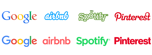
Have you noticed that lately the logos of very well-known brands are very similar to each other? Some earlier, others a little later, but overall they look very similar. You may have only noticed it a few months later or you may not have realised it yet, so here is a comparison:
We have several theories for this:
Readability
Consider the number of images we are bombarded with every day, whether on the street or on the Internet. Visual chaos is common and it seems that we will not get rid of it soon. Every brand wants to reach us with its product or service, and if there is something that helps it to do so, it will certainly use it.
Meanwhile, we are only able to absorb a few percent of what we see. Things that are simple, clear and easy to understand are something we need. That’s why brands strive to make their image as simple and consistent as possible, to make their materials easily identifiable and similar, while letting us know – our brand and our services are simple, clear and readable, you can rely on us.
Maturity
An established brand no longer needs to shout and draw attention to itself with an original logo. It can afford to simplify its image because it expresses its personality more through the quality of the services it offers, the messages it sends and the style in which it interacts with its customers. The goals of a start-up that is just entering the market and the goals of a brand that is widely known differ precisely because the latter is now focused on trust and reliability.
A brand is not just a logo
A brand is an identification system that builds a coherent message. The brand image consists of many factors and elements – a good logo alone is a distinctive sign, but it alone did not create an effective brand. To be successful you need an identity system that builds a coherent message. Let’s take Google as an example – how do you know that a given application or product belongs to Google? Obviously by the fonts, colours, characteristic style of graphics. All this and more makes up the identity system, thanks to which a brand is recognisable even if you can’t see its logo.
Utility
The number of users accessing the internet on a smartphone is growing every year. According to a Hootsuite report, it’s now up to over 5 billion, or about two-thirds of the entire population. How does this affect brands? Well, very directly. Less complex logos and graphics are better displayed on smartphone screens and are therefore quicker to absorb and simply more pleasant to look at. The big brands are going along with these trends and are changing, just as the technological world around us is changing.