visual identity visual identity

Petcuisine

A Polish manufacturer of high-quality pet food with a wide selection of recipes, sizes, and packaging options. It stands out for its modernity, high production capabilities, and flexibility in cooperation.

Client

Petcuisine


Scope of work
Branding
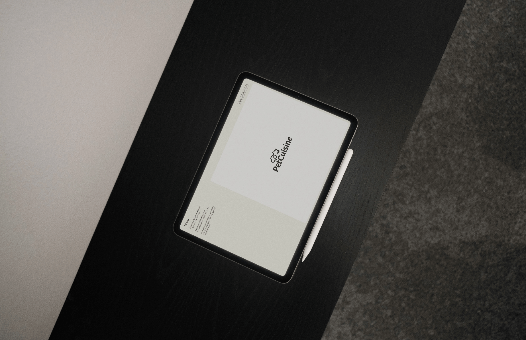
Logo
Website
Date
2024
Client

Petcuisine

Date
2024
Scope of work
Branding
Logo
Website

Link

Mockup_2@2x
Group 39075@2x

Process

Objective

Create a brand image aligned with the values of a new market entrant, perceived as a reliable and knowledgeable partner with flexible cooperation and strong production capabilities. Attention to detail is evident in every aspect.

Solution

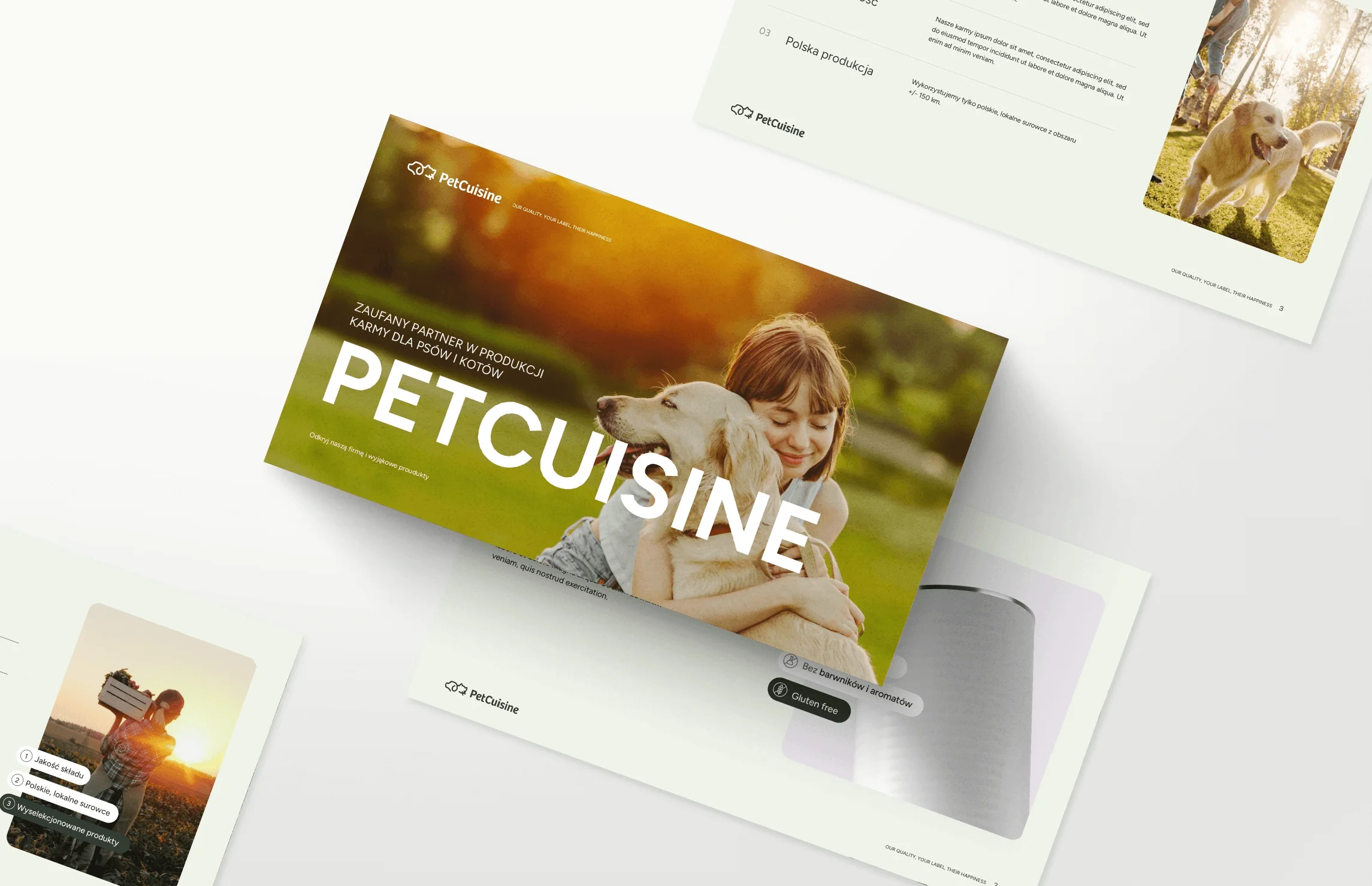
We based the visual key on earthy colors paired with a clean, sans-serif typography. Natural, sun-filled photos complemented with linear icons. A website that comprehensively presents the brand and its products.

Result

A professional, partnership-driven, and modern image for this innovative pet food manufacturing brand.

Big idea
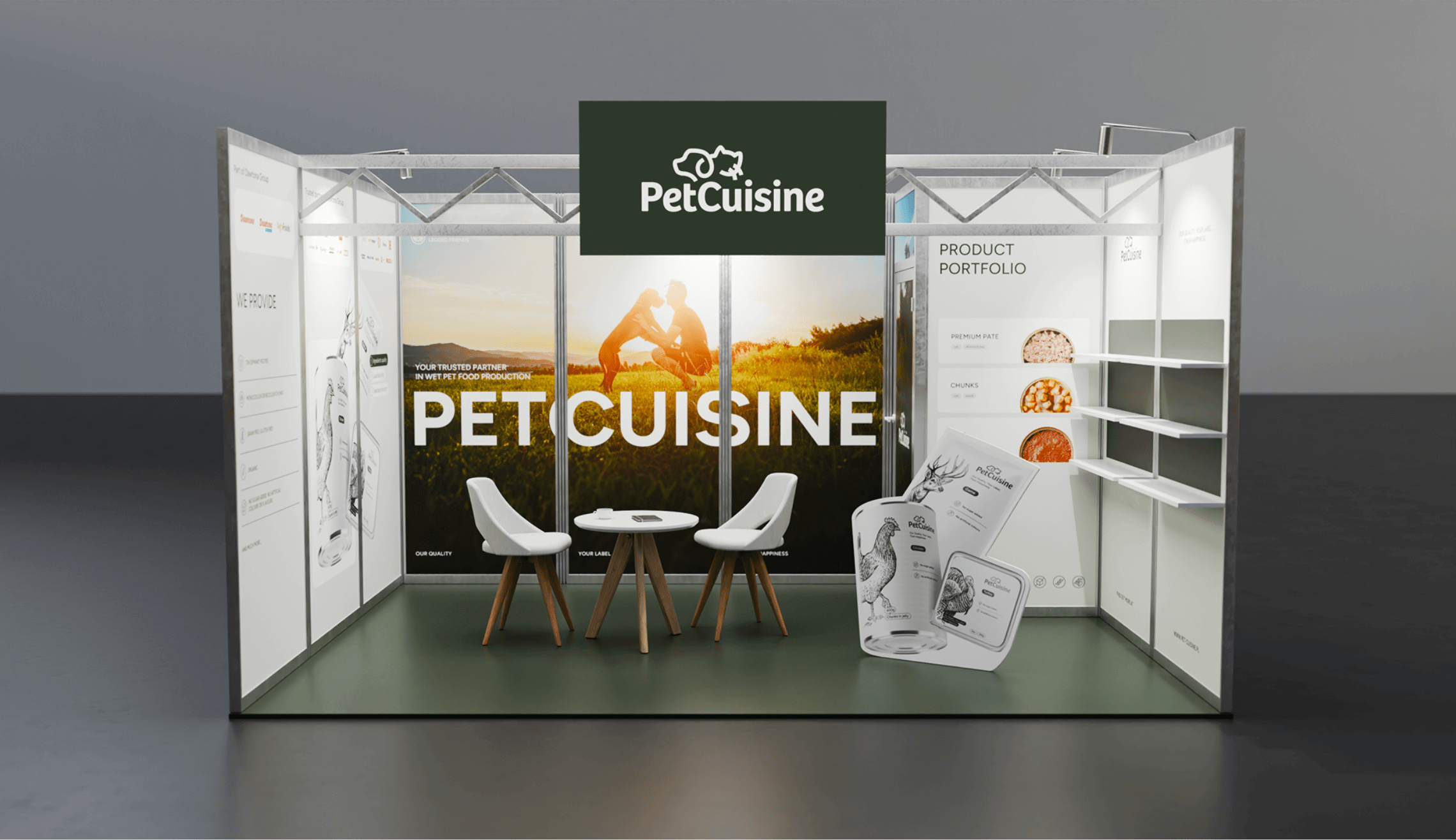
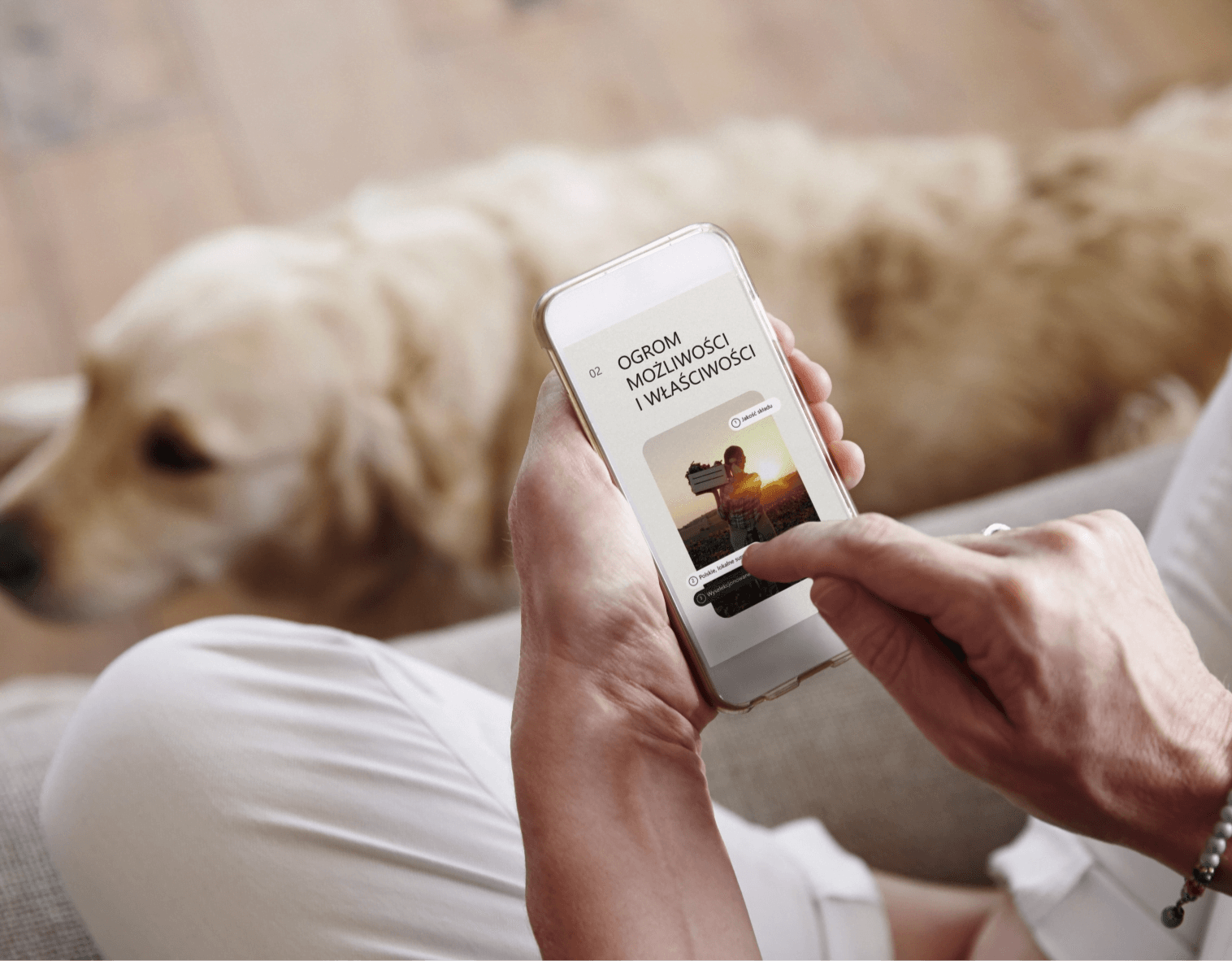
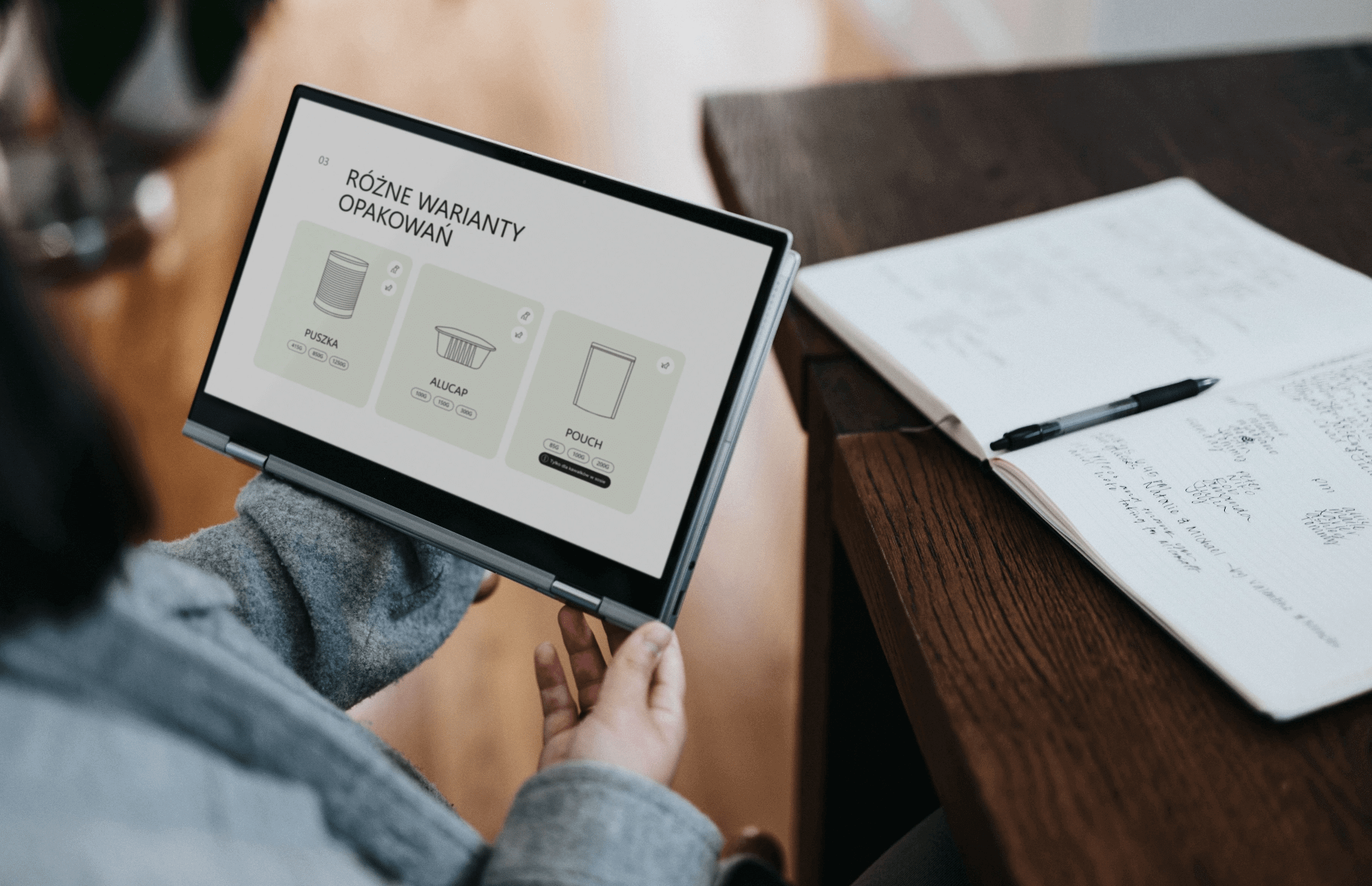
The main task was to design a website serving as the primary point of contact and source of information about the company’s services. The goal was clarity, easy navigation, and an organized flow. The second objective was to present production capabilities and available flavor options in an accessible, customizable product format.
sygnet mockup@2x
Mockup 3@2x

Key words

 Identity Packaging
 Social Media Design Logo
 Identity Packaging
 Social Media Design Logo
 
 Social Media Design Logo
 Identity Packaging
 
 Social Media Design Logo
 

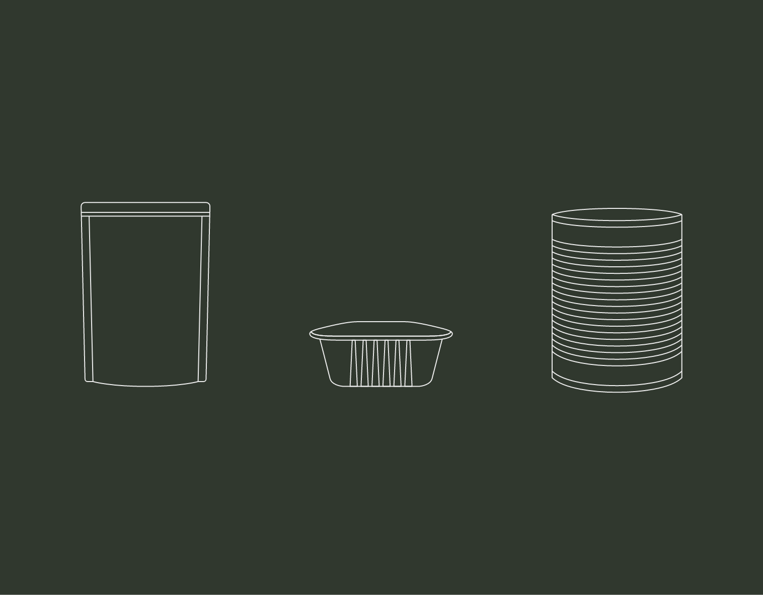
Packaging

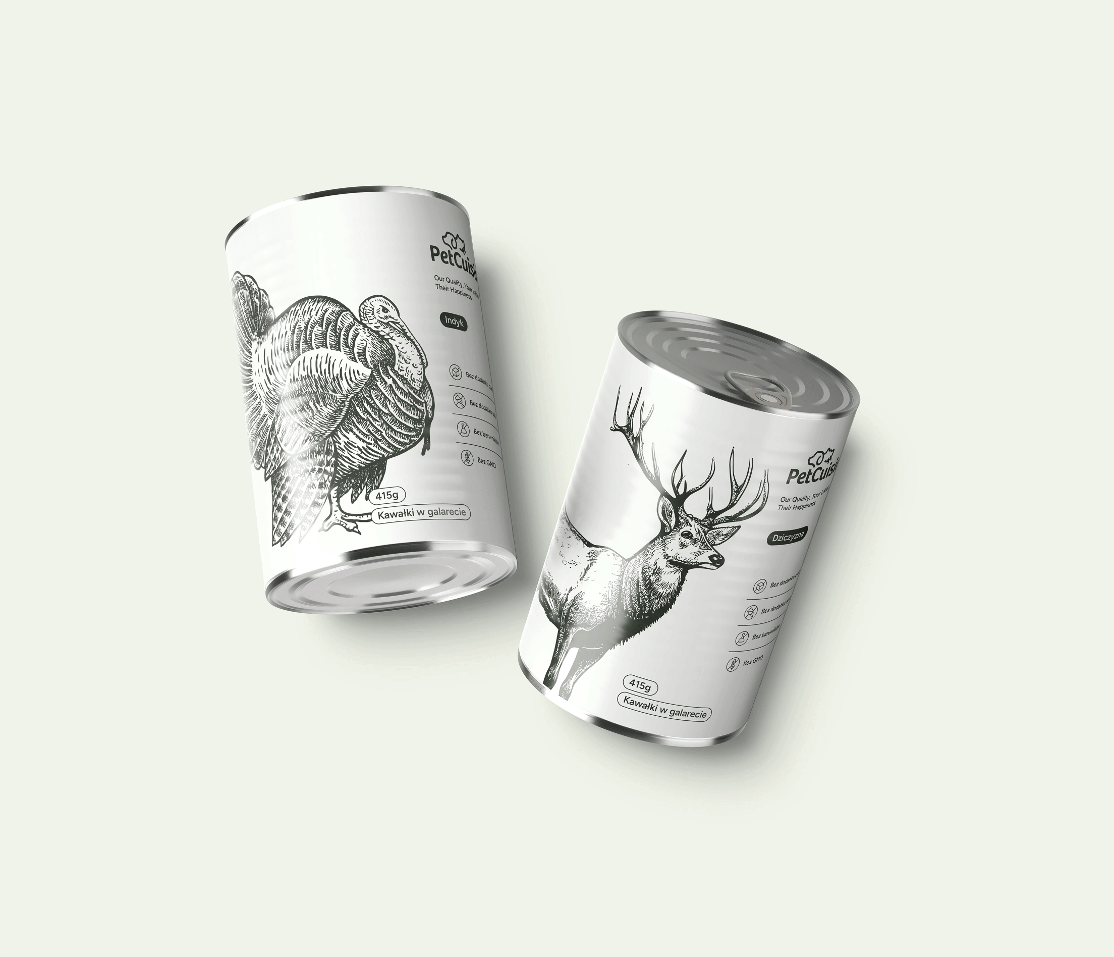
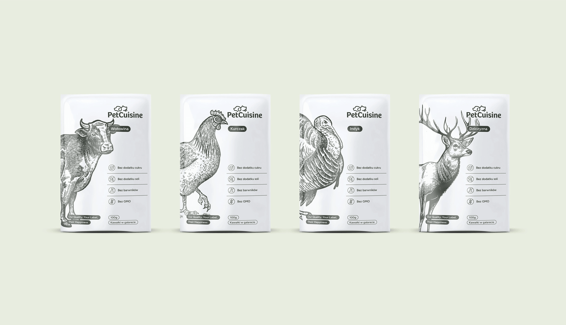
We used two main colors, illustrations, and subtle typography. This neutrality reflects the brand’s nature — Petcuisine offers private & white label pet food production, and the designs are intended as inviting placeholders.
Group 39056@2x
Group 39076@2x
CMYK: 14 0 18 78
RGB: 48 56 46
HEX: #30382e
CMYK: 2 0 5 5
RGB: 237 241 230
HEX: #edf1e6
CMYK: 0 0 0 0
RGB: 255 255 255
HEX: #ffffff
Mockup 7_3@2x

Typography

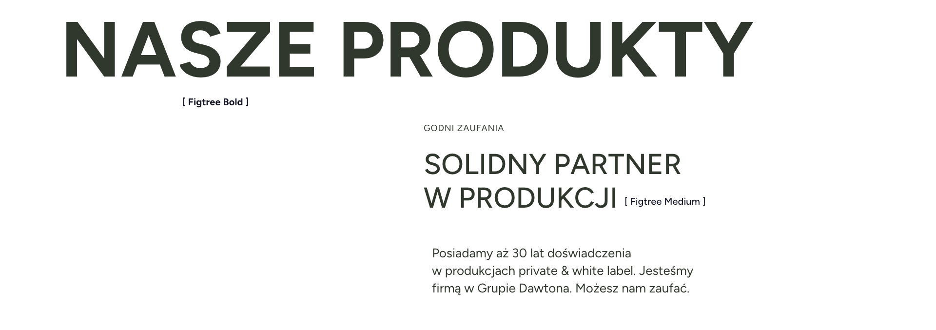
The Figtree type family serves as the primary font for Petcuisine. It’s used across all communication channels to maintain consistency in the company’s publications and image.

Main font

Figtree

Auxiliary font

Brak
typography

Website

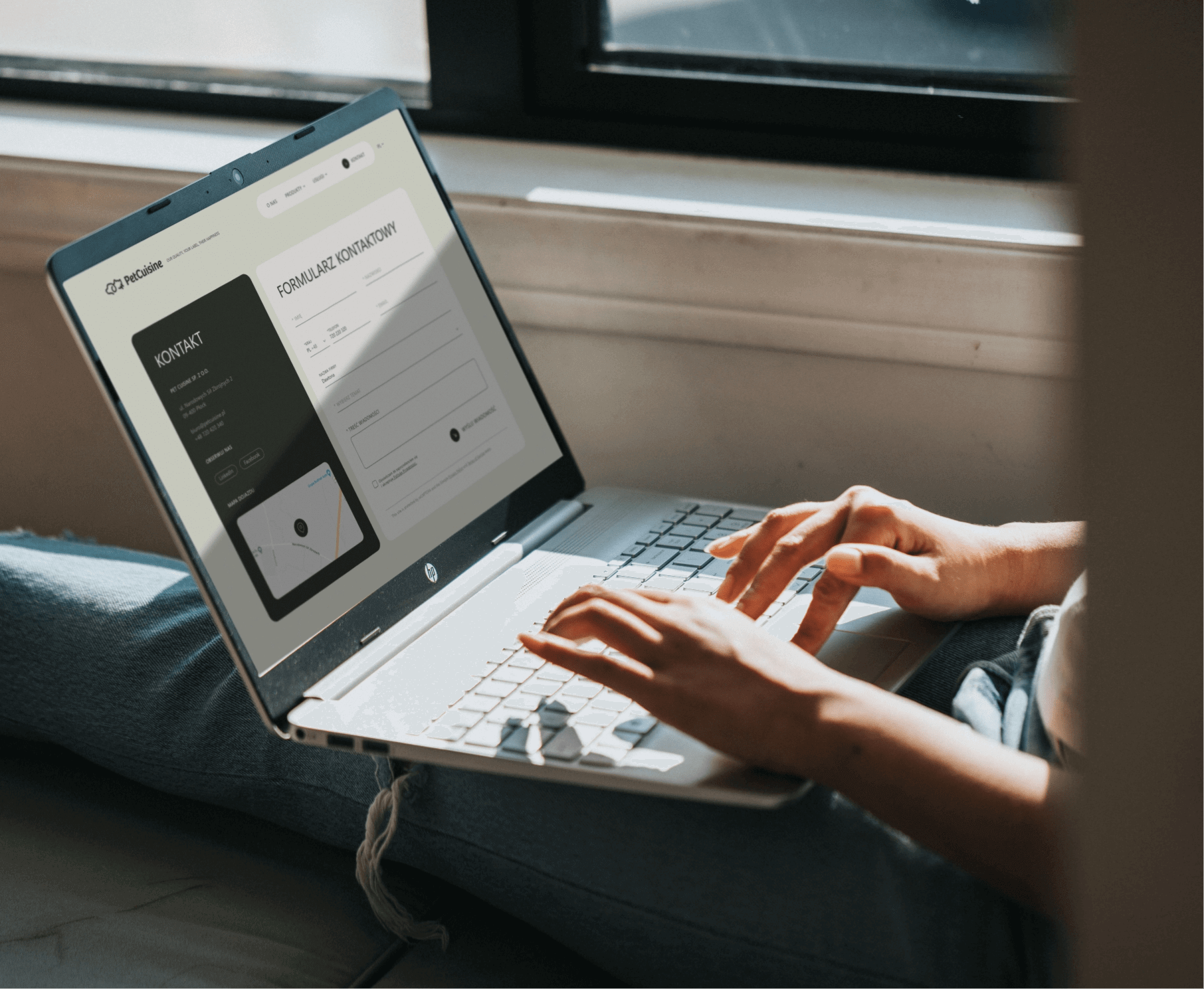
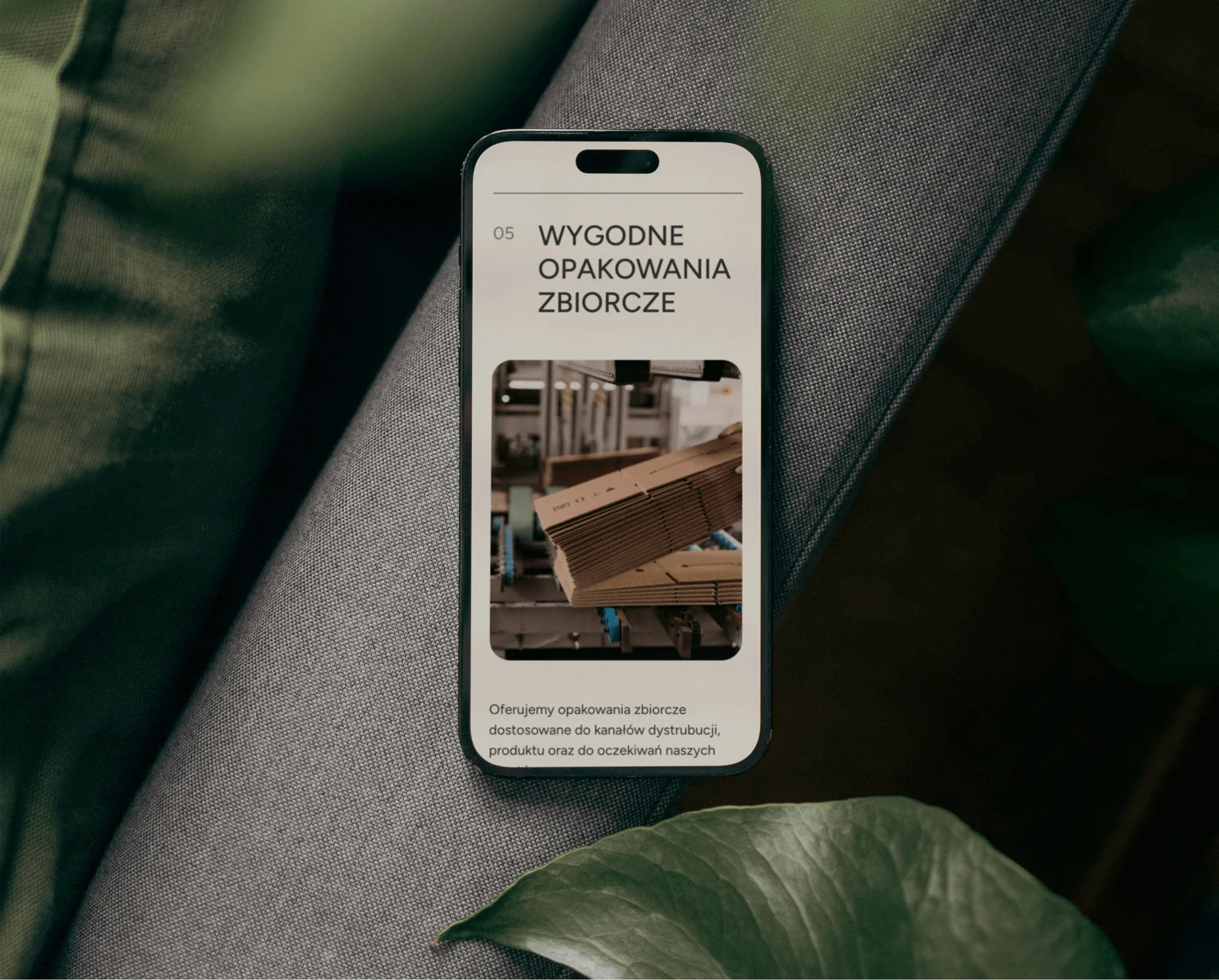
The website plays a crucial role in the brand’s operations, aiming to shorten contact paths, present the company in a nutshell, and spark interest. The design addresses these needs with modular layouts, clear typography, and a calm color palette.

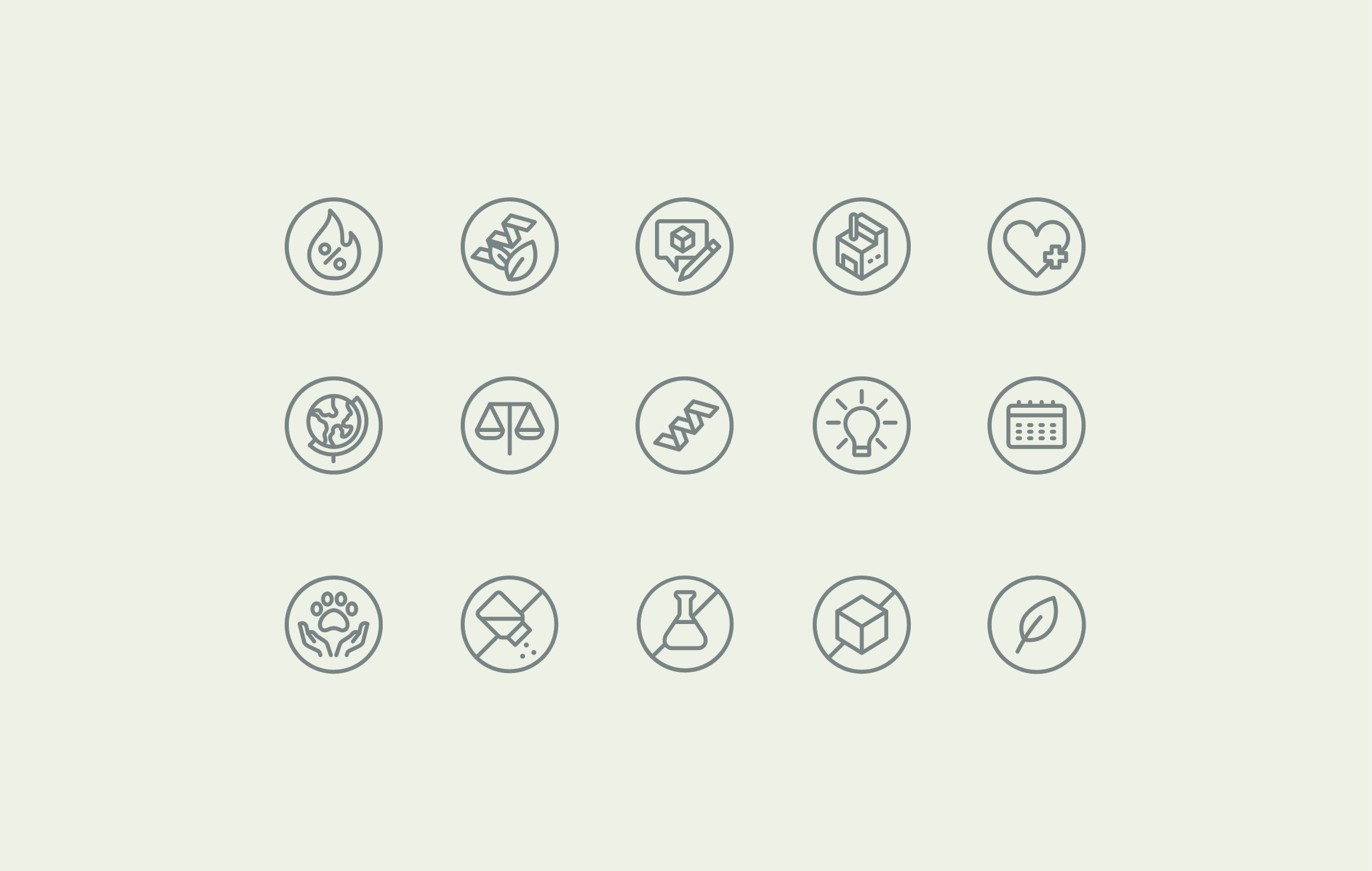
Iconography

Icons are an important visual system element, complementing and explaining product features.
Group 39074@2x

Photography

The brand's key visuals also include natural, sun-filled photos in warm tones that match the brand's color scheme.
Group 38928@2x

Recent projects

Pokket
Pokket is a new, highly dynamic brand in the food industry, redefining the meaning of handy snacks. It offers convenient tube forms that fit in any pocket and flavors not yet available on the market.
Dawtona
Dawtona is a Polish leader in processing fresh vegetables and fruits, primarily sourced from its own fields, utilizing an integrated production model to ensure the highest quality products.
Made in Podlasie
Made in Podlasie is a Polish brand entering the market in Kuwait, symbolising authenticity, quality and proximity to nature. It offers healthy food produced in the Podlasie region, aimed at people who want to take special care of the quality of the products they consume.
DCX
A European engineering and manufacturing company offering a wide range of liquid cooling solutions, including design, production, implementation, and commissioning of technologies.

Pokket

Dawtona

Made in Podlasie

DCX