.svg)
.svg)

Intima Clinic
A modern medical center with a particular specialization in aesthetic and plastic gynecology procedures. A holistic approach to patients through collaboration with specialists from various fields.
Intima Clinic
Scope of work
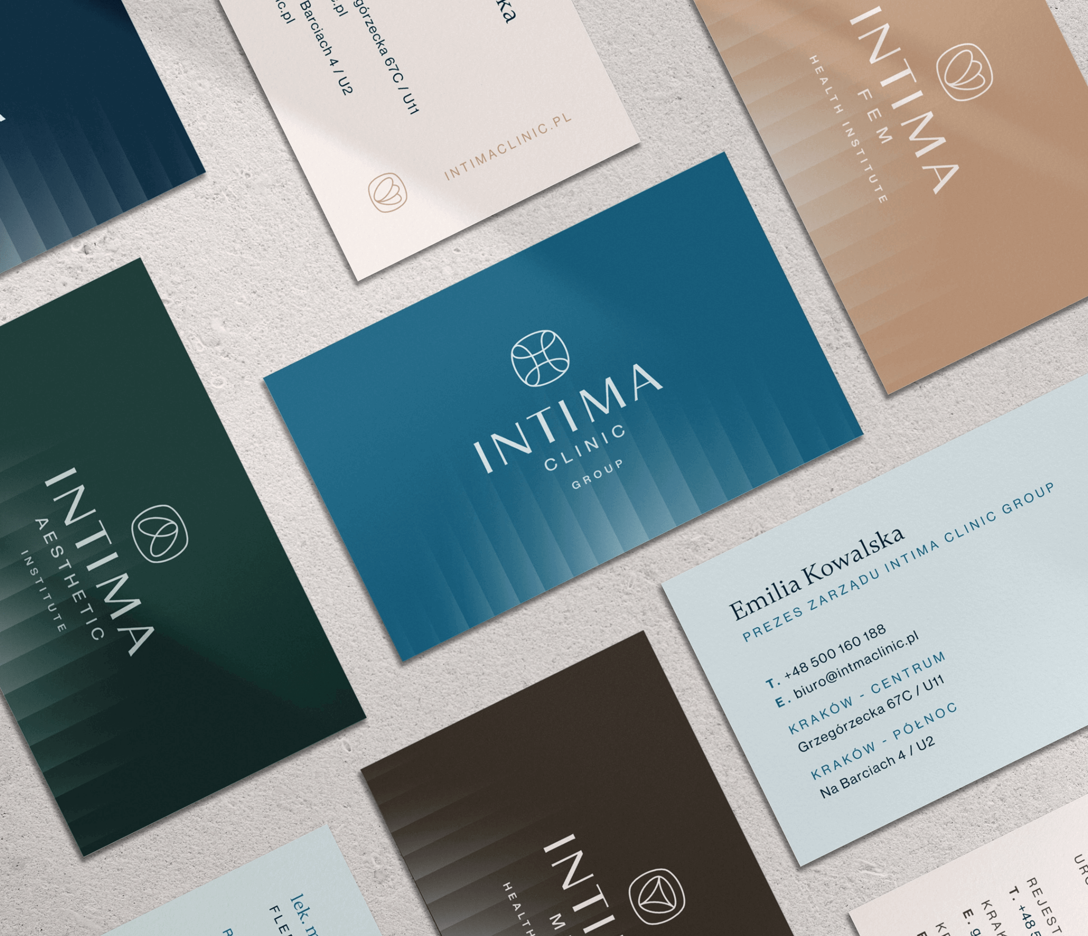
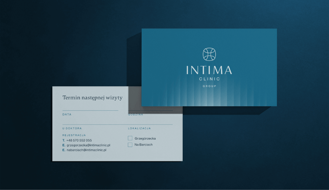
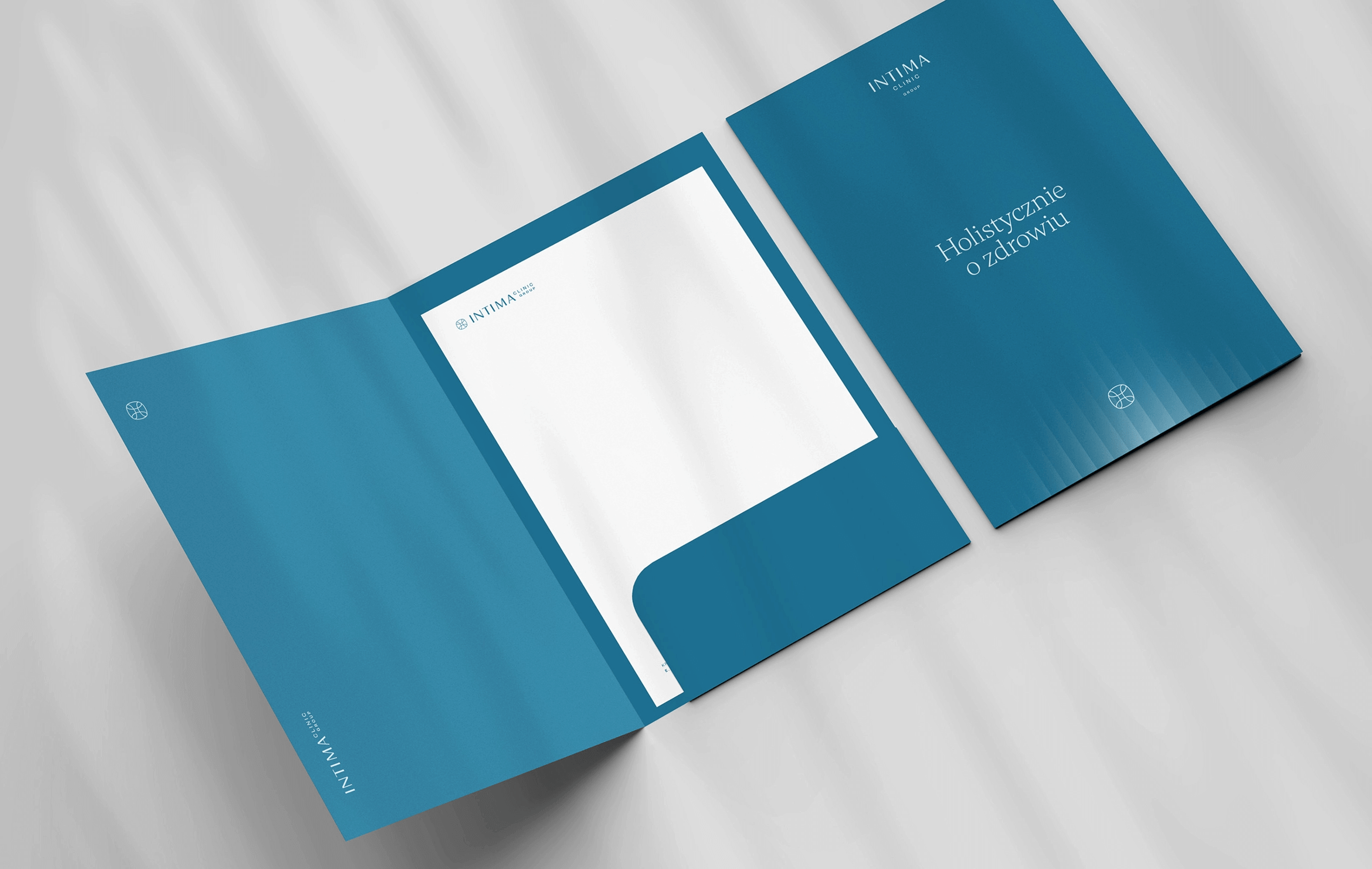
Branding
Logo
Production and printing
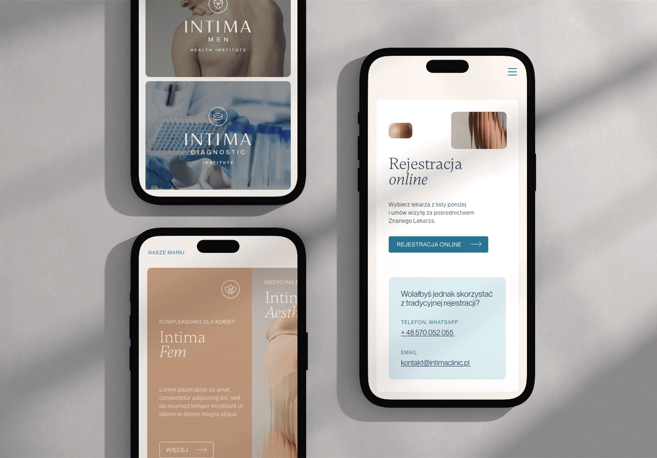
Website
2024
Intima Clinic
2024
Branding
Logo
Production and printing
Website

Process
 rotate(-45)' fill='%23c2f500'/%3E%3C/svg%3E%0A)
Objective
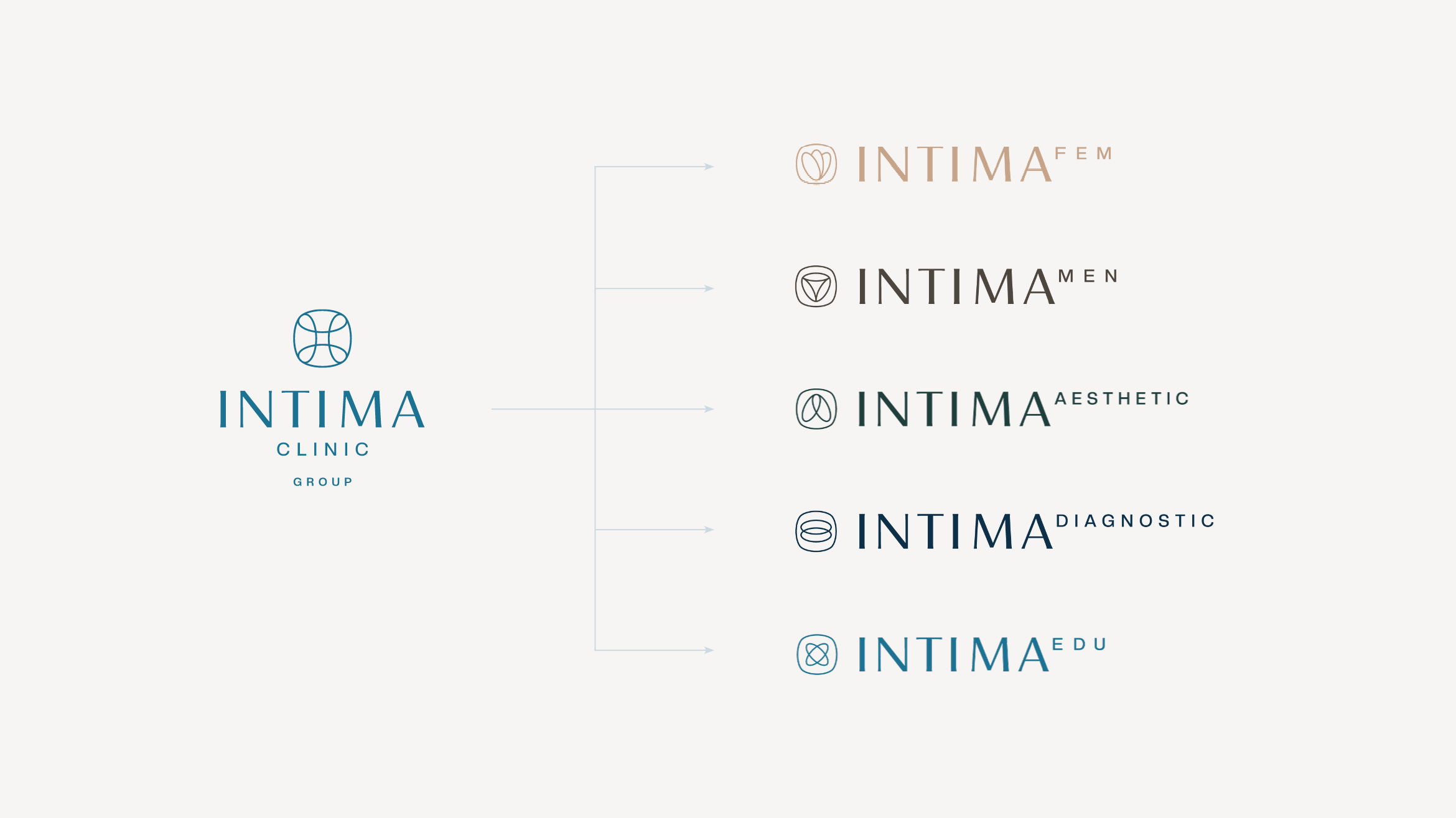
To organize the services of the Intima Clinic brand and distinguish sub-brands differing in specialization, yet collaborating within the entire portfolio. Modernity, high specialization, and intimacy presented in a subtle way.
Solution
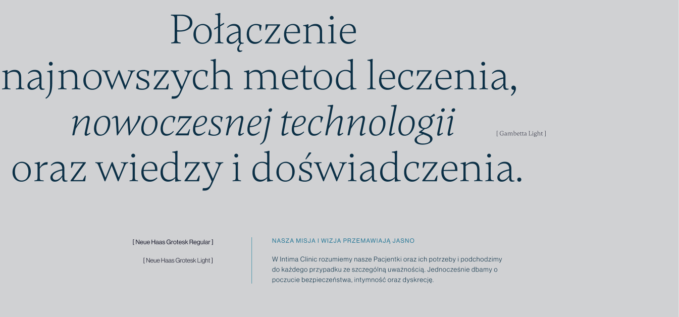
Development of naming understandable to all target groups. Identification based on harmonious colors, two font types, and high-quality photos. Intimacy highlighted by a glass effect appearing in backgrounds and photographs.
Result
A distinctly standout identification in the gynecology/aesthetic medicine market—emphasizing naturalness, subtlety, and patient care.
Big idea

Key words
Semantics

RGB: 221 240 246
HEX: #ddf0f6
RGB: 28 114 146
HEX: #1c7292
RGB: 13 48 72
HEX: #0d3048
Typography
Main font
Auxiliary font
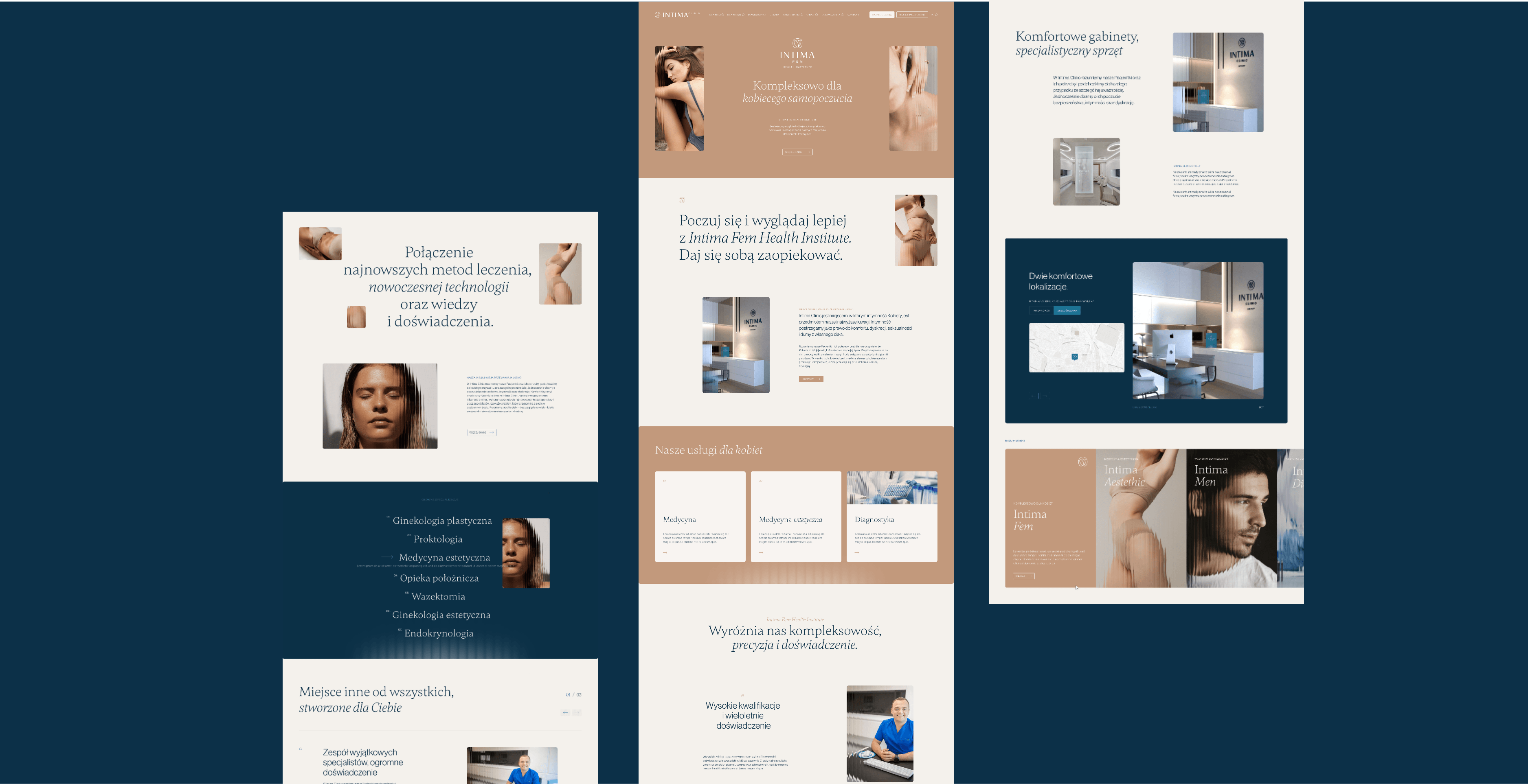
Website