.svg)

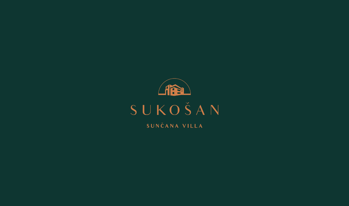
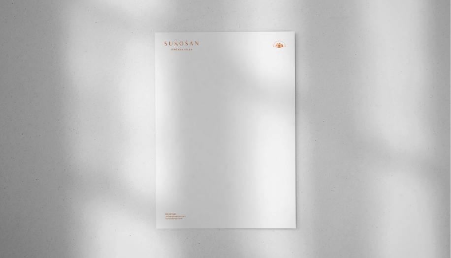
Sukošan
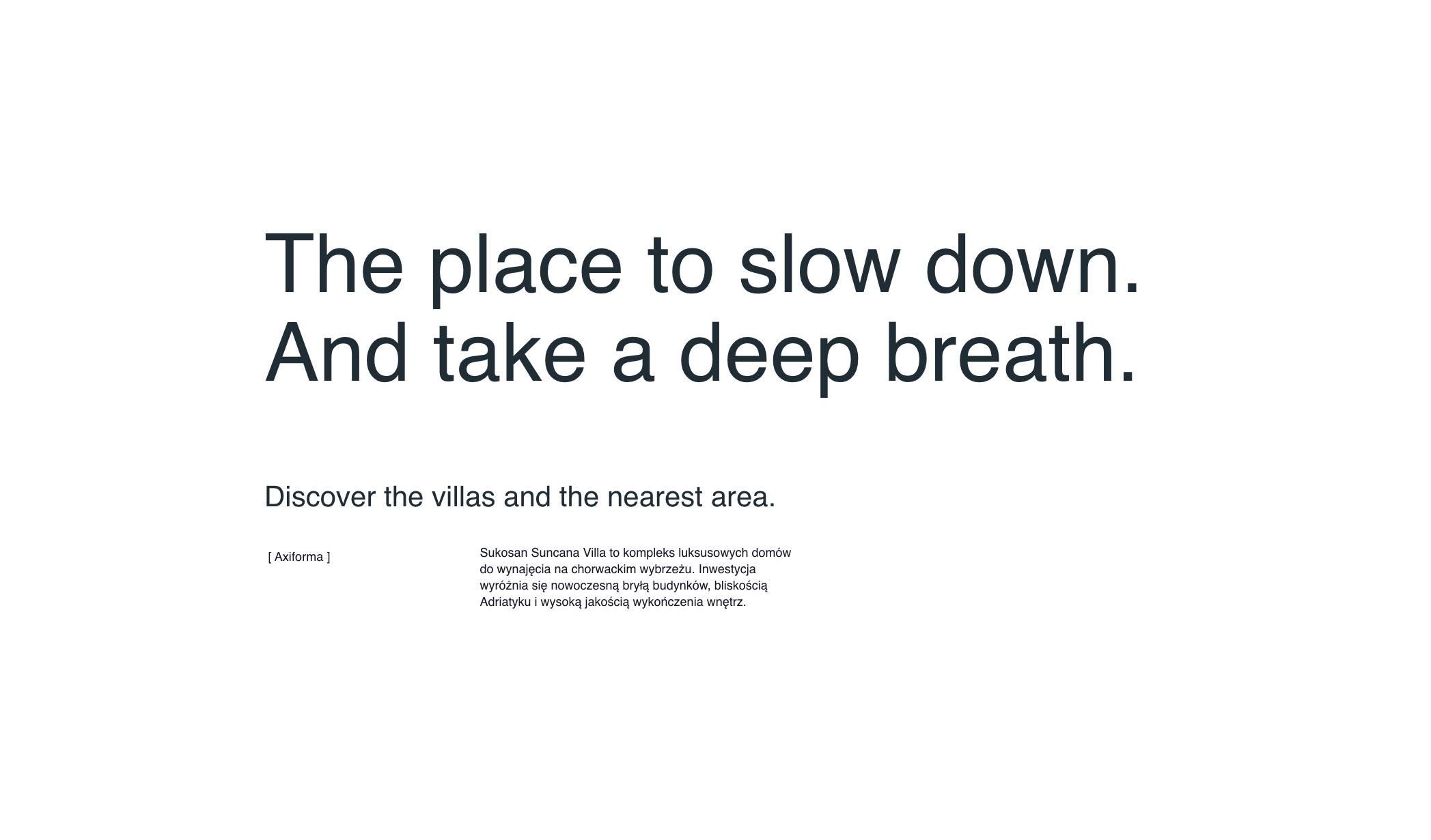
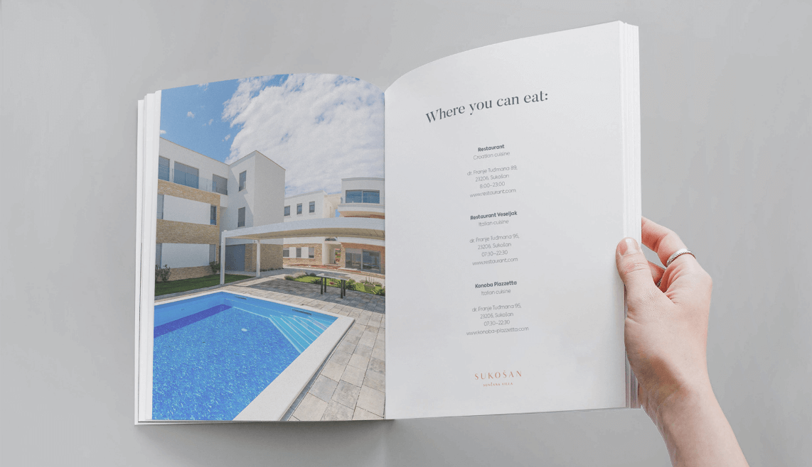
Sukošan is a picturesque town located in Croatia, known for its beautiful beaches and marina. It is a popular destination for tourists seeking relaxation by the Adriatic Sea.
Scope of work
Branding
Logo
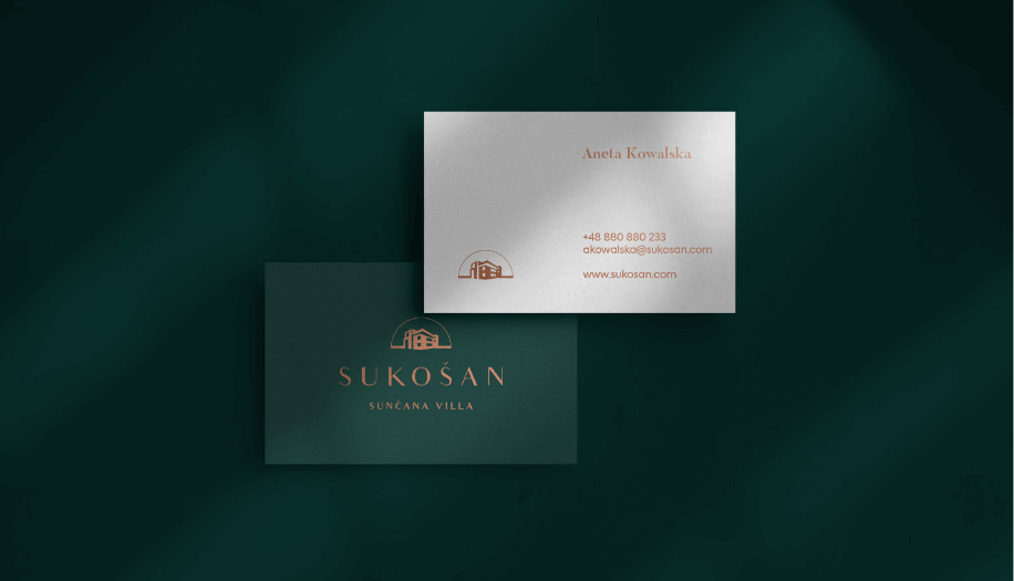
Production and printing
Social media
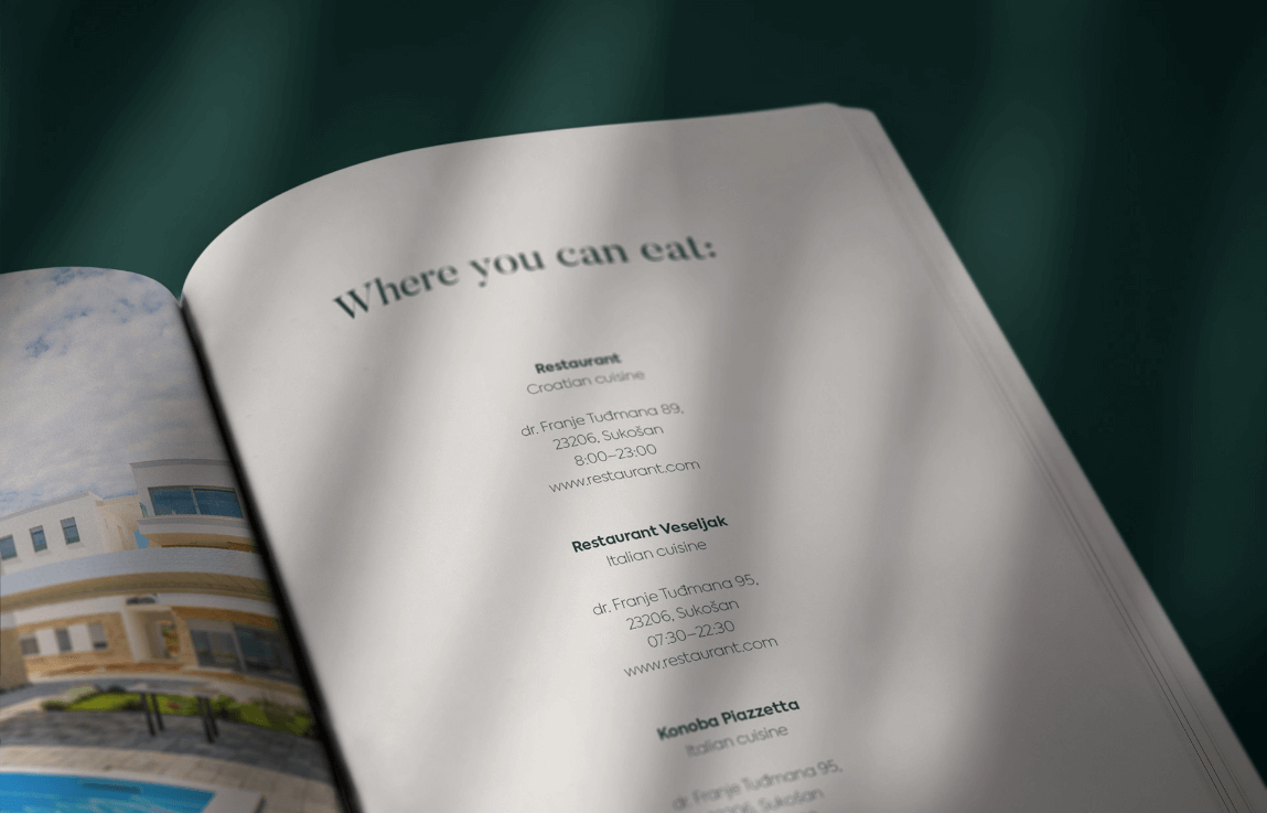
Website
2021
2021
Branding
Logo
Production and printing
Social media
Website
Process
 rotate(-45)' fill='%23c2f500'/%3E%3C/svg%3E%0A)
Goal
To create a visual identity that reflects the charm and attractiveness of Sukošan as a tourist destination. The aim was to design a logo and website that would attract potential visitors and provide them with essential information.
Solution
A visual identity was developed using colors associated with the sea and sun to convey the atmosphere of relaxation and vacation. The logo incorporates elements symbolizing waves and the sun, emphasizing the coastal character of the town.
Result
A cohesive and inviting image of Sukošan was created, encouraging tourists to visit and explore the town's attractions.
Big idea
Website
Key words


Semantics

RGB: 8 54 48
HEX: #083630
RGB: 210 128 72
HEX: #d28048
RGB: 255 255 255
HEX: #ffffff
Typography
Main font
Auxiliary font