.svg)
.svg)

visual identity
visual identity
So!home
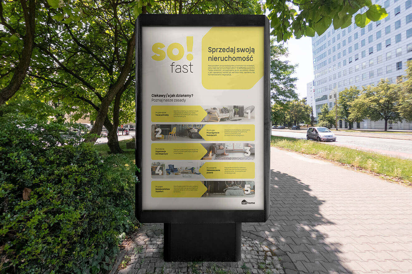
So!home is a Krakow-based company specializing in real estate sales using unconventional modern marketing solutions.
Client
Scope of work
Branding
Production and printing
Social media
So!home
Scope of work
Branding
Production and printing
Social media
Date
2019
2019
Client
So!home
Date
2019
2019
Scope of work
Branding
Production and printing
Social media
Branding
Production and printing
Social media
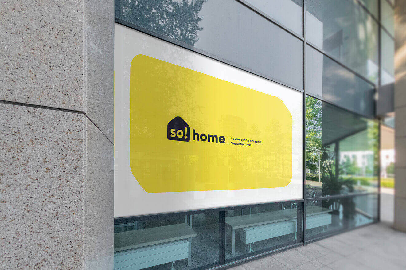
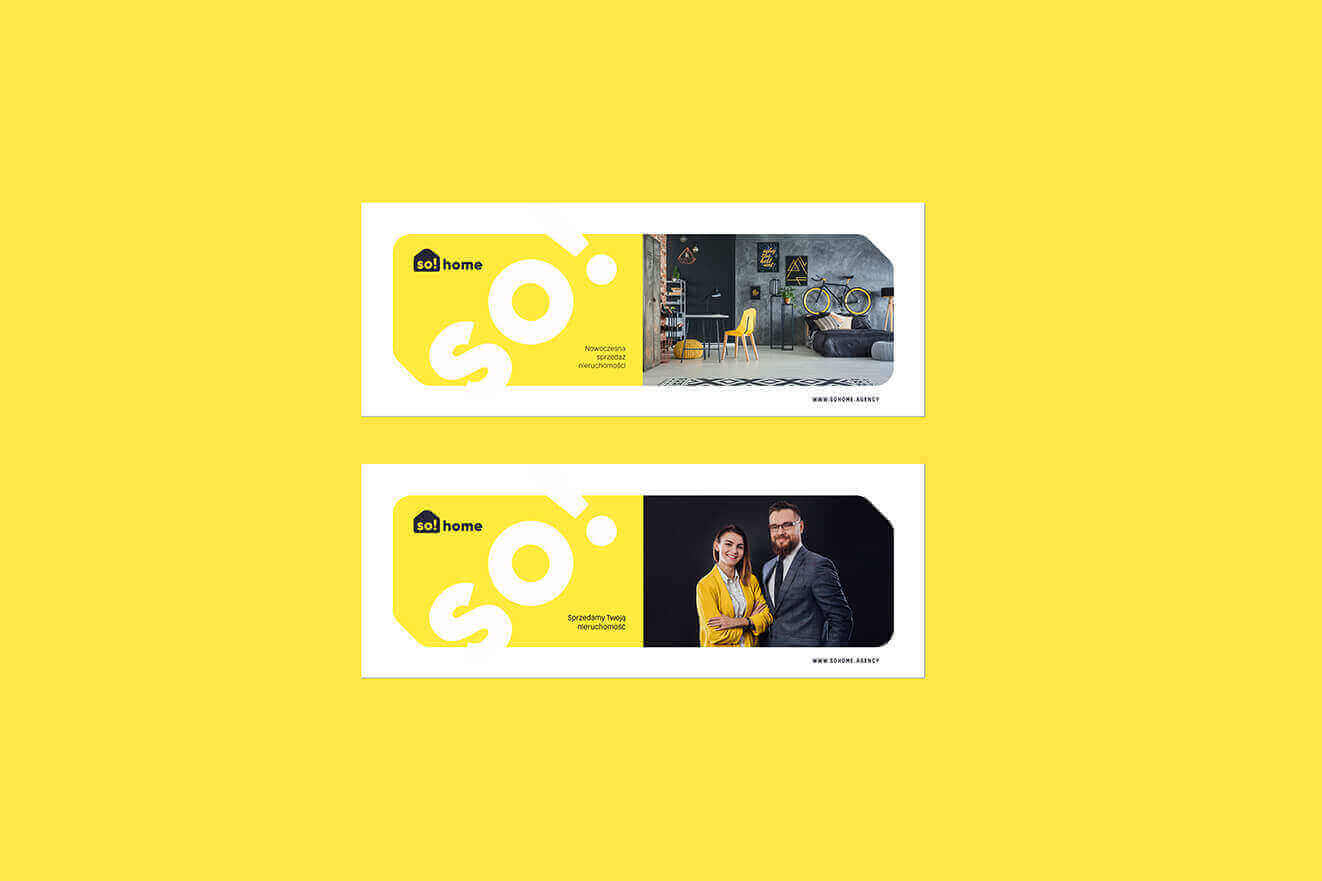
8_sohome_banner
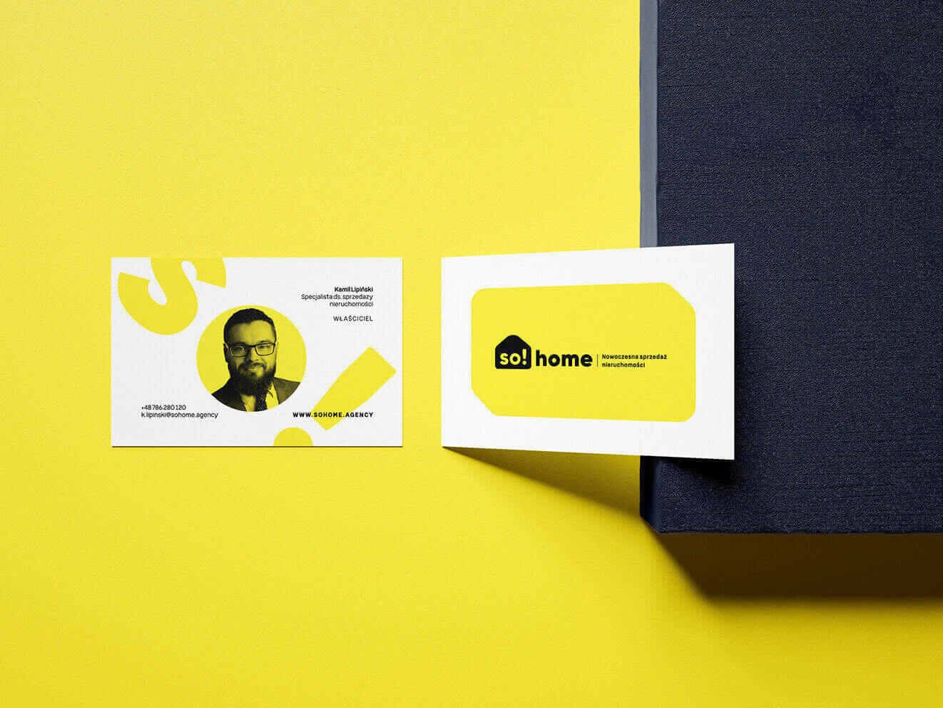
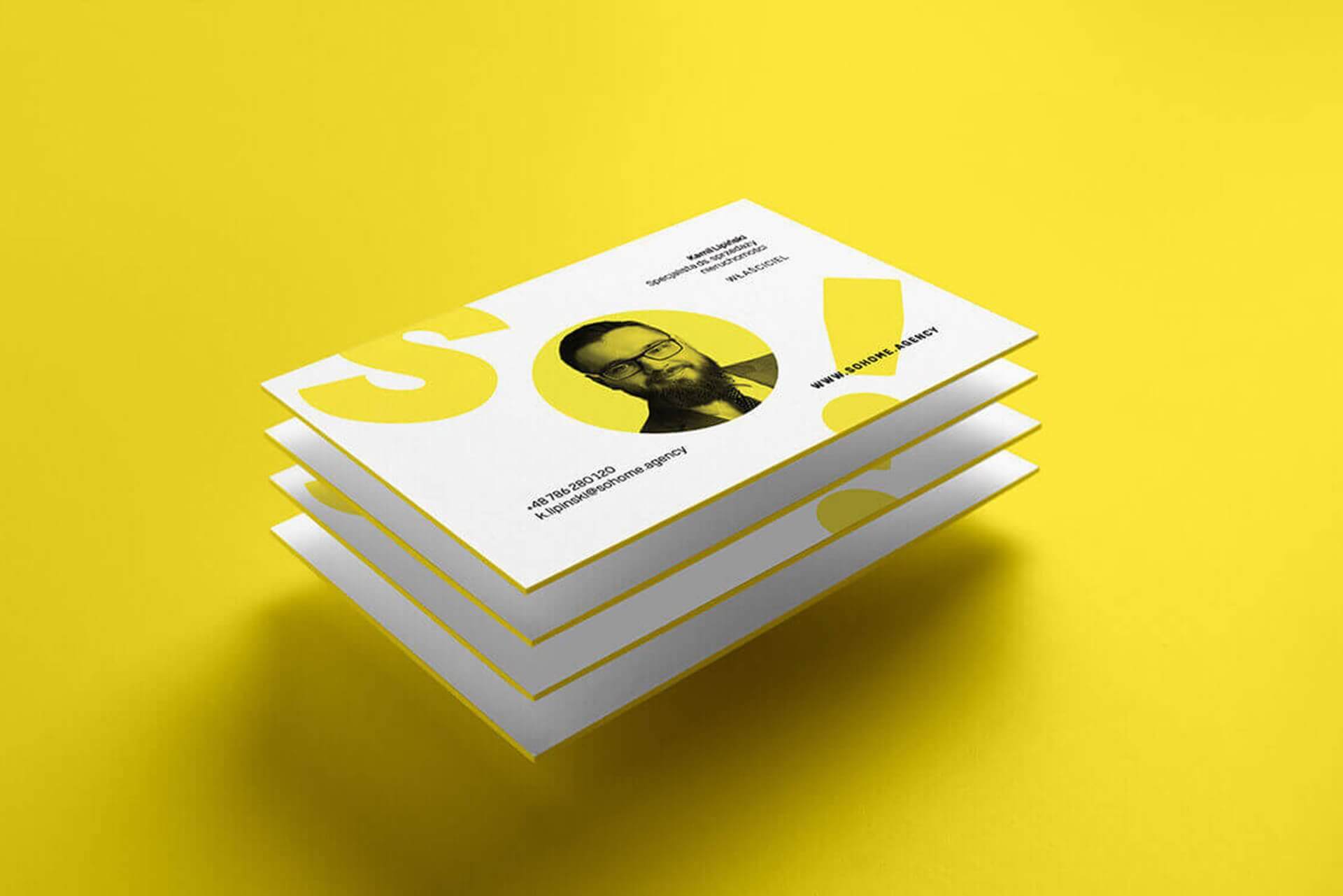
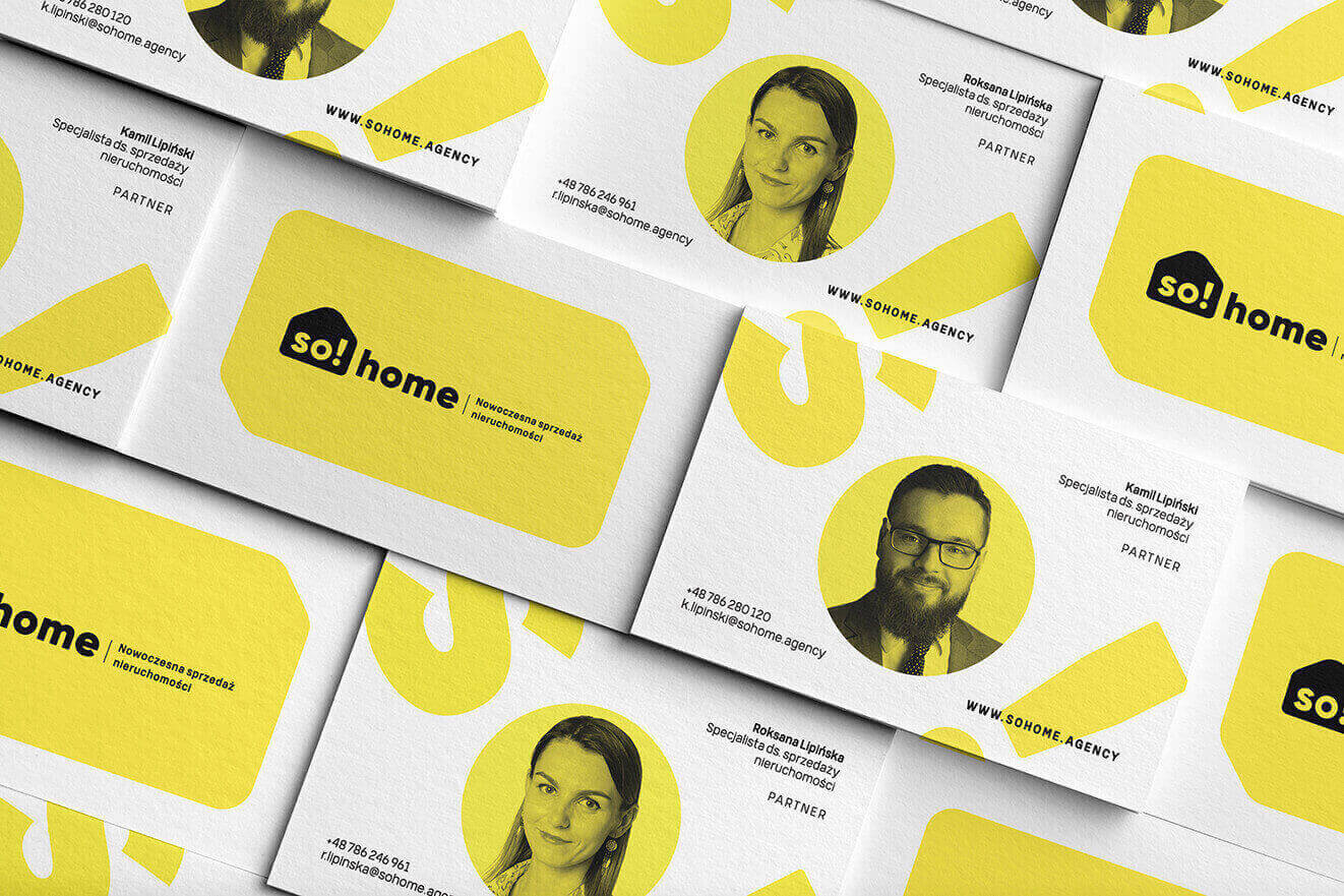
2_sohome_wizytowki
Process
 rotate(-45)' fill='%23c2f500'/%3E%3C/svg%3E%0A)
Objective
To develop a unique name and create a strong, energetic identity that reflects the brand's modern character and distinguishes it from the competition.
Solution
We combined the words "home" and "so!" to emphasize the message and serve as a consistent element in advertising slogans. To further distinguish the brand, we chose a bold leading color.
Result
A cohesive image—a name that fits the brand's personality, with its key features and modernity highlighted through strong typography and an energetic leading yellow color.
Big idea
In creating the visual identity, we aimed to showcase a brand that is modern and bold, yet effective and safe. So!Home deals with real estate sales, guiding the client through the entire process and ensuring it is as convenient and hassle-free as possible.
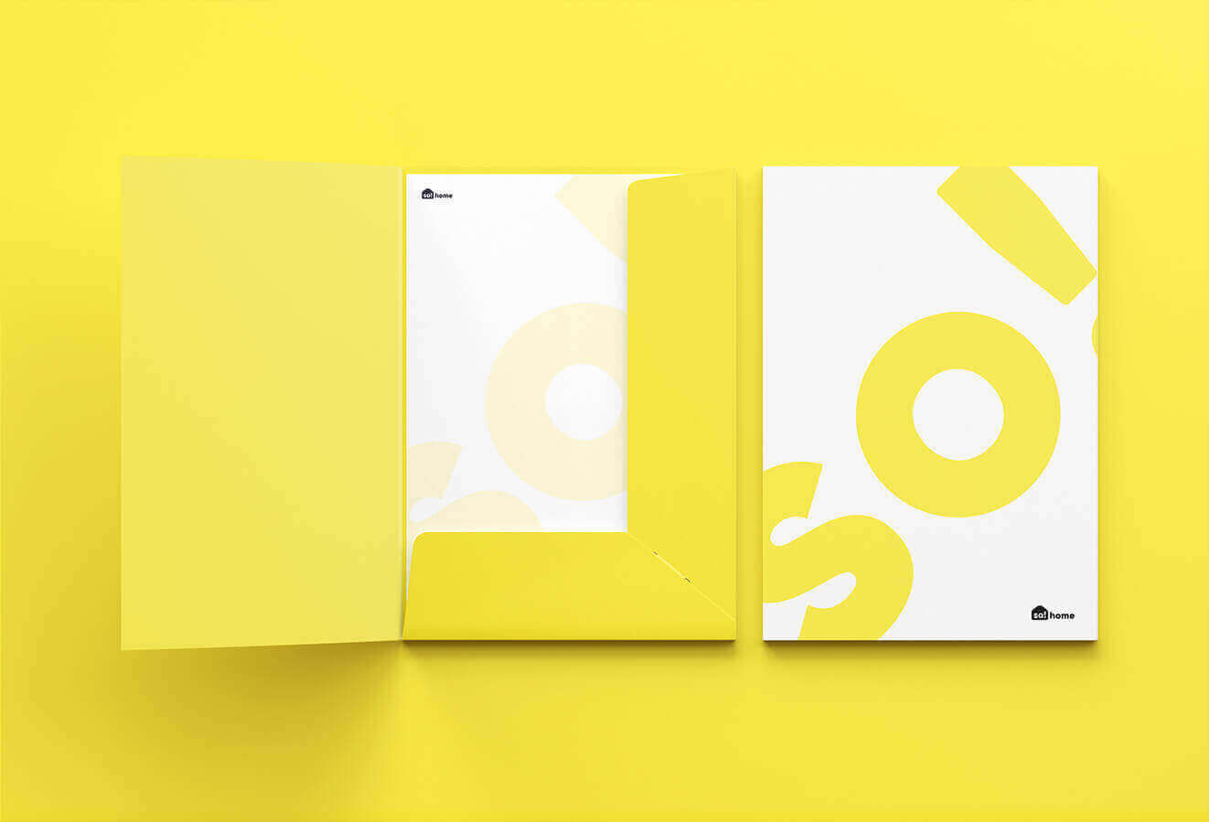
10_sohome_folder
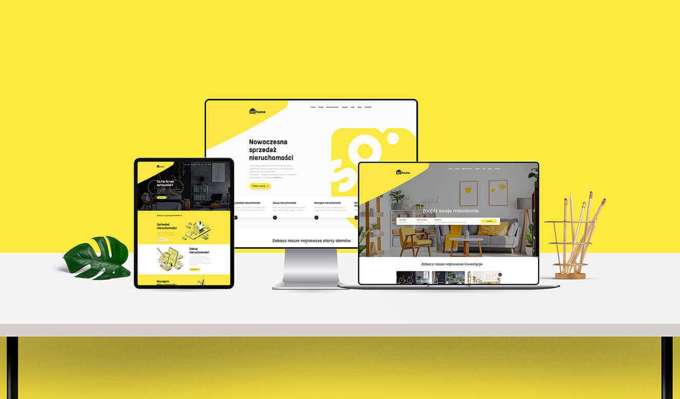
7_sohome_website
Key words
Modernity Key visual
Design Branding Trends
Modernity Key visual
Design Branding Trends
Design Branding Trends
Modernity Key visual
Design Branding Trends
Semantics
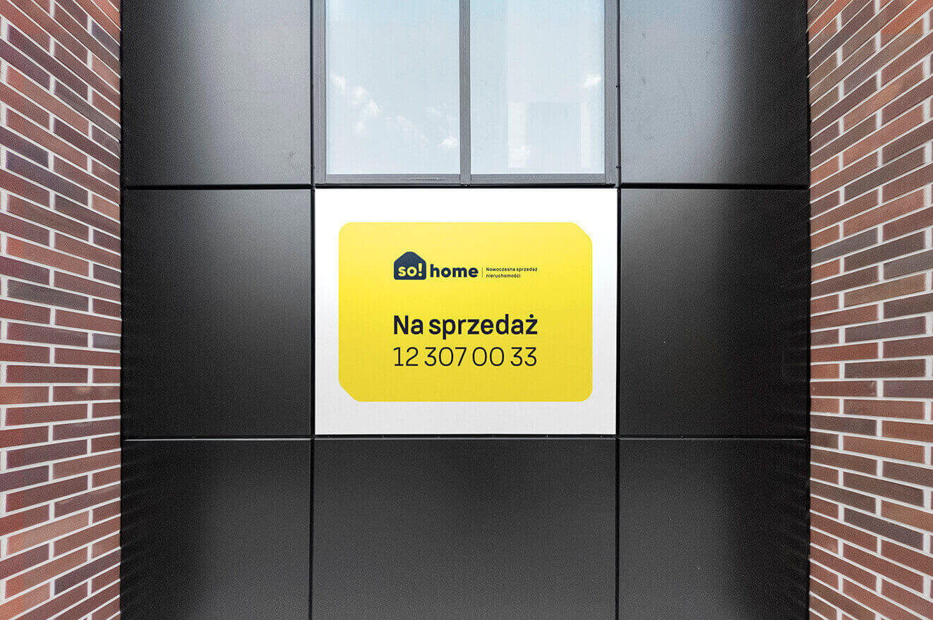
Based on the brand's visual assumptions, a logo was created featuring a house symbol with the leading slogan "SO!" inscribed. The emblem, with its soft and oval shapes, complements the bold typography in the sans-serif logotype.

15_sohome_bannery_online
11_sohome_plakat
CMYK: 0 0 3 89
RGB: 29 29 28
HEX: #1d1d1c
RGB: 29 29 28
HEX: #1d1d1c
CMYK: 0 9 74 0
RGB: 254 230 67
HEX: #fee643
RGB: 254 230 67
HEX: #fee643
CMYK: 0 0 0 0
RGB: 255 255 255
HEX: #ffffff
RGB: 255 255 255
HEX: #ffffff
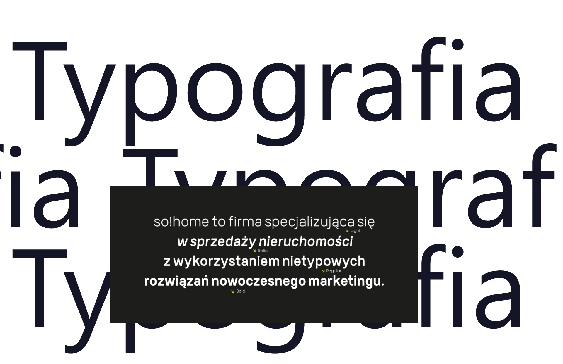
Typography
The identification uses Germalt, a modern, minimalist font family with a futuristic yet timeless feel.
Main font
Germalt
Auxiliary font
Germalt
1_sohome_wizytowki
13_sohome_social
Recent projects
Pokket
Pokket is a new, highly dynamic brand in the food industry, redefining the meaning of handy snacks. It offers convenient tube forms that fit in any pocket and flavors not yet available on the market.
Dawtona
Dawtona is a Polish leader in processing fresh vegetables and fruits, primarily sourced from its own fields, utilizing an integrated production model to ensure the highest quality products.
Made in Podlasie
Made in Podlasie is a Polish brand entering the market in Kuwait, symbolising authenticity, quality and proximity to nature. It offers healthy food produced in the Podlasie region, aimed at people who want to take special care of the quality of the products they consume.
DCX
A European engineering and manufacturing company offering a wide range of liquid cooling solutions, including design, production, implementation, and commissioning of technologies.