.svg)
.svg)

Hana Design
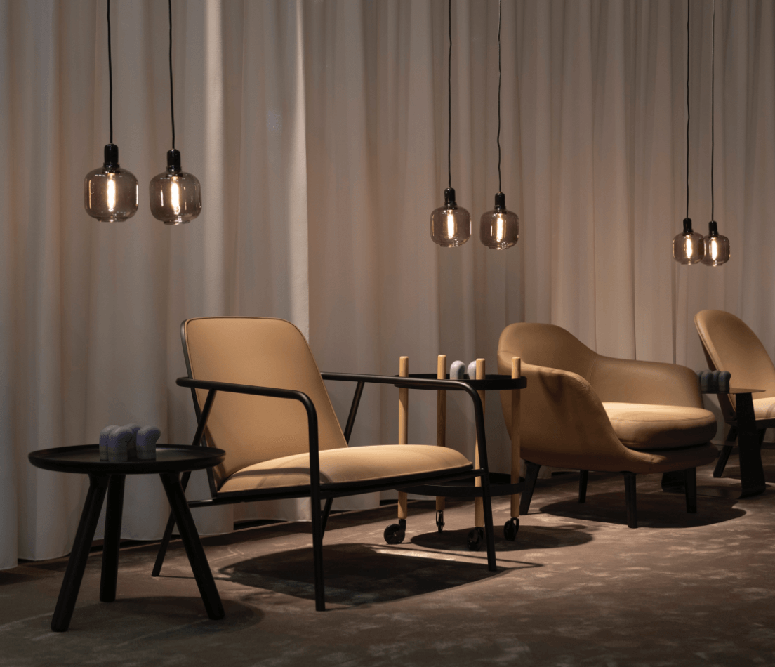
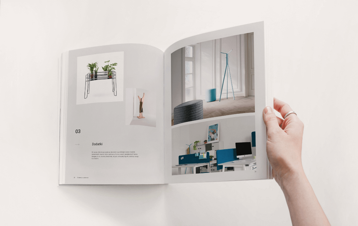
Hana Design specializes in comprehensive furnishing of private and commercial interiors—from furniture and accessories to lighting. They offer solutions from world-renowned brands and create custom-made furniture tailored to individual client designs.
Hana Design
Scope of work
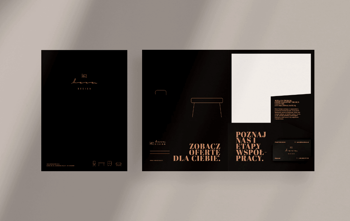
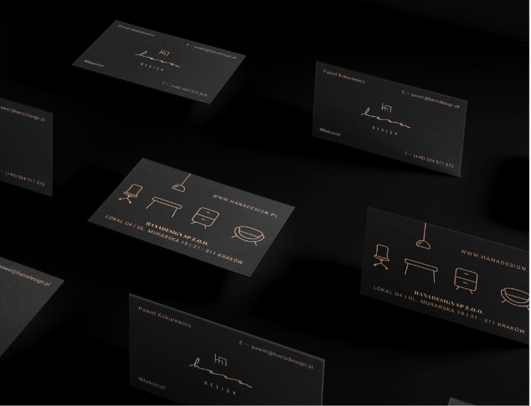
Branding
Gadgets
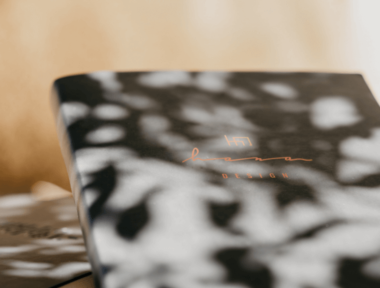
Logo
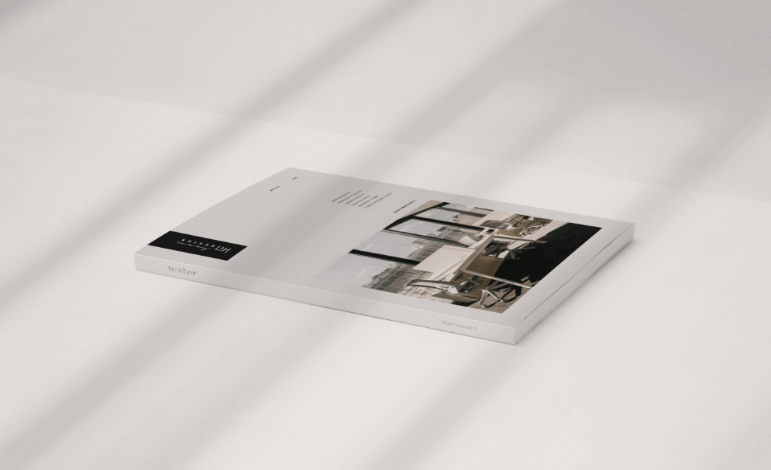
Production and printing
Social media
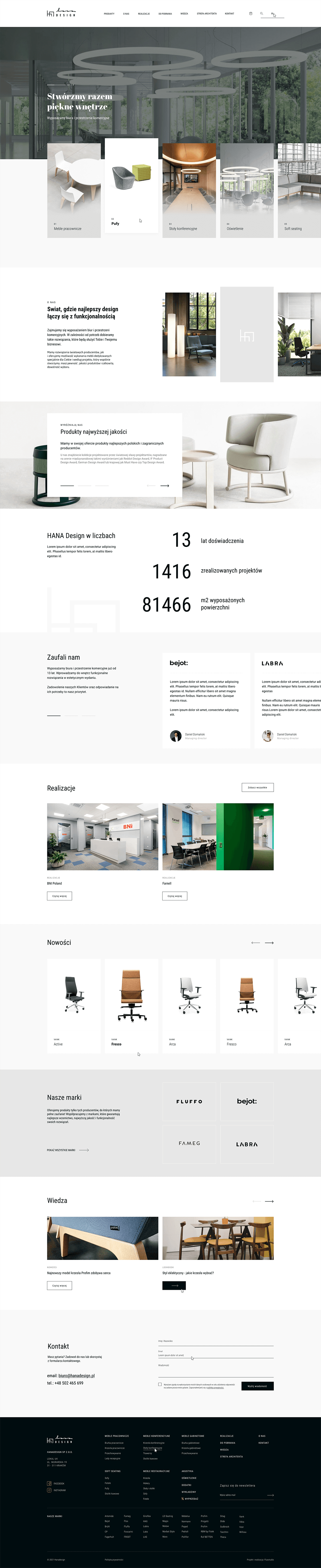
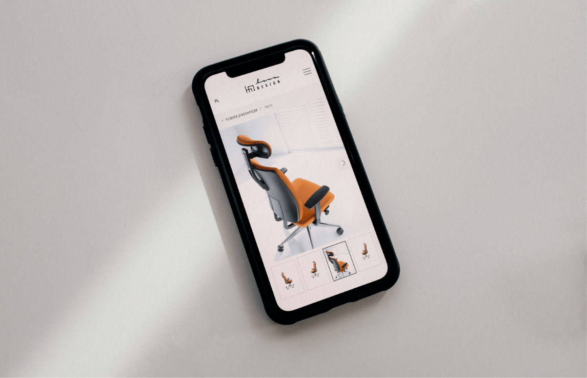
Website
2023
Hana Design
2023
Branding
Gadgets
Logo
Production and printing
Social media
Website
Process
 rotate(-45)' fill='%23c2f500'/%3E%3C/svg%3E%0A)
Objective
To refresh the existing brand identity and design image, marketing materials, and an advanced website. Properly presenting the premium segment brand as experienced, knowledgeable, and a specialist in its field.
Solution
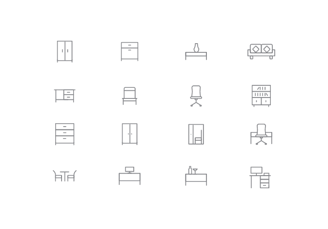
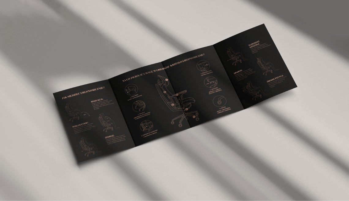
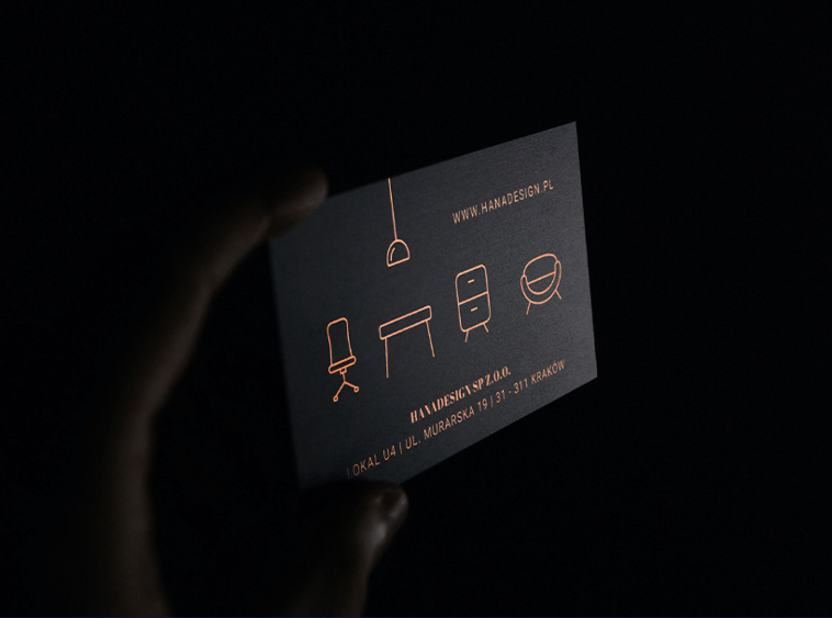
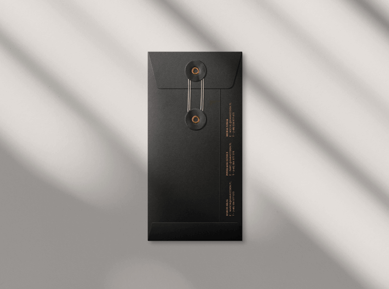
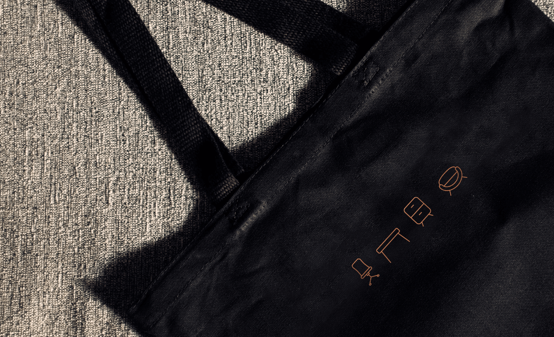
Expanding the existing color palette, which was based on black and white, to include grays and elegant gold, translating into a sense of stability, decisiveness, and high quality. Complementing with elegant typography and interesting linear iconography.
Result
A cohesive premium brand identity; a brand supporting architects by offering them functional and convenient tools to facilitate their work, including a website with a product configurator.
Big idea
Key words
Website

RGB: 38 38 38
HEX: #262626
RGB: 252 204 150
HEX: #fccc96
RGB: 255 255 255
HEX: #ffffff
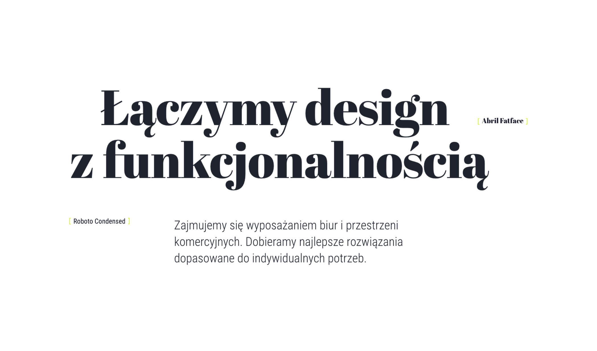
Typography
Main font
Auxiliary font
Iconography