visual identity visual identity

Intima Clinic

A modern medical center with a particular specialization in aesthetic and plastic gynecology procedures. It offers a holistic approach to patient care through collaboration between specialists from various fields, ensuring comprehensive and personalized treatment for both female and male patients.

Client

Intima Clinic


Scope of work
Branding
Logo
Production and printing
Website
Date
2024
Client

Intima Clinic

Date
2024
Scope of work
Branding
Logo
Production and printing
Website
Link

1@2x

Logo • Branding • Social media • Website •

Group 3088@2x

Process

Objective

The organization of services at Intima Clinic and the creation of sub-brands, each with a distinct specialization, yet collaborating within the overall portfolio. Modernity, high specialization, and intimacy are subtly conveyed throughout the brand identity.

Solution

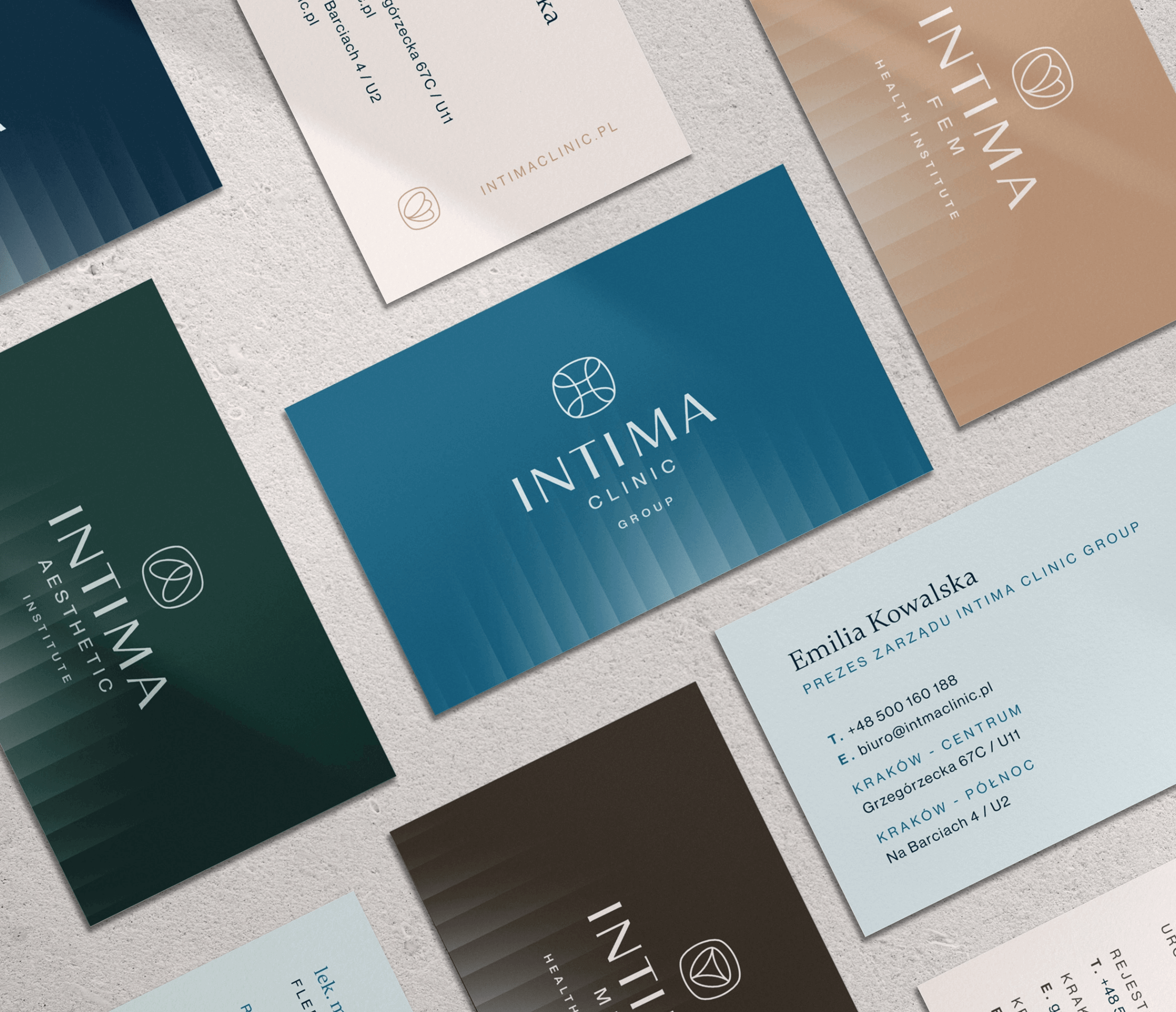
Development of naming conventions that are clear and understandable for all target groups. The identity is based on harmonious colors, two complementary fonts, and high-quality photos. Intimacy is emphasized through the glass effect applied in backgrounds and on images.

Outcome

A distinct identity in the gynecology and aesthetic medicine market, emphasizing naturalness, subtlety, and patient care. The focus is on creating a sense of warmth and trust, standing out from the competition with a patient-centered approach.

Big idea

A scalable identity that grows alongside the brand portfolio. Moving away from the typical standards of the Polish aesthetic and medical industry, it embraces a muted color palette, a distinctive serif font, and detailed body photography with a subtle glass effect. This approach conveys a sense of care and respect for intimacy.
3 (1)
Group 3670@2x

Key words

 Ginekologia Klinika Jakość
 Holizm Zaopiekowanie
 Ginekologia Klinika Jakość
 Holizm Zaopiekowanie
 
 Holizm Zaopiekowanie
 Ginekologia Klinika Jakość
 
 Holizm Zaopiekowanie
 

Semantics

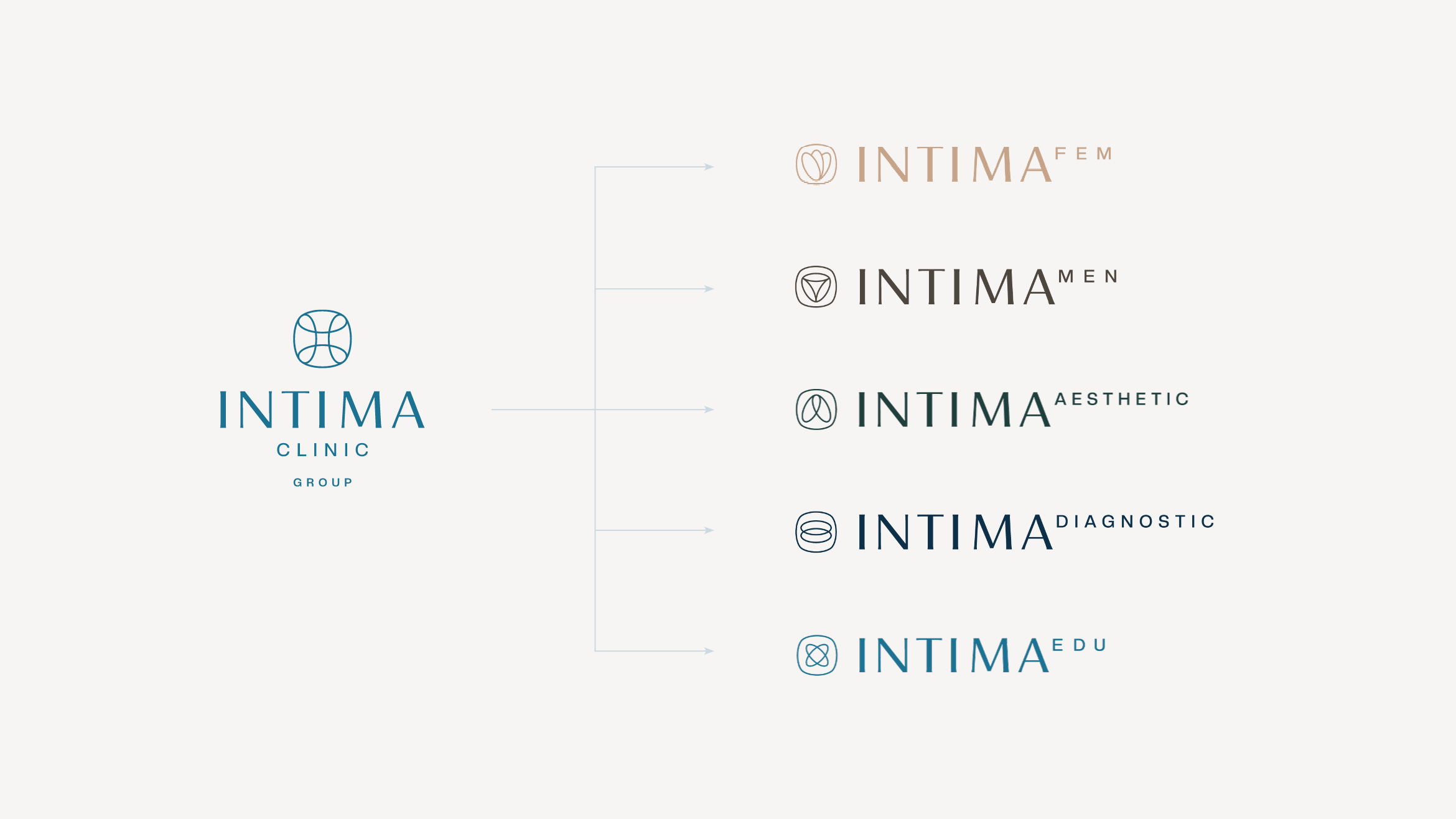
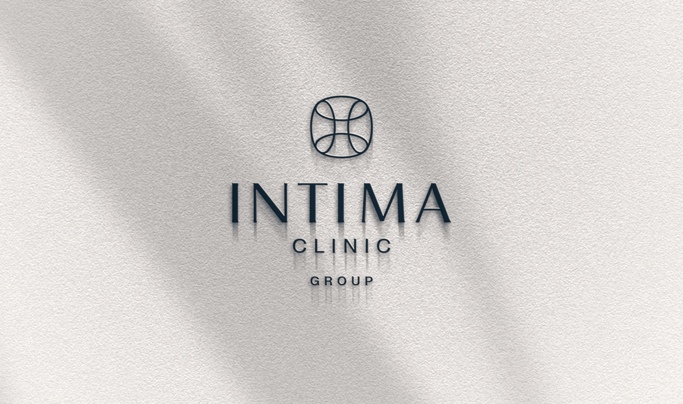
Logos follow the same structure: a large, shared "INTIMA" name for all sub-brands, a smaller individual brand name, and a logo mark composed of a flattened circle with a symbol inside that reflects the specific sub-brand. This cohesive system ties all sub-brands together while allowing each to maintain its own identity.
Group 39079@2x
4@2x
CMYK: 10 2 0 4
RGB: 221 240 246
HEX: #ddf0f6
CMYK: 81 22 0 43
RGB: 28 114 146
HEX: #1c7292
CMYK: 82 33 0 72
RGB: 13 48 72
HEX: #0d3048
8_2@2x

Typography

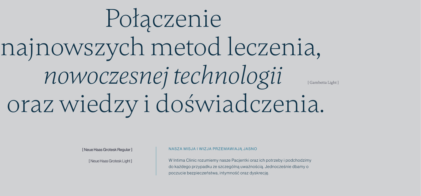
The brand identity was built around the serif typeface Gambetta and the sans-serif Neue Haas Grotesk, creating a combination that exudes delicacy and elegance. This pairing balances classic sophistication with modern clarity.

Main font

Gambetta

Auxiliary font

Neue Haas Grotesk
typography
Group 39080@2x

Website

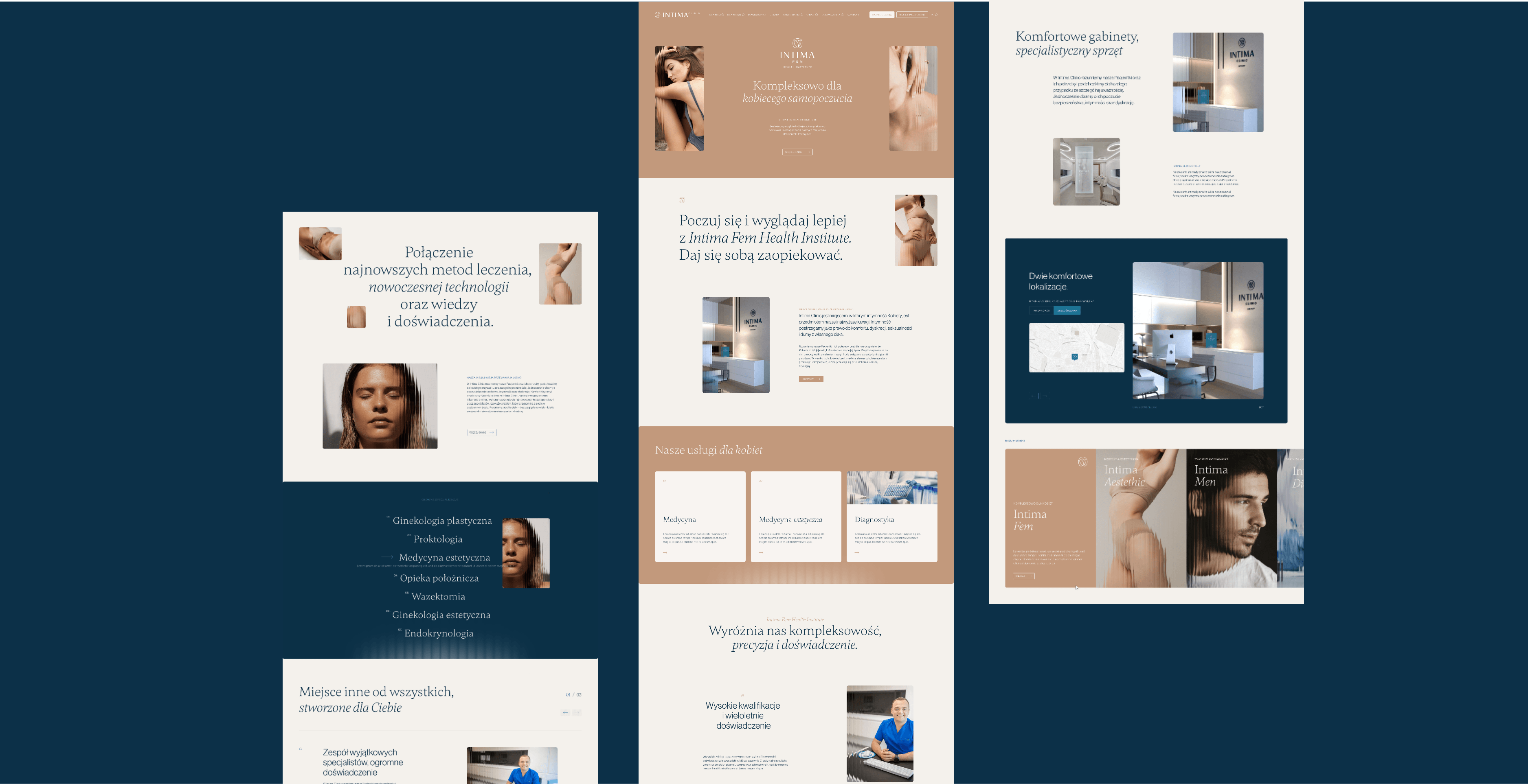
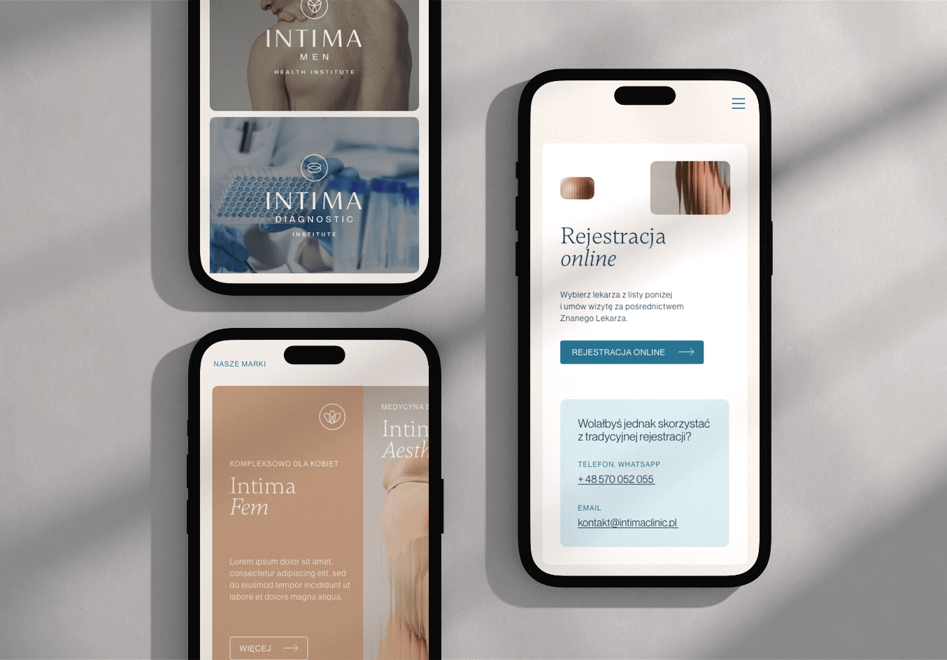
The website is one of the most important elements of the entire brand identity. It serves as both a functional tool and a source of information about the extensive portfolio of services. It is characterized by clarity and minimalism, ensuring a user-friendly experience while reflecting the brand's refined aesthetic.

Recent projects

Intima Clinic
Holistic approach to the health of patients
irtech
High-quality specialized measurement devices
Itrons
HVAC projects, execution, investment supervision, and much more
myvee
Innovation in the mobile telecommunications market
Intima Clinic
Holistic approach to the health of patients
irtech
High-quality specialized measurement devices
Itrons
HVAC projects, execution, investment supervision, and much more
myvee
Innovation in the mobile telecommunications market