.svg)
.svg)

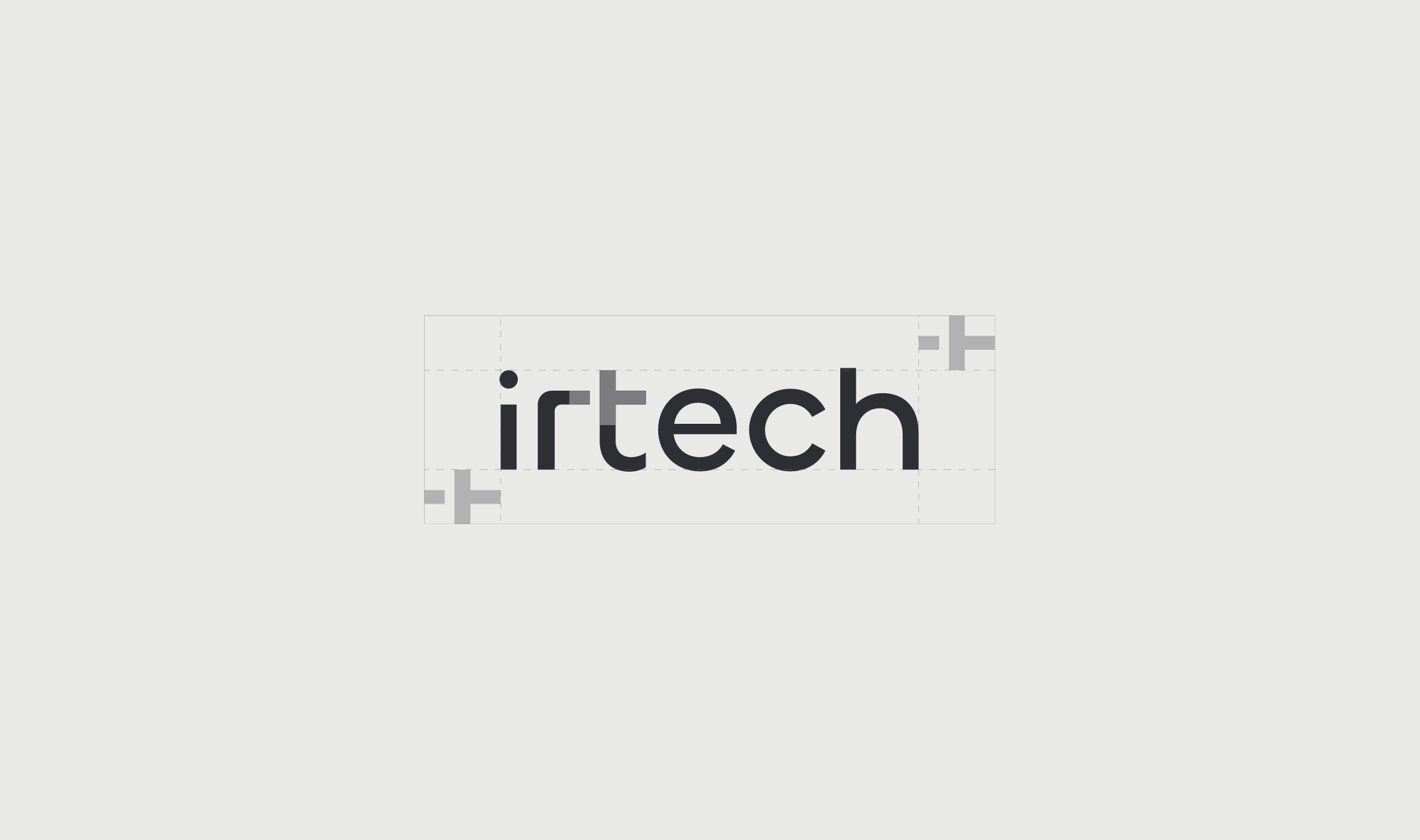
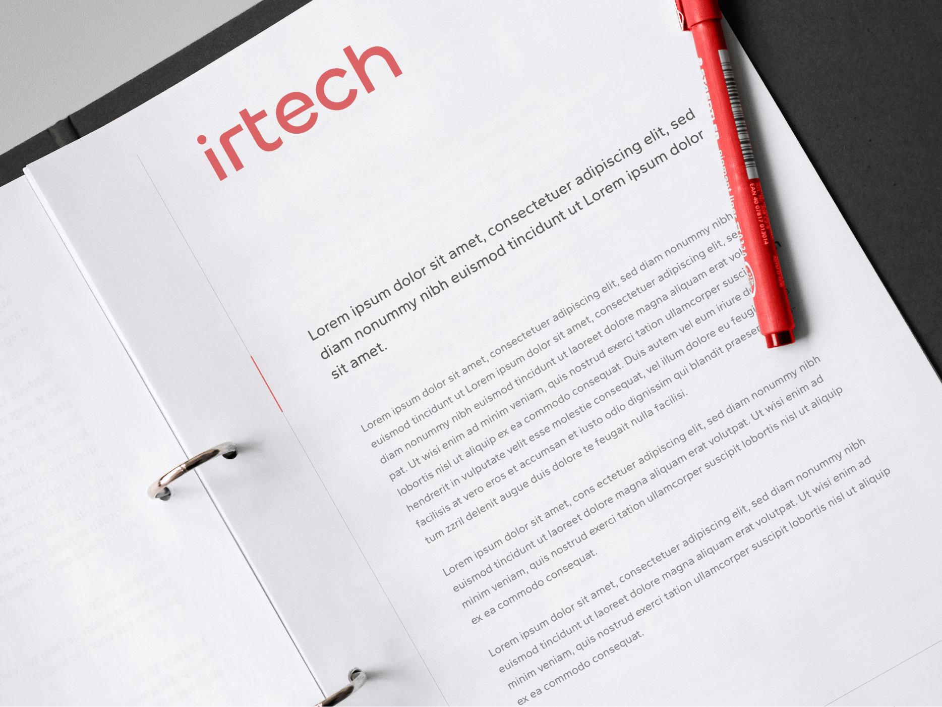
irtech
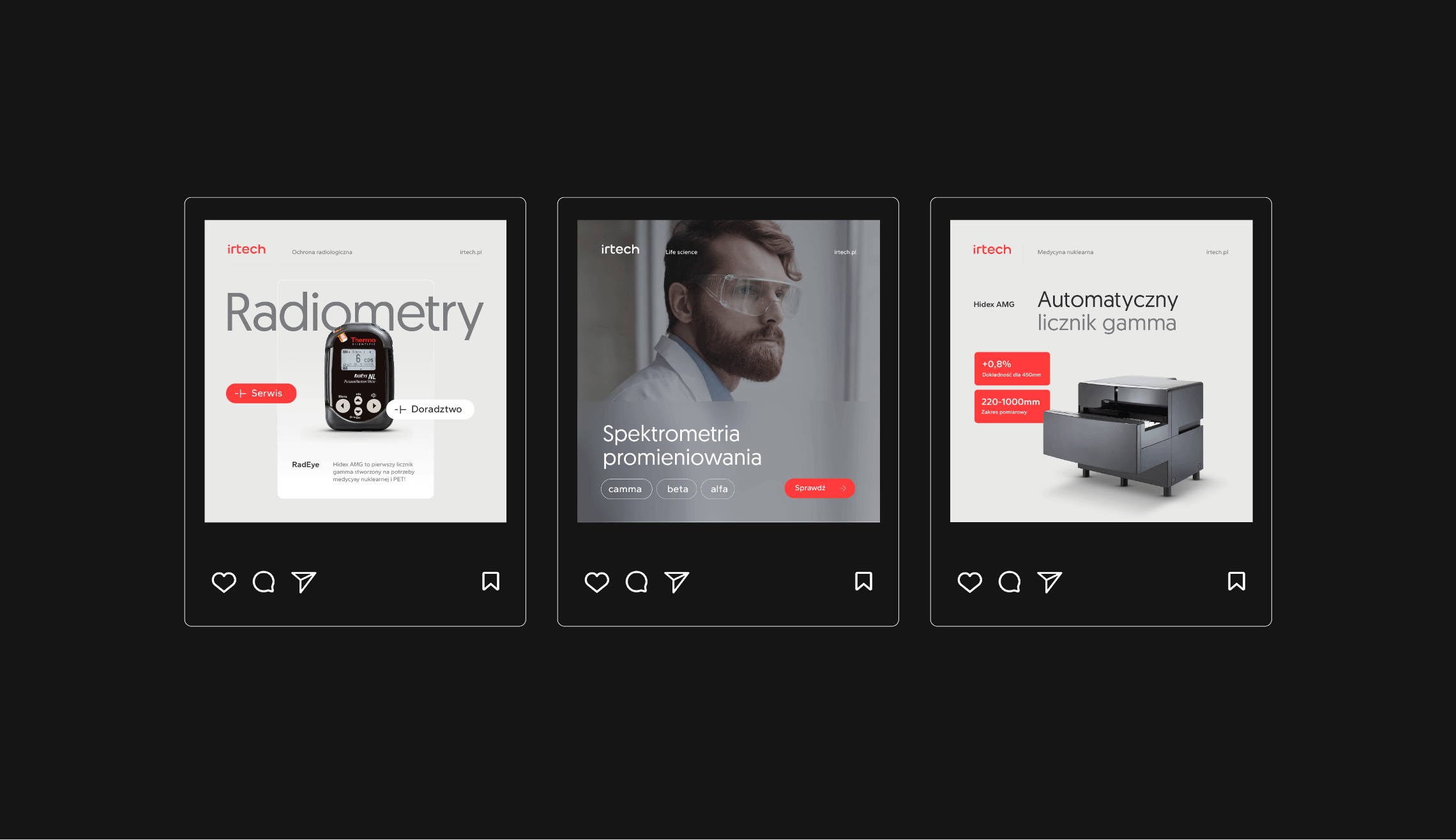
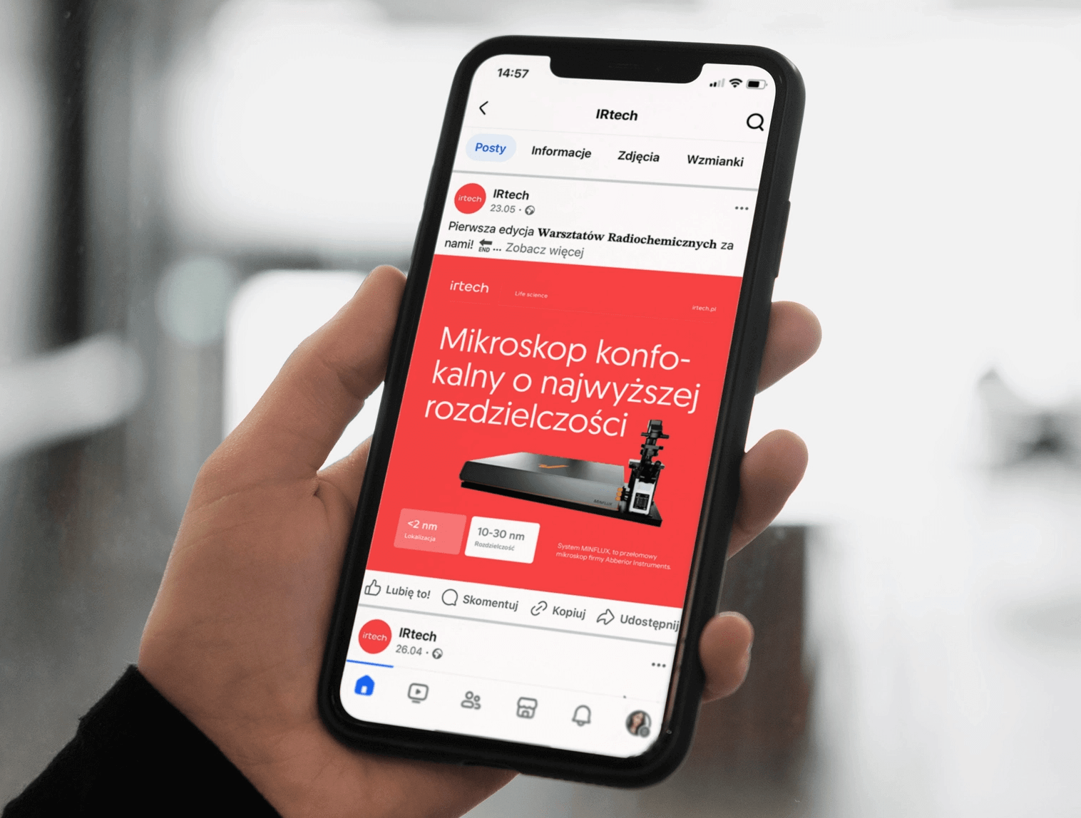
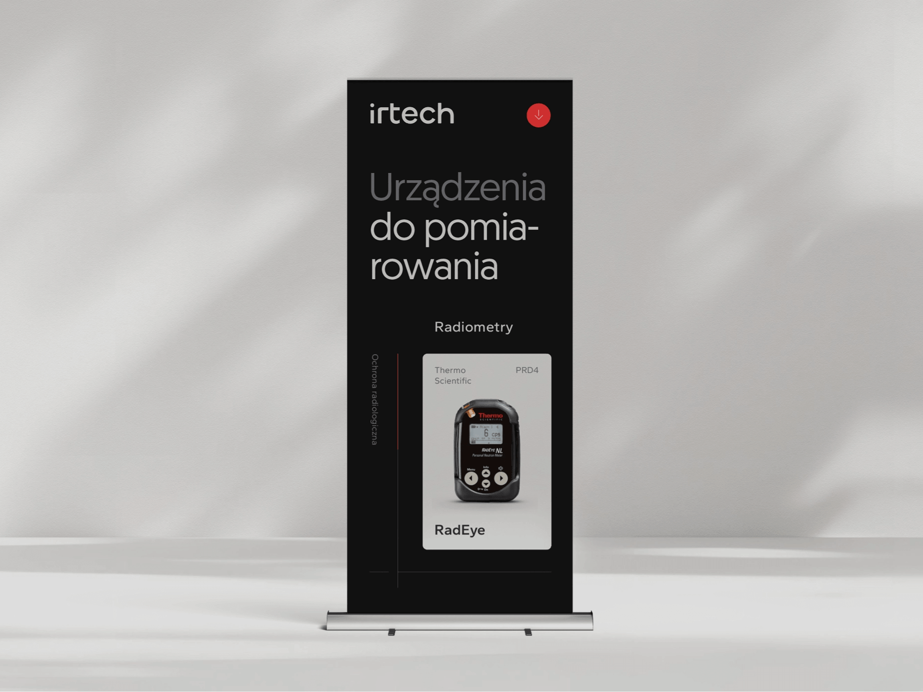
Irtech is a company specializing in the sale of measuring devices and providing post-sales support. They are experts in high-quality, specialized, and proven measuring equipment.
irtech
Scope of work
Branding
Logo
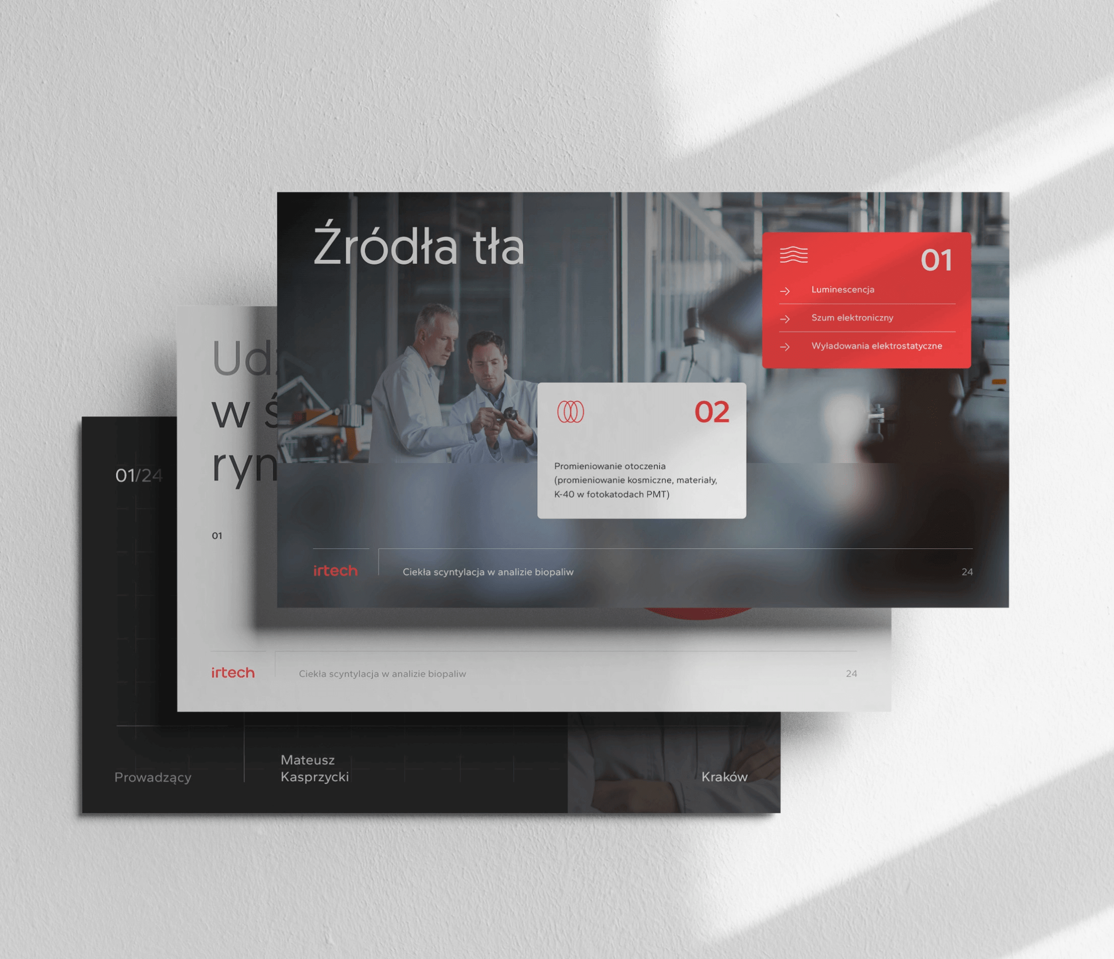
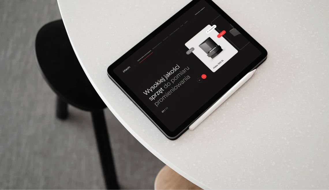
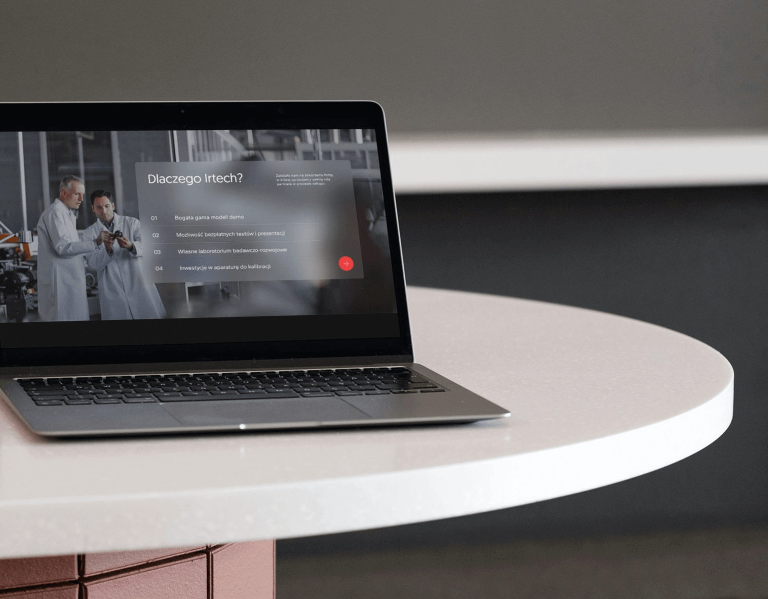
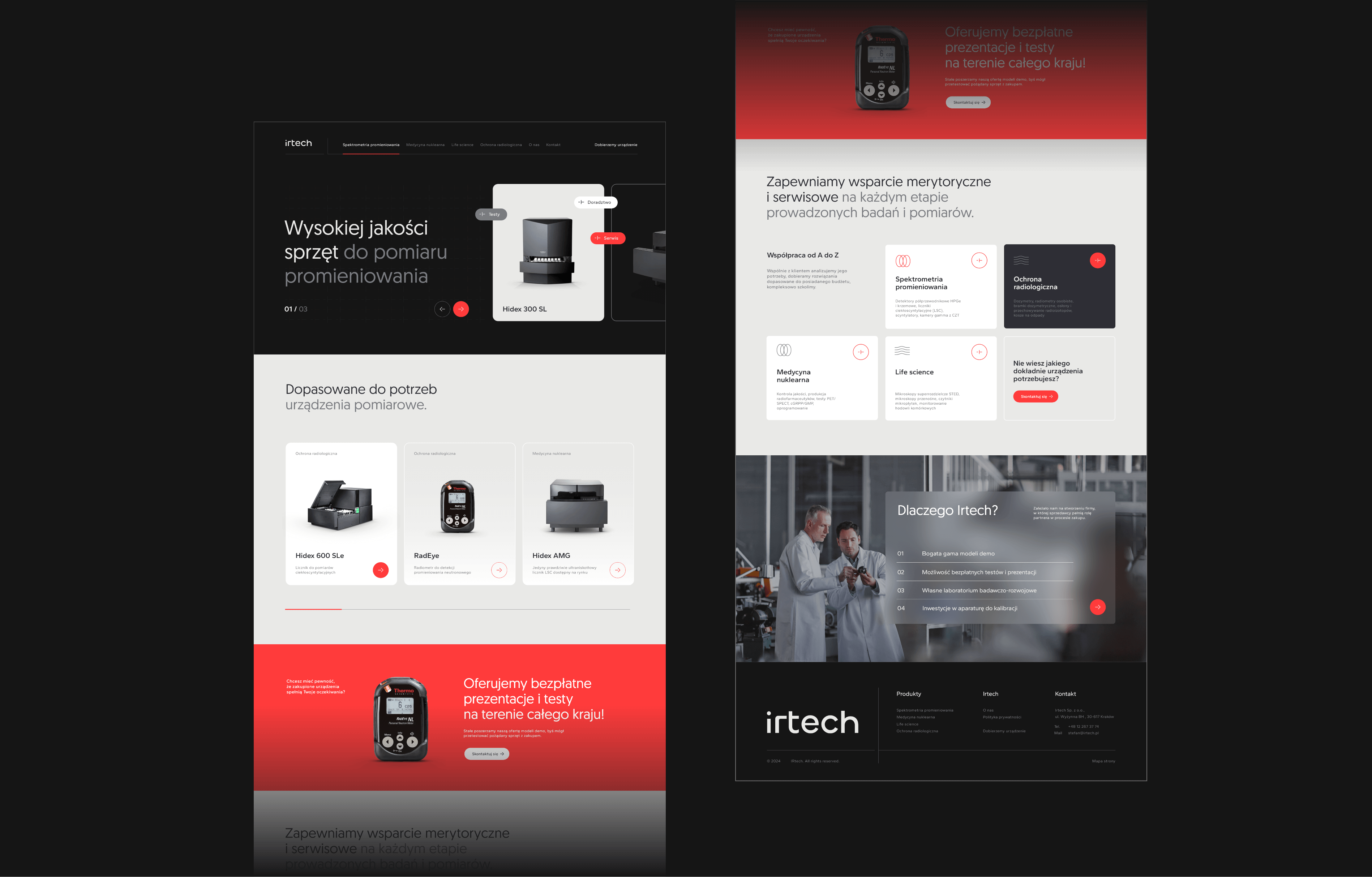
Website
2024
irtech
2024
Branding
Logo
Website
Process
 rotate(-45)' fill='%23c2f500'/%3E%3C/svg%3E%0A)
Objective
To create a cohesive communication strategy that addresses the challenge of aesthetically presenting products and showcasing a broad portfolio, utilizing manufacturer materials of highly varied quality. To portray an expert image, experience, and knowledge.
Solution
Refreshing the color scheme, developing a minimalist logo, and creating functional brand materials with a unified style of processing manufacturer photos. Providing easy-to-edit templates and brand materials that can serve as a foundation for future developments.
Result
A cohesive, modern, and professional brand image aspiring to be a leader in its industry. A recognizable identity that aids in building the strength of the brand.
Big idea
Key words
Website
RGB: 255 59 59
HEX: #ff3b3b
RGB: 21 21 21
HEX: #151515
RGB: 233 233 231
HEX: #e9e9e7
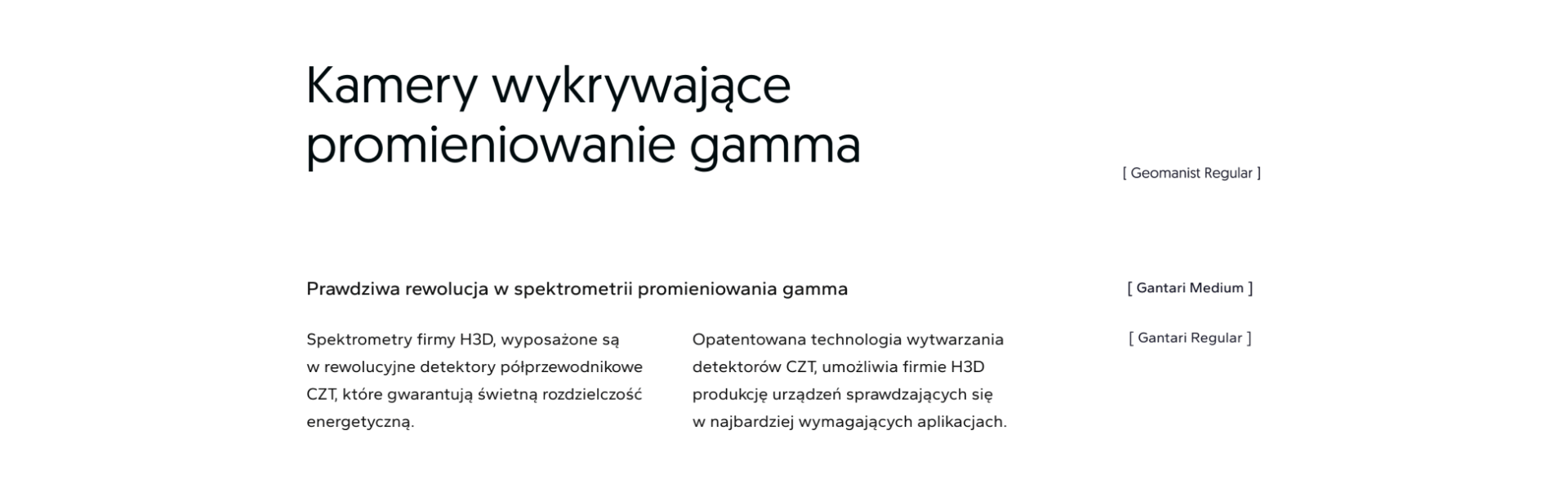
Typography
Main font
Auxiliary font
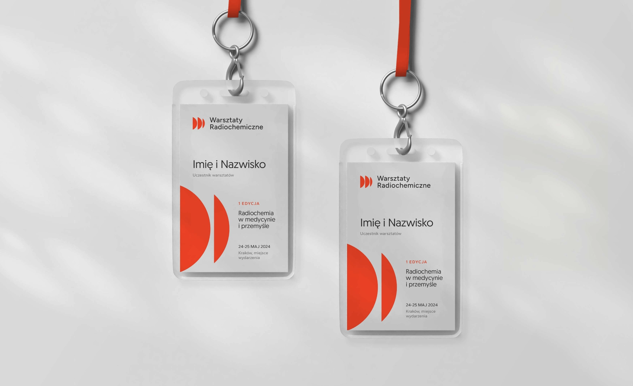
Workshops