.svg)
.svg)

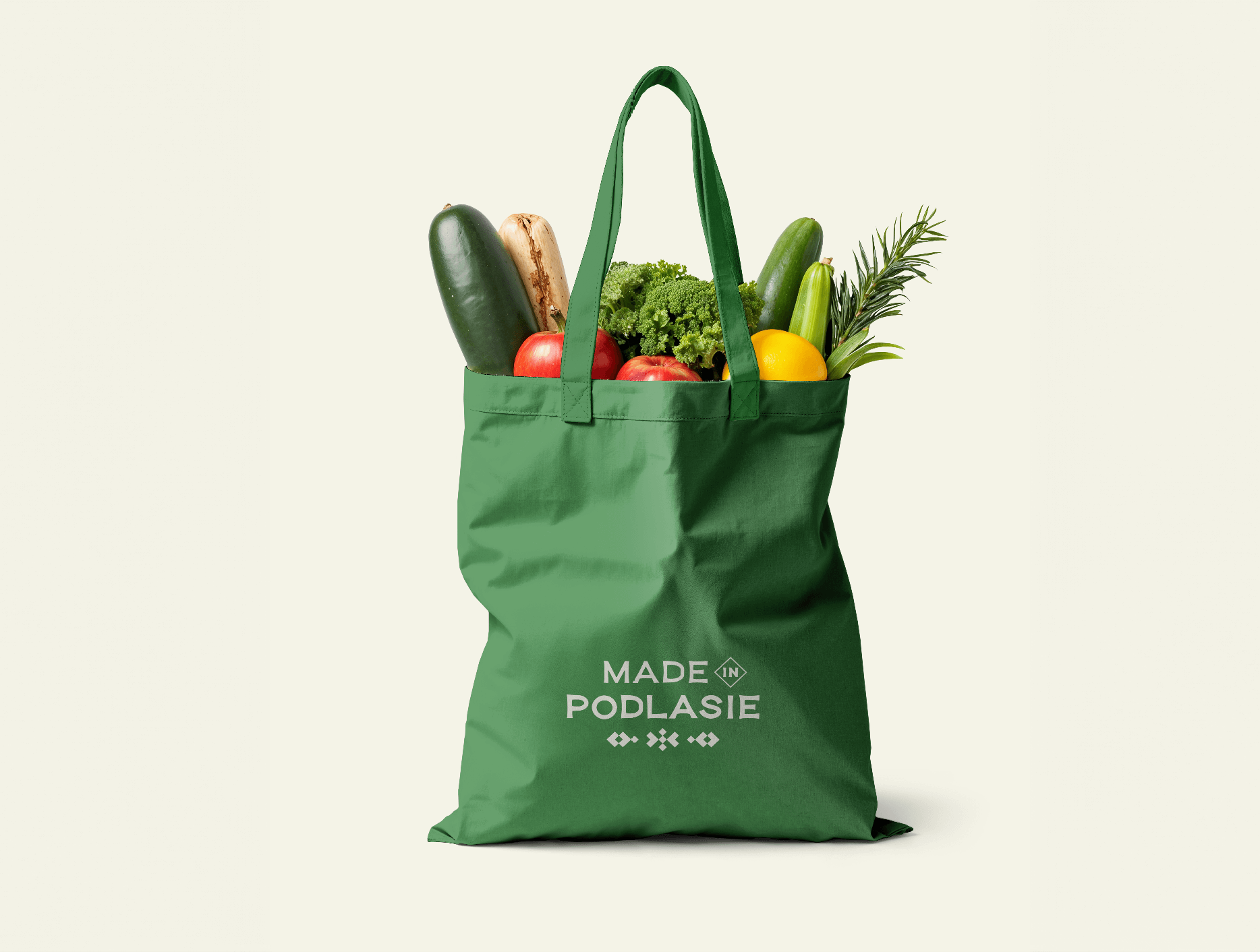
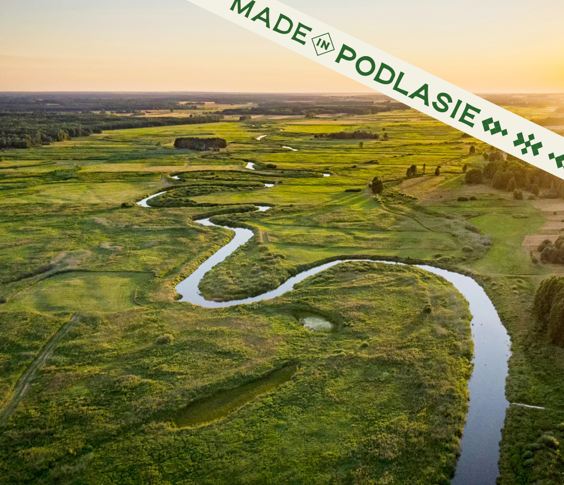
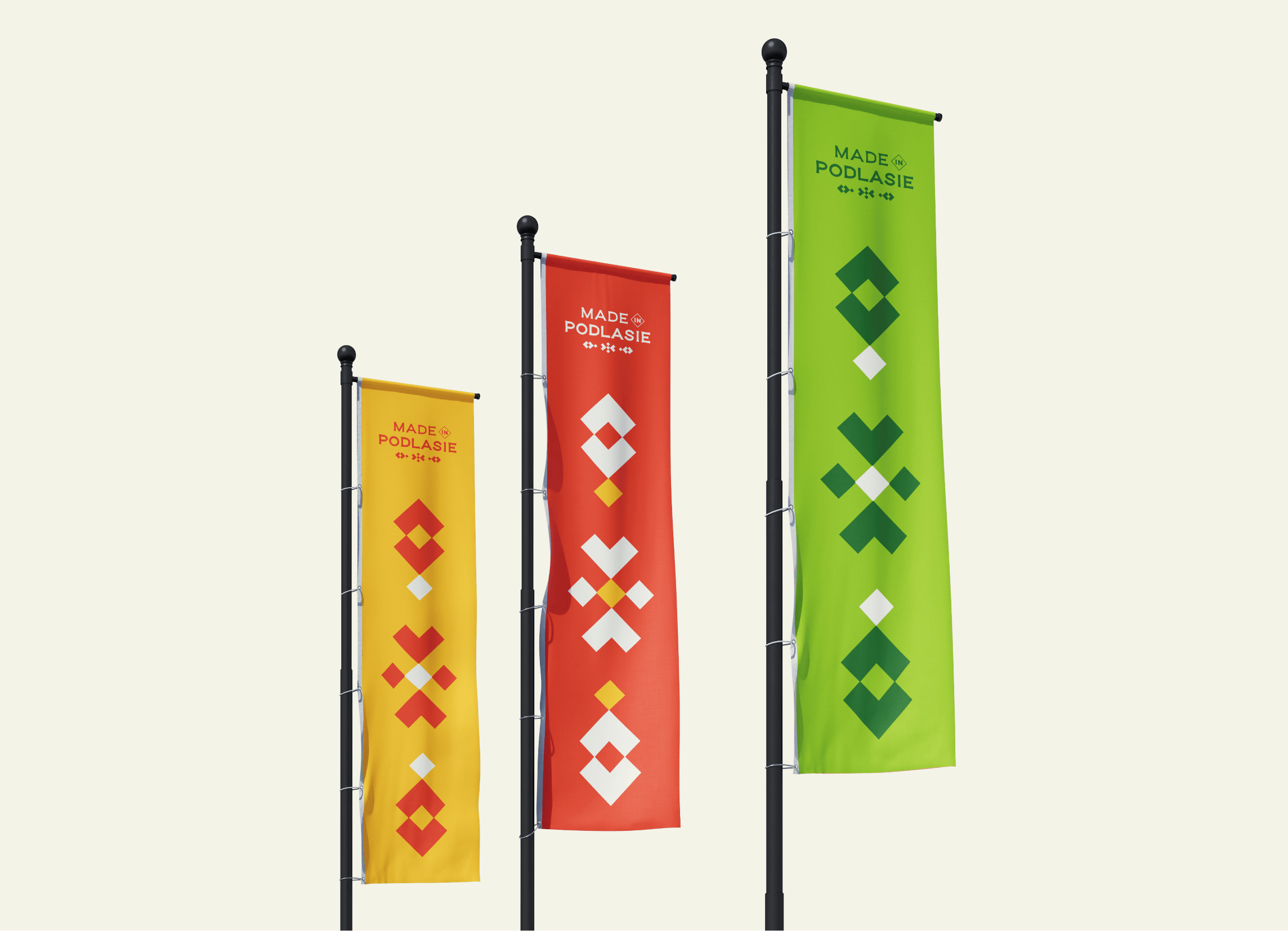
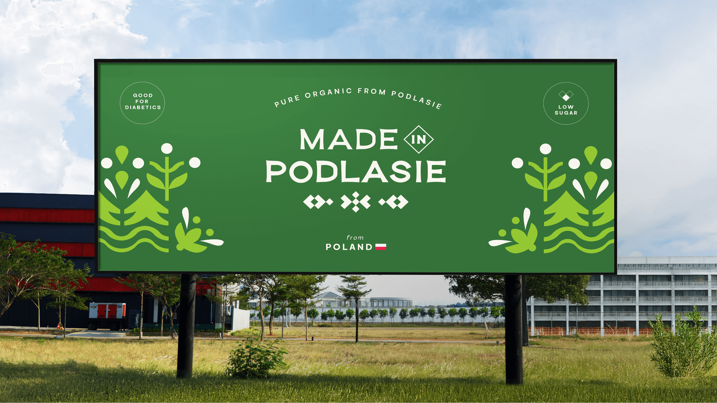
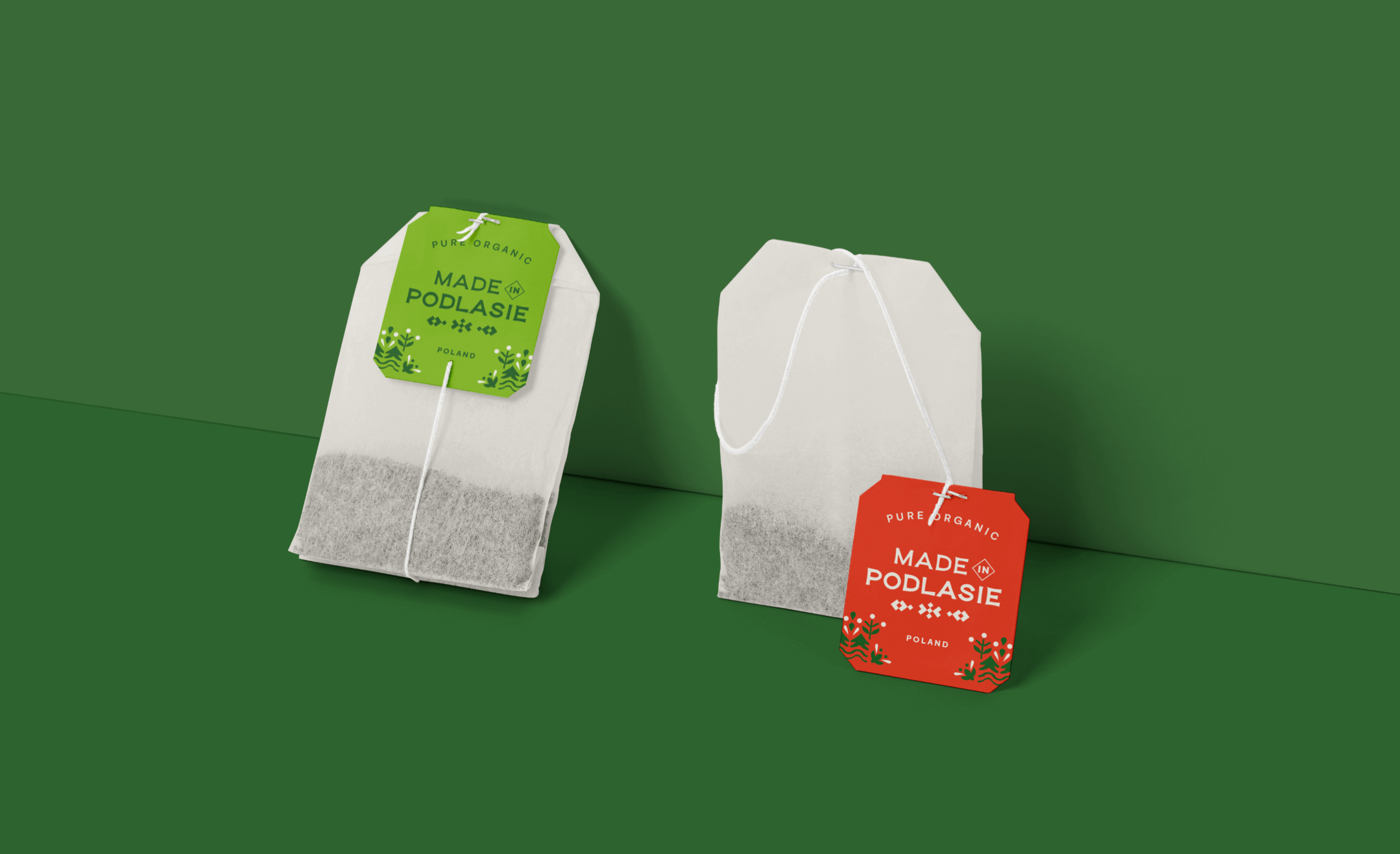
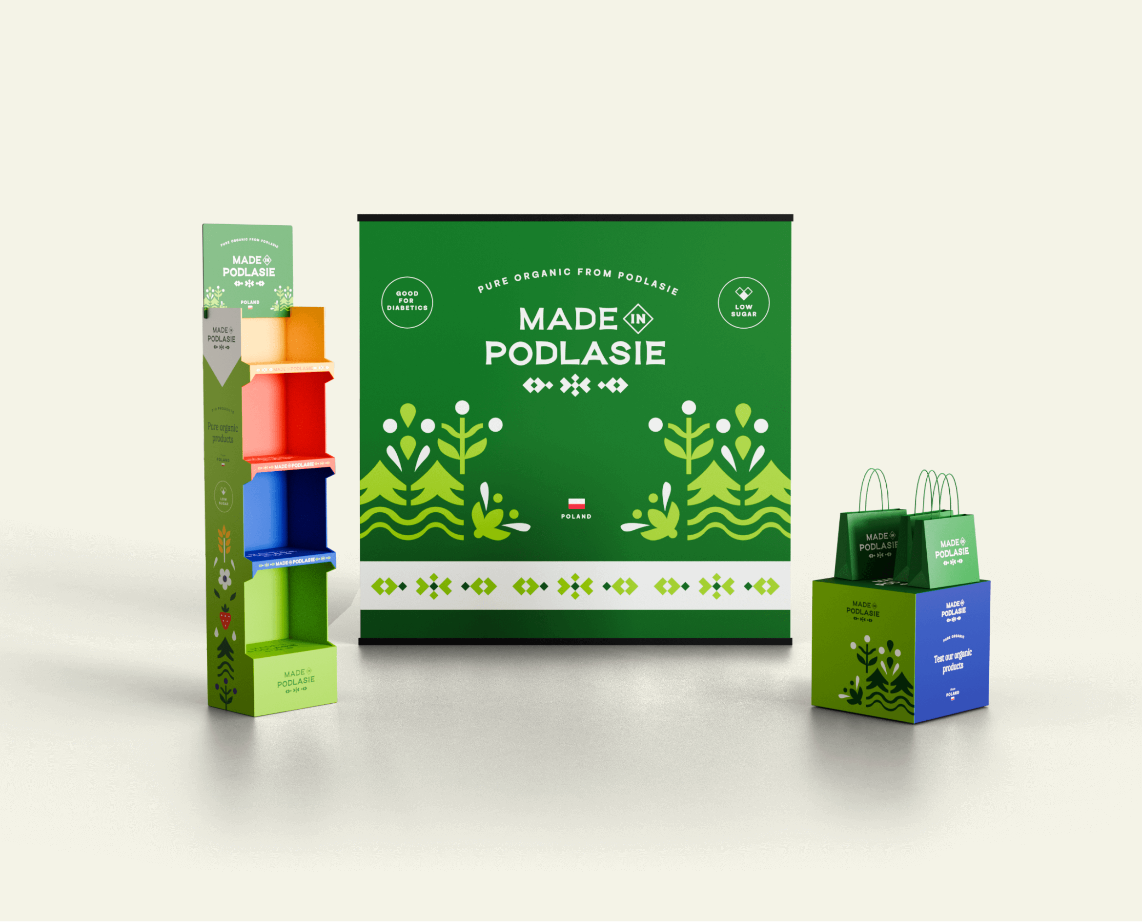
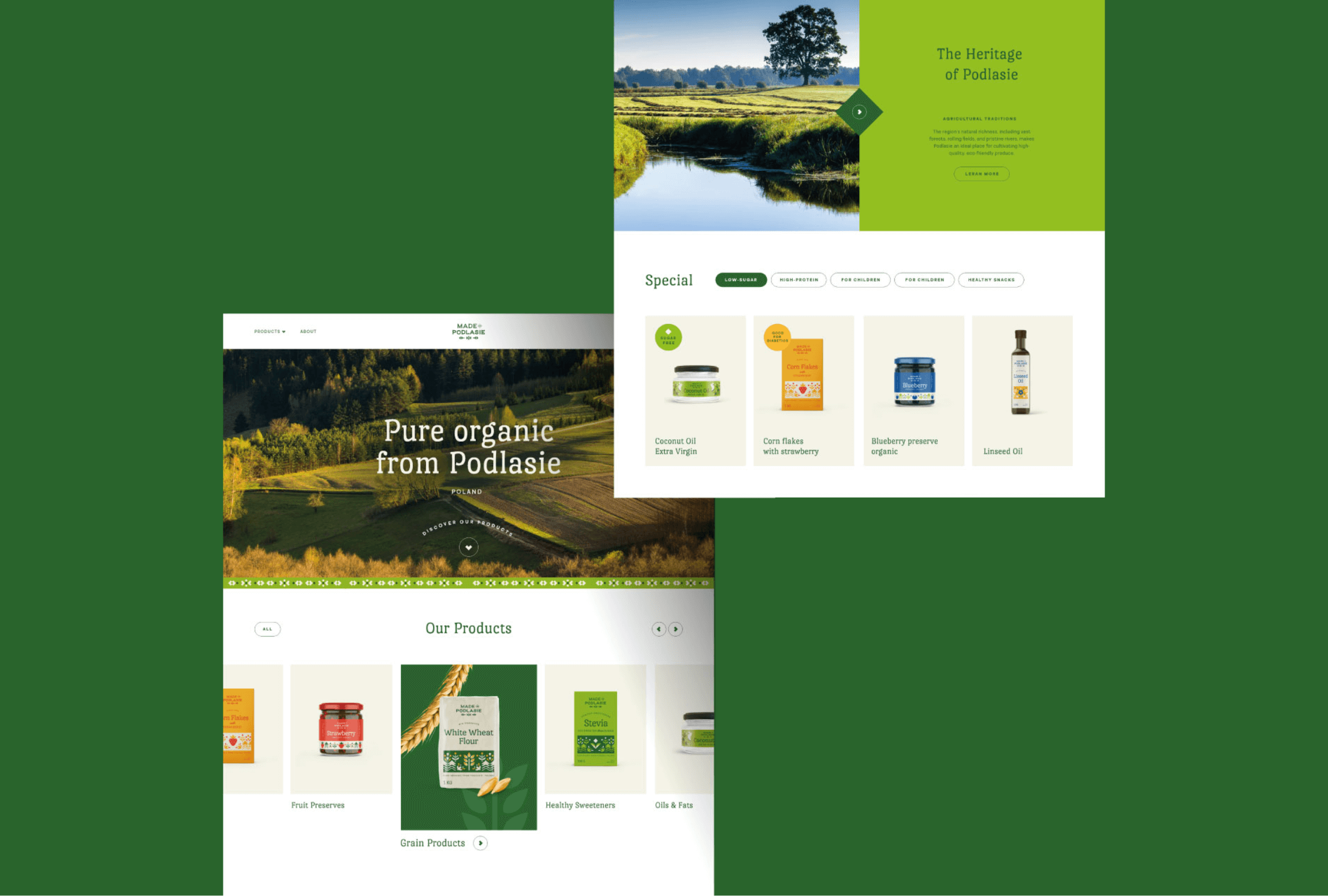
Made in Podlasie
Made in Podlasie is a Polish brand entering the market in Kuwait, symbolising authenticity, quality and proximity to nature. It offers healthy food produced in the Podlasie region, aimed at people who want to take special care of the quality of the products they consume.
Made in Podlasie
Scope of work
Branding
Logo
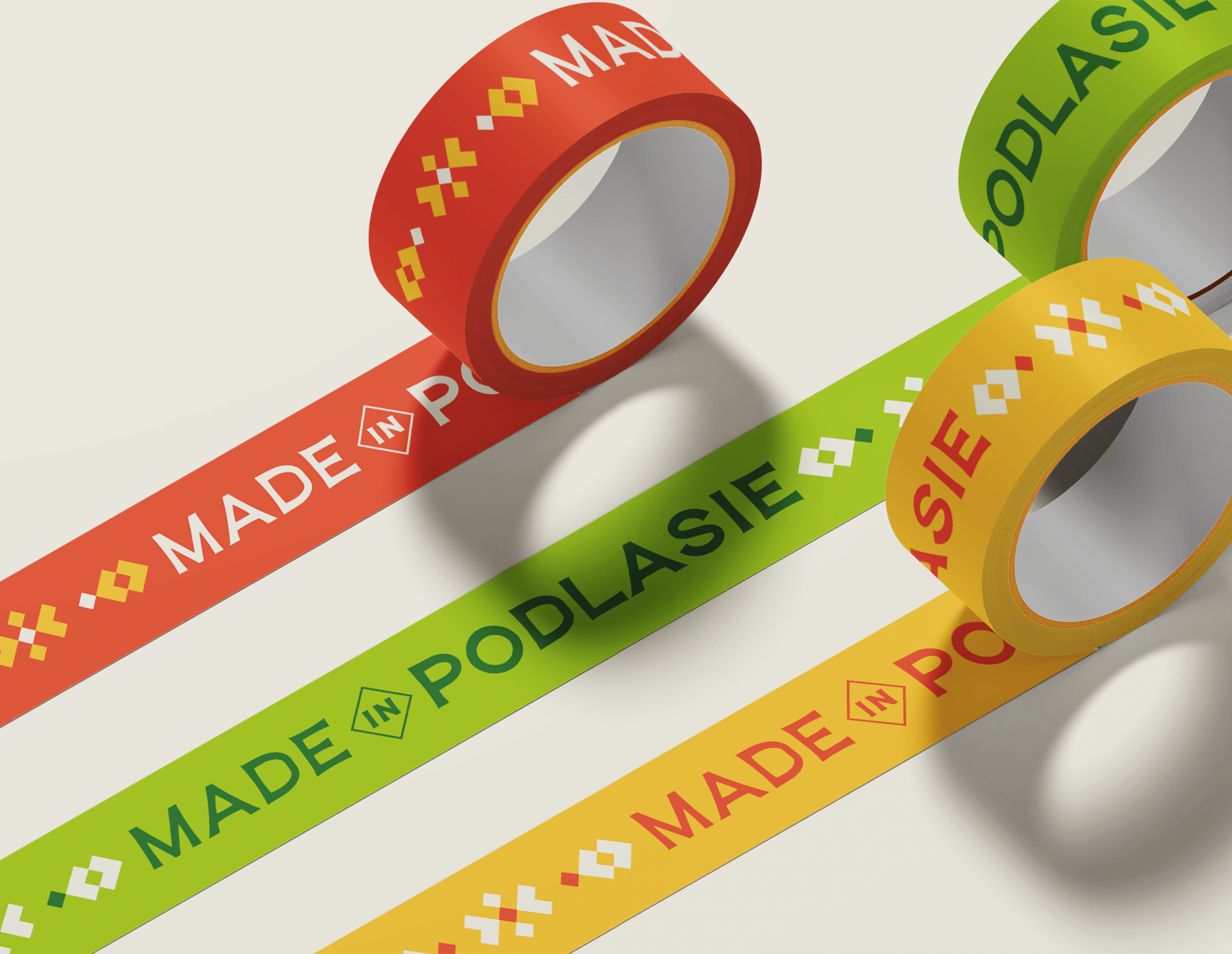
Production and printing
Social media
2025
Made in Podlasie
2025
Branding
Logo
Production and printing
Social media
Process
 rotate(-45)' fill='%23c2f500'/%3E%3C/svg%3E%0A)
Objective
Creating a brand tailored to the growing needs of conscious consumers seeking organic and high quality products. Visual distinction and a consistent, modern image that captures the spirit of Podlasie and finds recognition in the Kuwaiti market.
Solution
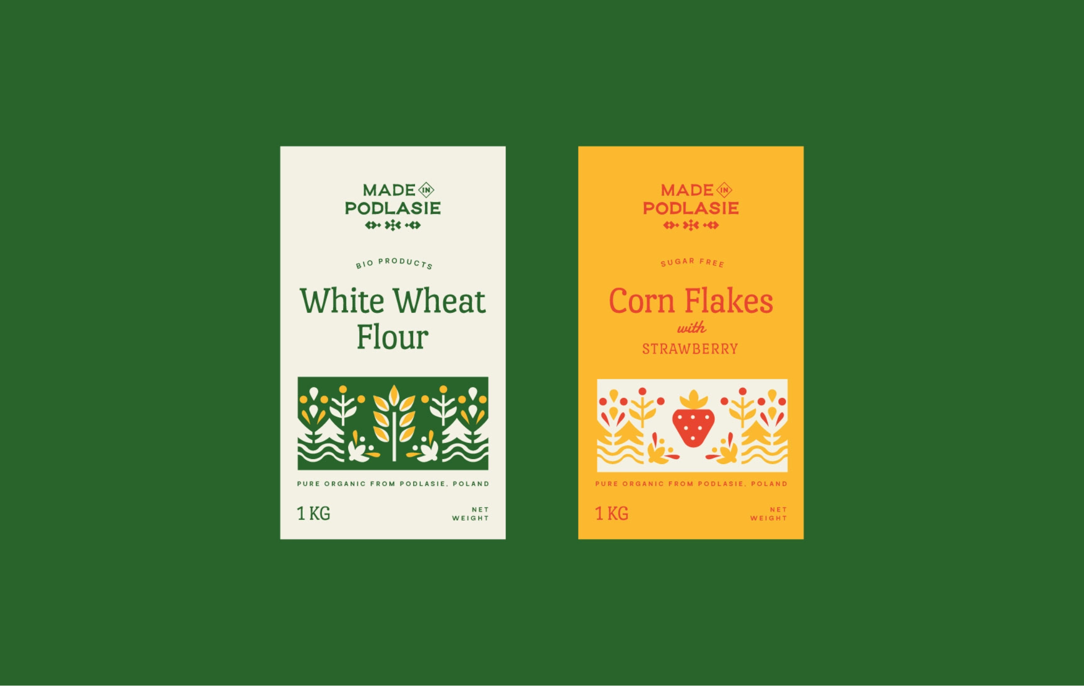
Combining traditional and modern visual elements, maintaining minimalism and versatility. Inspired by the aesthetics of embroidery and regional floral patterns, reinforcing the ecological and regional character of the brand. The introduction of a fresh colour palette inspired by the nature and tradition of Podlasie.
Result
A harmonious blend of tradition and modernity, with simultaneous references to Kuwaiti culture. A brand that is unequivocally organic, ecological and fully consistent with its values.
Big idea
Key words
Semantics
Packaging

RGB: 35 100 43
HEX: #23642b
RGB: 244 243 231
HEX: #f4f3e7
RGB: 251 187 48
HEX: #fbbb30
Typography
Main font
Auxiliary font

Illustrations