.svg)
.svg)

visual identity
visual identity
MedApp
MedApp is a technology company creating innovative solutions in the field of medicine. It works on technologies supporting imaging diagnostics and digital medicine.
Client
Scope of work
Branding
Logo
Social media
Website
MedApp
Scope of work
Branding
Logo
Social media
Website
Date
2021
2021
Client
MedApp
Date
2021
2021
Scope of work
Branding
Logo
Social media
Website
Branding
Logo
Social media
Website
logo
sygnet
infografiki
Process
 rotate(-45)' fill='%23c2f500'/%3E%3C/svg%3E%0A)
Goal
To create an identity for a technology company engaged in innovations in the field of medicine. To present MedApp as a reliable partner and a secure investment.
Solution
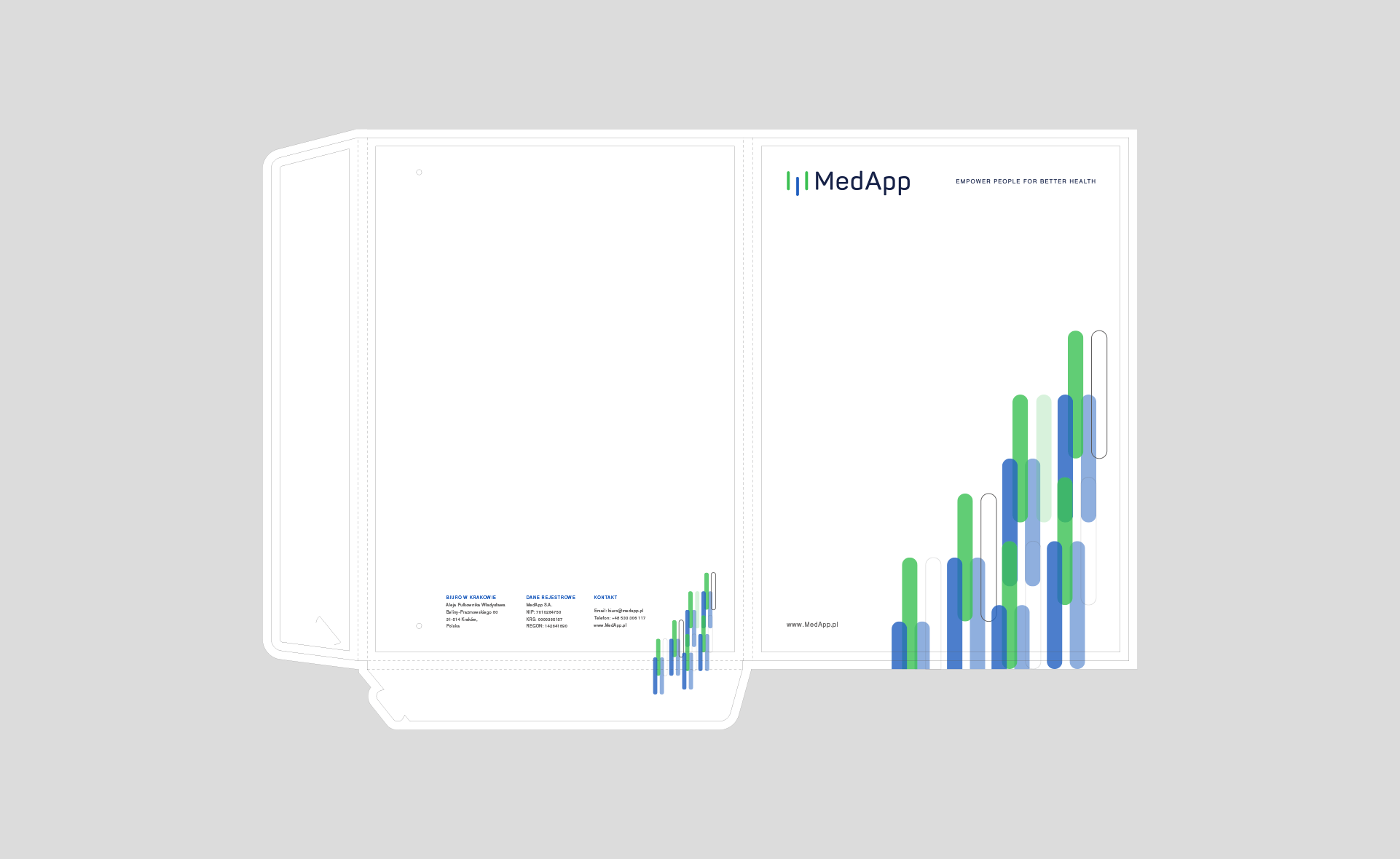
An identity utilizing medical colors, navy blue and white. The logo's emblem is used as a recurring graphic element in materials. Additionally, product logos were created based on the main logo – using a single element from the emblem in the product's color.
Result
A business image combining medicine, business, and technology.
fotomontaz-animacja
Big idea
Creating a representative image for a technology company entering the stock market. Demonstrating professionalism, advancement, while maintaining a business style in the identity.
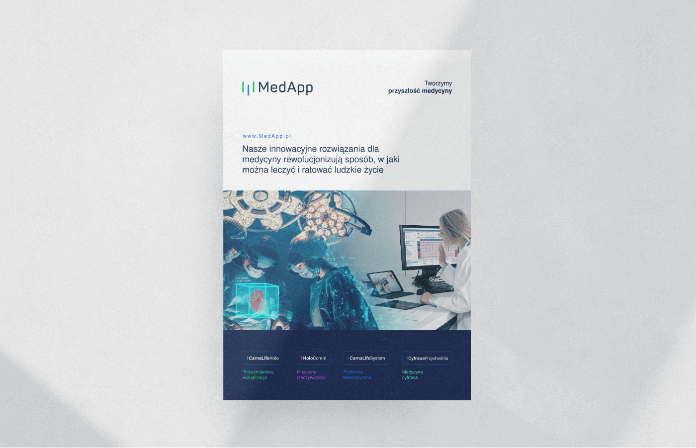
okladka
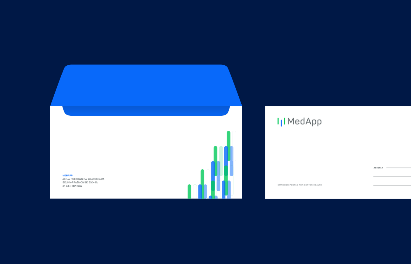
koperty
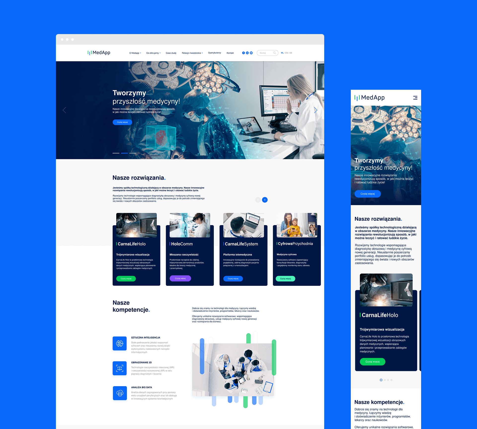
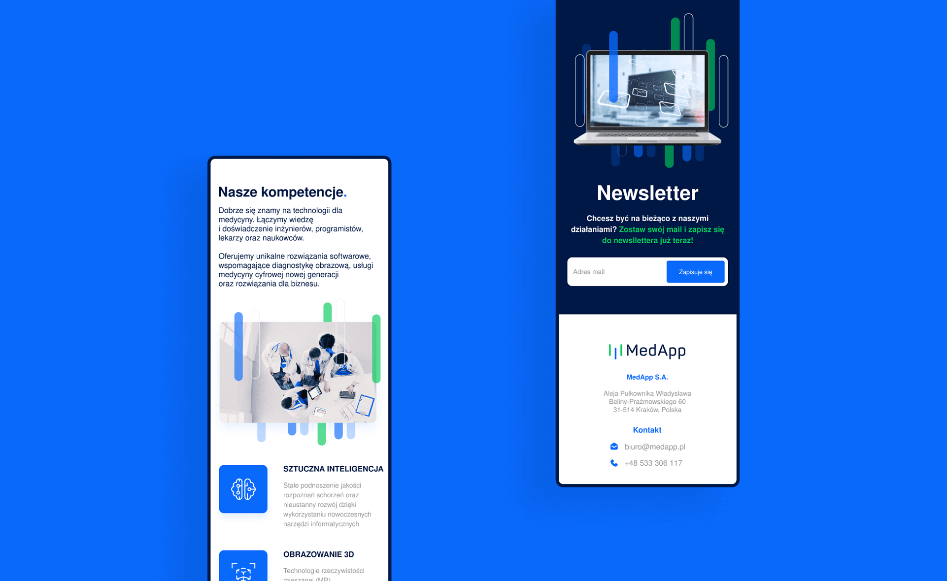
Website
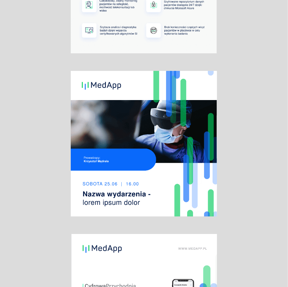
The website serves as the company's business card; therefore, it is very simple, clear, with regular layouts. The homepage contains only the most important information and links to product pages, while the product pages comprehensively showcase the solution's advantages, present the product in various applications, and encourage trials.
Key words
Innovation Modernity Trust Technology
Technology Trust Modernity Innovation
Innovation Modernity Trust Technology
Technology Trust Modernity Innovation
Technology Trust Modernity Innovation
Innovation Modernity Trust Technology
Technology Trust Modernity Innovation
Semantics
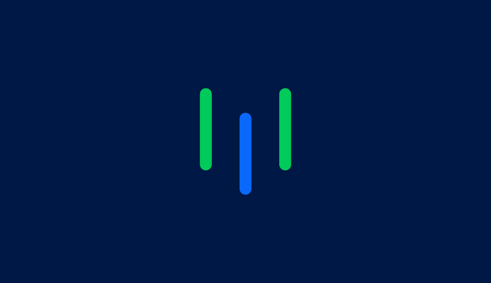
The MedApp logo consists of an emblem and text with a claim. The emblem was created through variations around symbols related to coding, lifeline, monitoring, and the letter M from the company's name. The three lines symbolize the three main sectors that MedApp combines – business, medicine, and technology.
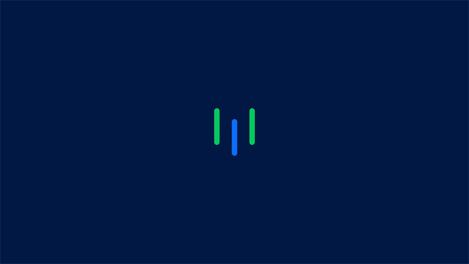
Logo
CMYK: 96 58 0 2
RGB: 9 105 251
HEX: #0969fb
RGB: 9 105 251
HEX: #0969fb
CMYK: 100 65 0 73
RGB: 0 24 69
HEX: #001845
RGB: 0 24 69
HEX: #001845
CMYK: 0 0 0 0
RGB: 255 255 255
HEX: #ffffff
RGB: 255 255 255
HEX: #ffffff
Montages
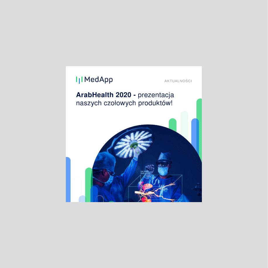
Photomontages play a very important role in the company's communication, showing possible applications of the developed products and solutions. We created a series tailored to the language and communication style, as well as the company's color scheme. Neutral colors with subtle blue accents associated with "medical" were used.
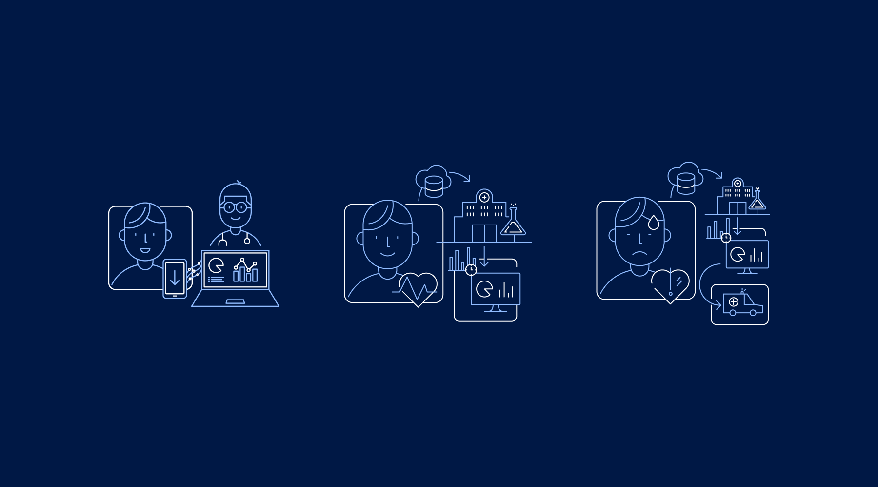
Iconography
Modern, legible icons complementing the content of the website, image, and advertising materials.

Recent projects
Pokket
Pokket is a new, highly dynamic brand in the food industry, redefining the meaning of handy snacks. It offers convenient tube forms that fit in any pocket and flavors not yet available on the market.
Dawtona
Dawtona is a Polish leader in processing fresh vegetables and fruits, primarily sourced from its own fields, utilizing an integrated production model to ensure the highest quality products.
Made in Podlasie
Made in Podlasie is a Polish brand entering the market in Kuwait, symbolising authenticity, quality and proximity to nature. It offers healthy food produced in the Podlasie region, aimed at people who want to take special care of the quality of the products they consume.
DCX
A European engineering and manufacturing company offering a wide range of liquid cooling solutions, including design, production, implementation, and commissioning of technologies.