.svg)
.svg)

Qmodular
Qmodular is a company specializing in the production of modular homes, buildings, blocks, hotels, and more. It is a rapidly growing enterprise that has set innovation and the pursuit of perfection in its projects as its standard.
Qmodular
Scope of work
Branding
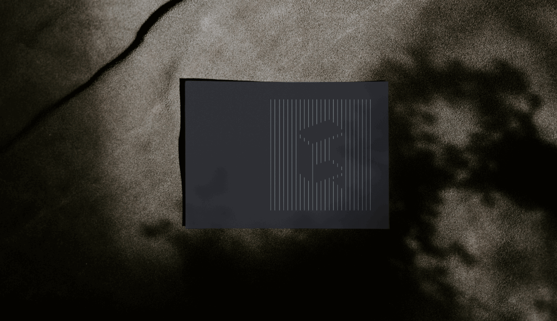
Logo
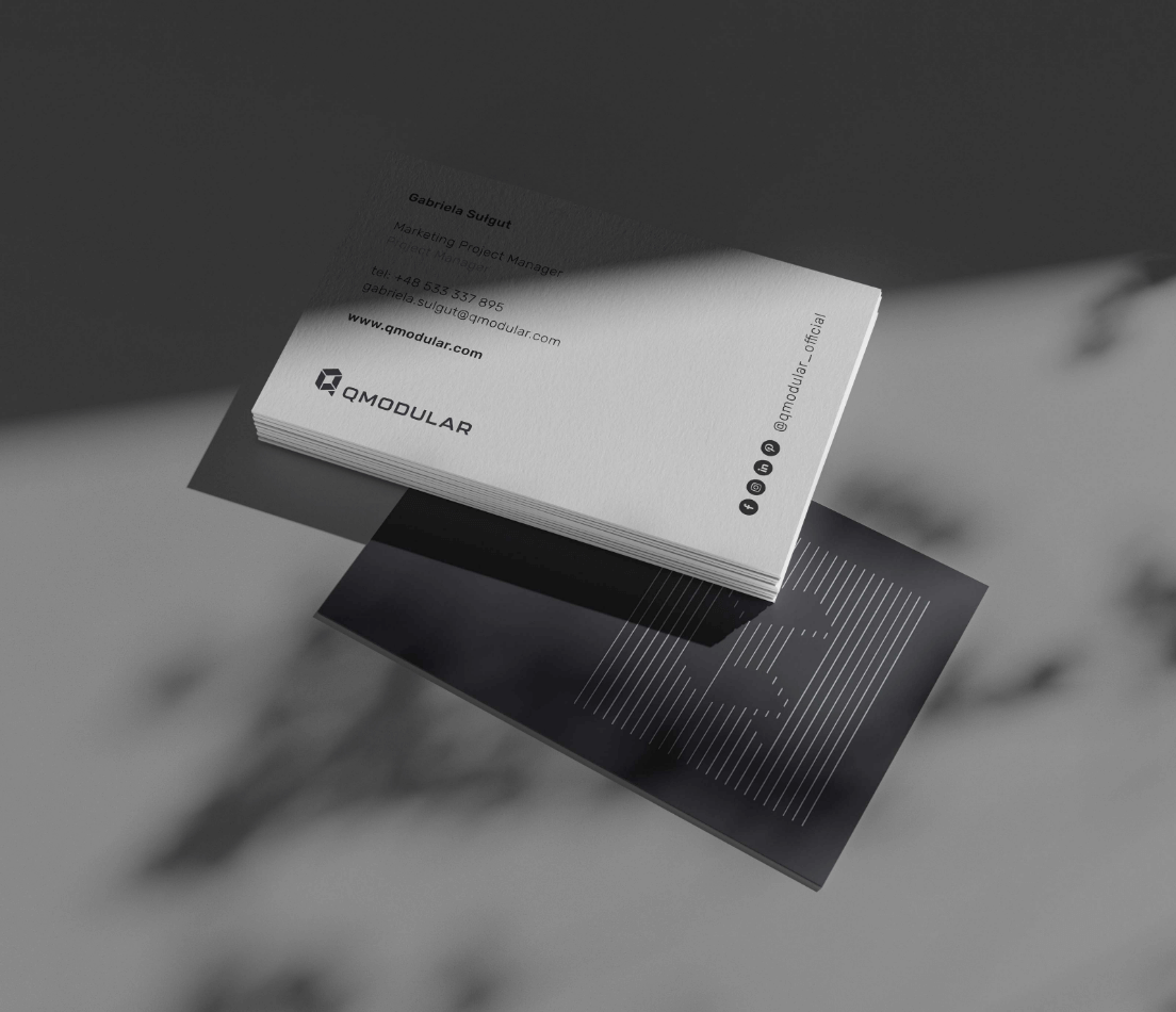
Production and printing
2021
Qmodular
2021
Branding
Logo
Production and printing
Process
 rotate(-45)' fill='%23c2f500'/%3E%3C/svg%3E%0A)
Objective
The client approached us with the need to create a new visual language for the brand, which until then had only a website and a logo.
Solution
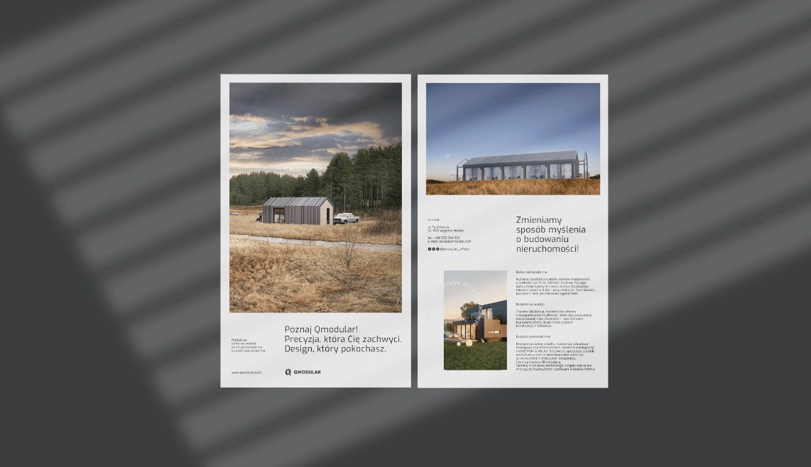
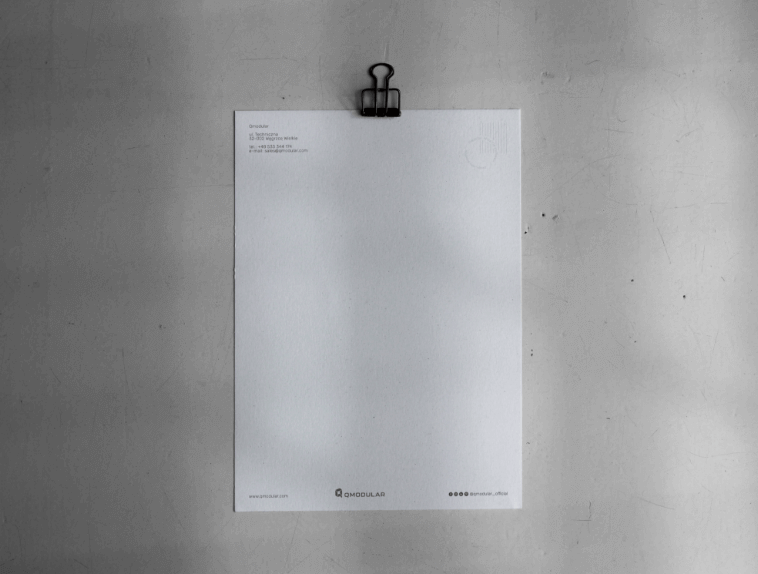
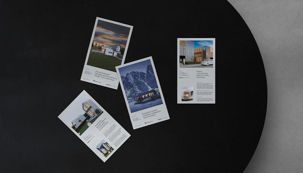
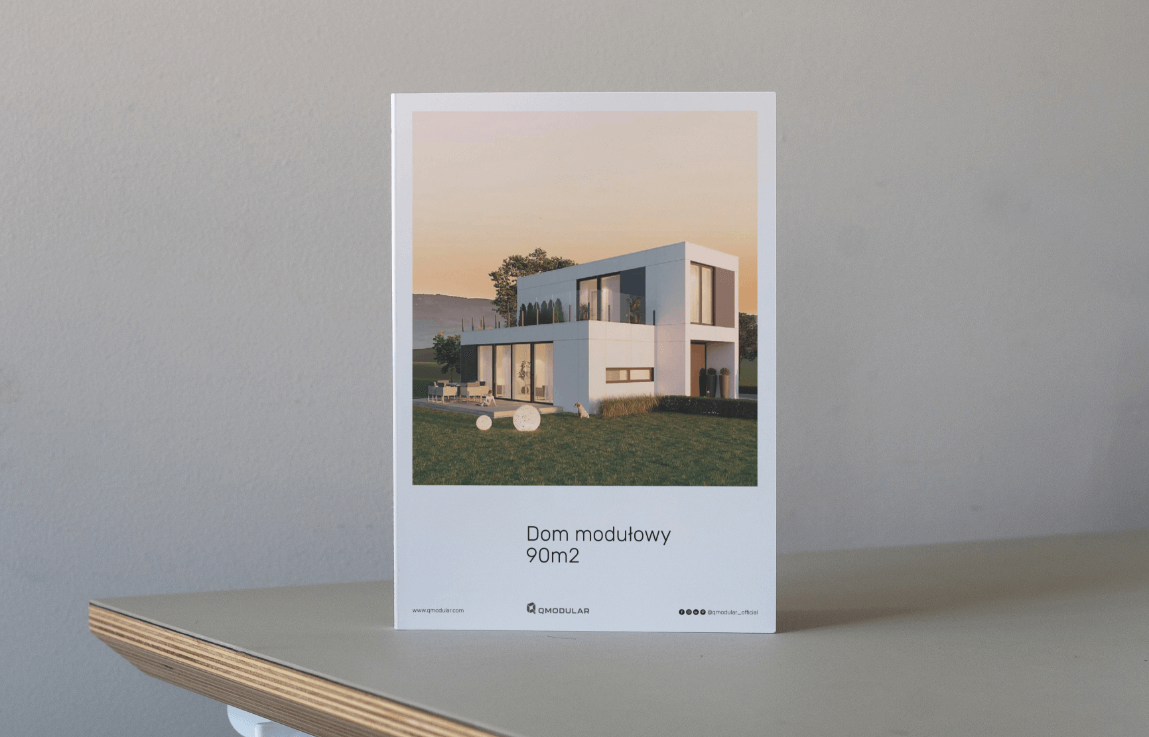
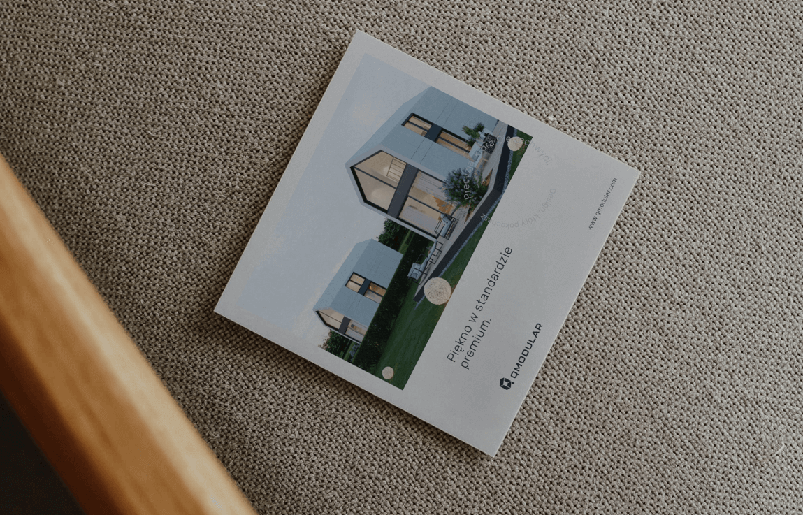
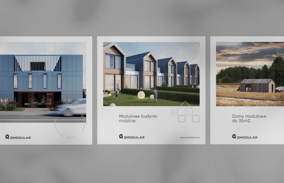
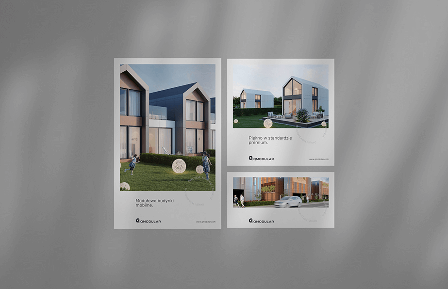
The logo was refreshed, sans-serif fonts matching the modern character of the brand were selected, and colors harmonizing with the aesthetics of Qmodular's house designs were chosen. Business cards, posters, email footers, and product cards were then created to serve the company's cohesive image.
Result
The created identity has a modern, orderly, and subdued character, which perfectly aligns with the company's values and image. A consistent visual language translates into a more professional reception by clients.
Big idea
Key words
Semantics

RGB: 55 55 60
HEX: #37373c
RGB: 231 230 230
HEX: #e7e6e6
RGB: 189 196 200
HEX: #bdc4c8
Typography
Main font
Auxiliary font

Iconography
