.svg)
.svg)

Safety Service
Safety Service is a Krakow-based company specializing in health and safety training and services, employing unconventional solutions and utilizing a modern approach, making the training interesting and memorable.
Safety Service
Scope of work
2021
Safety Service
2021
Process
 rotate(-45)' fill='%23c2f500'/%3E%3C/svg%3E%0A)
Goal
To create a visual identity that will help the company become the most recognizable health and safety firm in Krakow. A professional and consistent image, yet friendly and helpful.
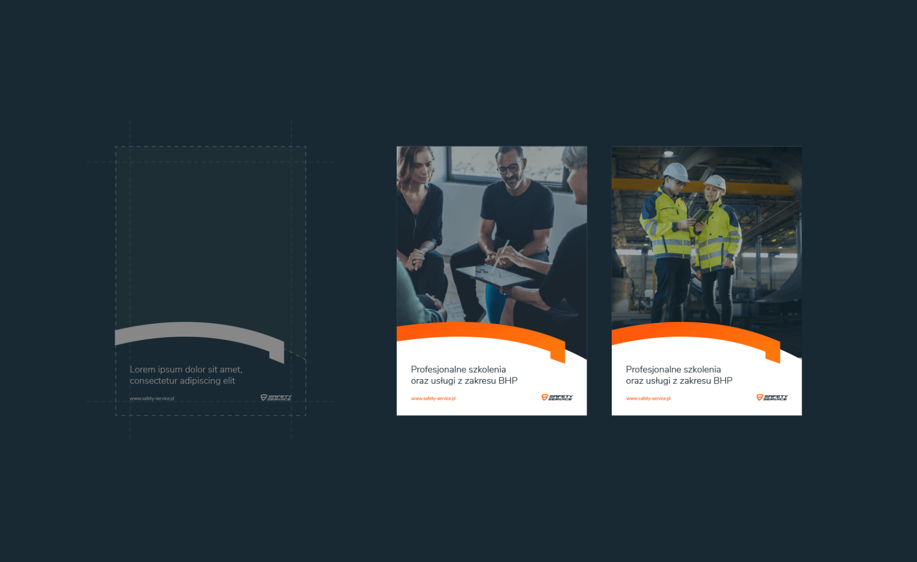
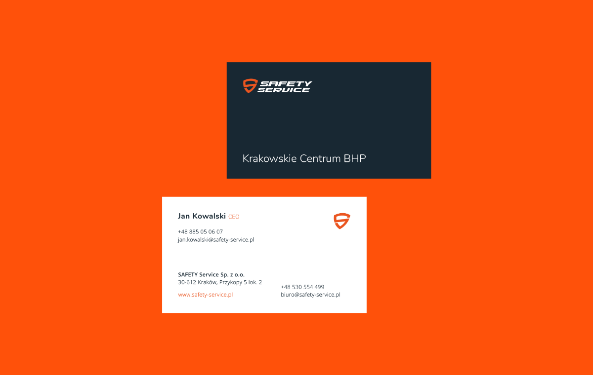
Solution
A visual identification system in a modern and quite minimalist aesthetic, where strong colors, typography, and icons play the main roles. Asymmetrical typographic and graphic layouts were used.
Effect
A modern, fresh, and distinctive health and safety training brand that, through its approach and image, encourages engagement with its offerings.
Big idea
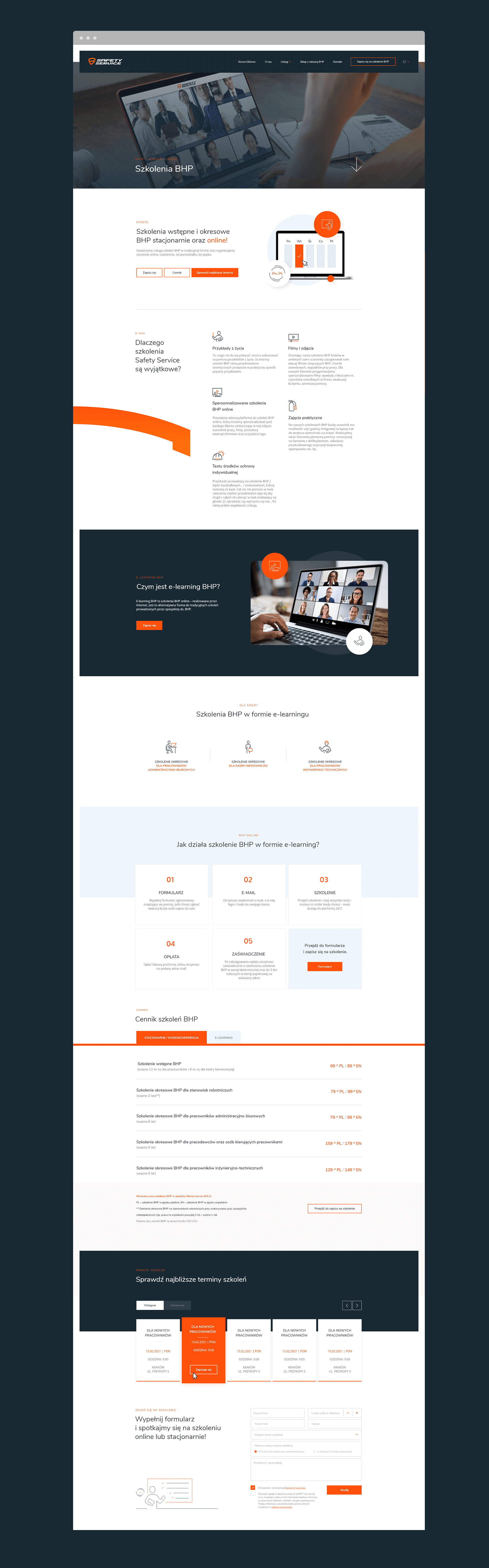
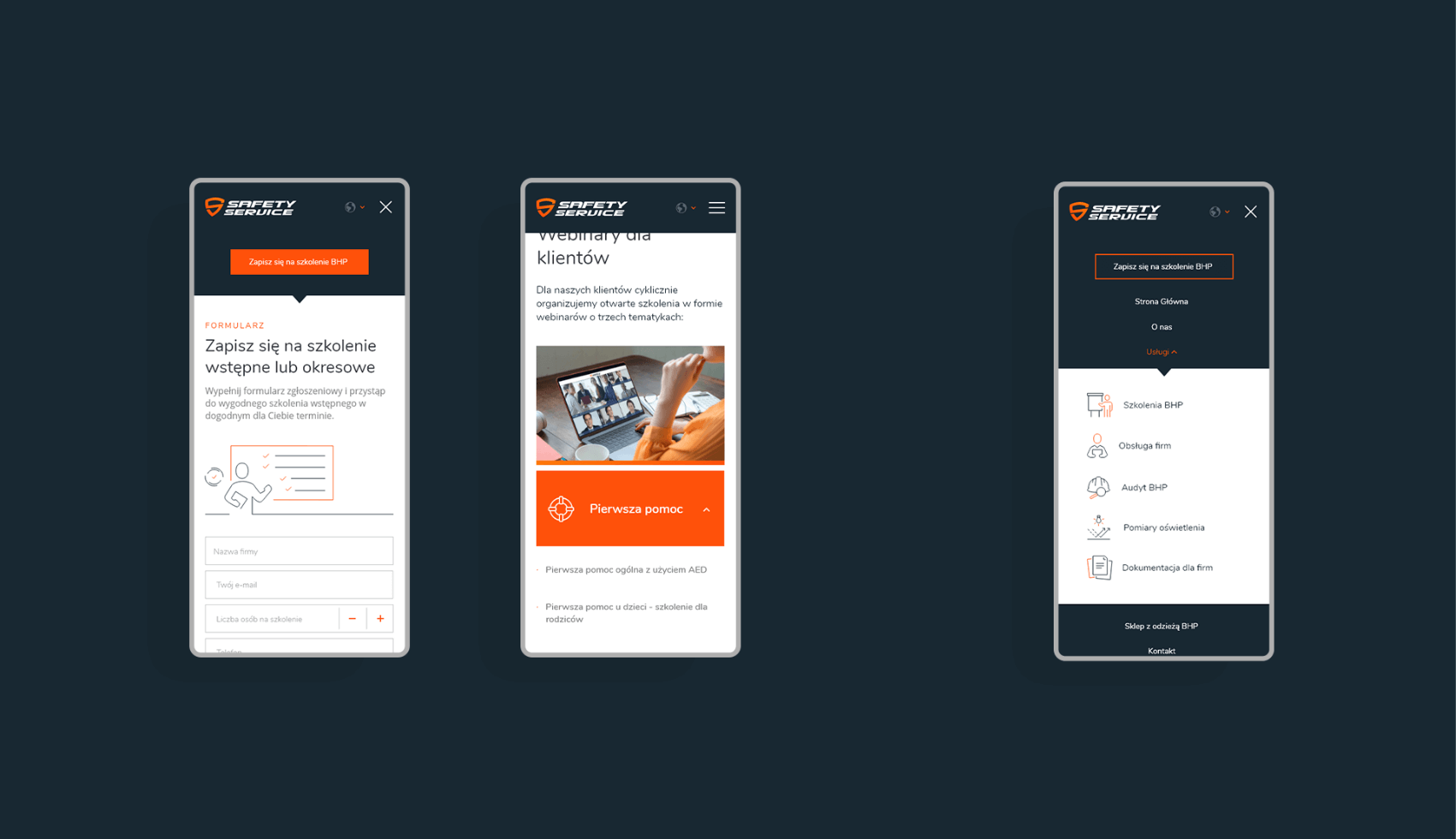
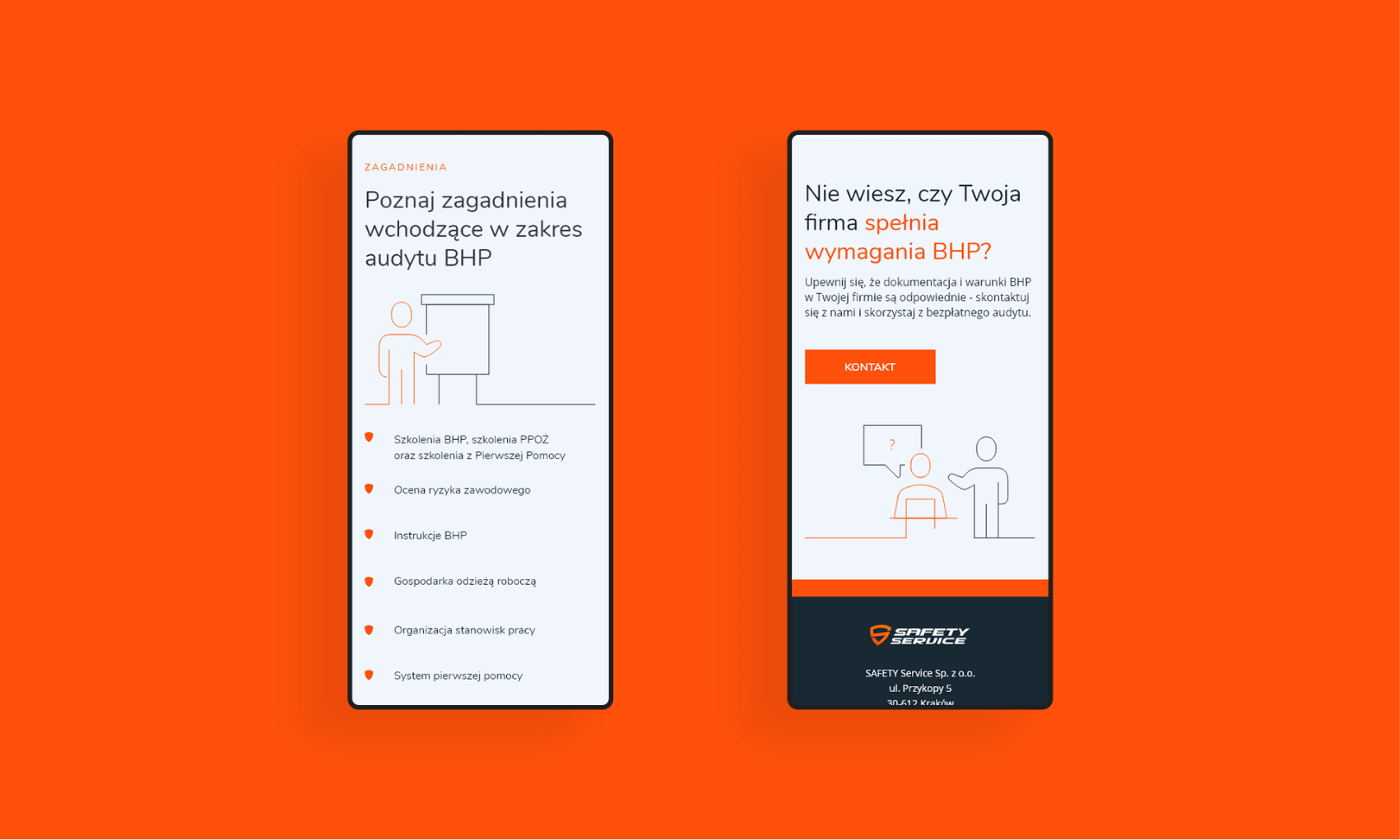
Website
Key words

Semantics

RGB: 255 81 11
HEX: #ff510b
RGB: 25 41 51
HEX: #192933
RGB: 240 246 251
HEX: #f0f6fb
Typography
Main font
Auxiliary font

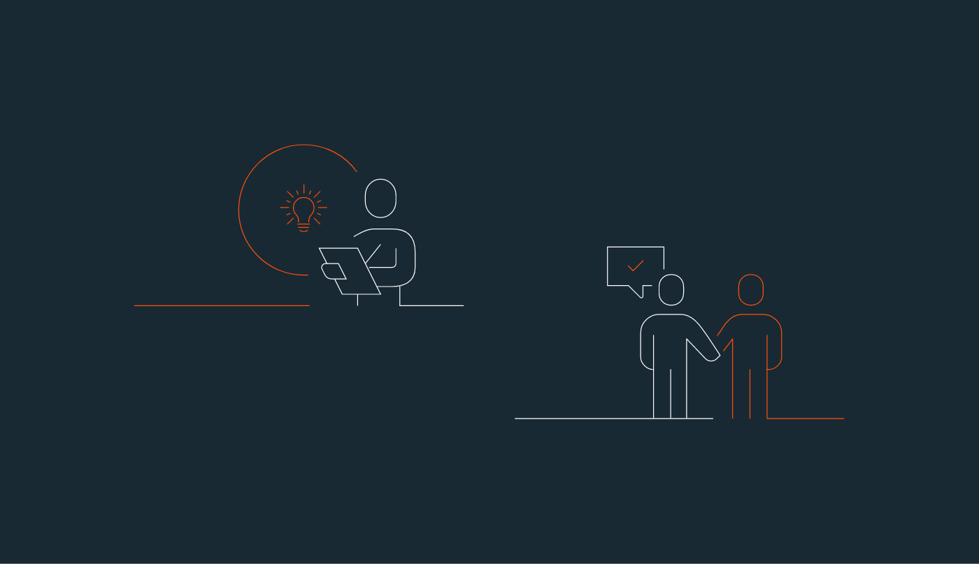
Iconography