.svg)
.svg)

Stamper
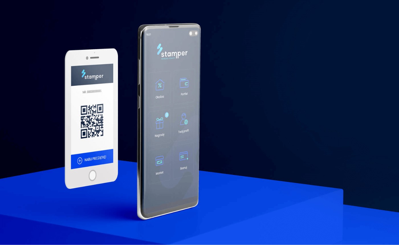
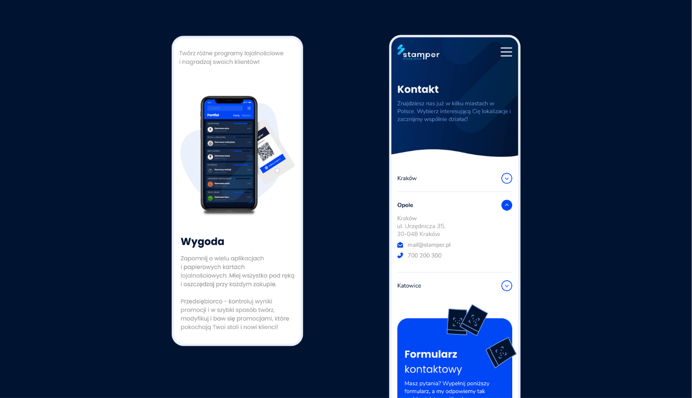
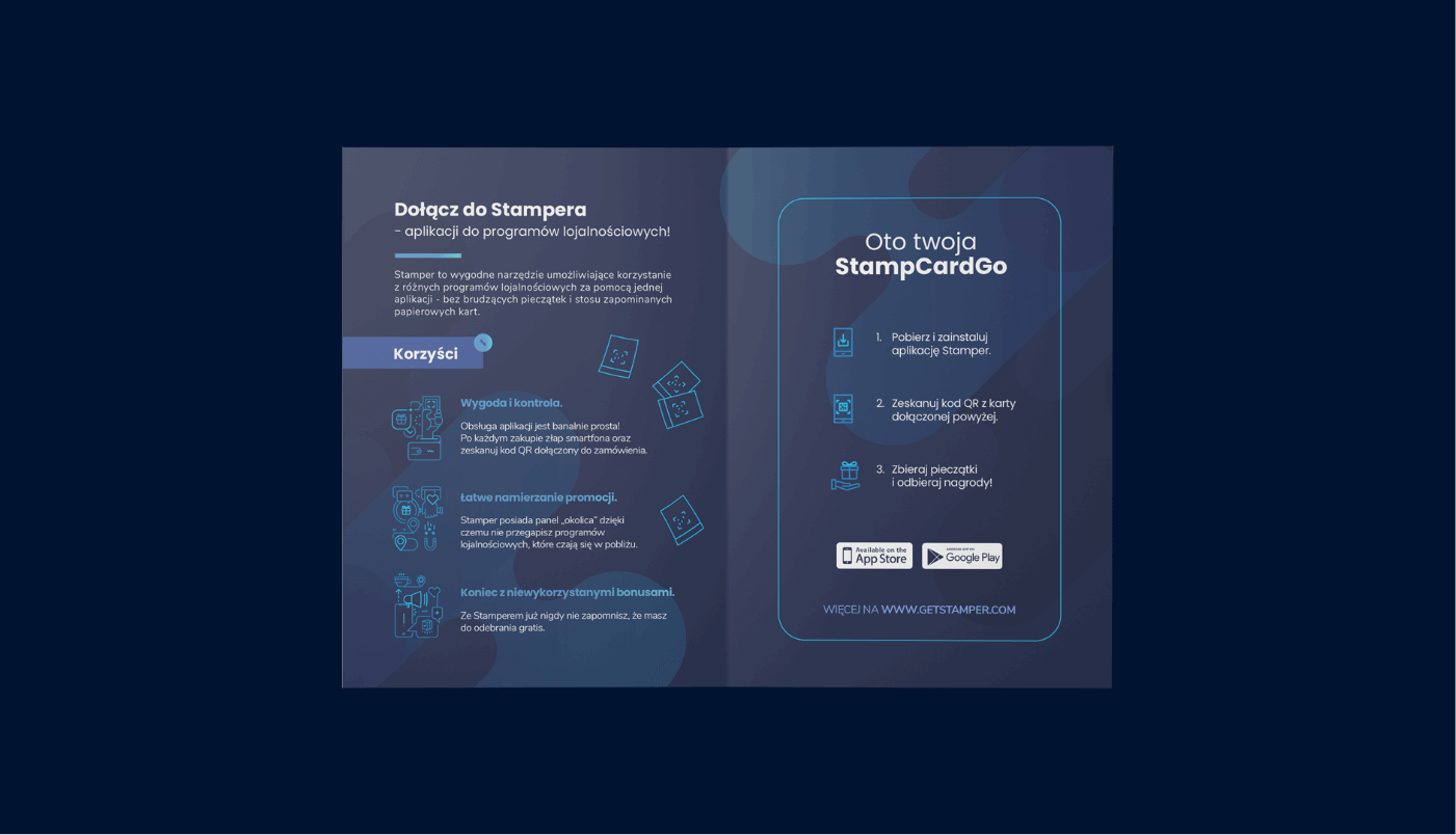
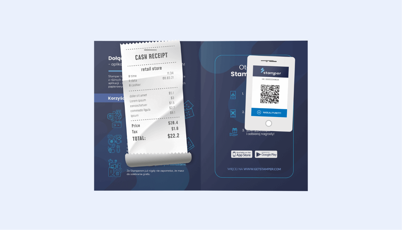
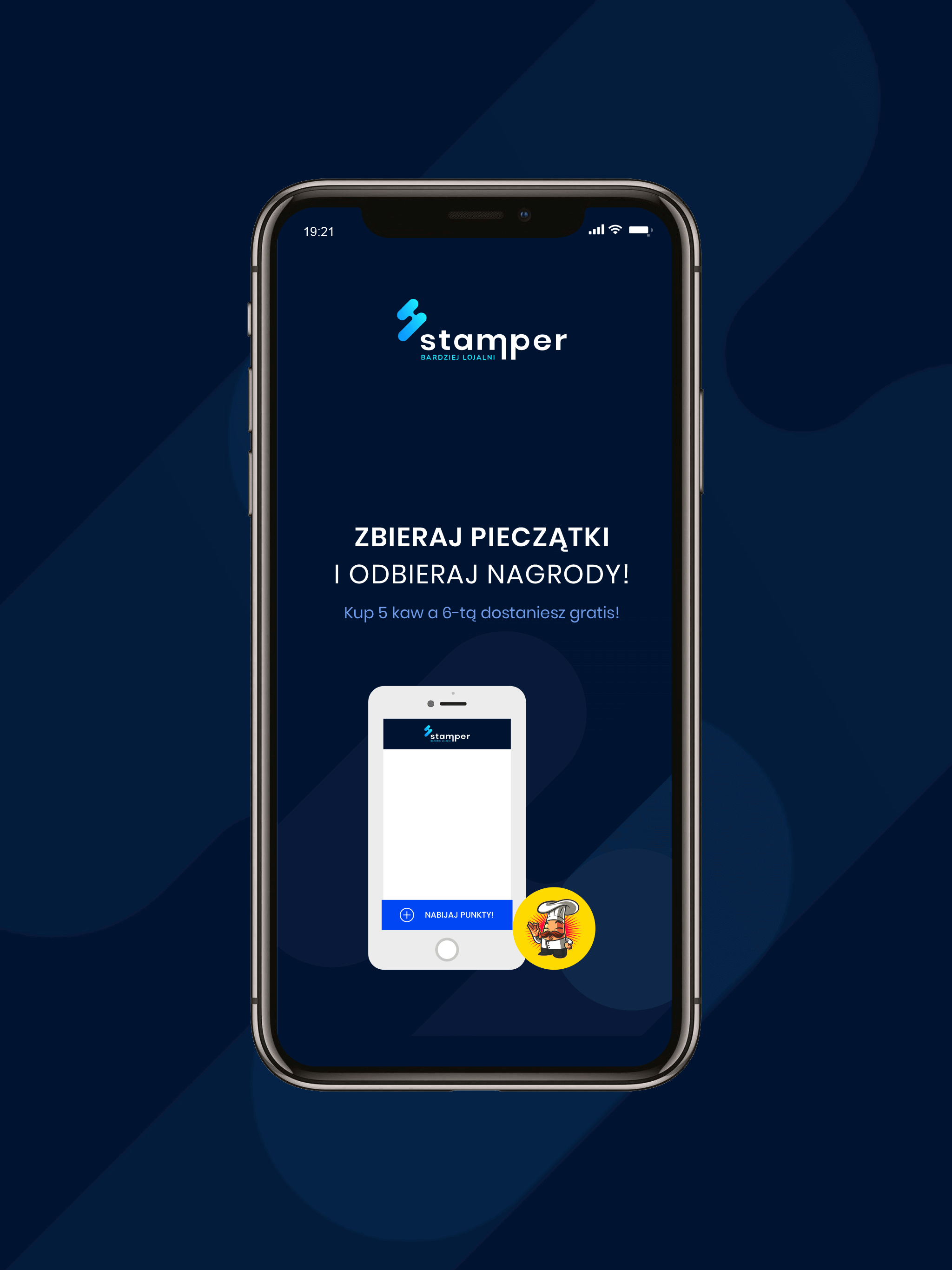
Stamper is a new, proprietary solution on the Polish market that allows organizing loyalty programs using a mobile application and an online system for managing promotions. It replaces traditional paper cards and stamps with a single, convenient application offering many configuration possibilities.
Stamper
Scope of work
Branding
Logo
Production and printing
Social media
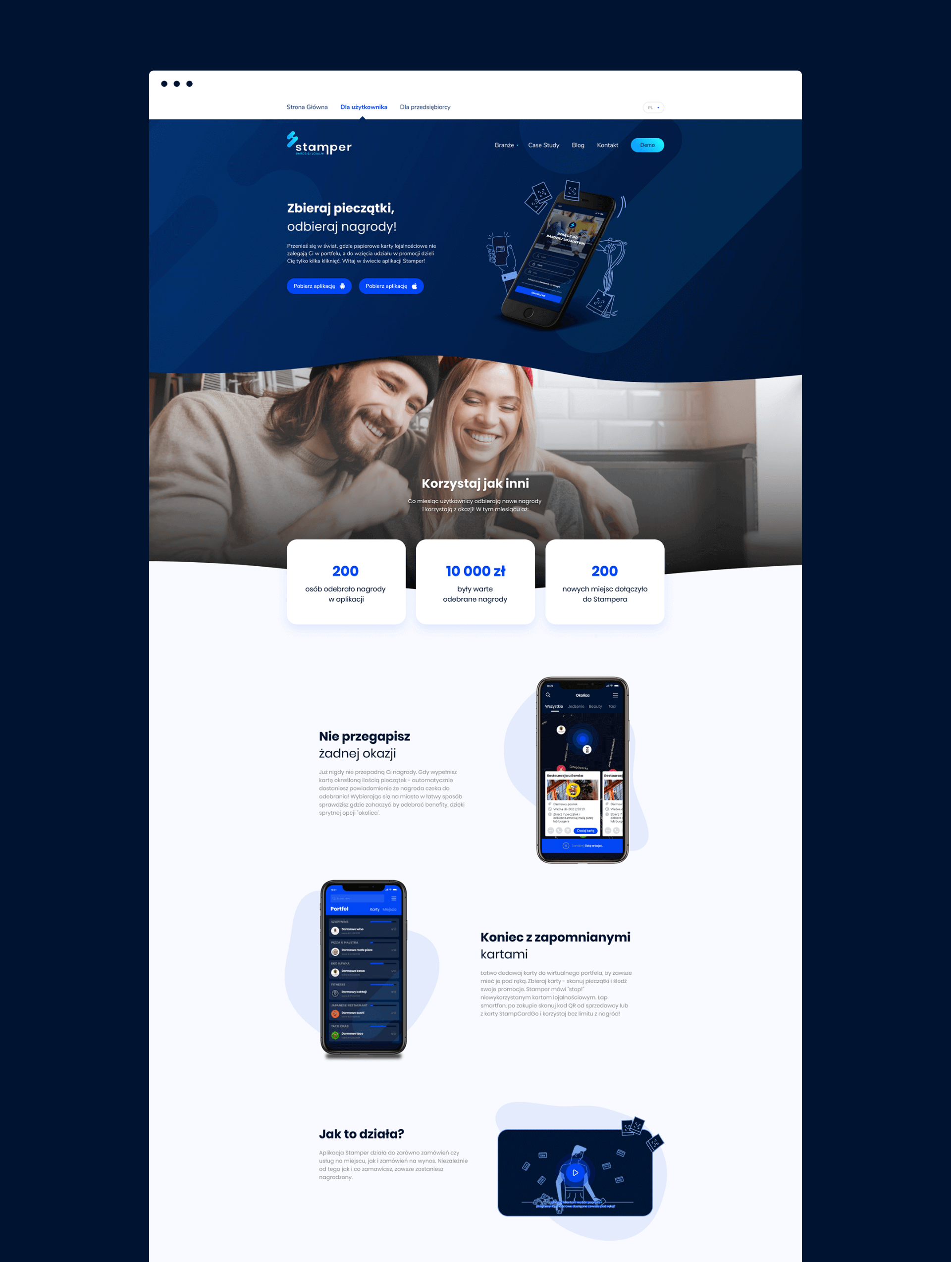
Website
2021
Stamper
2021
Branding
Logo
Production and printing
Social media
Website
Process
 rotate(-45)' fill='%23c2f500'/%3E%3C/svg%3E%0A)
Objective
To create a new brand from scratch and help introduce it to the market. Collaboration on multiple levels—visual and marketing—that together will translate into the application's success among business and private users.
Solution
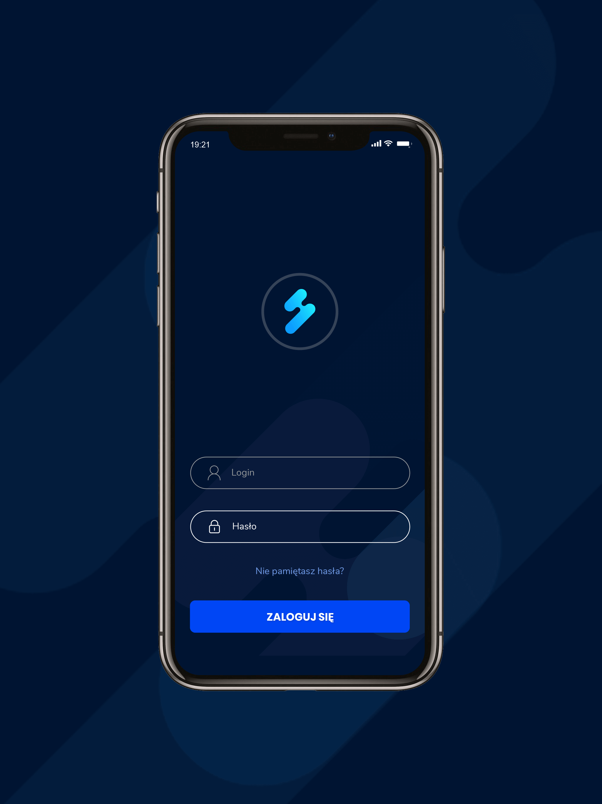
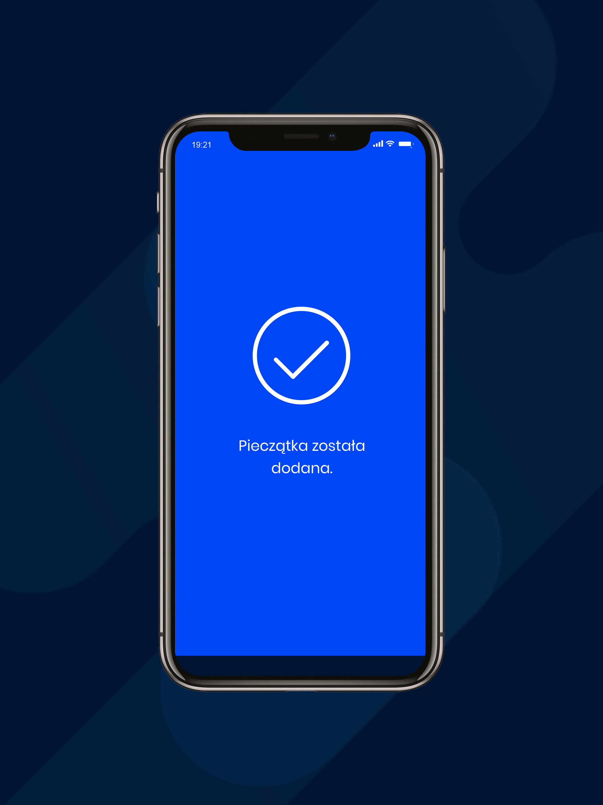
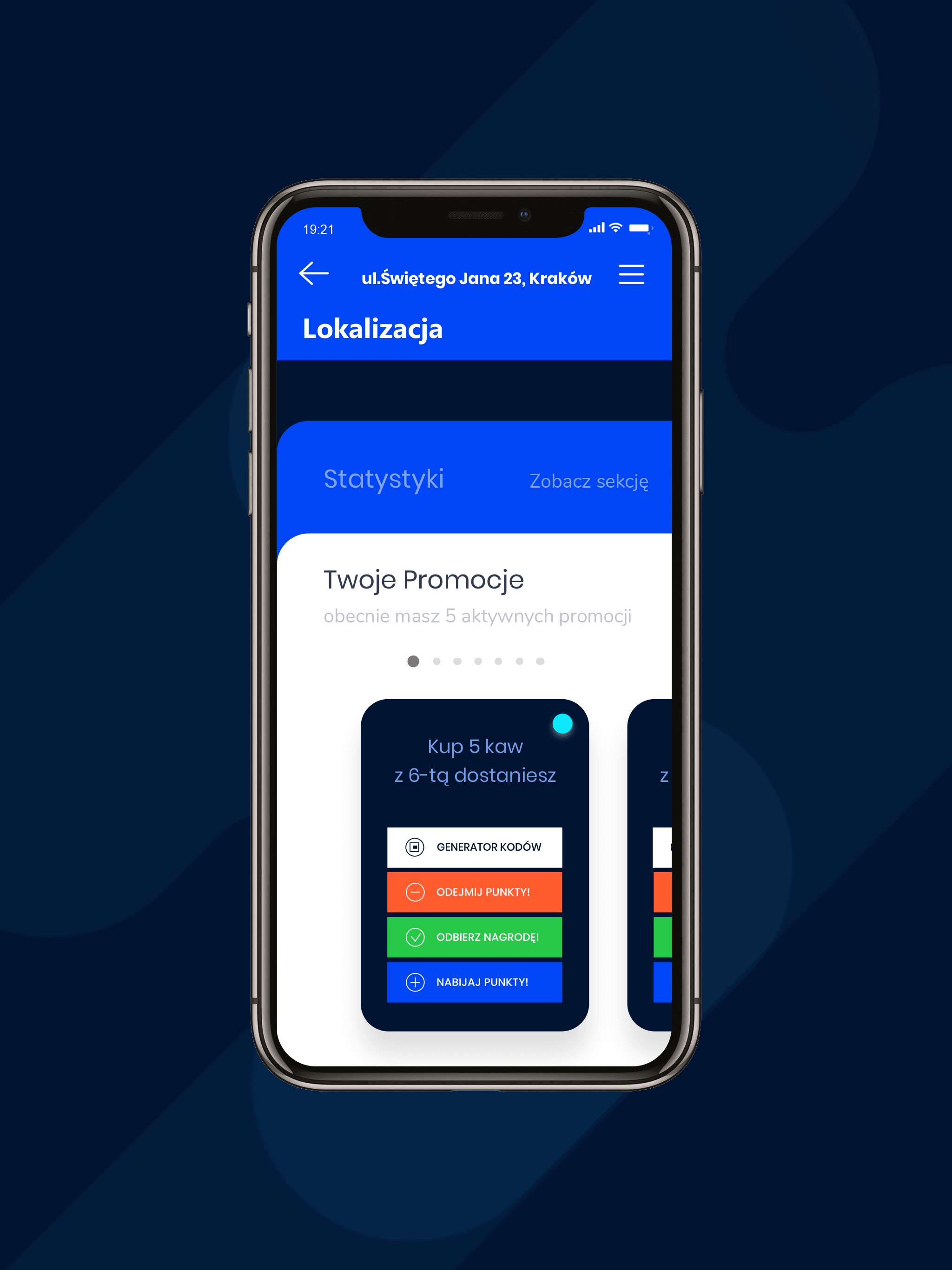
Creating the name "Stamper," which is associated with the essence of the brand's operation and will work well in various markets. Developing a casual and friendly communication language with users and entrepreneurs, focused on creating dialogue. Structuring the mobile application, drawing conclusions from tests, and implementing changes, resulting in a more intuitive application. Finally, providing 360 support in creating marketing and promotional materials.
Result
A visually and communicatively consistent new brand on the market, which continues to expand its list of clients and users.
Big idea
Website
Key words


Semantics
RGB: 0 70 244
HEX: #0046f4
RGB: 0 20 50
HEX: #001432
RGB: 234 240 252
HEX: #eaf0fc
Typography
Main font
Auxiliary font

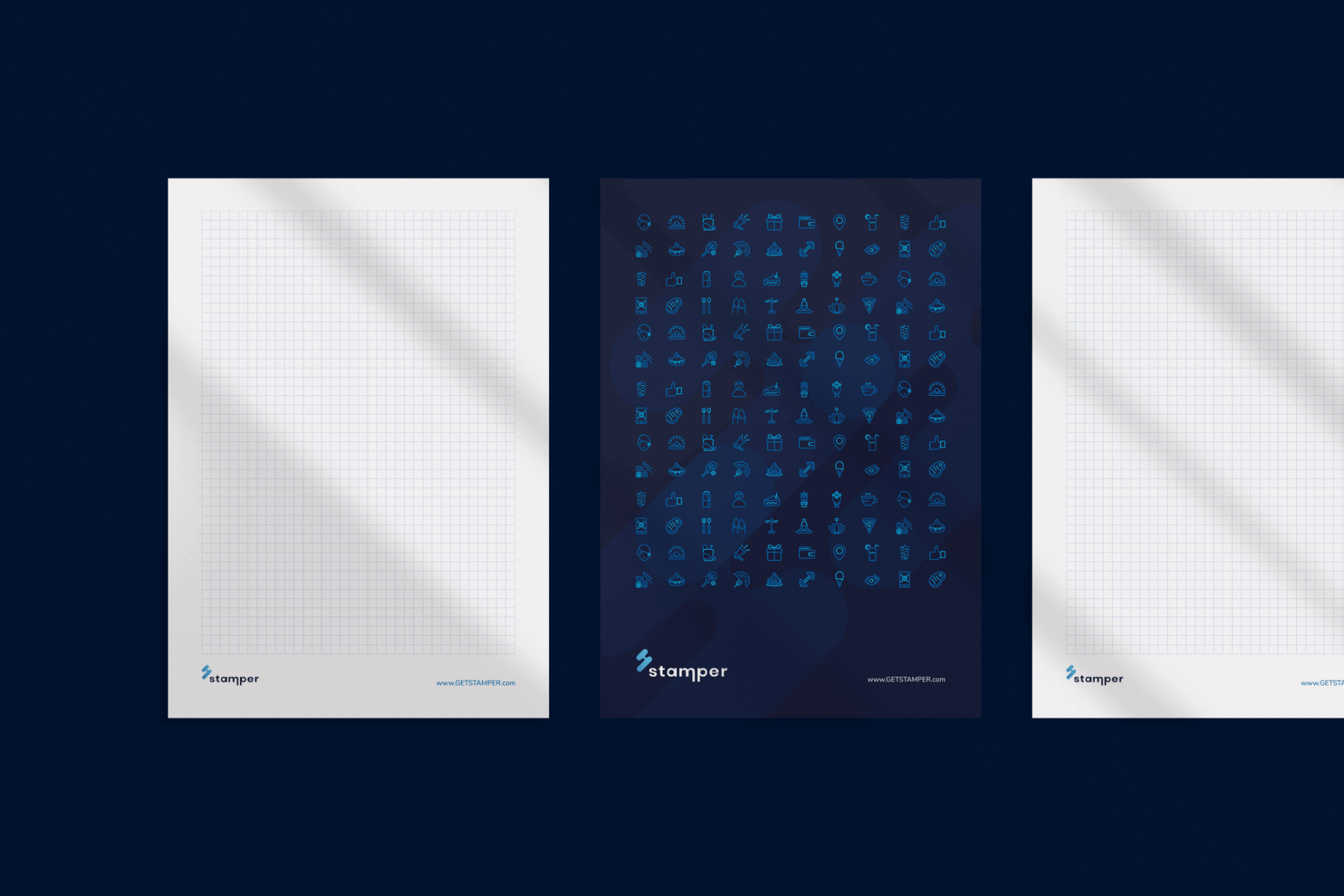
Iconography
