.svg)
.svg)

visual identity
visual identity
Valare
A new brand engaged in the production of high-quality wall coverings, with diverse textures and patterns created by renowned designers.
Client
Scope of work
Branding
Logo
Website
Valare
Scope of work
Branding
Logo
Website
Date
2021
2021
Client
Valare
Date
2021
2021
Scope of work
Branding
Logo
Website
Branding
Logo
Website
plakaty
plakaty szablon
Process
 rotate(-45)' fill='%23c2f500'/%3E%3C/svg%3E%0A)
Goal
To create an identity for a premium brand entering the Polish and international markets. Focusing on showcasing high-quality materials and service, as well as exceptional design.
Solution
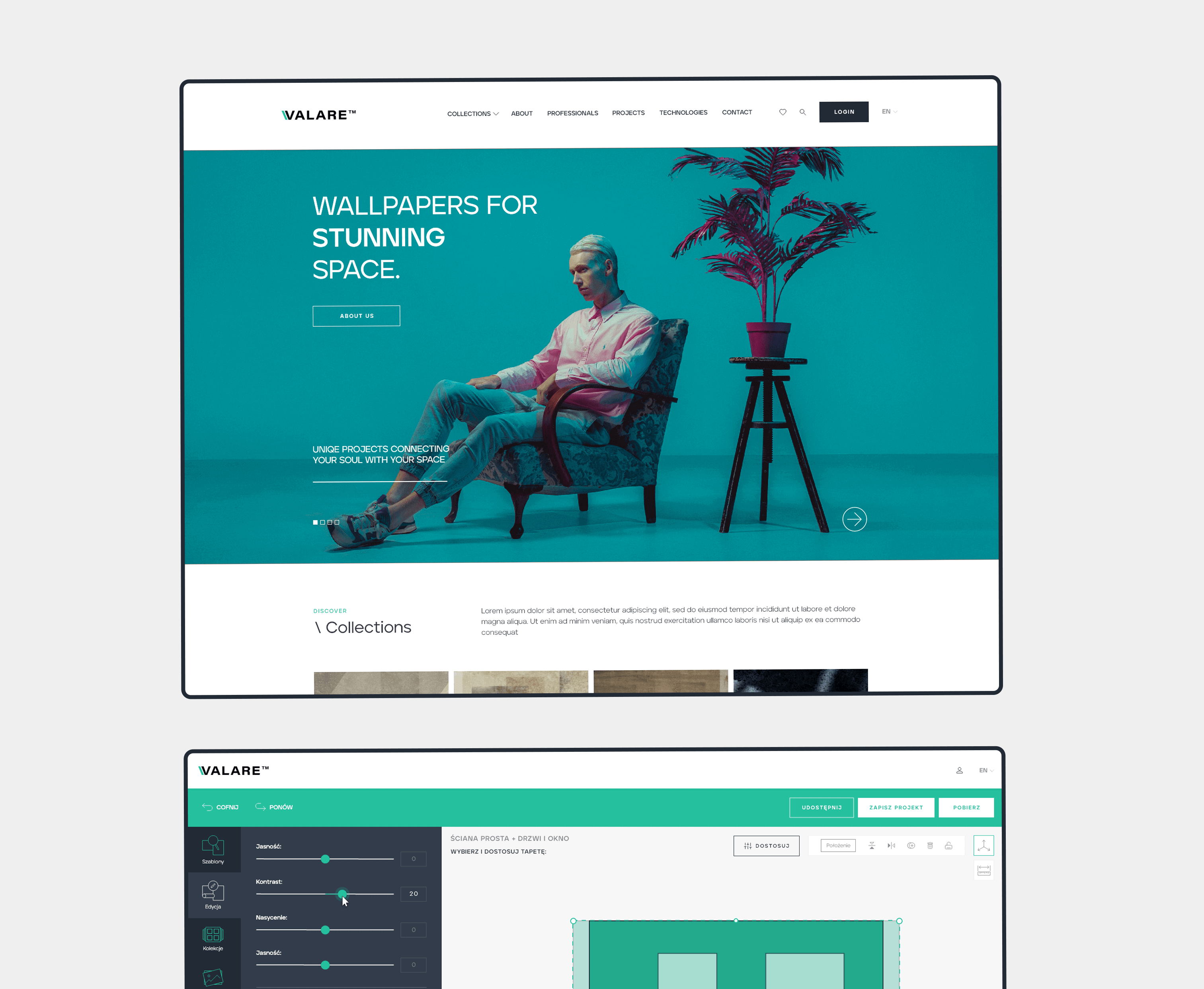
We created a complete identity for the new brand – from the company name, through corporate materials, to a website with an extensive configurator. The identity is based on subdued colors with a turquoise accent, minimalist typography, and high-quality interior photos.
Big idea
As a new brand entering the market, Valare must immediately be associated with quality and a designer approach to design. It should evoke desire, respect, and align with global standards.
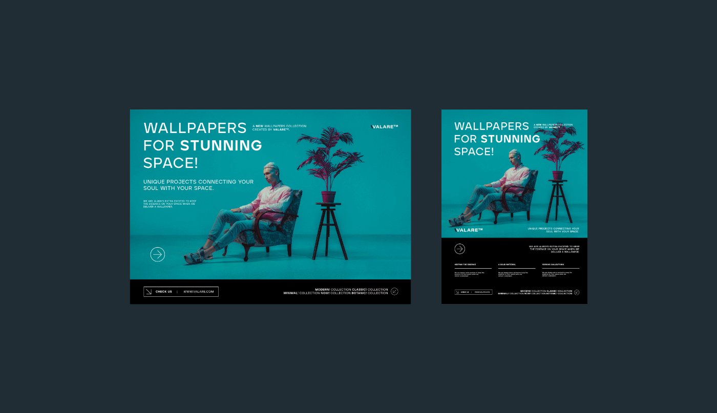
bannery
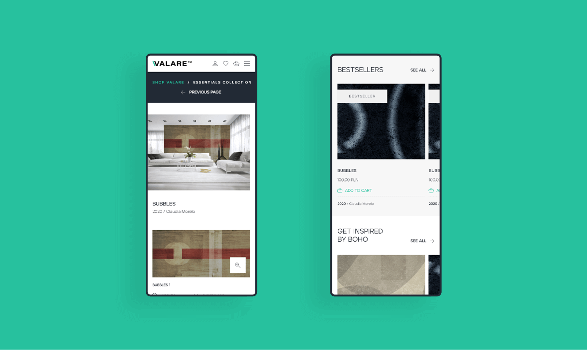
Website
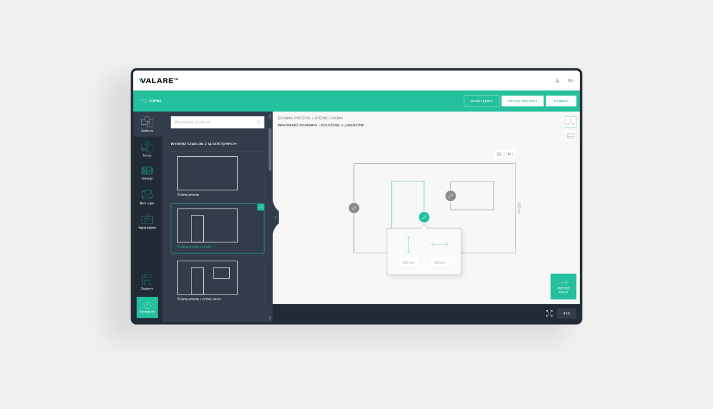
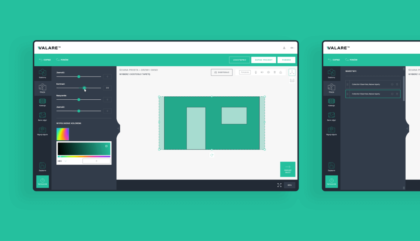
The created website is the heart of the entire identity and the main sales tool. We aimed for simplicity with a memorable accent; therefore, the company color is used in many elements, which will be associated with Valare. The website is intended to serve a practical function and work primarily with architects; hence, an entire zone was created for them, where they can design their own patterns, collect favorite collections, and gain knowledge in the field of installation tips.
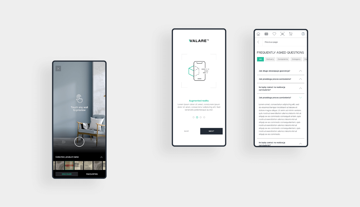
aplikacja mobilna
Widok mobilny
Key words
Design Trends Customisation Responsive
Responsive Customisation Trends Design
Design Trends Customisation Responsive
Responsive Customisation Trends Design
Responsive Customisation Trends Design
Design Trends Customisation Responsive
Responsive Customisation Trends Design
Semantics
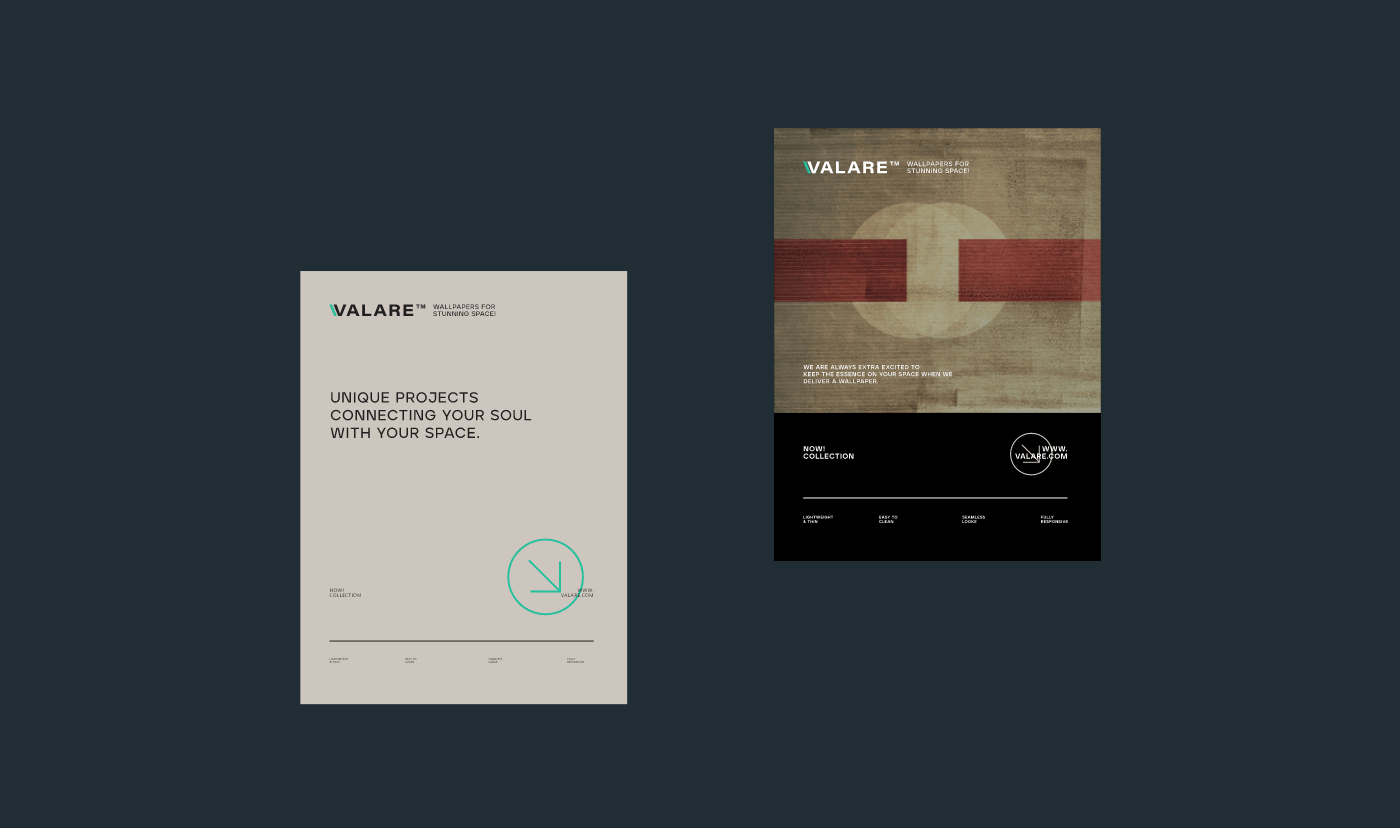
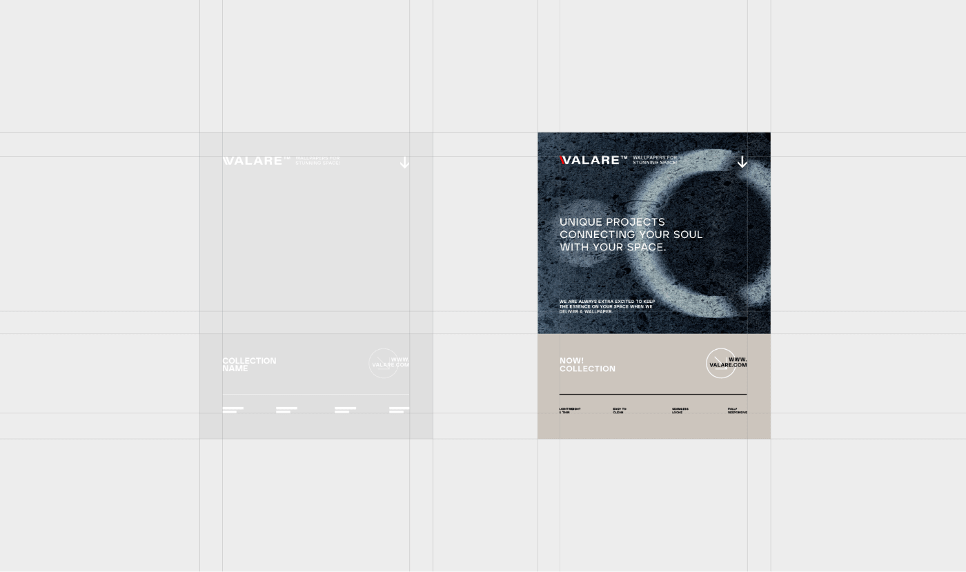
The logo has a minimalist typographic form with an accent on the letter V.
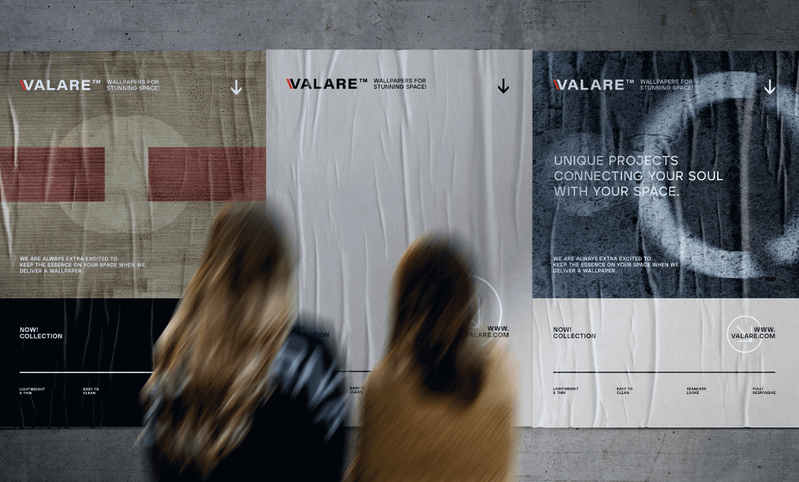
3-plakaty-ulica
CMYK: 81 0 18 25
RGB: 37 192 158
HEX: #25c09e
RGB: 37 192 158
HEX: #25c09e
CMYK: 36 21 0 79
RGB: 34 42 53
HEX: #222a35
RGB: 34 42 53
HEX: #222a35
CMYK: 0 0 0 3
RGB: 247 247 247
HEX: #f7f7f7
RGB: 247 247 247
HEX: #f7f7f7
Typography
We chose a single font family – Aventa, in various weights.
Main font
Aventa Bold
Auxiliary font
Aventa Regular

Recent projects
Pokket
Pokket is a new, highly dynamic brand in the food industry, redefining the meaning of handy snacks. It offers convenient tube forms that fit in any pocket and flavors not yet available on the market.
Dawtona
Dawtona is a Polish leader in processing fresh vegetables and fruits, primarily sourced from its own fields, utilizing an integrated production model to ensure the highest quality products.
Made in Podlasie
Made in Podlasie is a Polish brand entering the market in Kuwait, symbolising authenticity, quality and proximity to nature. It offers healthy food produced in the Podlasie region, aimed at people who want to take special care of the quality of the products they consume.
DCX
A European engineering and manufacturing company offering a wide range of liquid cooling solutions, including design, production, implementation, and commissioning of technologies.