.svg)
.svg)

Itrons
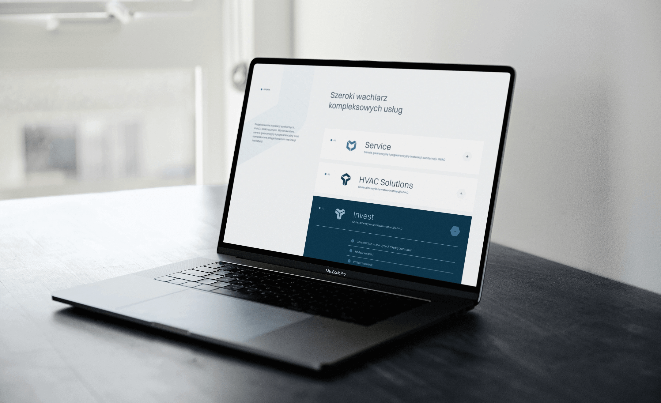
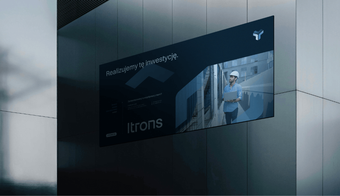
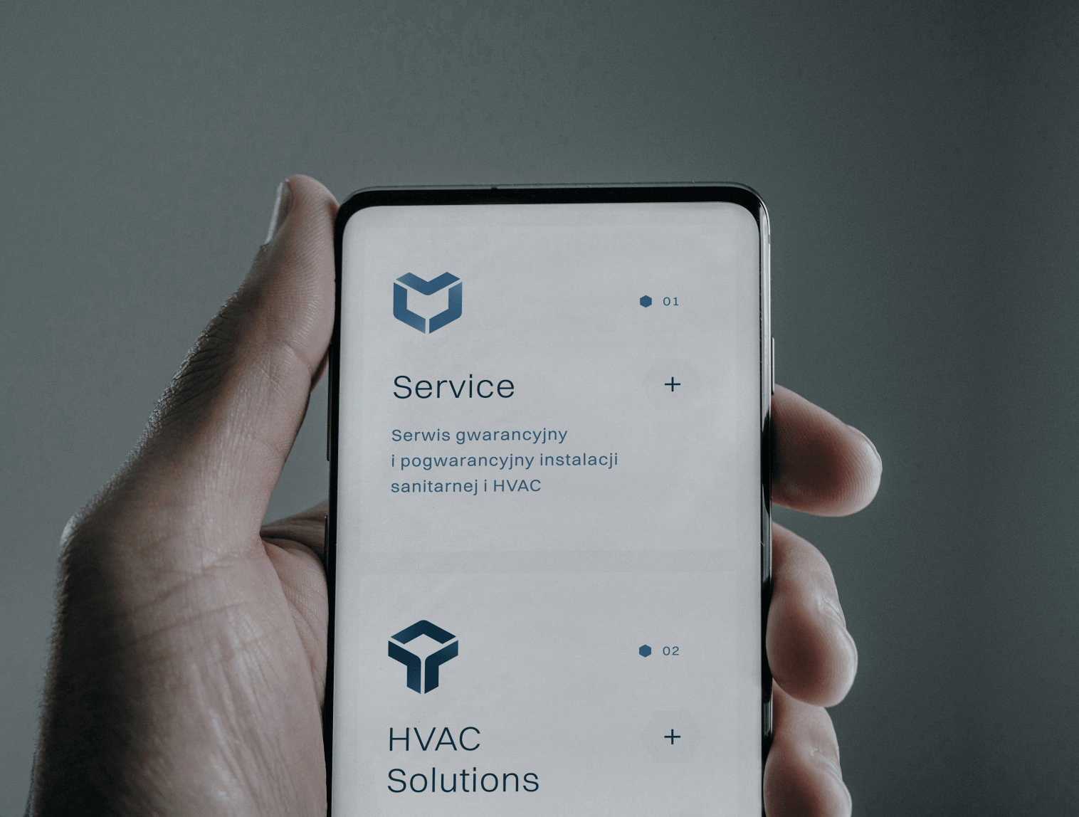
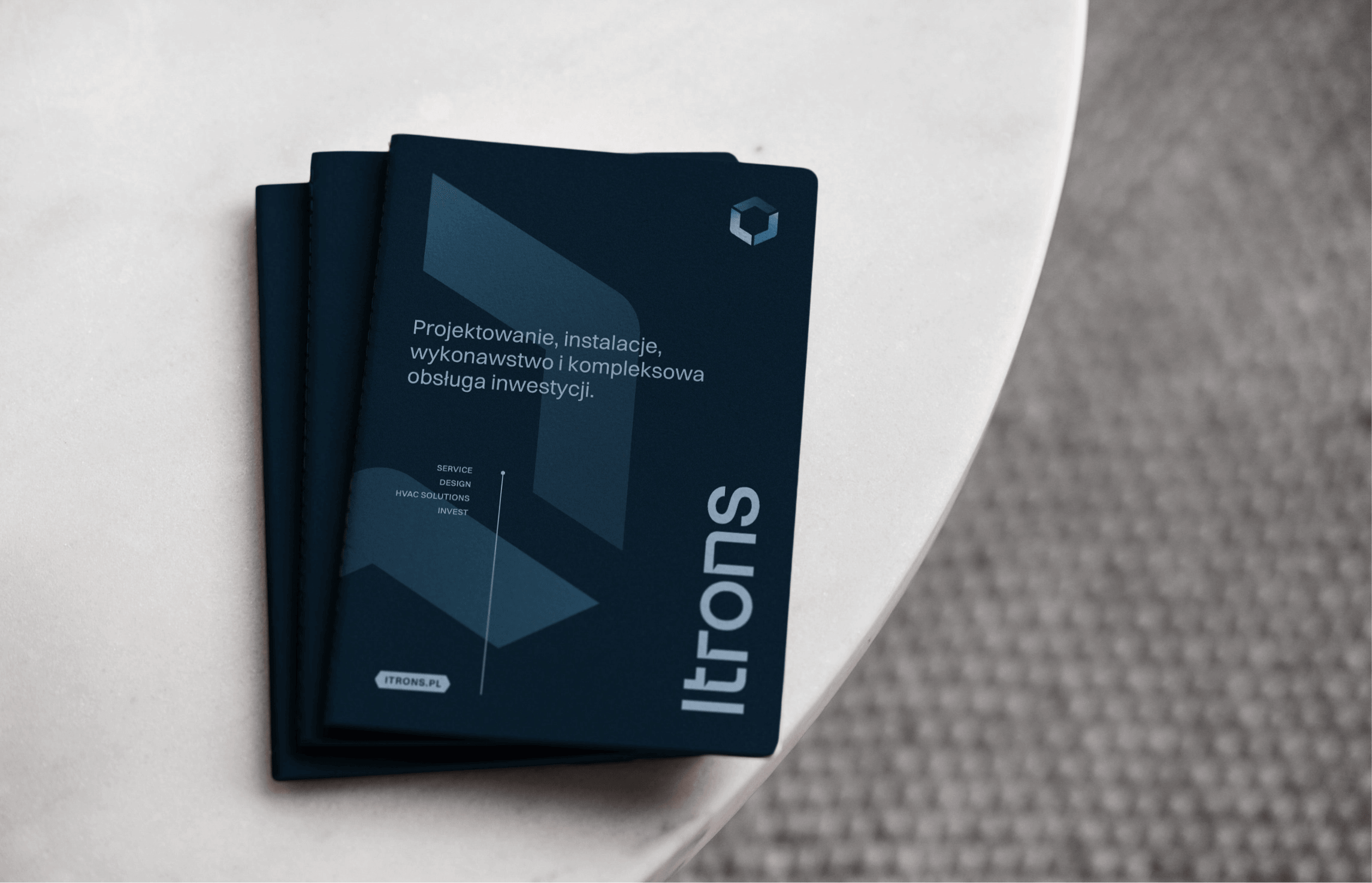
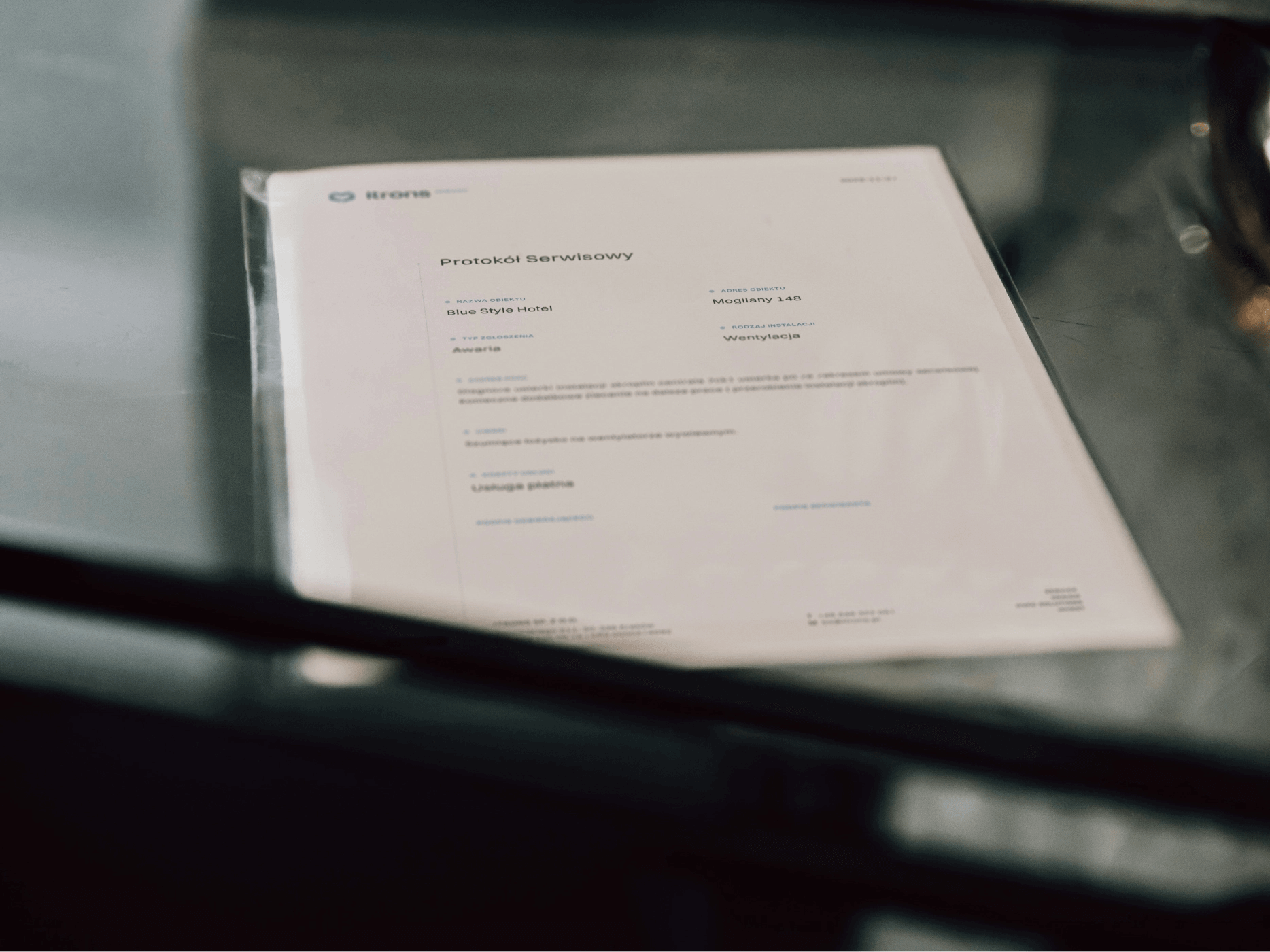
Itrons is a company specializing in the design and execution of sanitary, HVAC, and electrical installations, as well as providing warranty and post-warranty services. They offer comprehensive preparation and implementation of investments.
Itrons
Scope of work
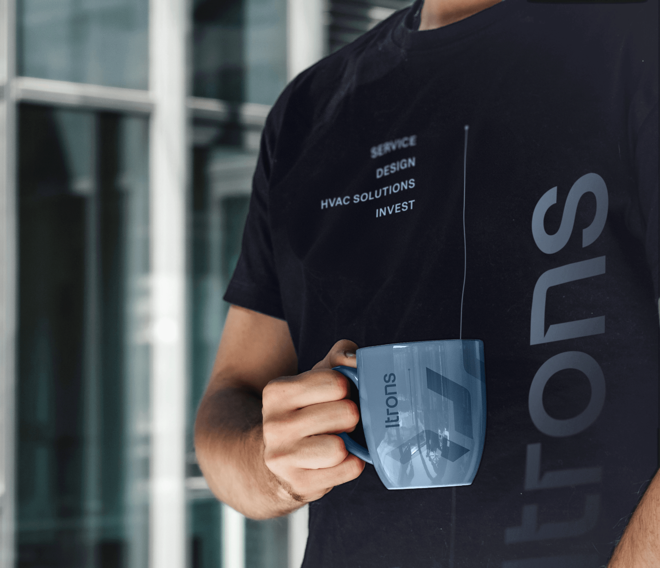
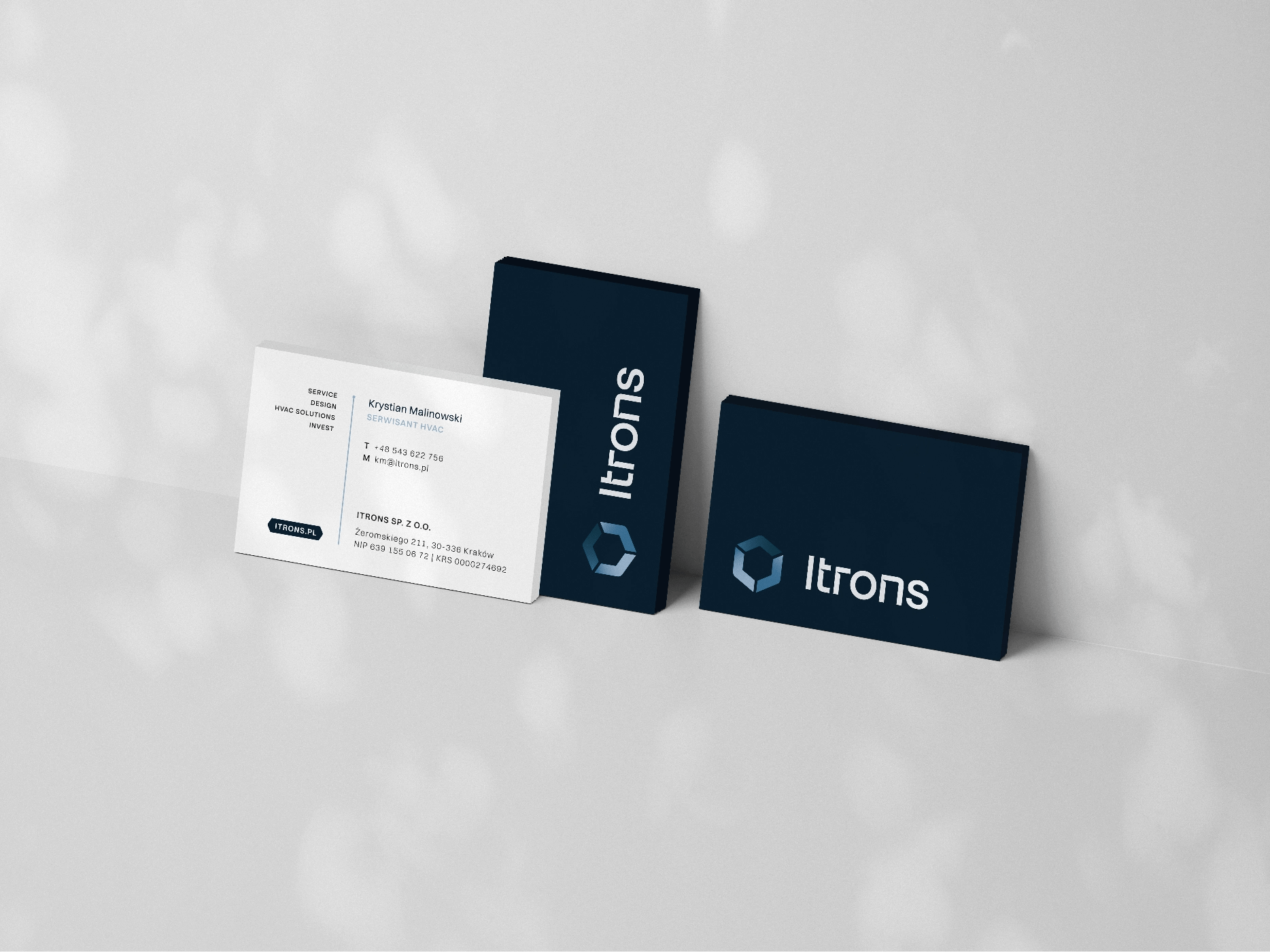
Branding
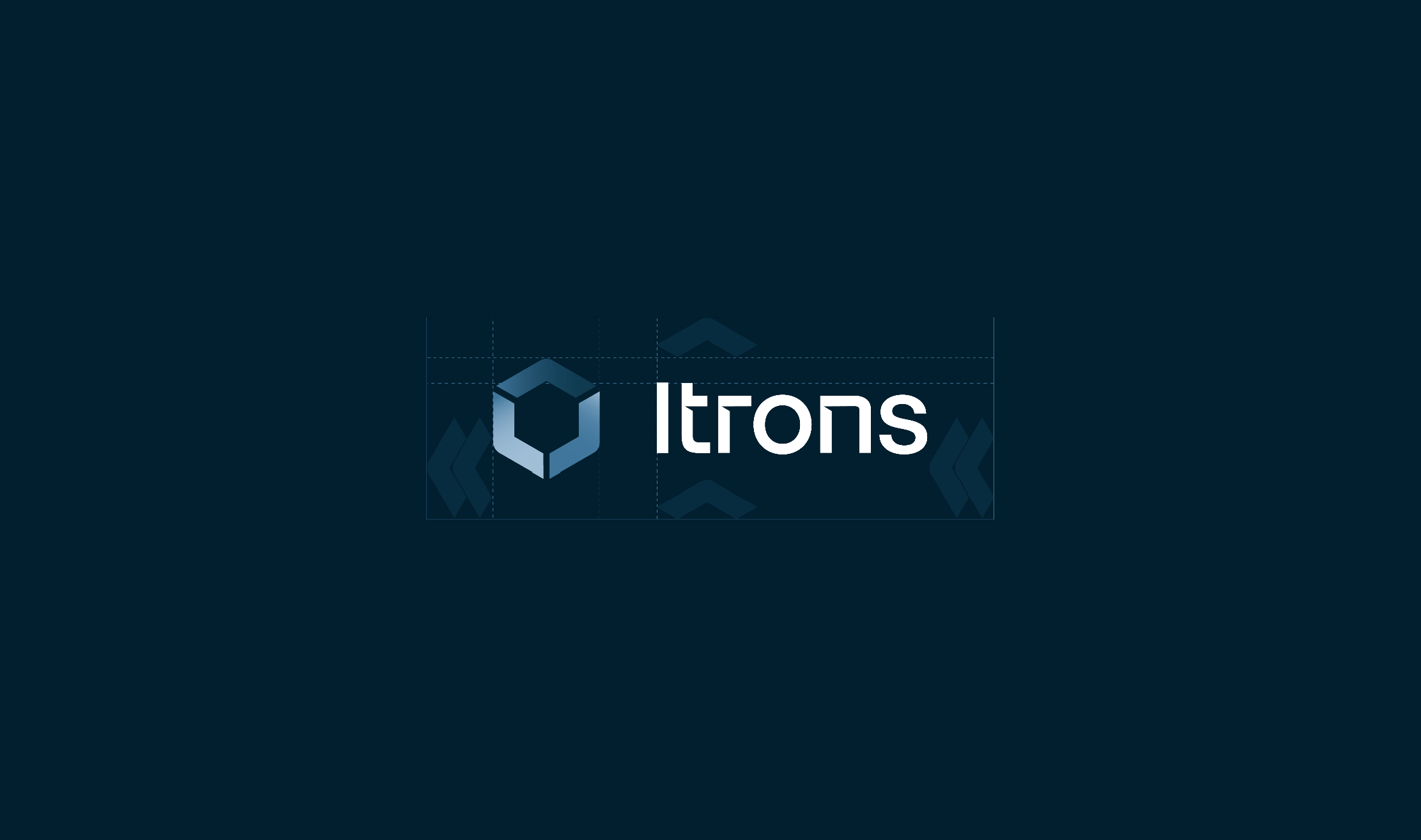
Logo
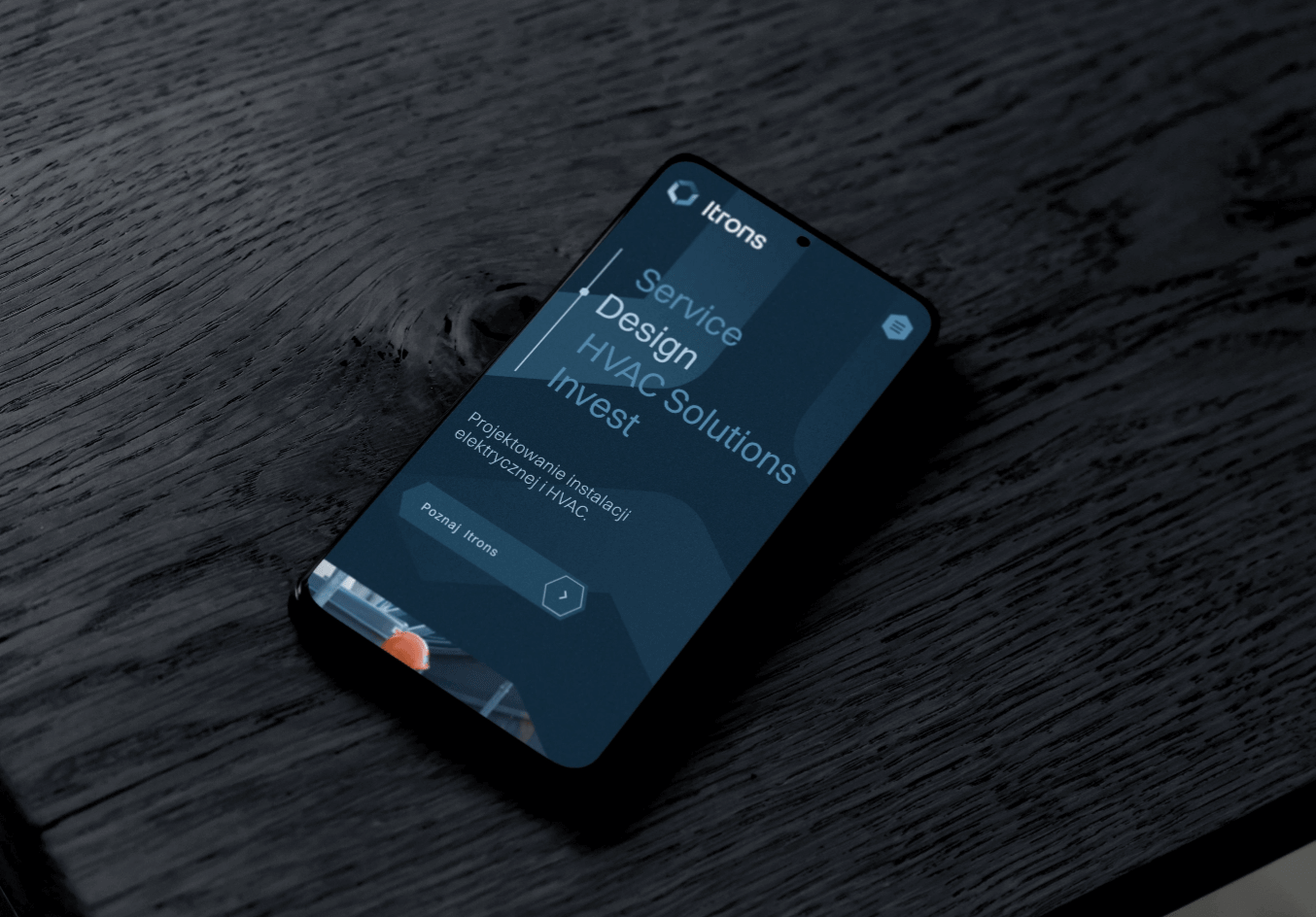
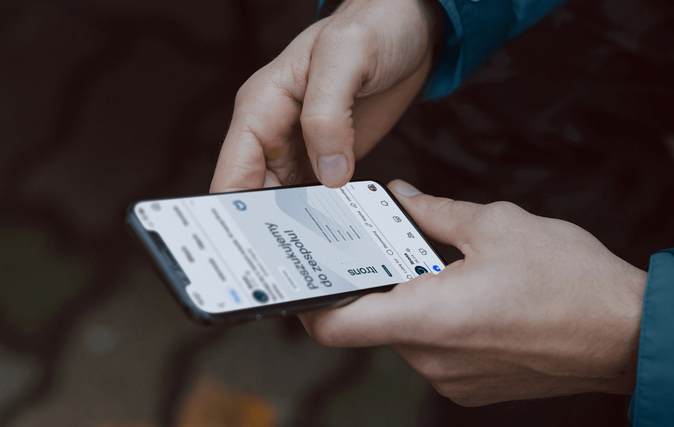
Website
2024
Itrons
2024
Branding
Logo
Website
Process
 rotate(-45)' fill='%23c2f500'/%3E%3C/svg%3E%0A)
Objective
Rebranding and streamlining communication for a brand offering a wide range of services. The goal was to encapsulate a sense of security, reliability understood as timeliness and high quality, as well as empathy and professionalism within the brand identity.
Solution
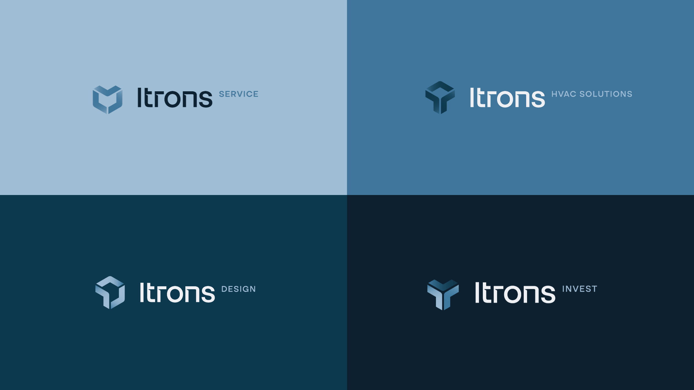
Creation of sub-brands, thereby clearly dividing services within each, which organizes communication and resolves previous issues. Harmonious color schemes and typography for each brand. Utilization of logo components and gradients in visual communication.
Result
A modern, businesslike, and professional image that stands out in the industry. Facilitated and transparent communication of sub-brands.
Big idea
Key words
Brand Portfolio
Materials
RGB: 12 34 50
HEX: #0c2232
RGB: 61 119 157
HEX: #3d779d
RGB: 159 188 213
HEX: #9fbcd5
Website