.svg)
.svg)

Pure Dent
Pure Dent is a dental clinic established with a focus on high-quality services and patient care. They boast extensive clinical experience, specialized equipment, an individual approach, and a high level of treatment comfort.
Pure Dent
Scope of work
Branding
Logo
Social media
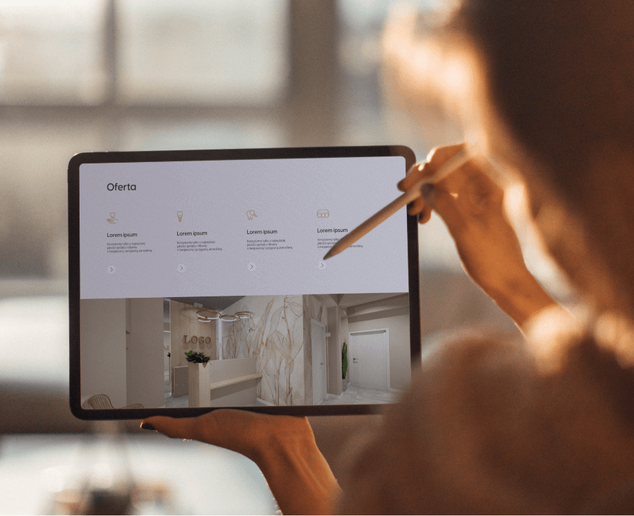
Website
2023
Pure Dent
2023
Branding
Logo
Social media
Website
Process
 rotate(-45)' fill='%23c2f500'/%3E%3C/svg%3E%0A)
Objective
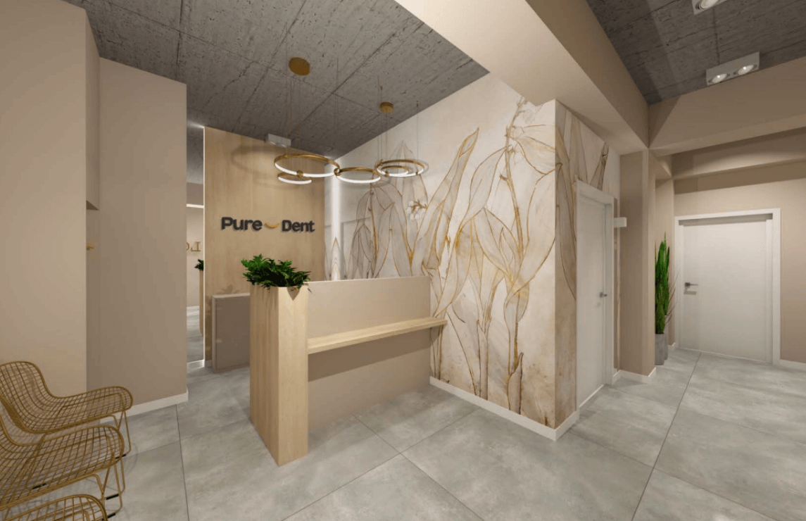
To develop a visual identity that combines extensive knowledge, quality, and professionalism with friendliness, patient focus, and comfort. To combat the fear of dentists by providing a sense of care and expertise.
Solution
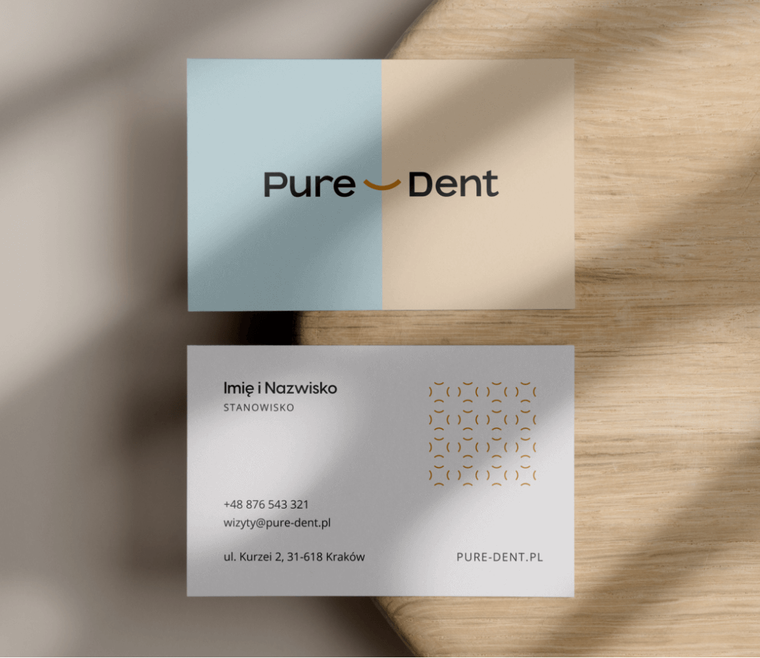
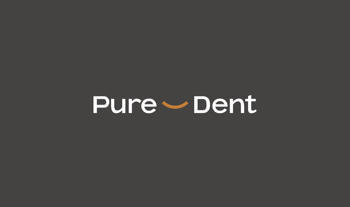
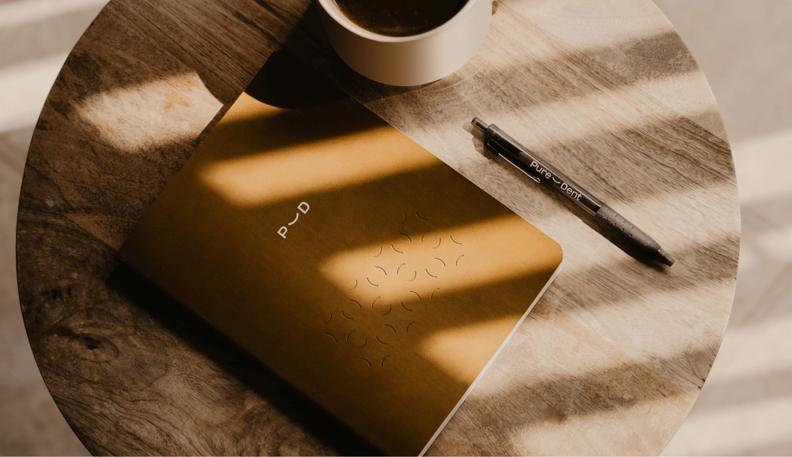
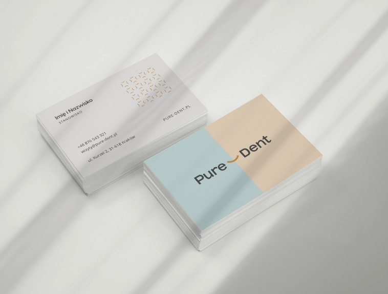
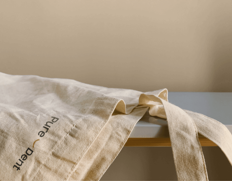
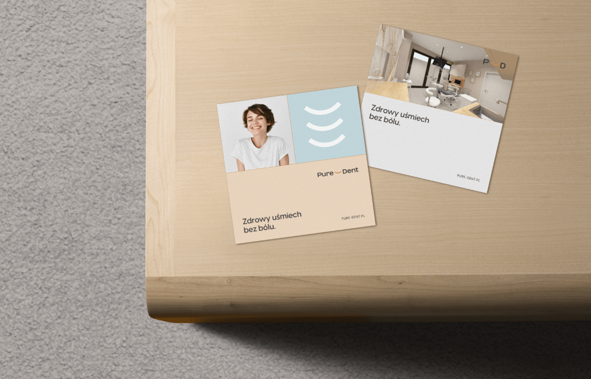
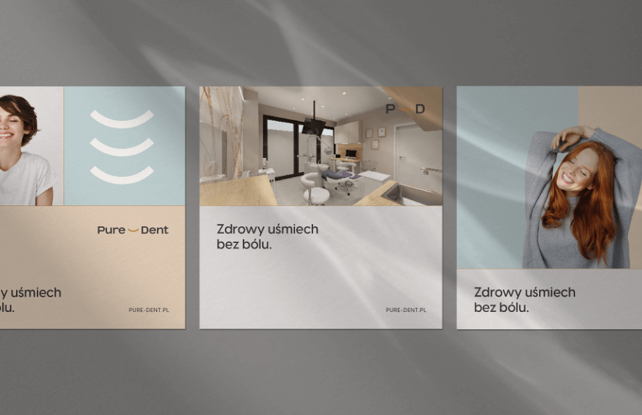
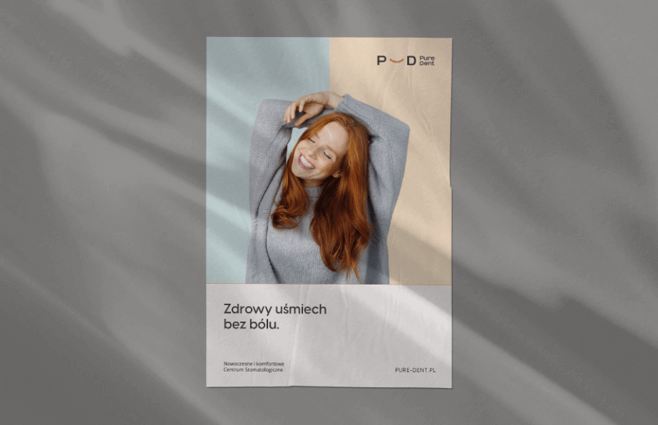
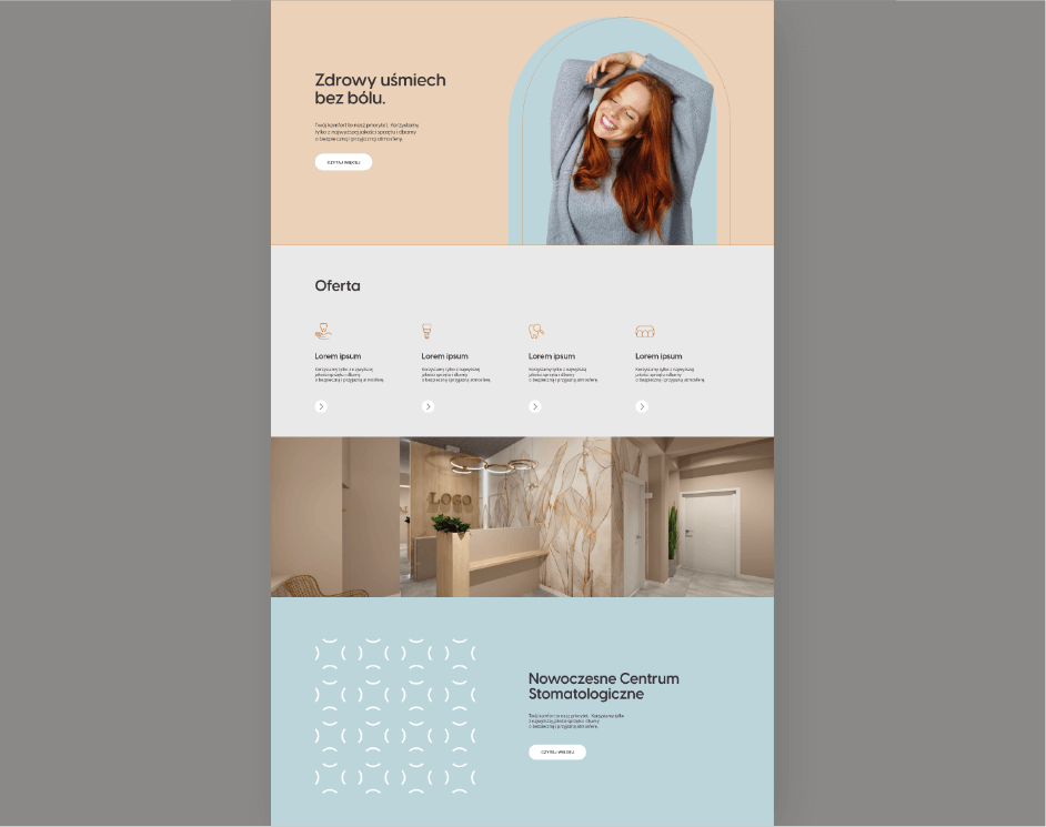
Utilizing pastel blue combined with delicate gold, beige, and grays, providing a sense of medical professionalism and high quality. A minimalist symbol of a smile appears in the logotype, symbolizing a friendly attitude and pleasant atmosphere during treatment.
Result
A visual identity consistent with the brand's values and concept, supporting the building of the desired image. A sense of security, quality, and comfort expressed graphically.
Big idea
Key words
Semantics

RGB: 237 217 194
HEX: #edd9c2
RGB: 205 146 73
HEX: #cd9249
RGB: 198 219 223
HEX: #c6dbdf
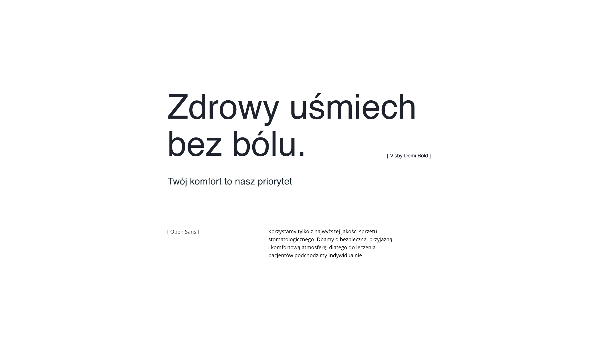
Typography
Main font
Auxiliary font
Website
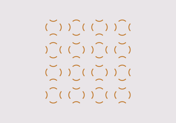
Pattern