.svg)
.svg)

Jaźniej
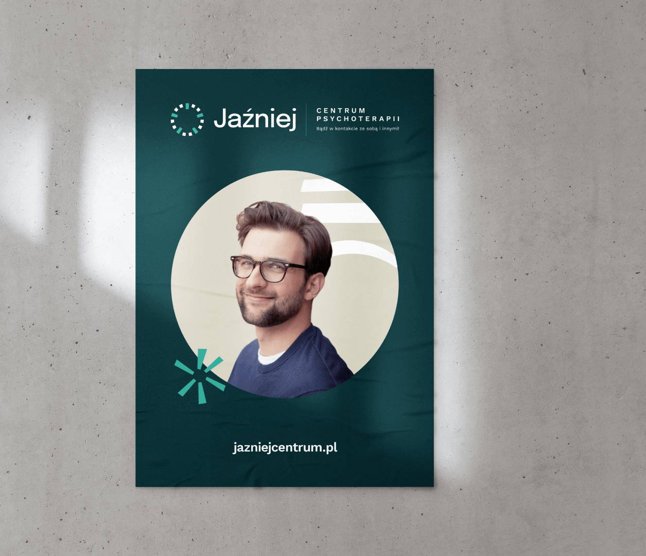
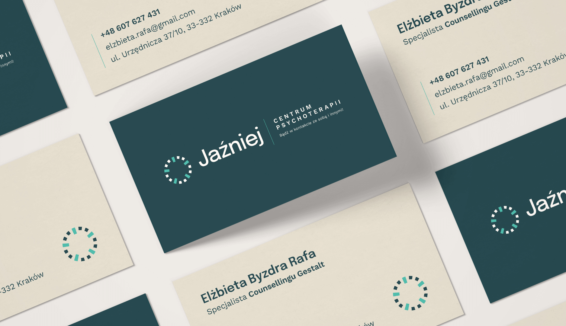
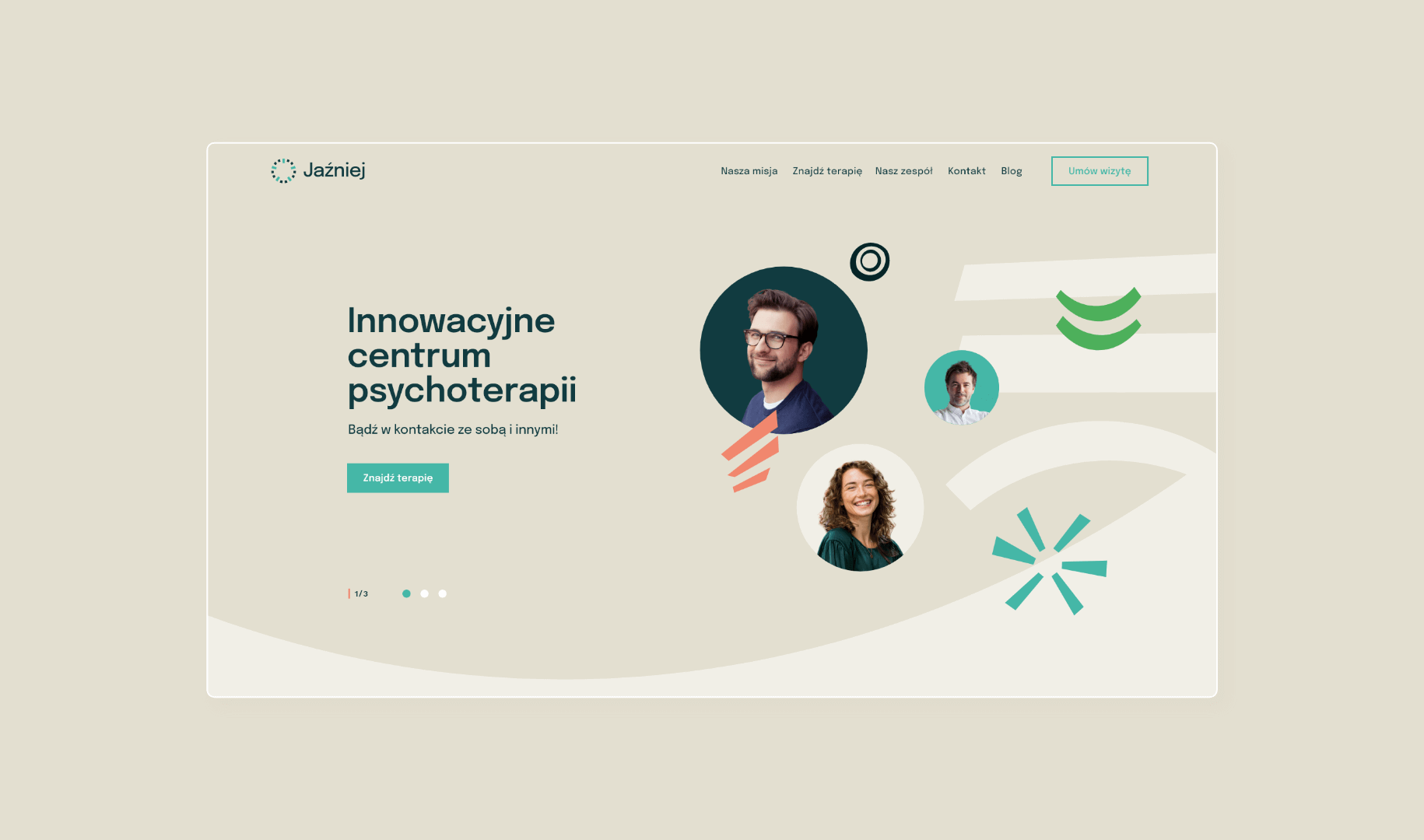
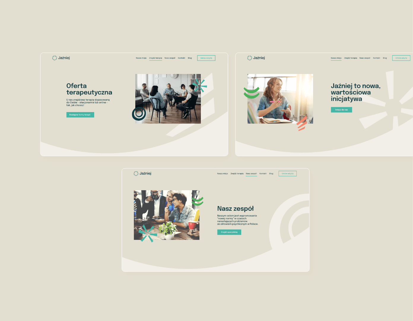
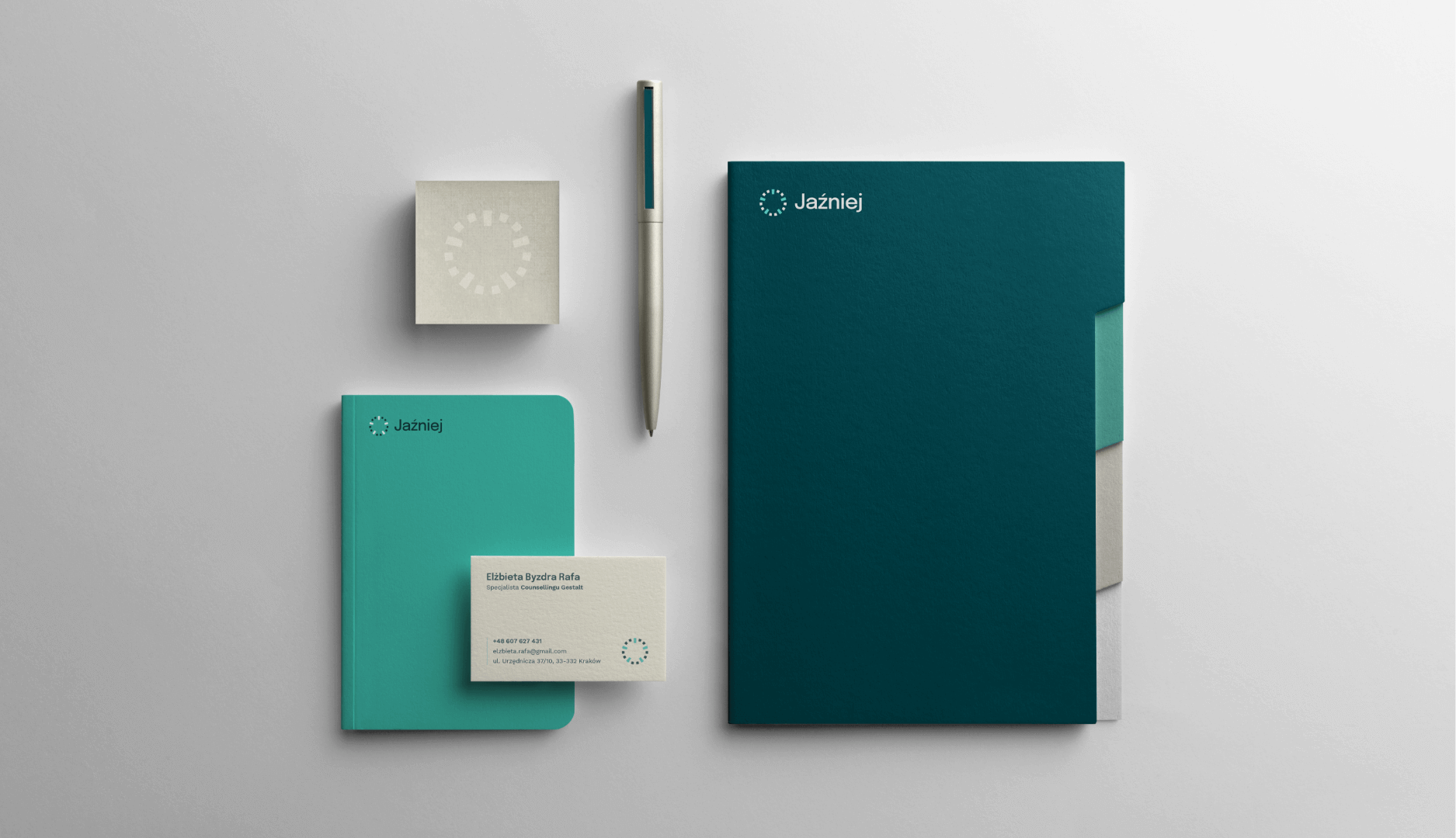
Jaźniej is a newly established psychotherapy center focusing on building a positive relationship with oneself and one’s emotions. It is a place that brings together specialists from various fields, concentrating on a holistic approach to patients’ problems.
Jaźniej
Scope of work
Branding
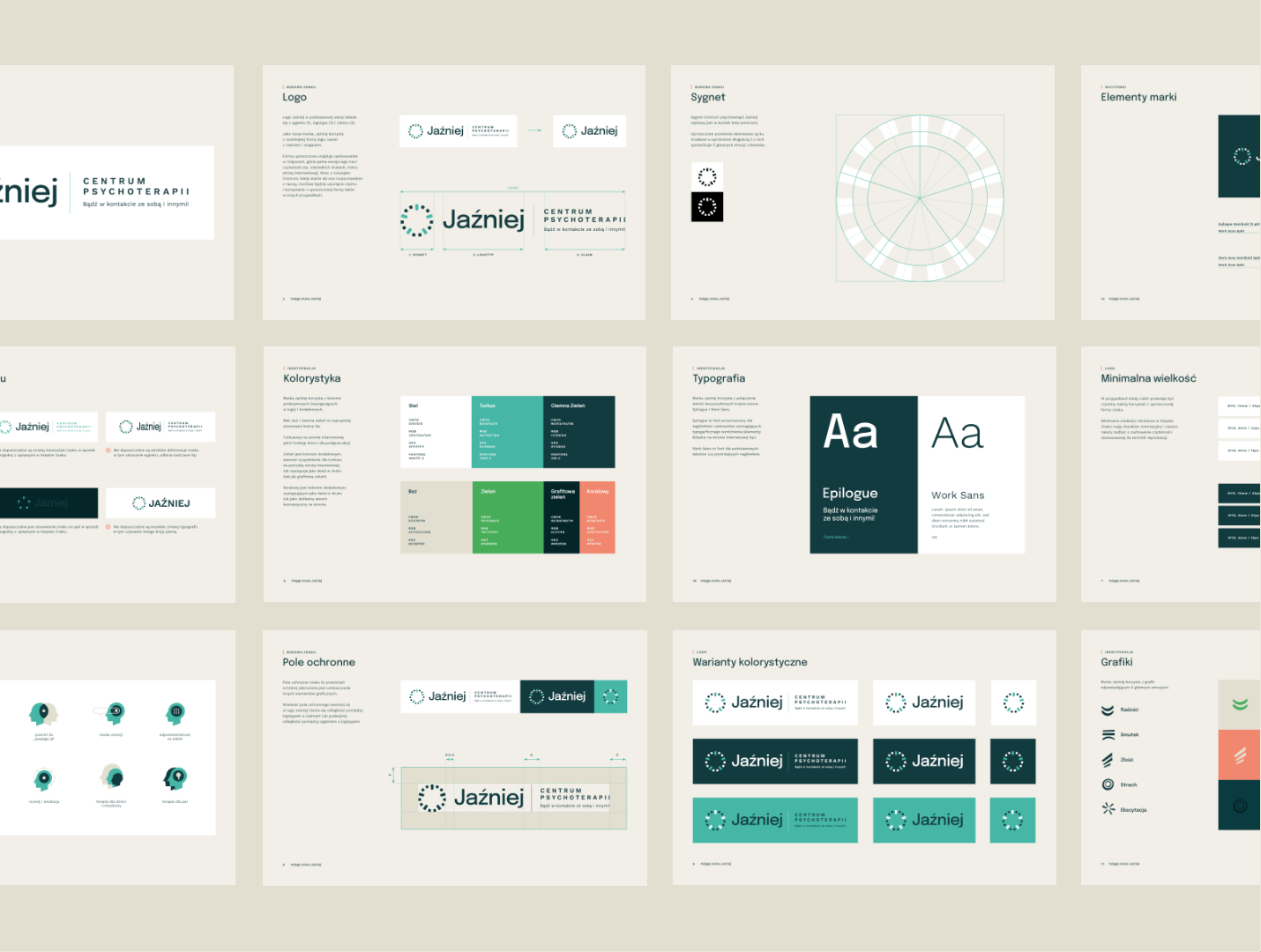
Logo
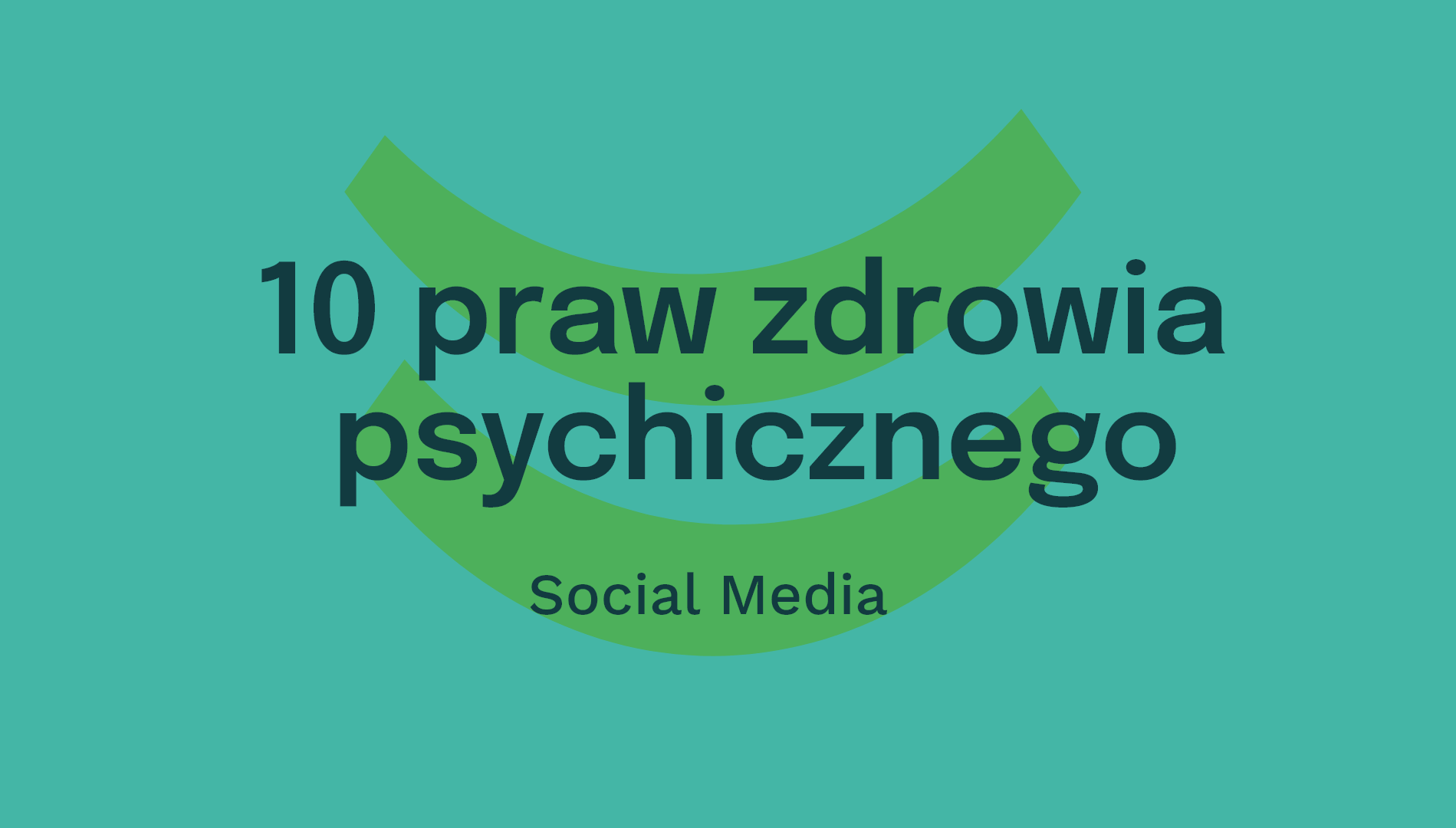
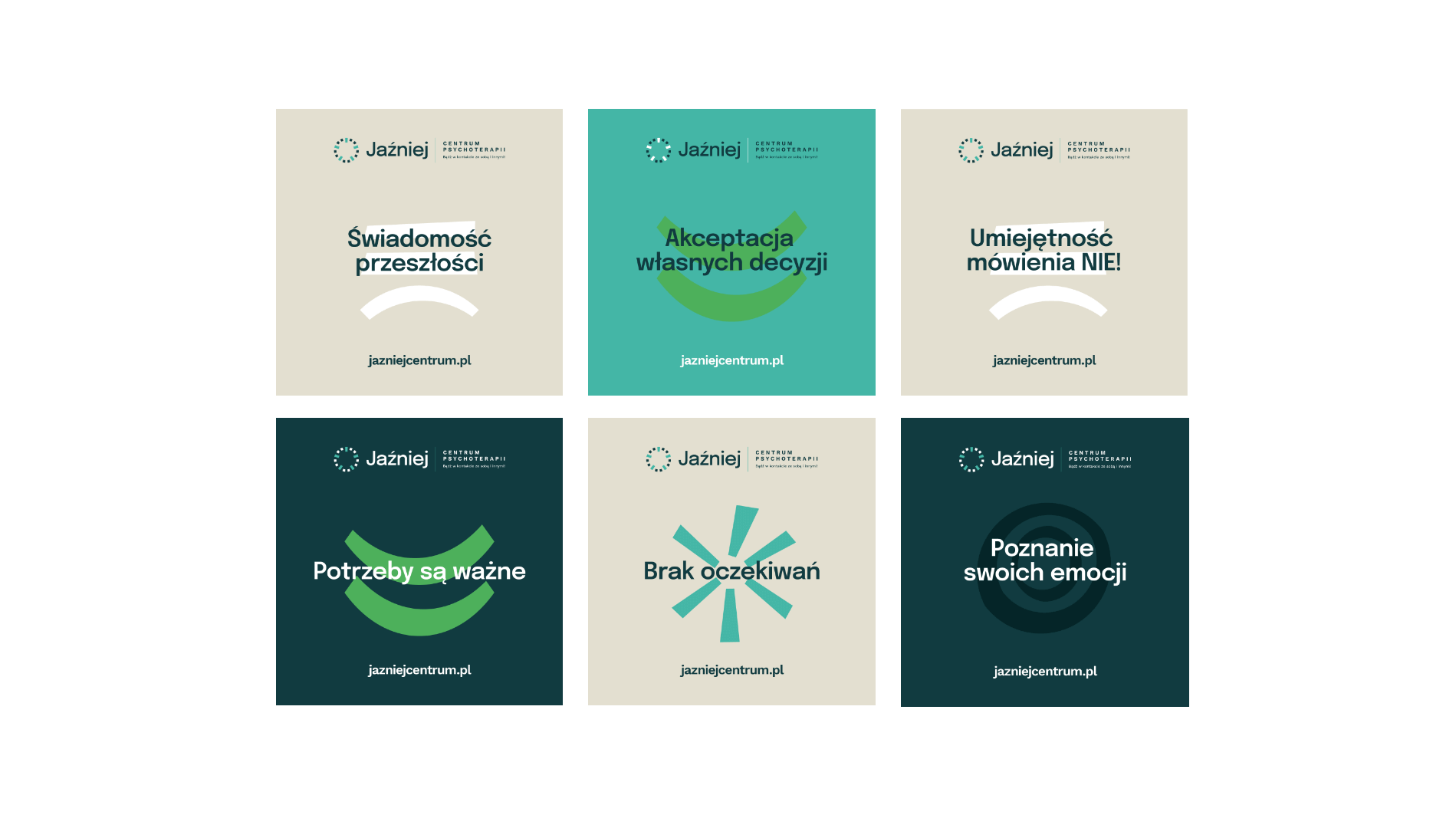
Social media
Website
2019
Jaźniej
2019
Branding
Logo
Social media
Website
Process
 rotate(-45)' fill='%23c2f500'/%3E%3C/svg%3E%0A)
Objective
To create a visual communication for a psychotherapy center with an innovative approach to therapy and mental health. To showcase what distinguishes the center from others, emphasizing its friendly nature and focus on the ability to recognize emotions.
Solution
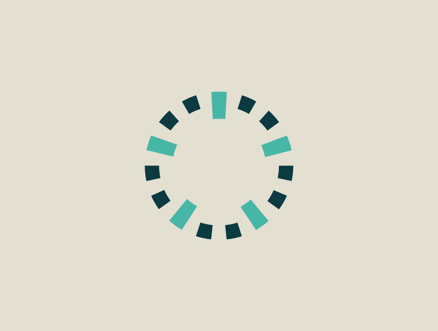
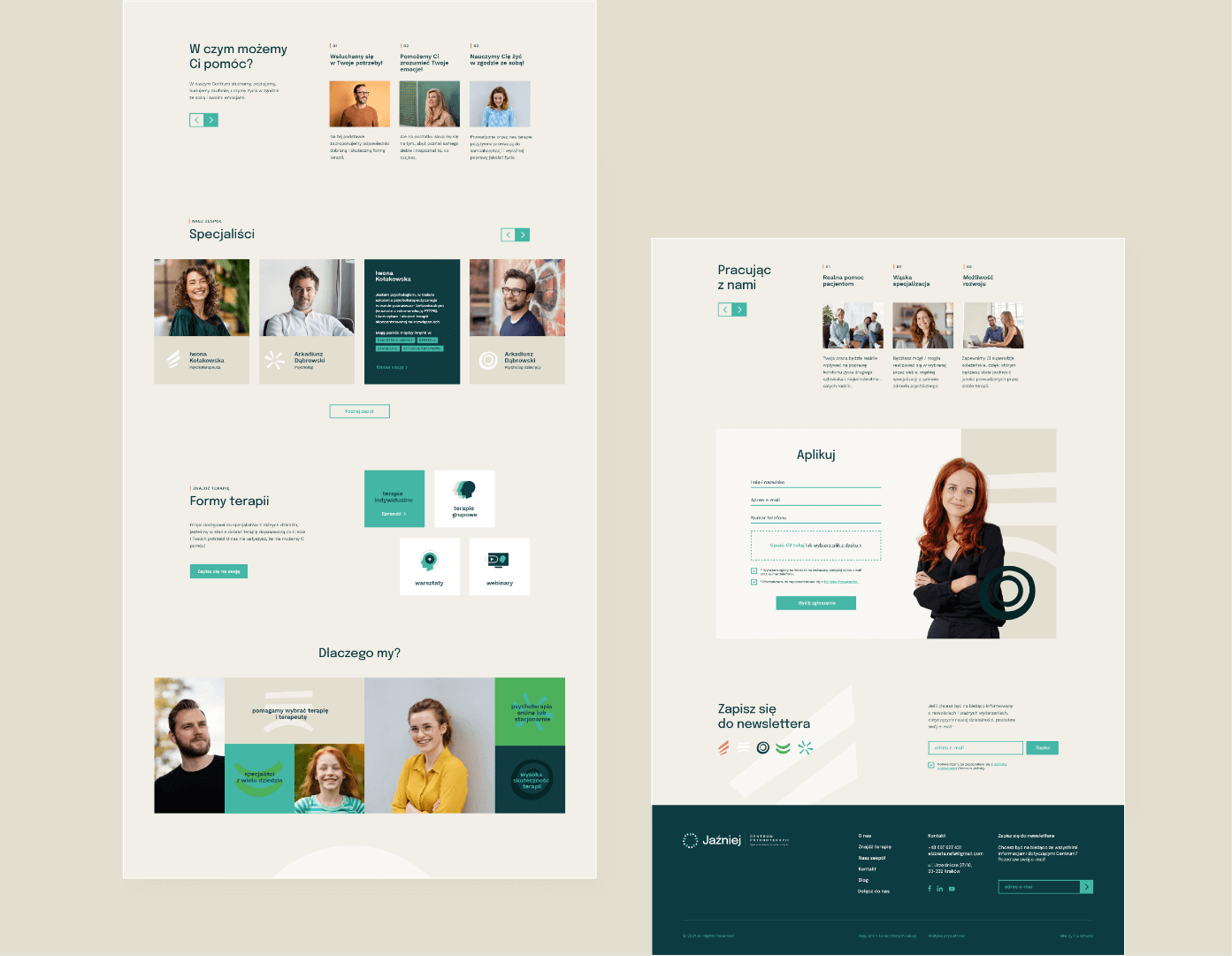
An identity in calm yet varied colors, based on photography and graphic elements representing the spectrum of emotions. A logotype built on a circle symbolizing the connection between the center and the five main emotions.
Result
A modern and timeless identity with a friendly character, supporting the company's image.
Big idea

Key words
Semantics
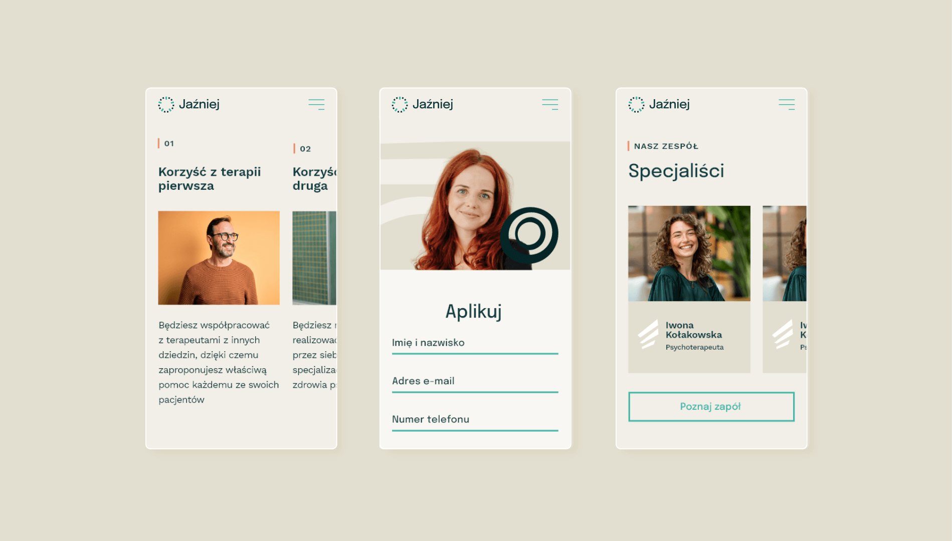
Website
RGB: 17 59 64
HEX: #113b40
RGB: 68 182 166
HEX: #44b6a6
RGB: 227 223 208
HEX: #e3dfd0
Typography
Main font
Auxiliary font

Iconography
