visual identity visual identity

FitMyMind

FitMyMind is a new approach to eating habits. Qualified clinical dietitians and psychodietitians focusing on physical transformation, but above all, mental transformation.

Client

Fit My Mind


Scope of work
Branding
Logo
Social media
Date
2019
Client

Fit My Mind

Date
2019
Scope of work
Branding
Logo
Social media
FITMYMIND_IDENTYFIKACJA_3
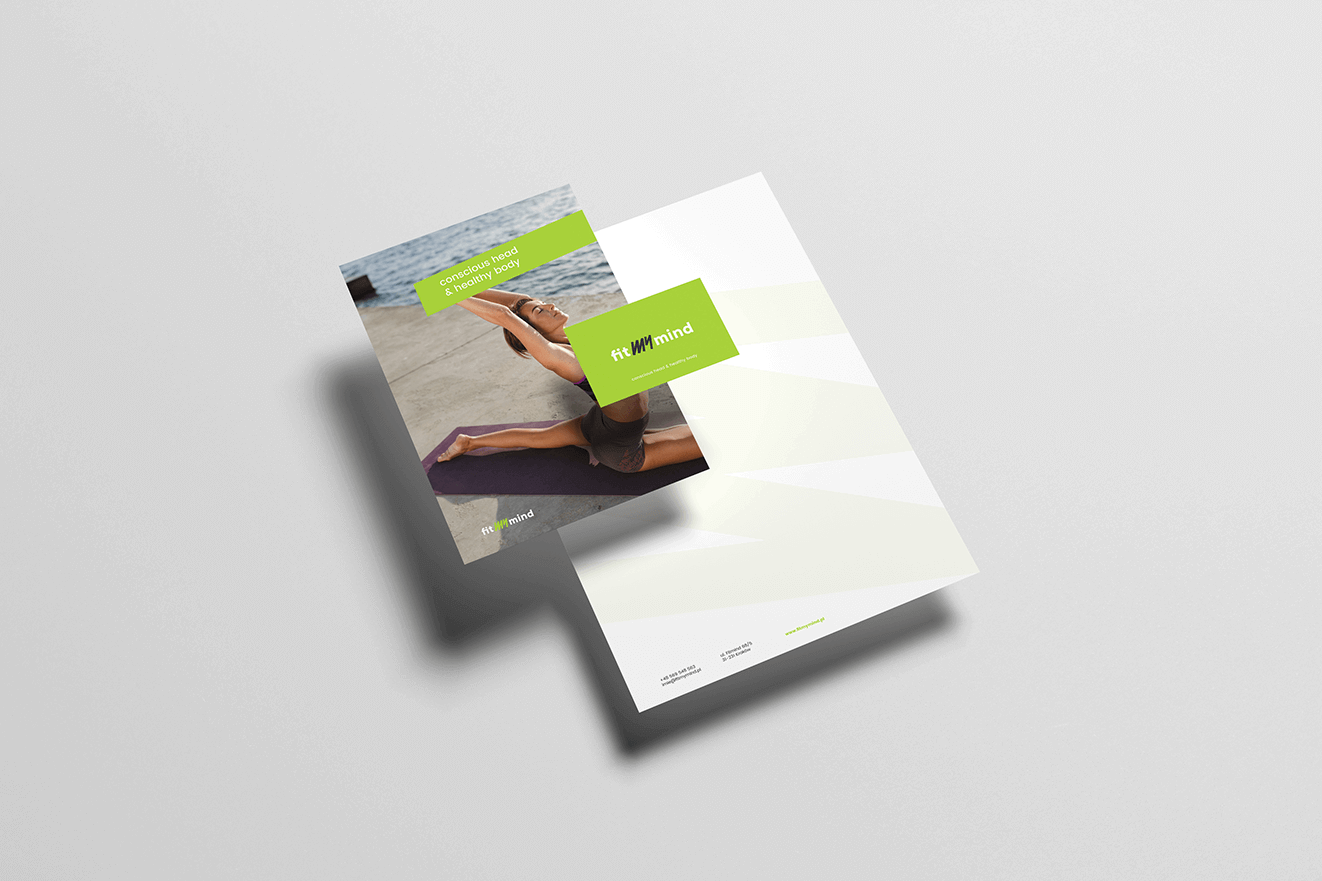
FITMYMIND_KARTY_2

Process

Objective

To create a competitive brand that emphasizes differences compared to others in Poland—focusing on changing the way of thinking about nutrition. An image appealing to business clients, such as corporations and larger companies.

Solution

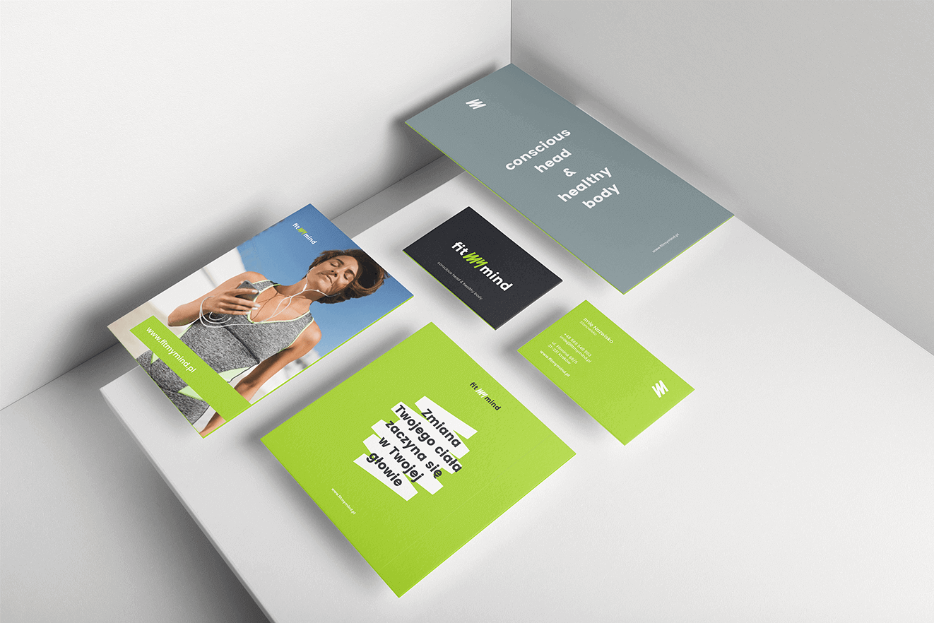
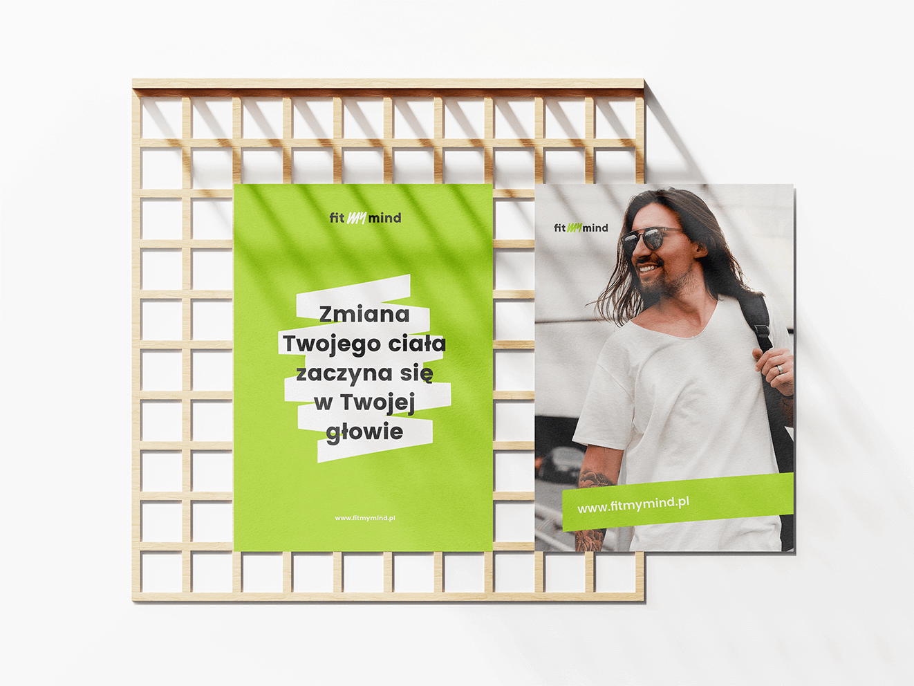
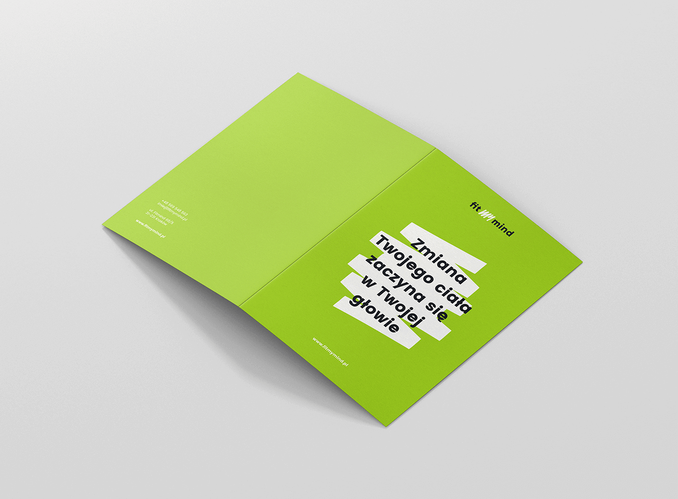
A name resulting from the combination of the words "fit" and "mind" to highlight the brand's distinctive feature. A recognizable graphic motif in the form of a "marker stroke" that subtly appears in all created materials.

Result

A modern, brand-aligned name and visual identity that works well in contact with both business and individual clients.

Big idea
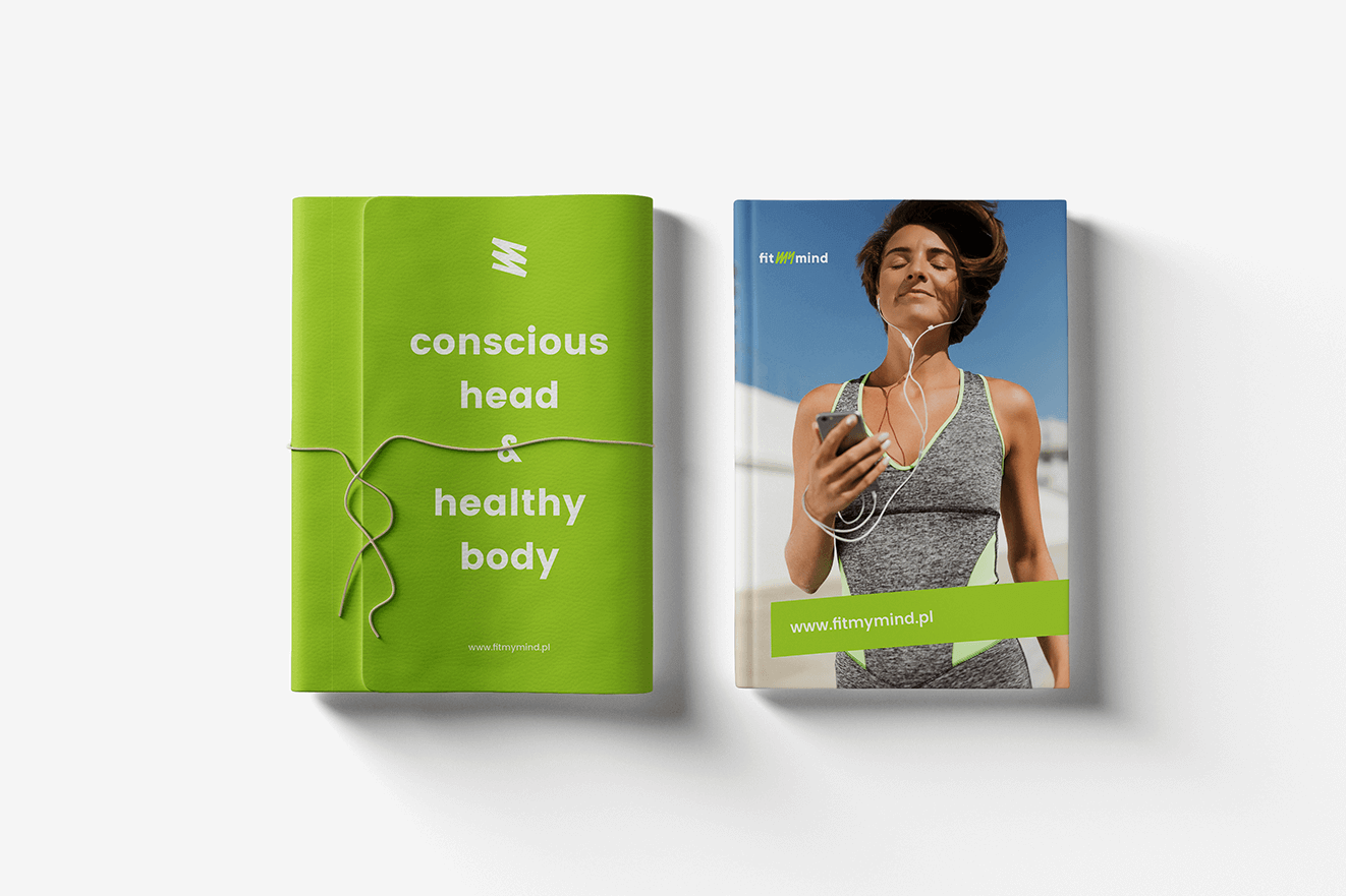
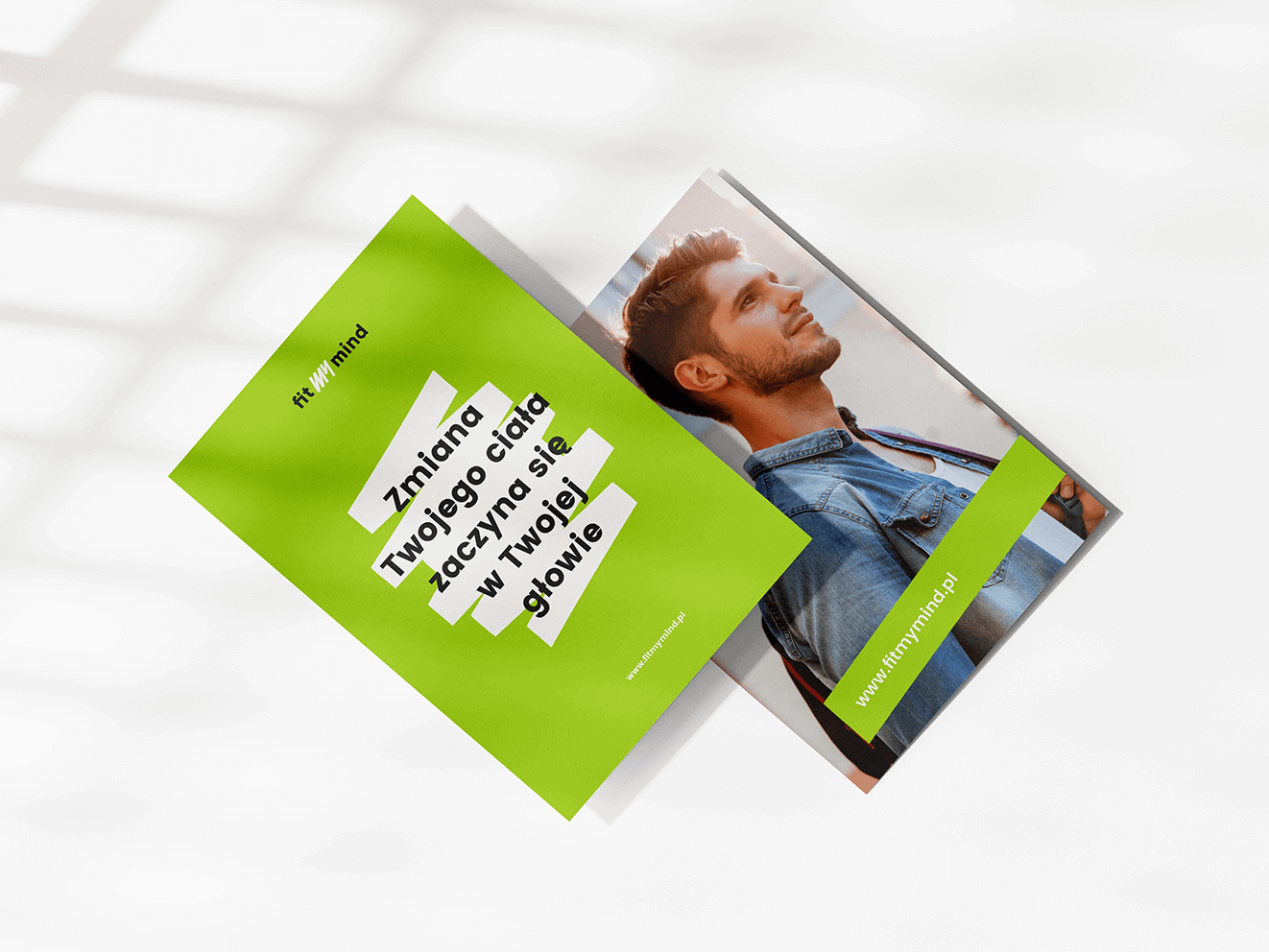
In creating visual elements, we focused on a consistent key visual in the form of a simple, recognizable graphic motif—a drawn marker stroke—to showcase a bold, energetic brand that motivates changes in both body and mind.
FITMYMIND_BOOK
Logo_Mockup_Paper_Vol2_by_Bulbfish_04

Key words

 Design Branding Trends
 Logo Identity KV
 Design Branding Trends
 Logo Identity KV
 
 Logo Identity KV
 Design Branding Trends
 
 Logo Identity KV
 

Semantics

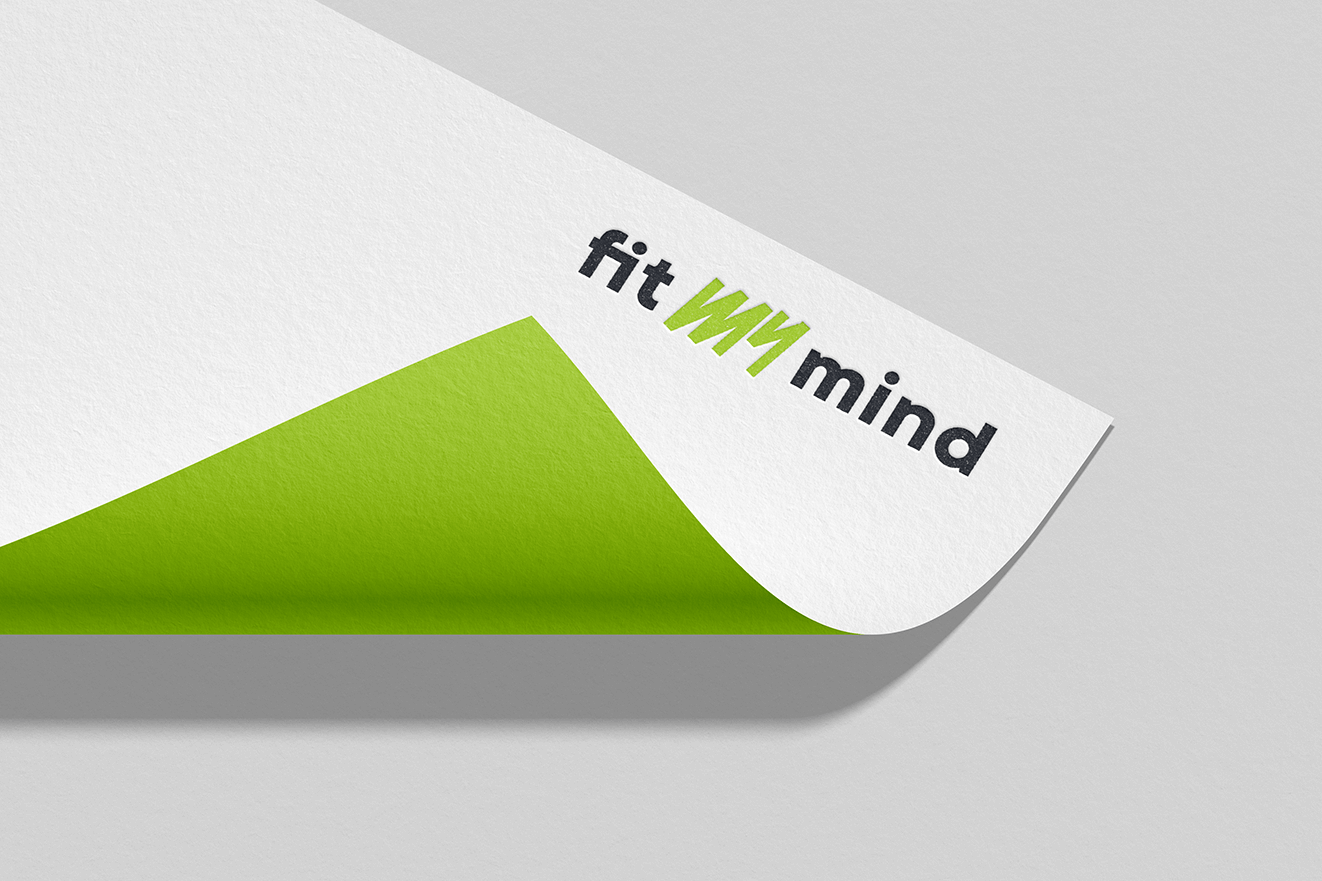
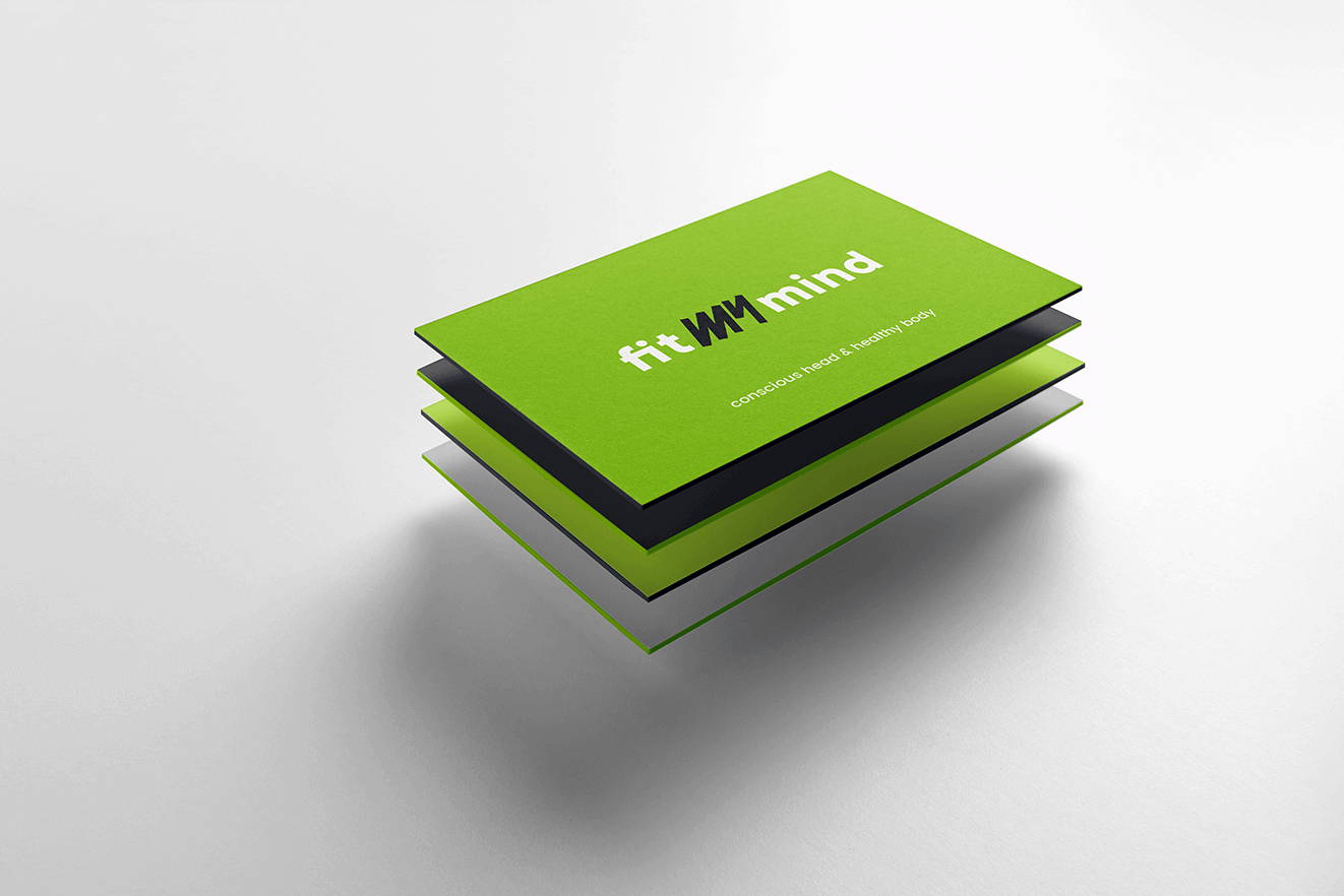
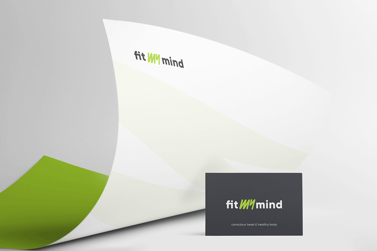
When creating the logotype, we aimed to present a brand that is both modern and friendly. It was also important to depict an image that indicates accessibility, competence, and energy. The typographic accent in the word "MY"—drawn with marker strokes—introduces dynamism and energy into the mark. The logotype has a sans-serif style to emphasize the company's modern yet friendly character. The logo combines three words: "fit," "my," and "mind."
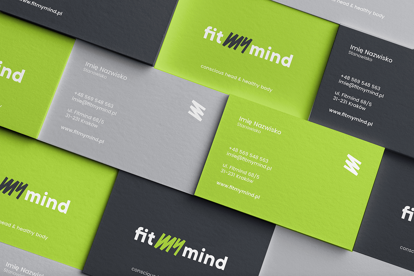
FITMYMIND_WIZYTOWKI2
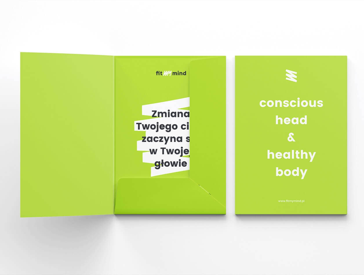
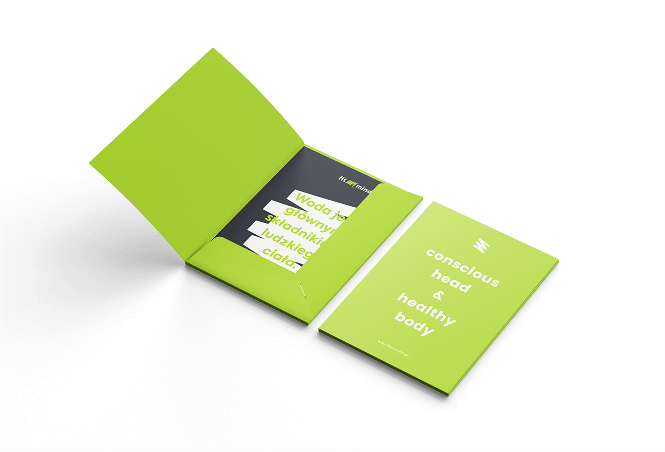
Projekt teczki
CMYK: 20 14 0 80
RGB: 41 44 51
HEX: #292c33
CMYK: 21 0 79 16
RGB: 170 215 46
HEX: #aad72e
CMYK: 14 3 0 41
RGB: 129 146 150
HEX: #819296
FITMYMIND_KARTY_4

Typography

The font used in the identity is intended to emphasize the brand's character; a single sans-serif font family was selected.

Main font

Poppins

Auxiliary font

Poppins
typography

Iconography

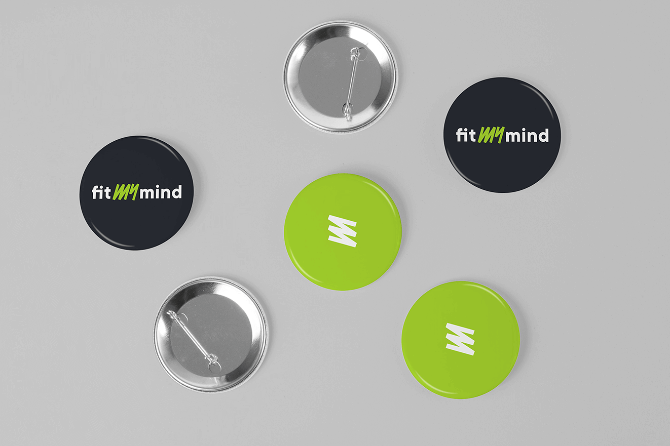
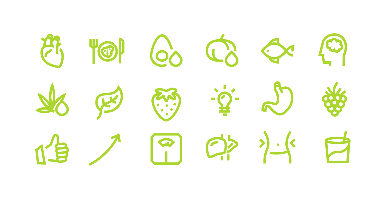
We created a set of simple icons with sharp lines imitating marker movement, referencing the construction of the logotype.
logo
Bez nazwy-1
FITMYMIND_PAPIER FIRMOWY
FITMYMIND_KARTY_1

Recent projects

Pokket
Pokket is a new, highly dynamic brand in the food industry, redefining the meaning of handy snacks. It offers convenient tube forms that fit in any pocket and flavors not yet available on the market.
Dawtona
Dawtona is a Polish leader in processing fresh vegetables and fruits, primarily sourced from its own fields, utilizing an integrated production model to ensure the highest quality products.
Made in Podlasie
Made in Podlasie is a Polish brand entering the market in Kuwait, symbolising authenticity, quality and proximity to nature. It offers healthy food produced in the Podlasie region, aimed at people who want to take special care of the quality of the products they consume.
DCX
A European engineering and manufacturing company offering a wide range of liquid cooling solutions, including design, production, implementation, and commissioning of technologies.

Pokket

Dawtona

Made in Podlasie

DCX