.svg)
.svg)

visual identity
visual identity
IMI Polska
IMI Polska provides top-quality solutions for industry giving security on various levels.
Client
Scope of work
Branding
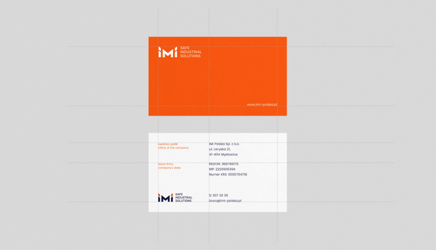
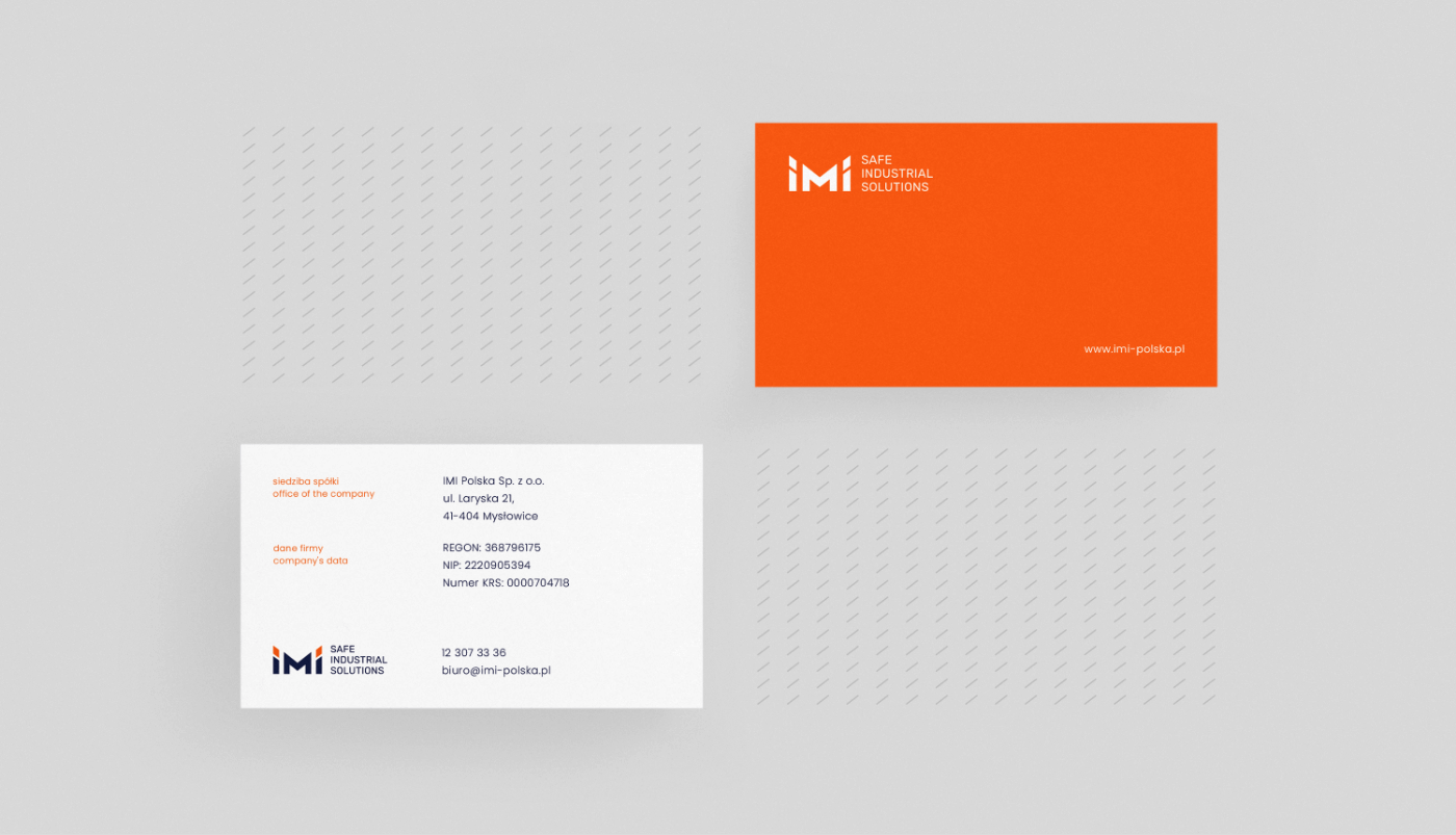
Logo
Website
IMI Polska
Scope of work
Branding
Logo
Website
Date
2020
2020
Client
IMI Polska
Date
2020
2020
Scope of work
Branding
Logo
Website
Branding
Logo
Website
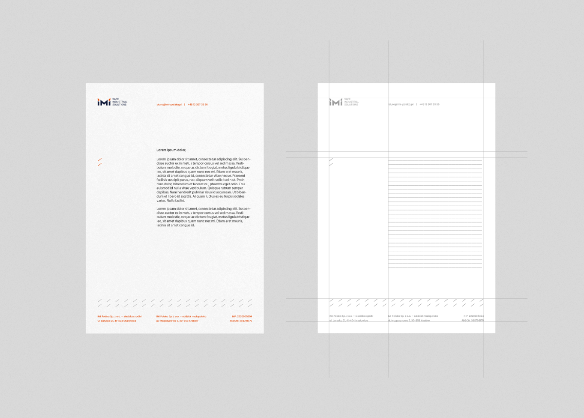
papier-firmowy-siatka
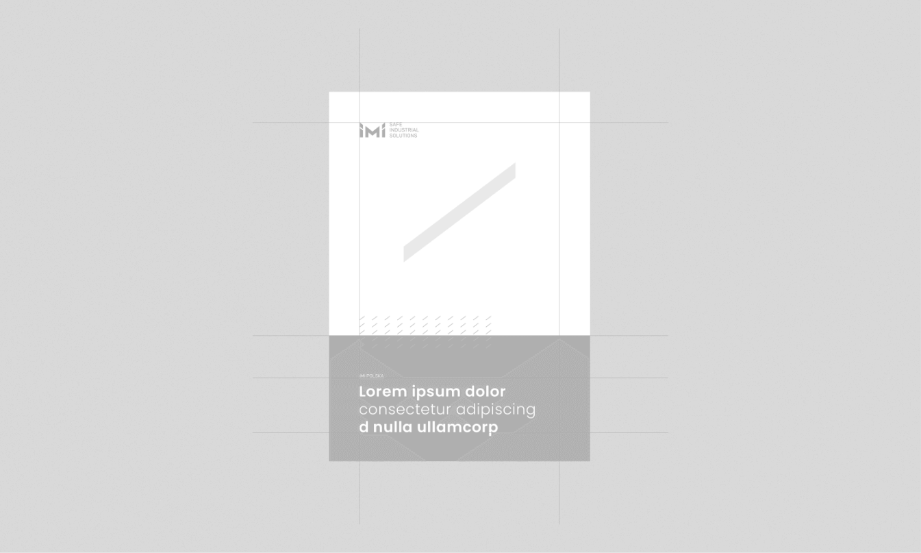
Okładka notesu
Process
 rotate(-45)' fill='%23c2f500'/%3E%3C/svg%3E%0A)
Objective
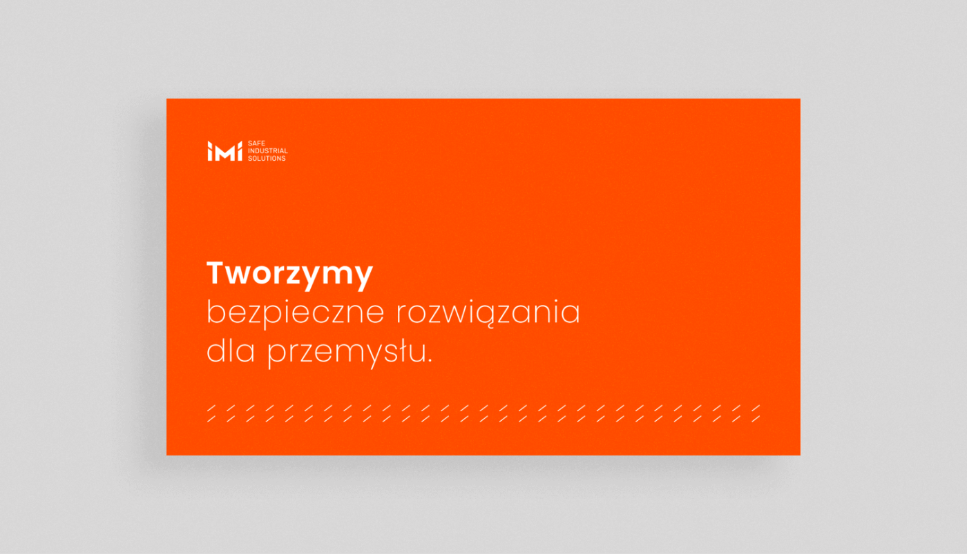
Refreshing the existing logo, followed by designing corporate materials and a website. The goal was to align the company's image with the standards of large international corporations, presenting IMI Polska as a trustworthy, credible partner that ensures a sense of security.
Solution
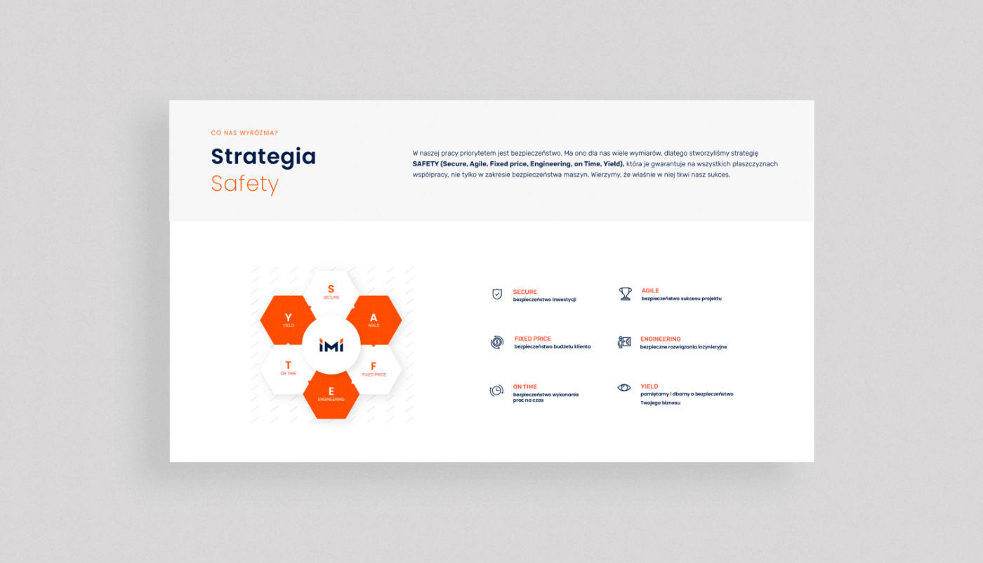
Modernizing the logo and changing the typography; a communication approach based on high-quality photographs enriched with visual identity elements and color adjustments. A comprehensive website focused on showcasing professionalism, collaboration processes, company principles, and knowledge sharing.
Big idea
The brand identity aimed to highlight professionalism, extensive knowledge and experience, and a strong sense of responsibility. The brand’s personality is deeply rooted in high competence, innovation, and modernity.
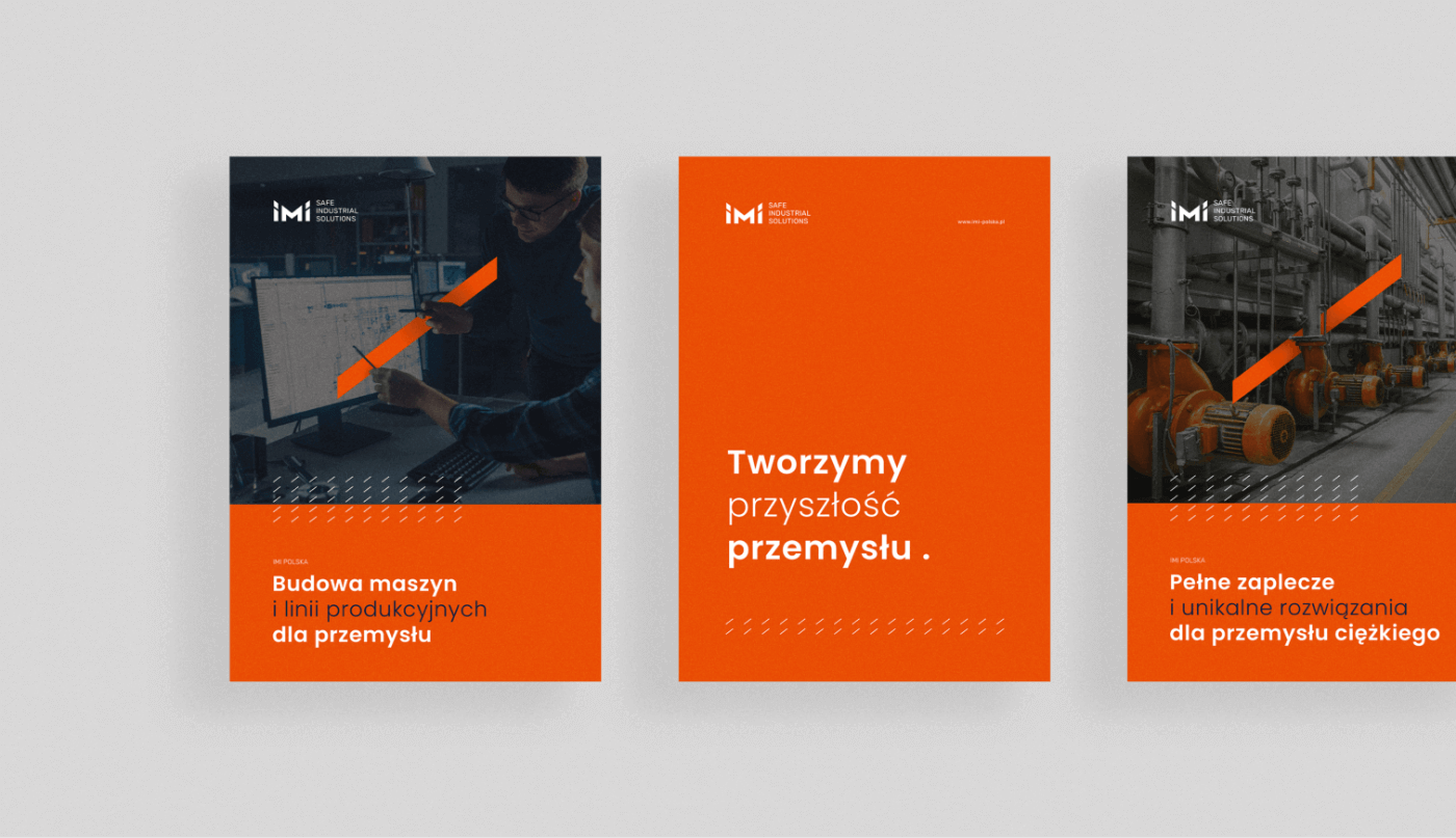
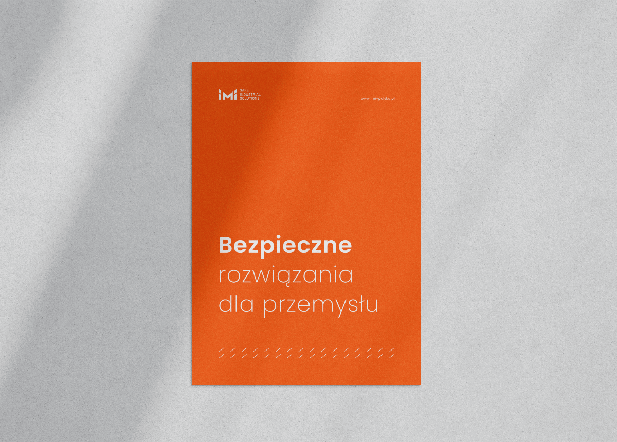
Plakaty
Szablon
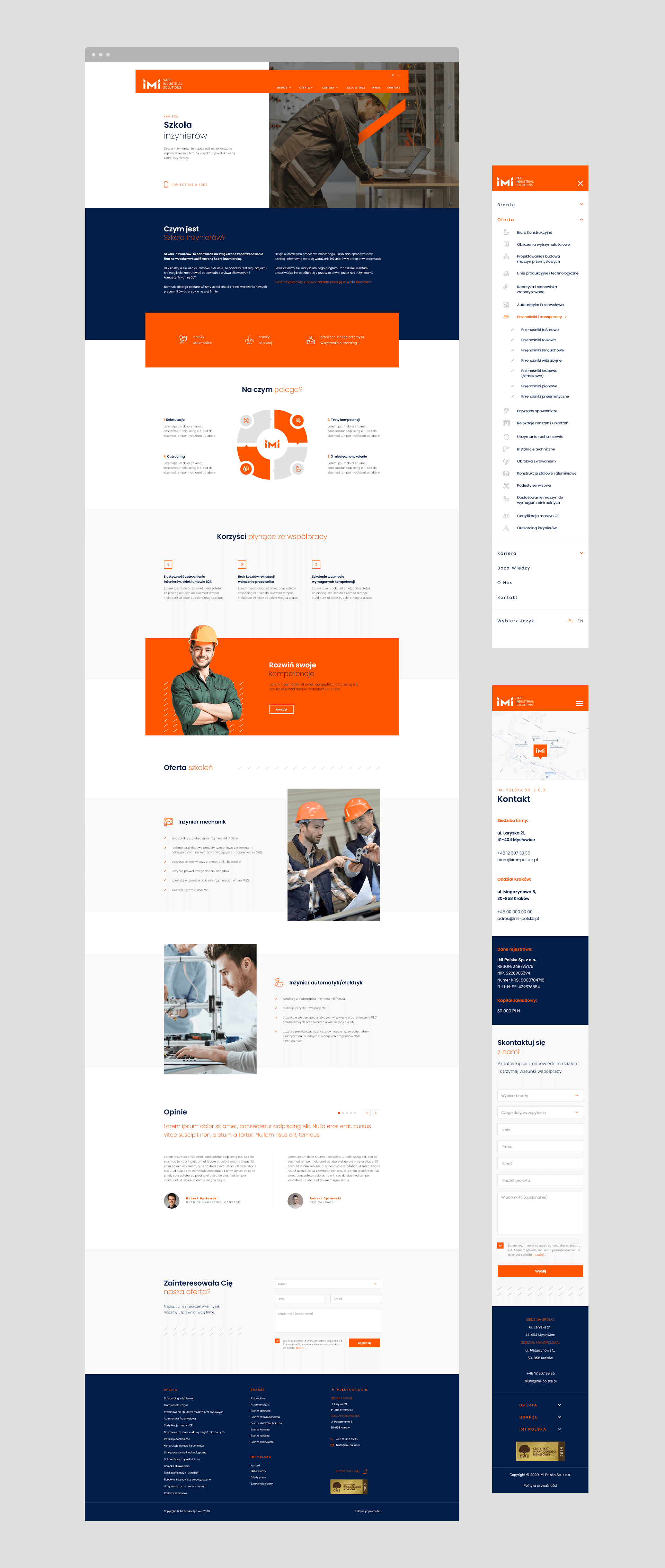
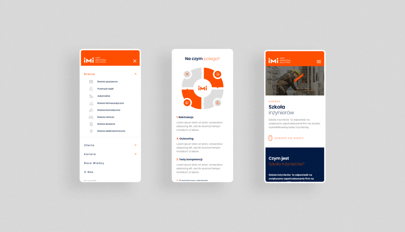
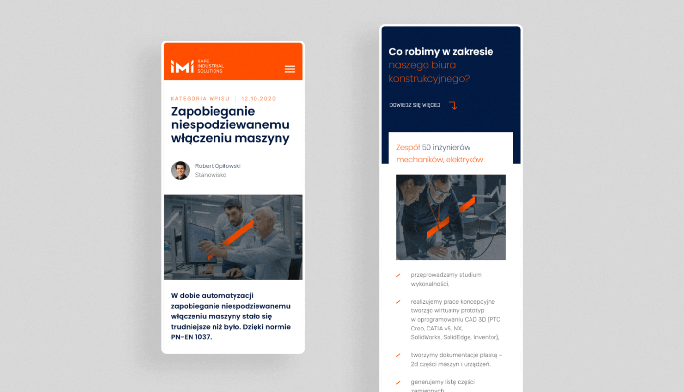
Website
A well-thought-out website structure significantly influenced the final user experience – the division into industries and services makes exploring the brand and contacting the company much easier and more organized. The website is also intuitive to navigate.
Key words
Design Branding Trends
Trends Design Branding
Design Branding Trends
Trends Design Branding
Trends Design Branding
Design Branding Trends
Trends Design Branding
Semantics
The logo was refreshed – unnecessary divisions in the letter "M" were removed, giving it a more modern appearance.
CMYK: 0 67 100 0
RGB: 255 85 0
HEX: #ff5500
RGB: 255 85 0
HEX: #ff5500
CMYK: 96 59 0 71
RGB: 3 30 73
HEX: #031e49
RGB: 3 30 73
HEX: #031e49
CMYK: 0 0 0 9
RGB: 232 232 232
HEX: #e8e8e8
RGB: 232 232 232
HEX: #e8e8e8
Typography
Two sans-serif font families were used – Poppins and Rubik, whose combination expresses the technological nature of the brand.
Main font
Poppins
Auxiliary font
Rubik

Iconography
Simple, monochromatic icons perfectly complement the content and enhance information clarity.

Recent projects
Pokket
Pokket is a new, highly dynamic brand in the food industry, redefining the meaning of handy snacks. It offers convenient tube forms that fit in any pocket and flavors not yet available on the market.
Dawtona
Dawtona is a Polish leader in processing fresh vegetables and fruits, primarily sourced from its own fields, utilizing an integrated production model to ensure the highest quality products.
Made in Podlasie
Made in Podlasie is a Polish brand entering the market in Kuwait, symbolising authenticity, quality and proximity to nature. It offers healthy food produced in the Podlasie region, aimed at people who want to take special care of the quality of the products they consume.
DCX
A European engineering and manufacturing company offering a wide range of liquid cooling solutions, including design, production, implementation, and commissioning of technologies.