visual identity visual identity
Press play and see our showreel

Jaźniej

Jaźniej is a newly established psychotherapy centre that focuses on building a positive relationship with yourself and your emotions. It is a place that brings together specialists from various fields who focus on a holistic approach to their patients’ problems.

Client

Jaźniej


Scope of work
Branding
Logo
Social media
Website
Date
2019
Client

Jaźniej

Date
2019
Scope of work
Branding
Logo
Social media
Website
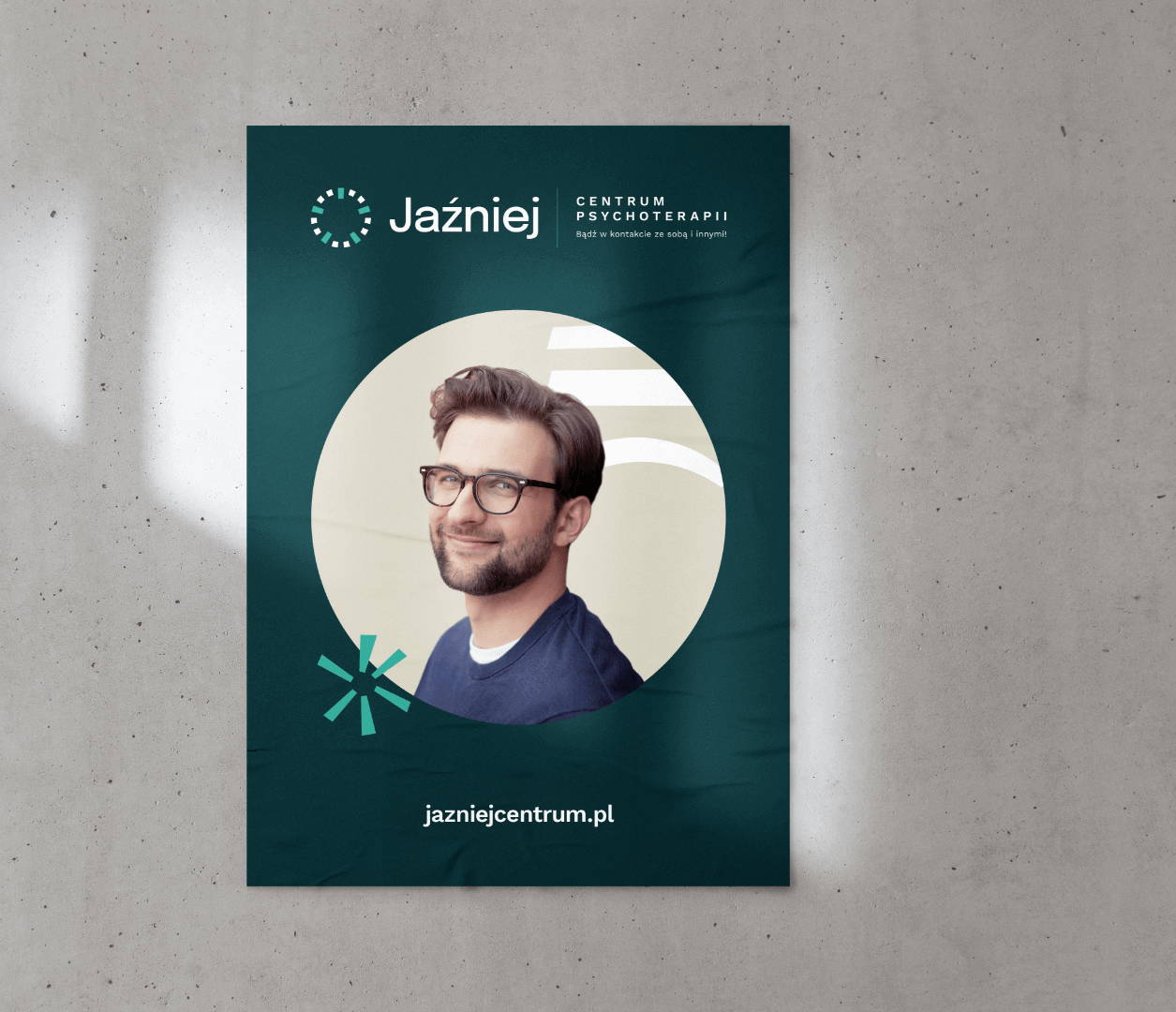
gluedposter-mockup2

• Logo • Branding • Iconography • Website

Logo

Process

objective

The creation of visual communication for a psychotherapy centre with an innovative approach to therapy and mental health. Showing how the centre stands out from others, emphasising its friendliness and focus on the ability to recognise emotions.

solution

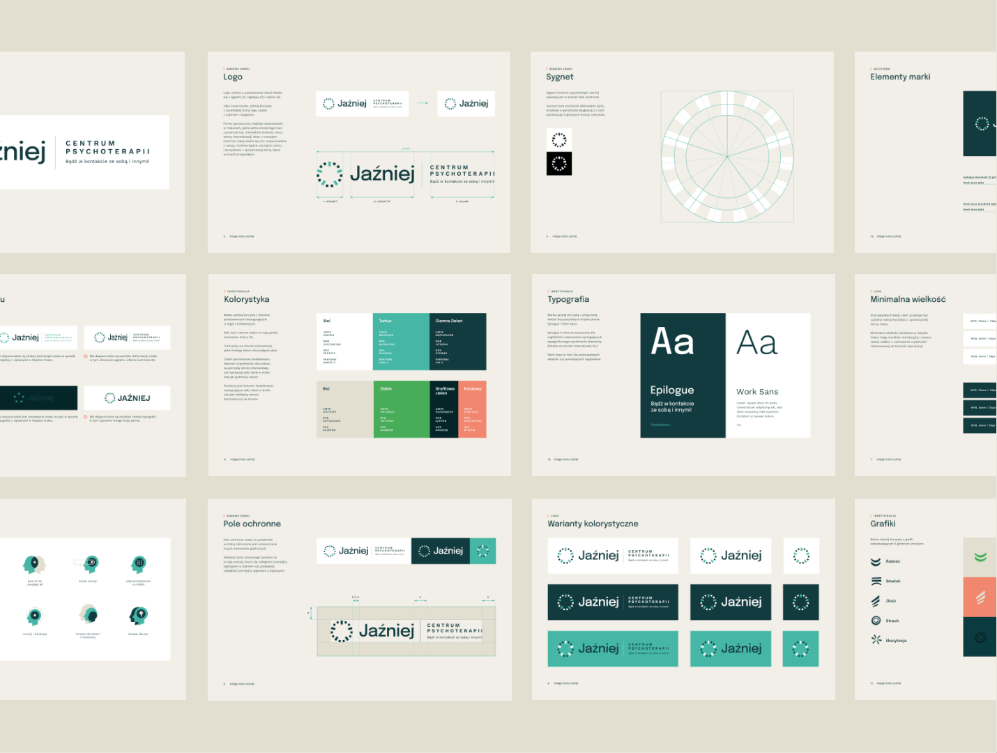
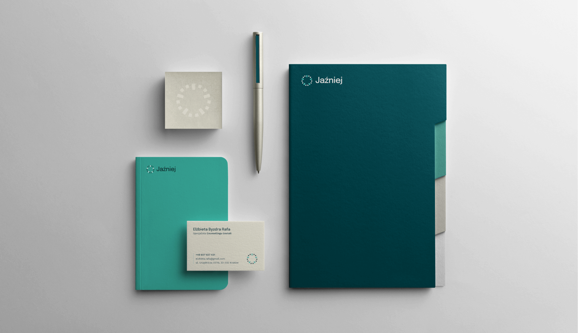
Visual identity in calm but varied colours, based on photography and graphic elements representing a spectrum of emotions. The logotype is built on a circle symbolising the combination of the centre and the five main emotions.

effect

A modern and timeless identity with a friendly character to support the company's image.

Big idea

The central idea behind the visual key was to show emotion and promote a new approach to mental health.
Group 1
Group 1683

Key words

 Web Design Branding
 Social Media Design Logo
 Web Design Branding
 Social Media Design Logo
 
 Social Media Design Logo
 Web Design Branding
 
 Social Media Design Logo
 

Semantics

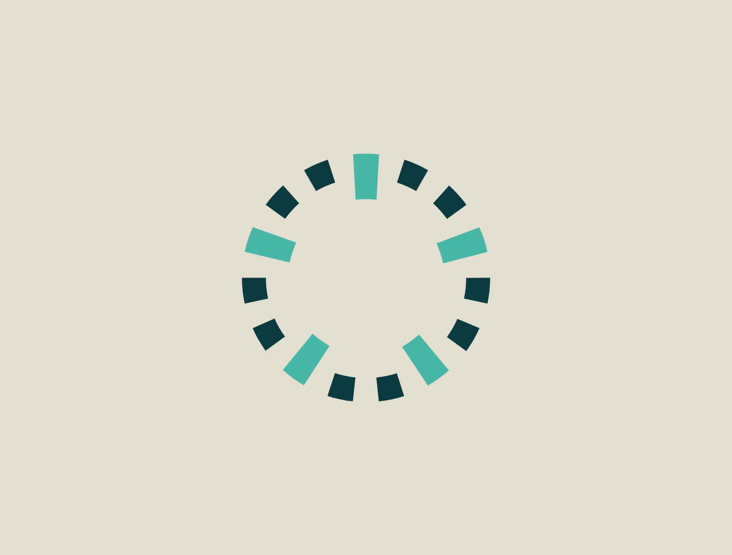
The Jaźniej logotype results from a combination of 5 emotions and a circle symbolising the centre. It has a simple, geometric form.
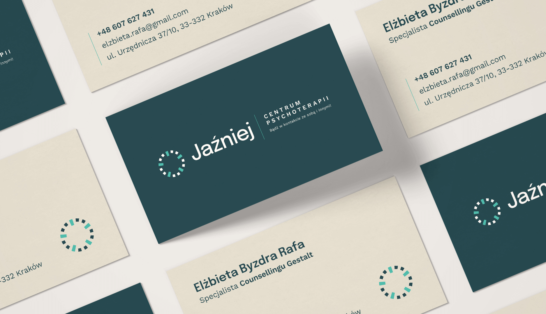
10_Business-Card-Mockup-2_90x50

Website

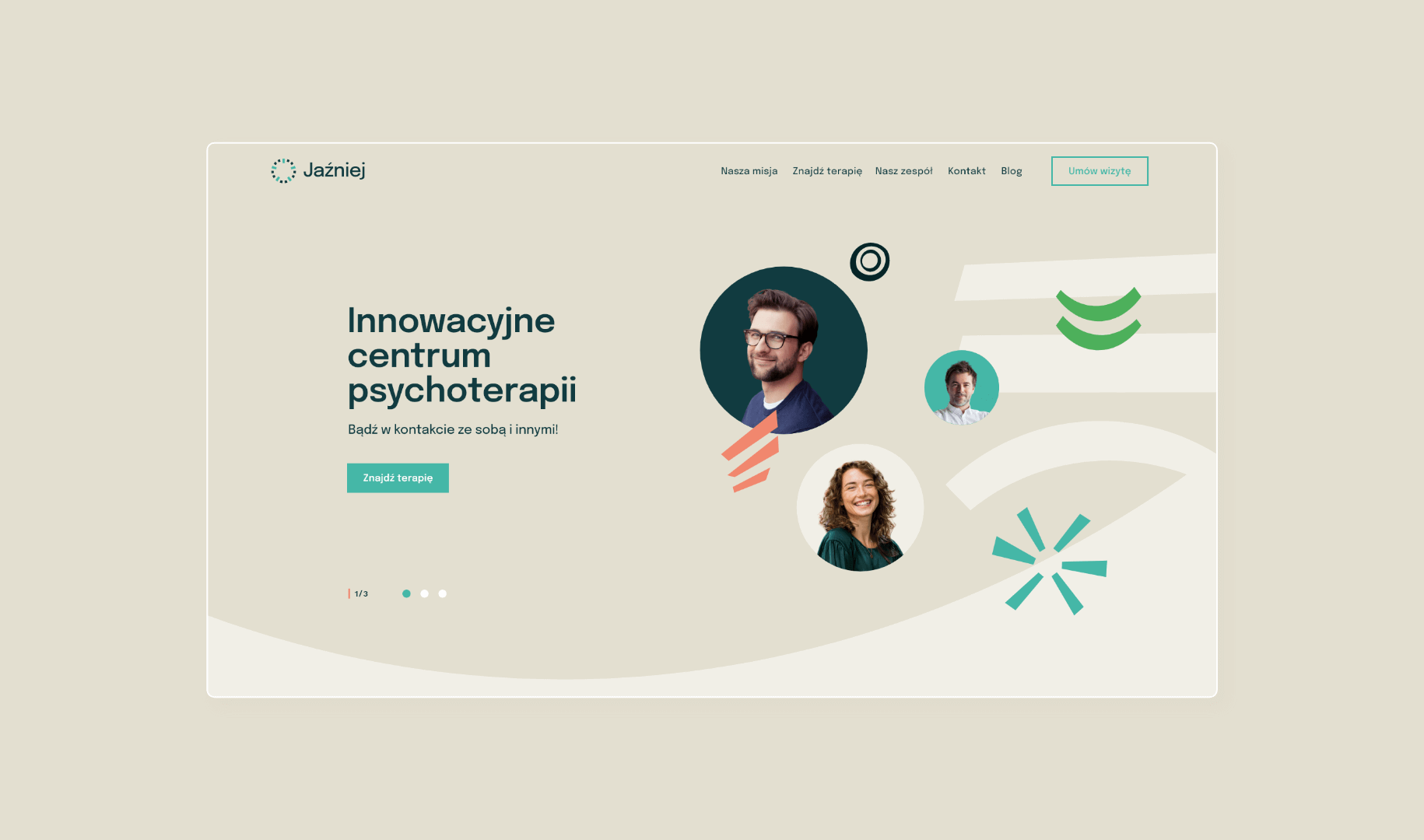
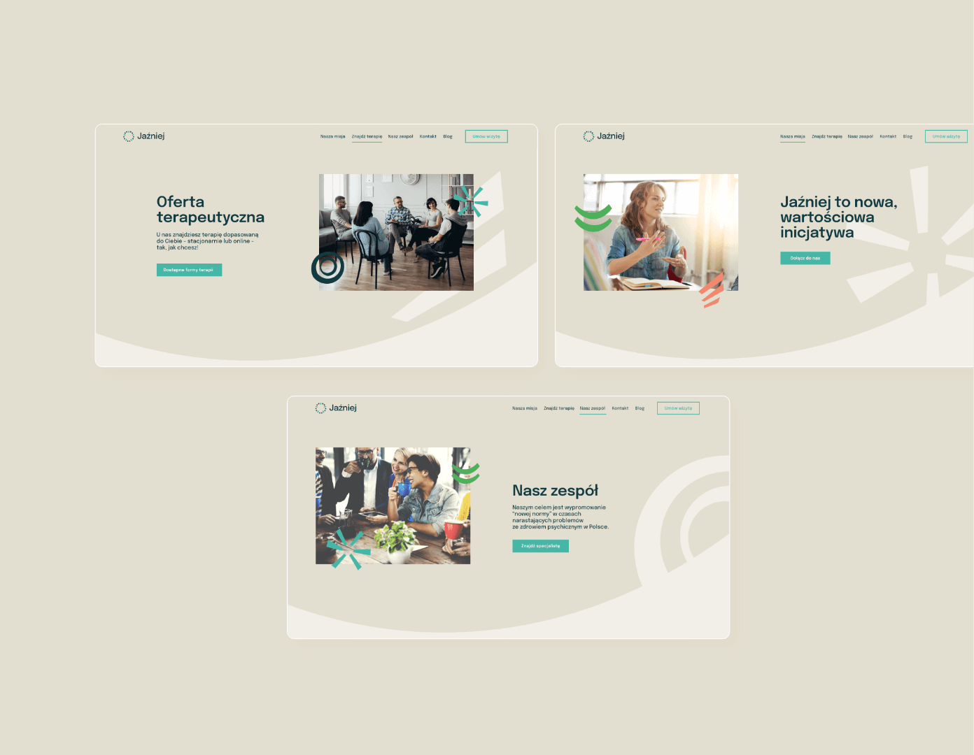
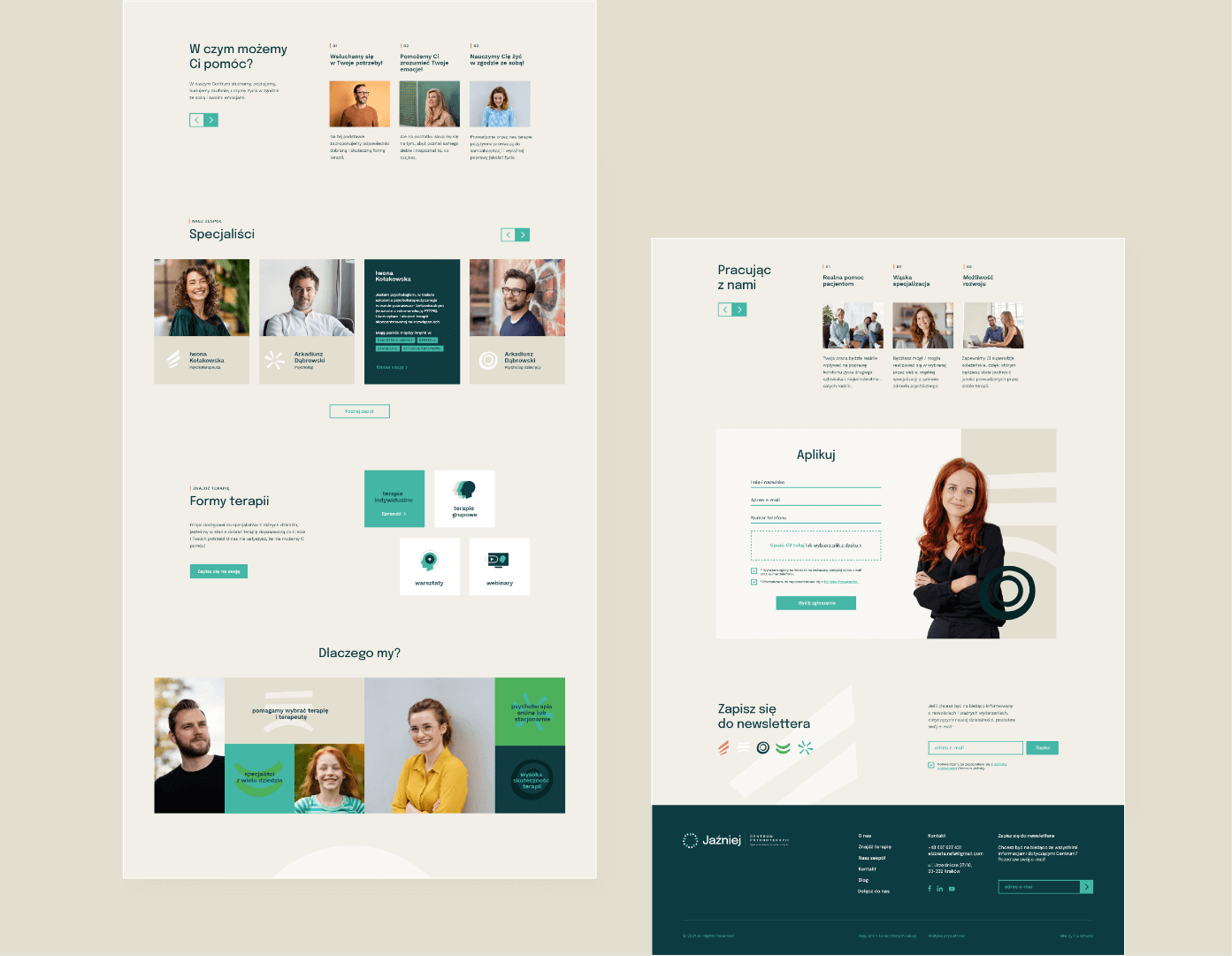
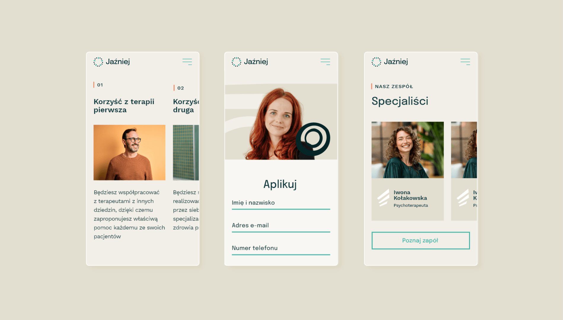
The website has an informative and educational function. On the one hand, it presents basic information about the company, explains what the therapy is about and how to sign up for it, has an extensive blog section, and on the other hand, it has a built-in appointment booking system, which makes contact with the centre easier and more convenient.
Group 2629
CMYK: 73 8 0 75
RGB: 17 59 64
HEX: #113b40
CMYK: 63 0 9 29
RGB: 68 182 166
HEX: #44b6a6
CMYK: 0 2 8 11
RGB: 227 223 208
HEX: #e3dfd0
03-mnml-branding-mockup

Typography

Two sans-serif font families have been selected for the identity, which together create a harmonious combination.

Main font

Epilogue

Auxiliary font

Work Sans
typography

Iconography

Icons are built around the human head as the centre of everything, each icon is an extension of this sign.
logo

Graphics

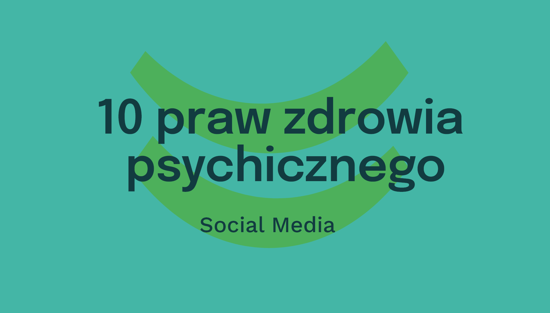
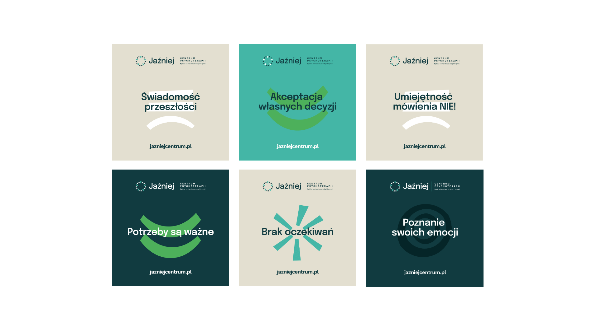
As emotions are at the heart of the business, they also found their way to a graphic representation used on most company materials. The symbols have an irregular shape.

Recent projects

Intima Clinic
Holistic approach to the health of patients
irtech
High-quality specialized measurement devices
Itrons
HVAC projects, execution, investment supervision, and much more
myvee
Innovation in the mobile telecommunications market
Intima Clinic
Holistic approach to the health of patients
irtech
High-quality specialized measurement devices
Itrons
HVAC projects, execution, investment supervision, and much more
myvee
Innovation in the mobile telecommunications market