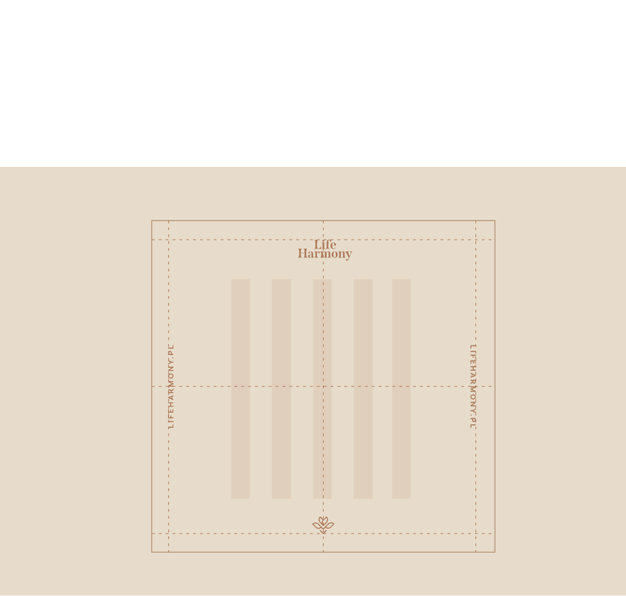
visual identity visual identity

Life Harmony
Day Spa

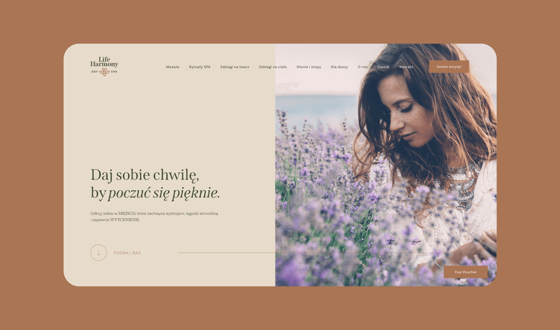
Life Harmony Day Spa is a unique place on the map of Krakow. A spa salon whose mission is to provide clients with respite, harmony, and soothing for the body and mind.

Client

Life Harmony Day Spa


Scope of work
Date
2022
Client

Life Harmony Day Spa

Date
2022
Scope of work

Link

4
Group 2813

Process

Objective

To design a comprehensive visual identity for a newly opened spa salon in Krakow, whose mission is to soothe the body and mind. The client's goal was to create a place where one can relax and gift themselves a valuable and pleasant moment.

Solution

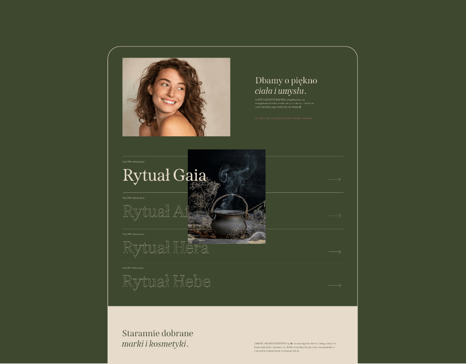
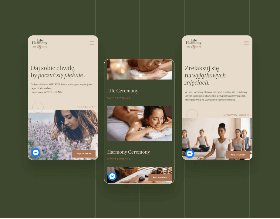
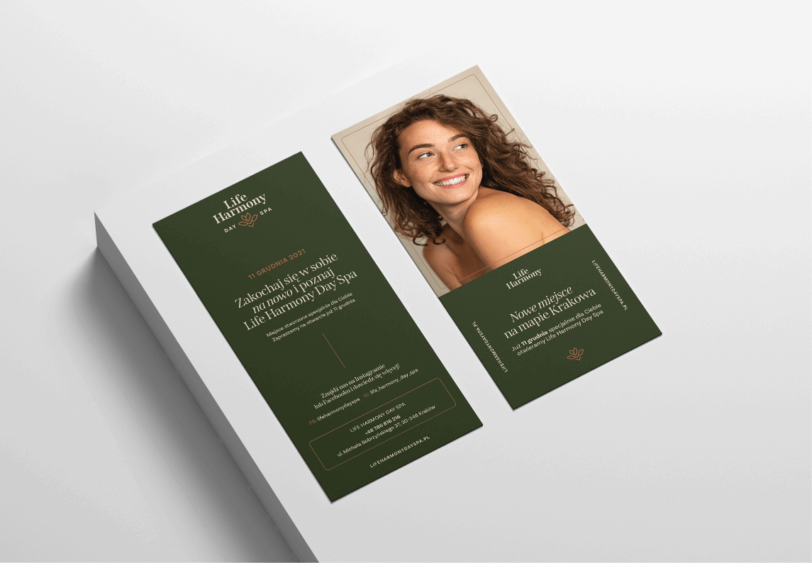
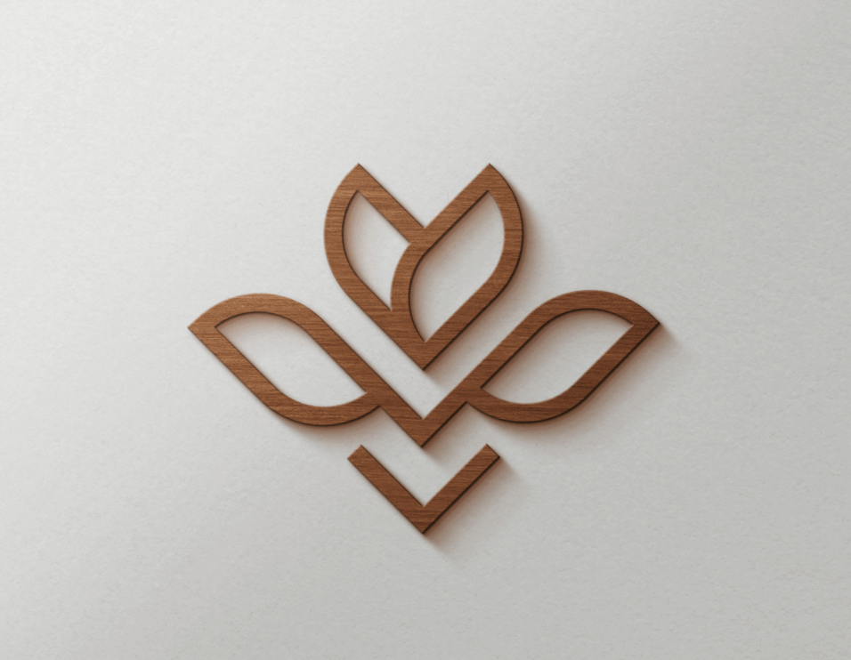
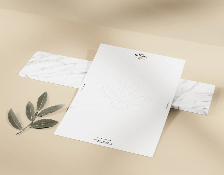
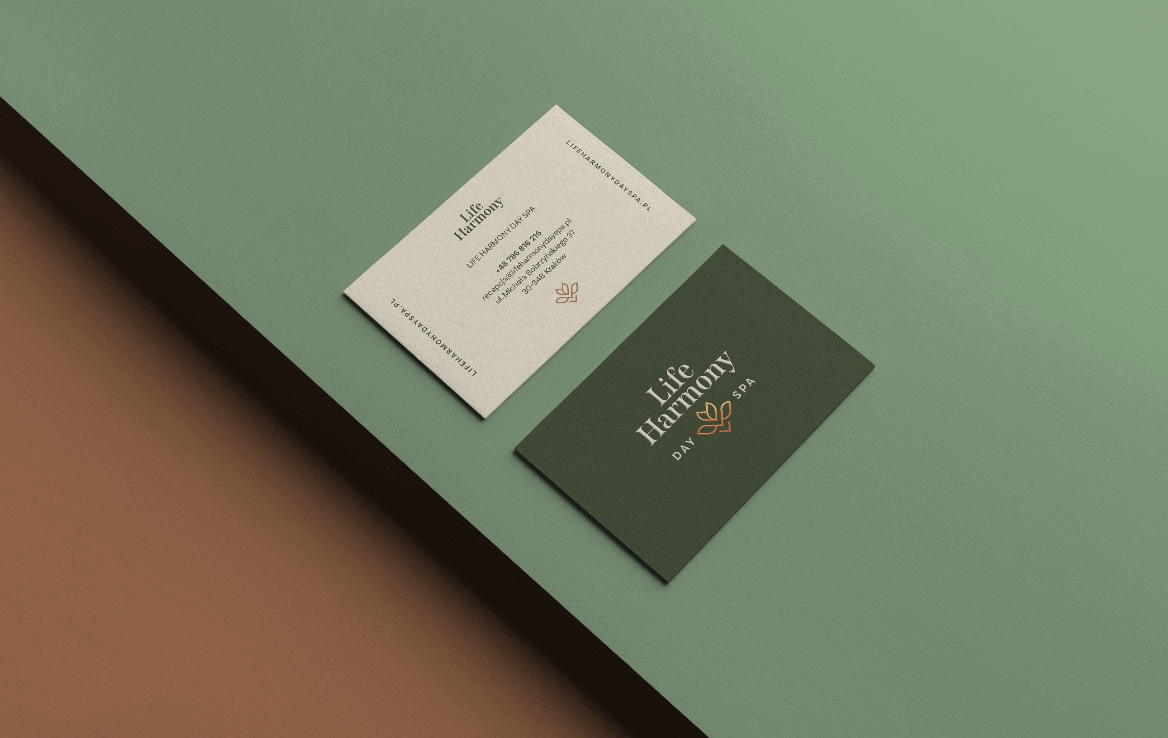
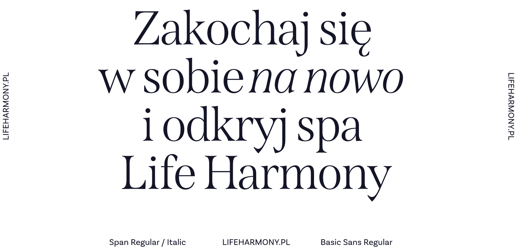
To create a brand associated with nature, tranquility, and inner balance, we focused on plant motifs, warm, enveloping earth tones (greens, browns, beiges), as well as elegant and subtle typographic and graphic solutions.

Result

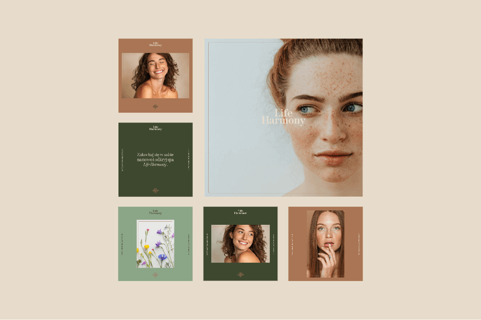
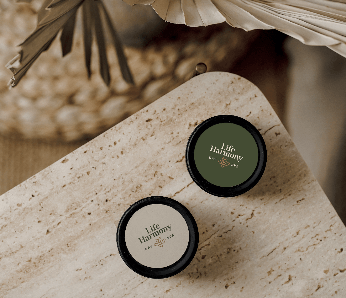
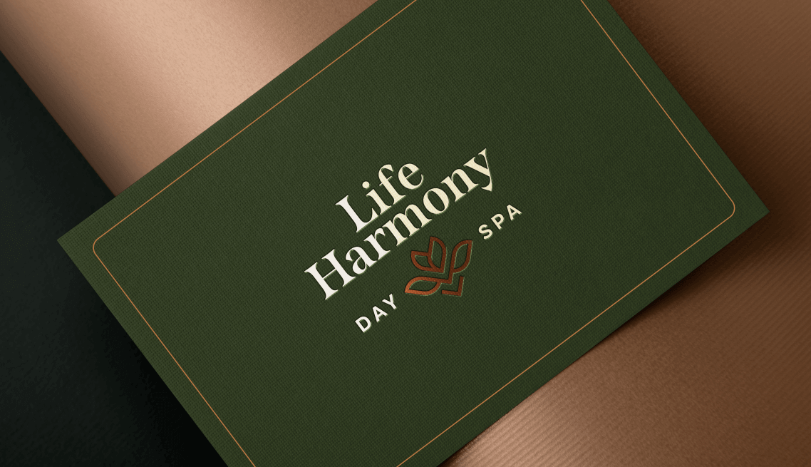
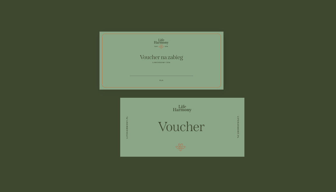
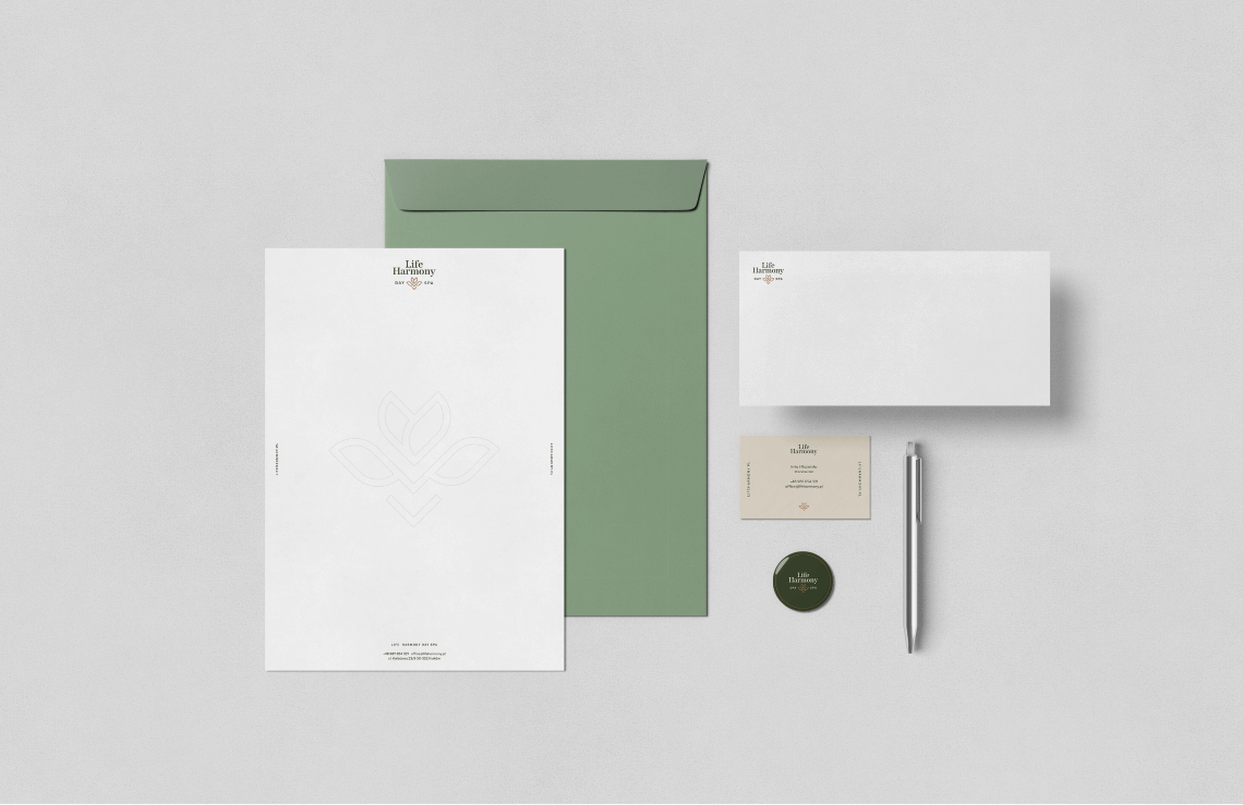
The final result of the design process was the creation of a cohesive brand identity system: a logo, utility materials, and marketing materials—in both print and digital versions—that attract attention and encourage visiting the salon and staying longer.

Big idea

Life Harmony Day Spa is a place meant to be associated with deep relaxation, which has been lacking in our surrounding world lately. It aims to provide respite and restore life balance. The brand seeks to build warm relationships with its audience, evoke positive emotions, and promise to give the client what they need most to fully regenerate.
Przechwytywanie
Przechwytywaniea

Key words

 Identity Branding
 Logo Social Media KV
 Identity Branding
 Logo Social Media KV
 
 Logo Social Media KV
 Identity Branding
 
 Logo Social Media KV
 

Semantics

The logo consists of elegant typography and a flower symbol, evoking thoughts of nature, delicacy, and rebirth—of both body and soul.
Group 2813
CMYK: 39 0 56 76
RGB: 37 61 27
HEX: #253d1b
CMYK: 0 6 13 8
RGB: 234 220 203
HEX: #eadccb
CMYK: 0 33 50 42
RGB: 147 98 73
HEX: #936249
06-mnml-branding-mockup

Typography

The project features elegant typography that introduces lightness, calm, and harmony. We selected Span as the main font and complemented it with Basic Sans.

Main font

Span

Auxiliary font

Basic Sans
typography
Group 2817
1

Website

The goal of the designed website was to aesthetically and clearly present the services and all the possibilities offered by the salon, as well as to encourage booking a visit—featuring clear subpages with numerous photos, content highlighting the positive effects of treatments, and multiple CTA buttons inviting interaction.
04_Dl-Flyer-Mockup

Recent projects

Pokket
Pokket is a new, highly dynamic brand in the food industry, redefining the meaning of handy snacks. It offers convenient tube forms that fit in any pocket and flavors not yet available on the market.
Dawtona
Dawtona is a Polish leader in processing fresh vegetables and fruits, primarily sourced from its own fields, utilizing an integrated production model to ensure the highest quality products.
Made in Podlasie
Made in Podlasie is a Polish brand entering the market in Kuwait, symbolising authenticity, quality and proximity to nature. It offers healthy food produced in the Podlasie region, aimed at people who want to take special care of the quality of the products they consume.
DCX
A European engineering and manufacturing company offering a wide range of liquid cooling solutions, including design, production, implementation, and commissioning of technologies.

Pokket

Dawtona

Made in Podlasie

DCX