.svg)
.svg)

PolTREG
PolTREG S.A. is a biotechnology company and a global leader in cellular therapies for autoimmune diseases. The brand’s mission is to improve the quality of life for patients and their families, as well as to collaborate with global partners to commercialize innovative medical solutions.
PolTREG
Scope of work
Branding
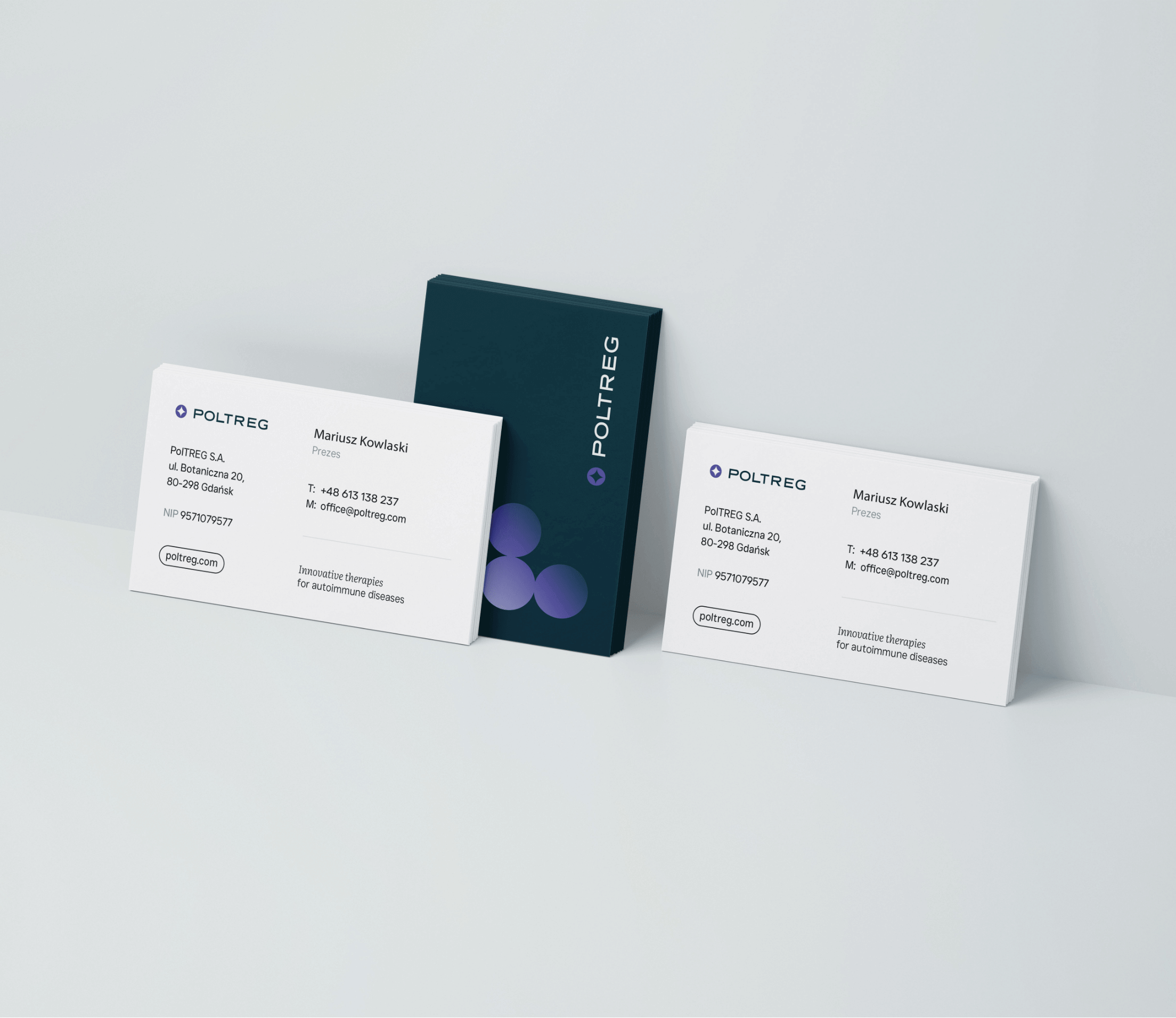
Logo
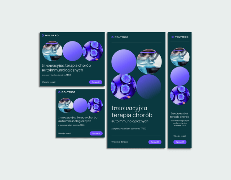
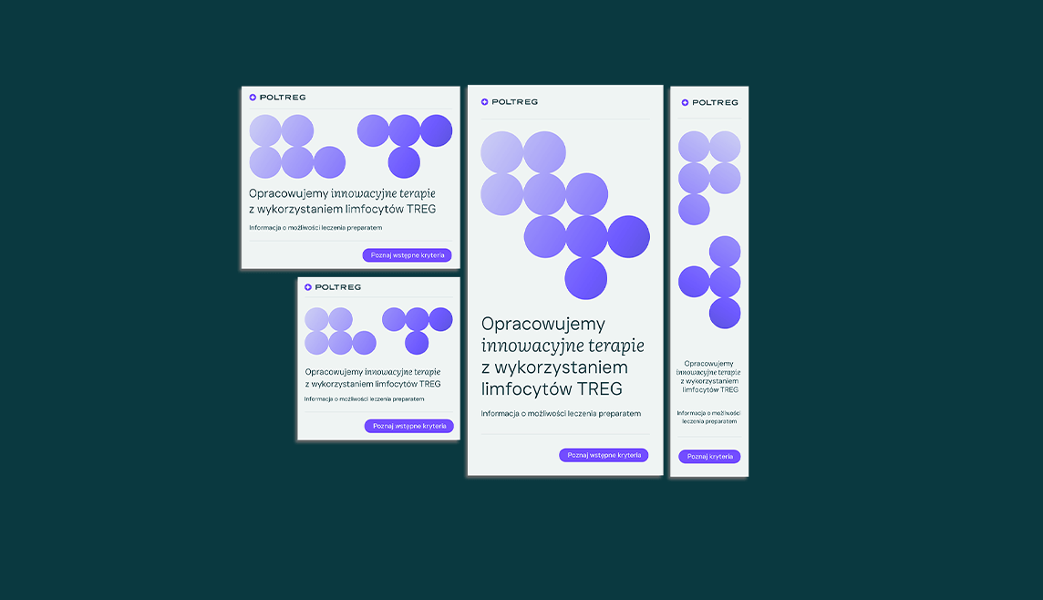
Social media
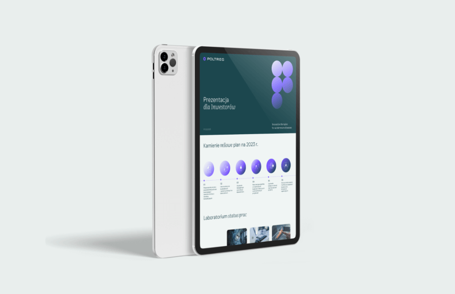
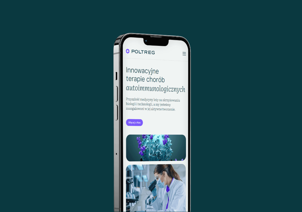
Website
2023
PolTREG
2023
Branding
Logo
Social media
Website
Process
 rotate(-45)' fill='%23c2f500'/%3E%3C/svg%3E%0A)
Objective
To develop a comprehensive visual identity and a functional website that aligns with the brand's DNA – emphasizing its medical nature, extensive knowledge and experience, the safety of offered therapies, as well as innovation and global development potential.
Solution
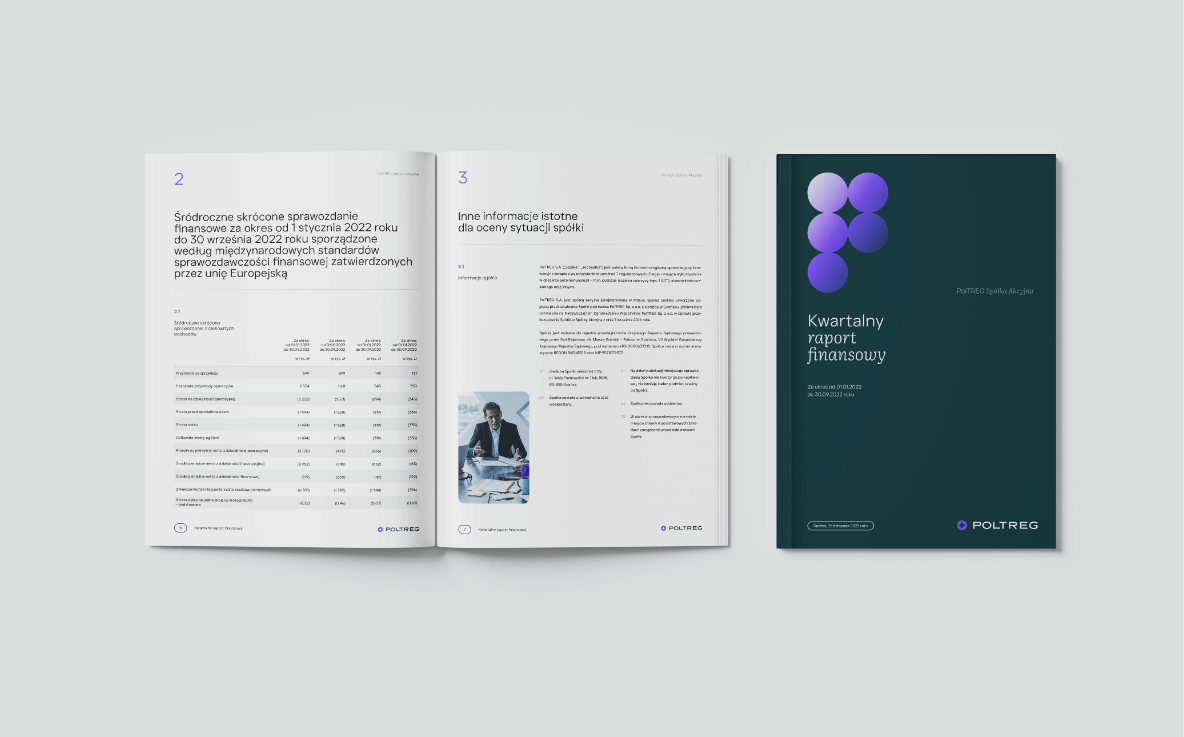
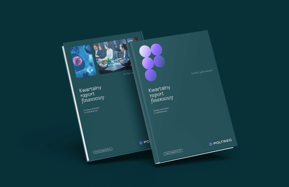
A visual key in shades of gray and dark green, complemented by an unexpected purple and dynamic gradients. Utilization of circular motifs and graphic elements with rounded corners, referencing human body cells. Additionally, the use of an extensive iconography and numerous photographs explaining content and processes.
Result
A professional and modern image of a rapidly growing company, simultaneously evoking a sense of complete safety of the offered solutions and patient care.
Big idea

Key words
Semantics

RGB: 10 57 64
HEX: #0a3940
RGB: 115 77 255
HEX: #734dff
RGB: 239 244 243
HEX: #eff4f3
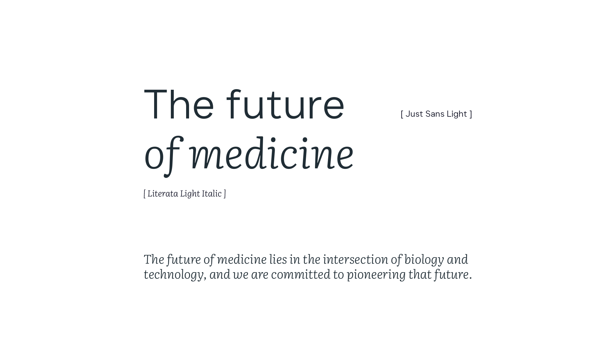
Typography
Main font
Auxiliary font
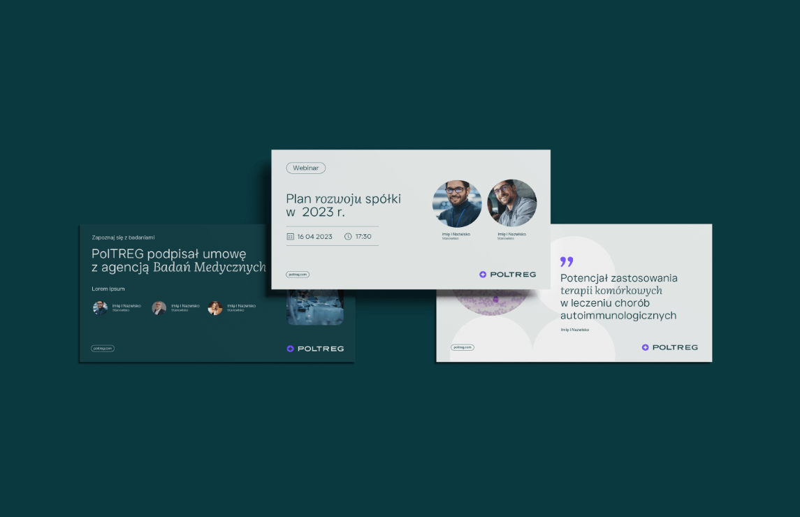
Website

Iconography

Pattern