.svg)
.svg)

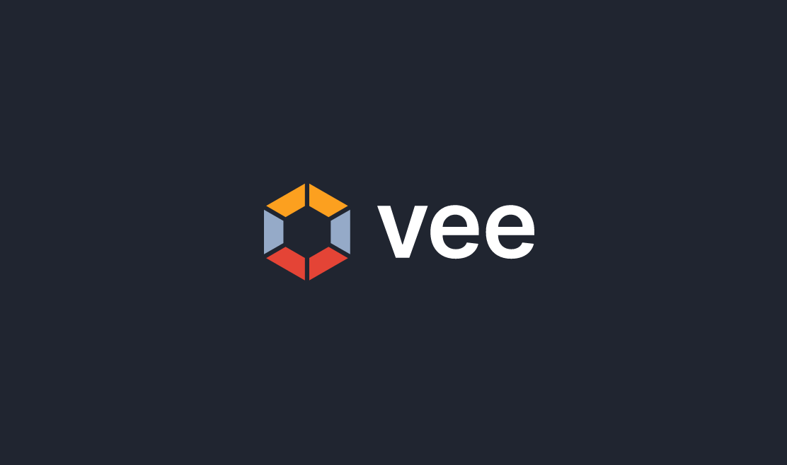
Vee
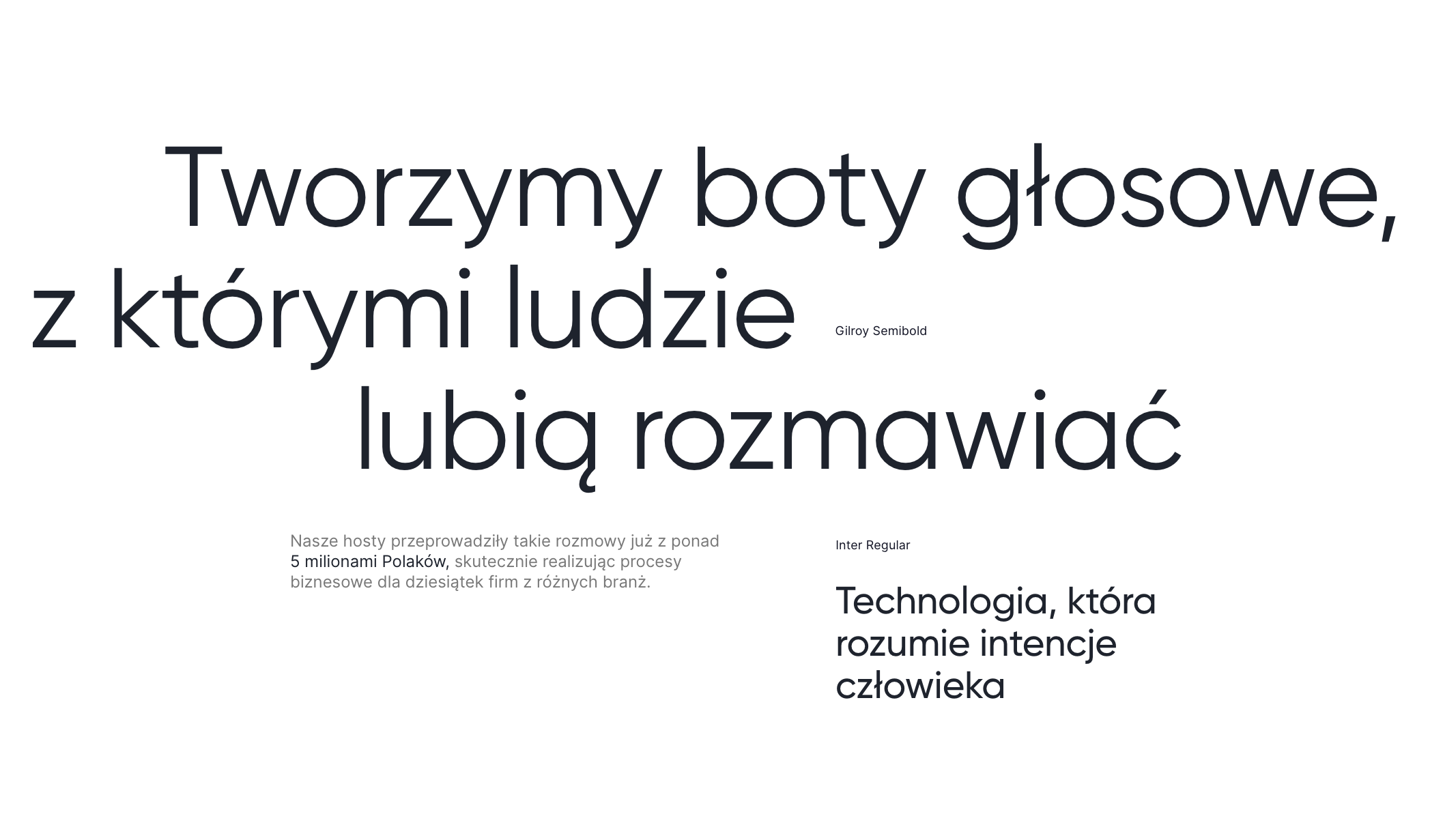
Vee specializes in automating telephone customer service processes, delivering intelligent voice hosts to the market with which—as they clearly emphasize—people enjoy conversing. The company has extensive and diverse experience in implementing a wide range of services—from helpline support to conducting large-scale outbound campaigns.
Vee S.A.
Scope of work
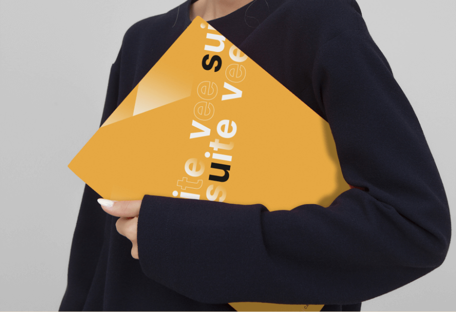
Branding
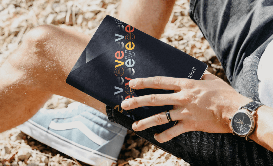
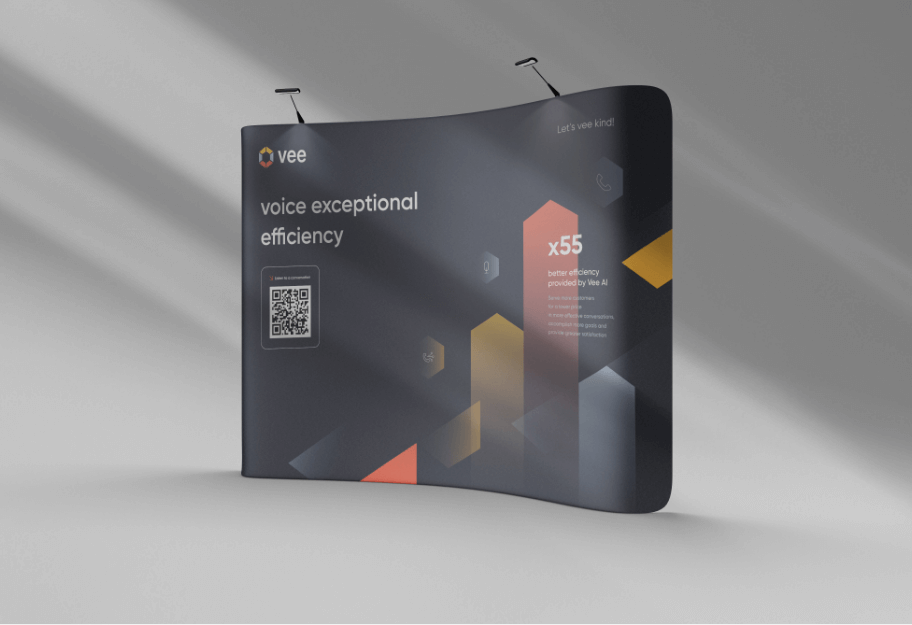
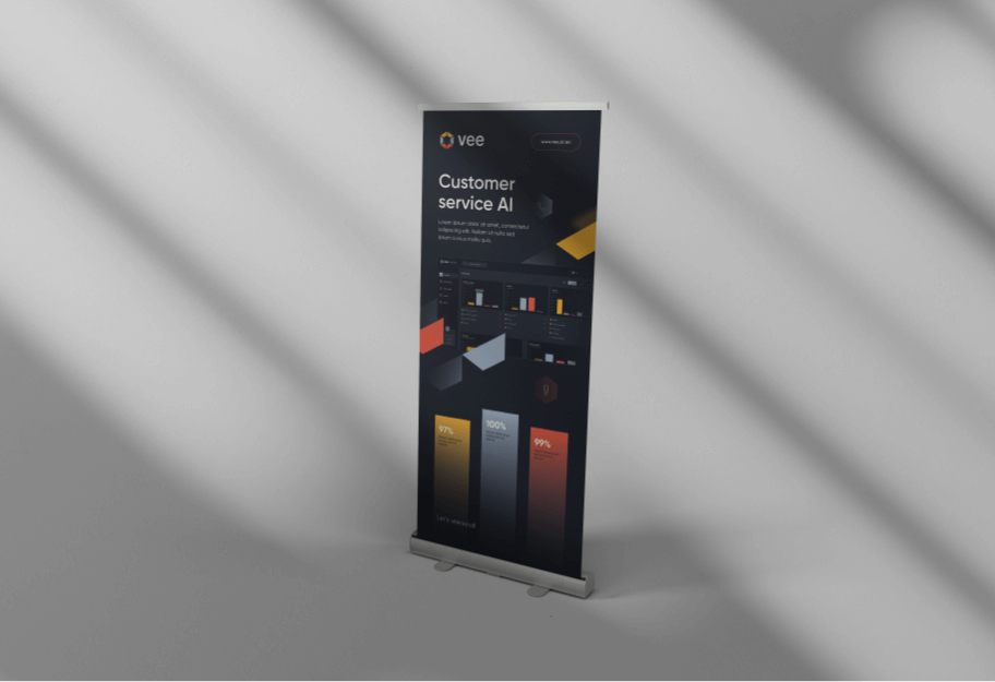
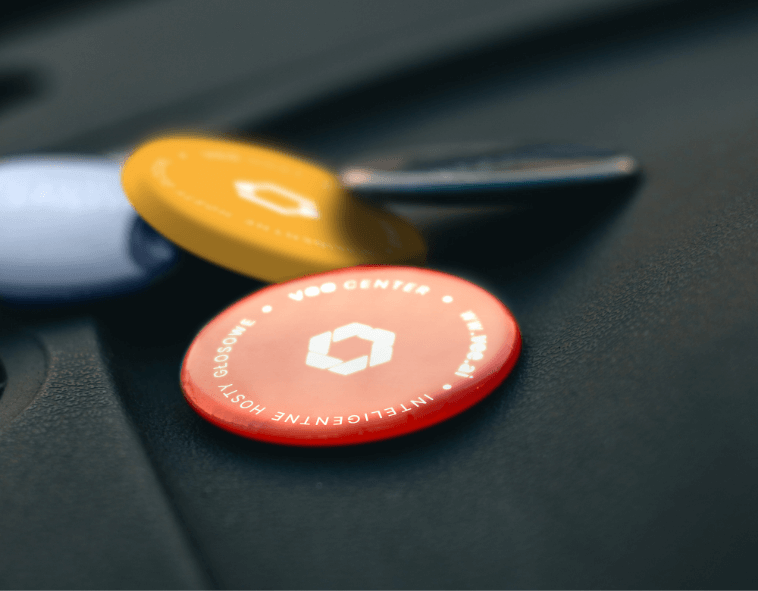
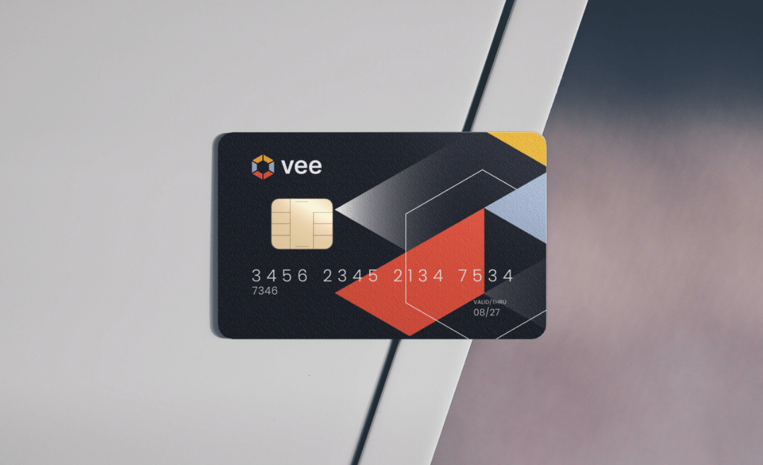
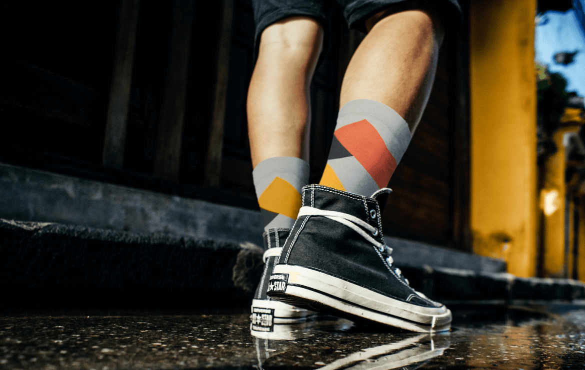
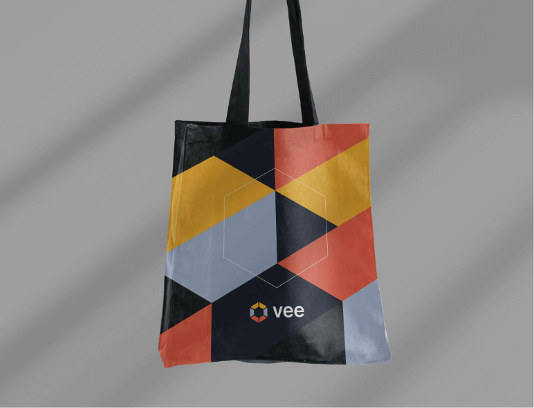
Gadgets
Logo
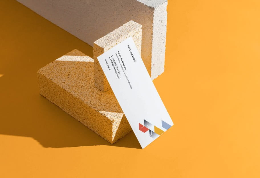
Production and printing
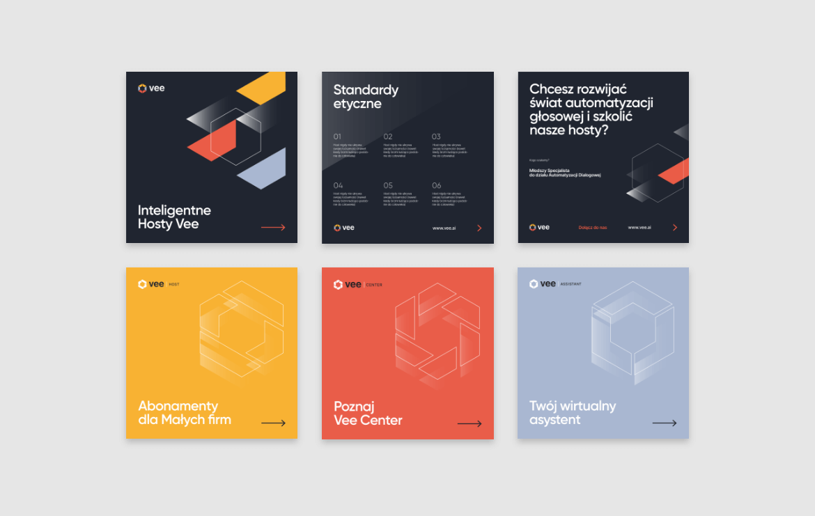
Social media
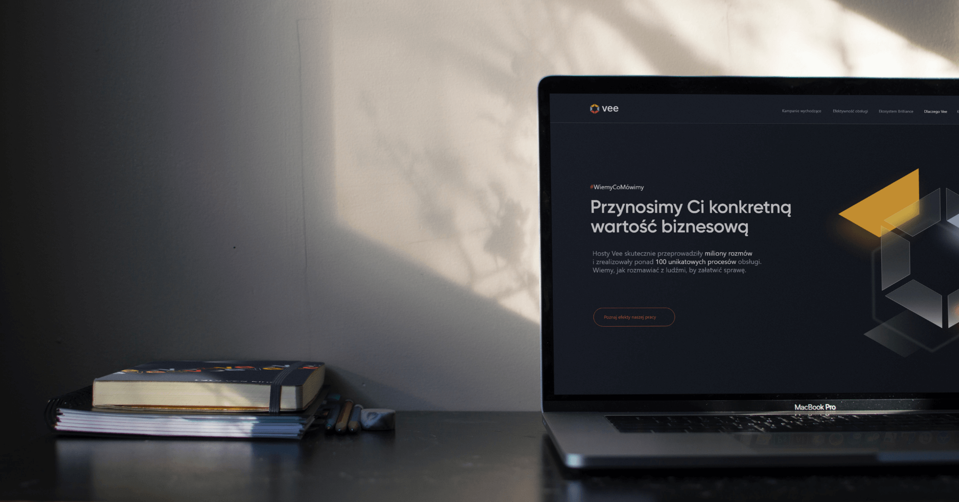
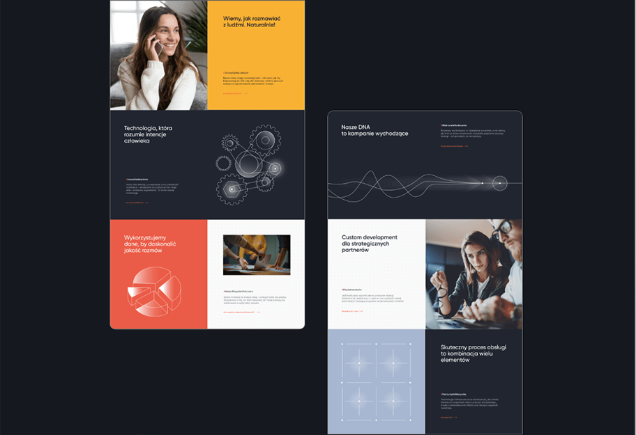
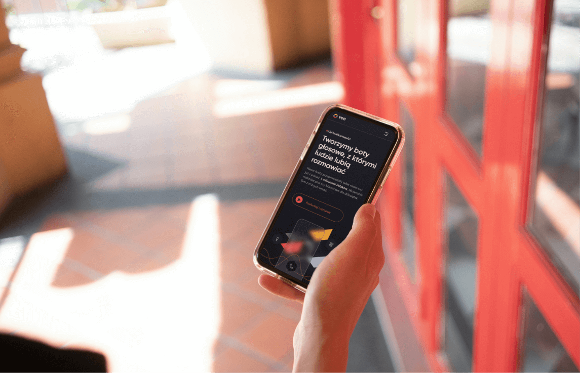
Website
2022
Vee S.A.
2022
Branding
Gadgets
Logo
Production and printing
Social media
Website

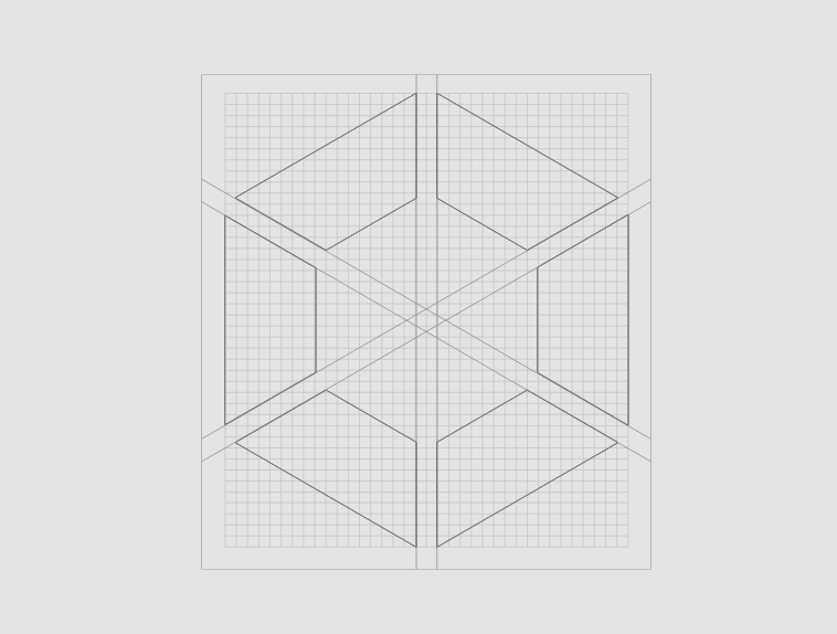
Process
 rotate(-45)' fill='%23c2f500'/%3E%3C/svg%3E%0A)
Objective
Our main goal was to create a brand image that highlights the innovation of the services provided by the Client, while also being friendly and accessible to the audience. We also aimed to best present the broad capabilities of Vee's technology—in a professional, substantive manner that encourages the establishment of business relationships.
Solution
The solutions we proposed were designed to best reflect the company's values, build a consistent corporate image, and distinguish it from the competition. The key words we referred to throughout the creative process, which characterize Vee's services, are: professional, substantive, efficient, and friendly.
Result
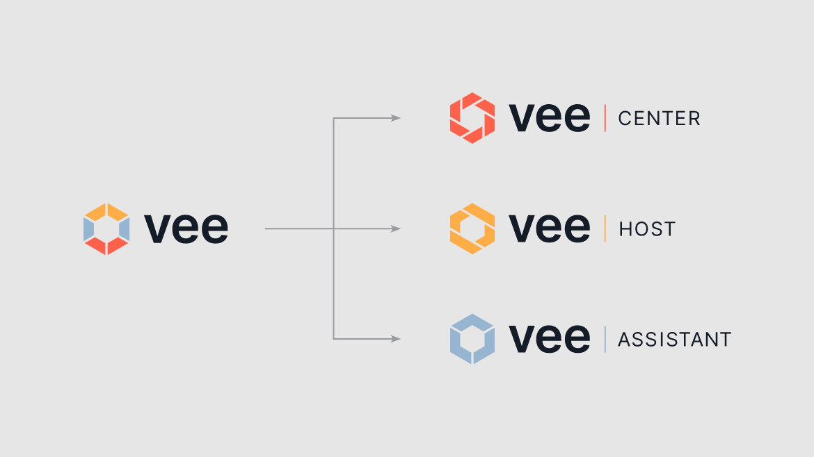
The brand's personality was transformed into a cohesive and aesthetic visual system that engages the audience and makes the company recognizable and noticeable across various channels. We created packages of corporate materials (both printed and digital), promotional gadgets, as well as functional websites and web applications that support Vee's daily operations and provide tangible business value.
Big idea
Key words
Semantics
Website


RGB: 168 183 209
HEX: #a8b7d1
RGB: 234 92 71
HEX: #ea5c47
RGB: 248 177 51
HEX: #f8b133
Typography
Main font
Auxiliary font
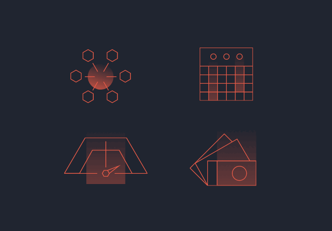
Iconography