Vee
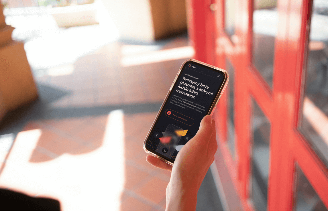
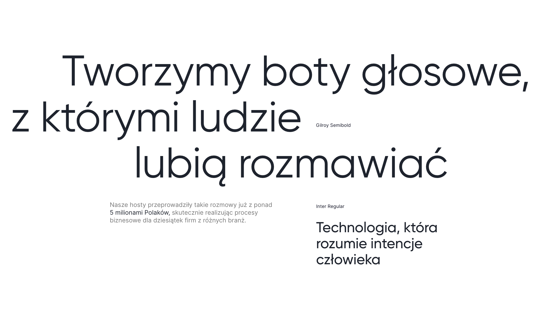
Vee specializes in automating telephone customer service processes, bringing intelligent voice hosts to the market that people like to talk to. The company has rich and diverse experience in the implementation of a wide range of services – from hotline support to the implementation of mass outbound campaigns.
Vee S.A.
Scope of work
Branding
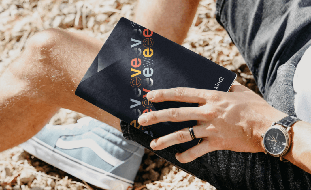
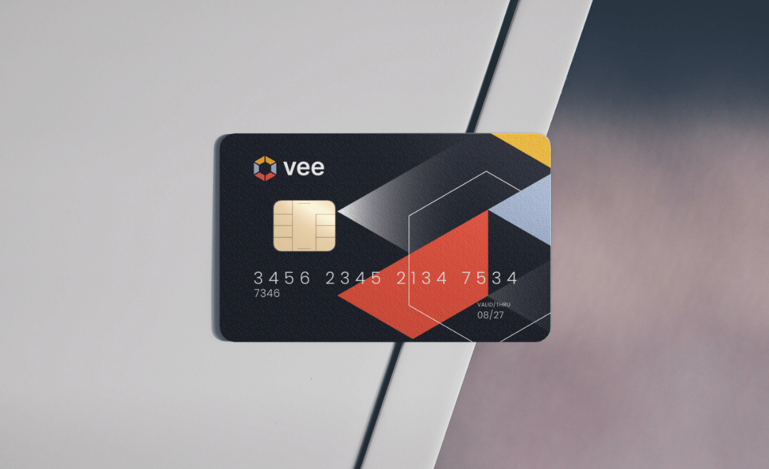
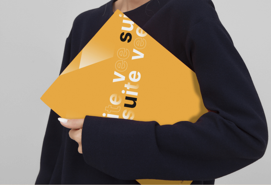
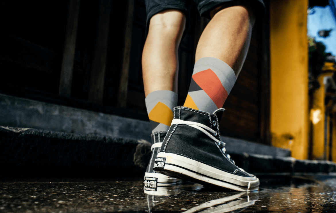
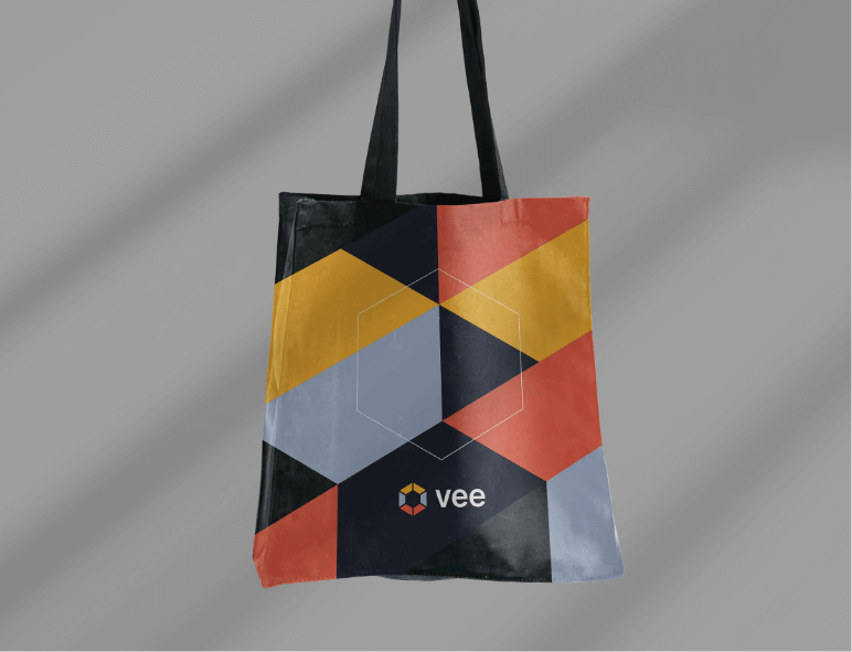
Gadżety
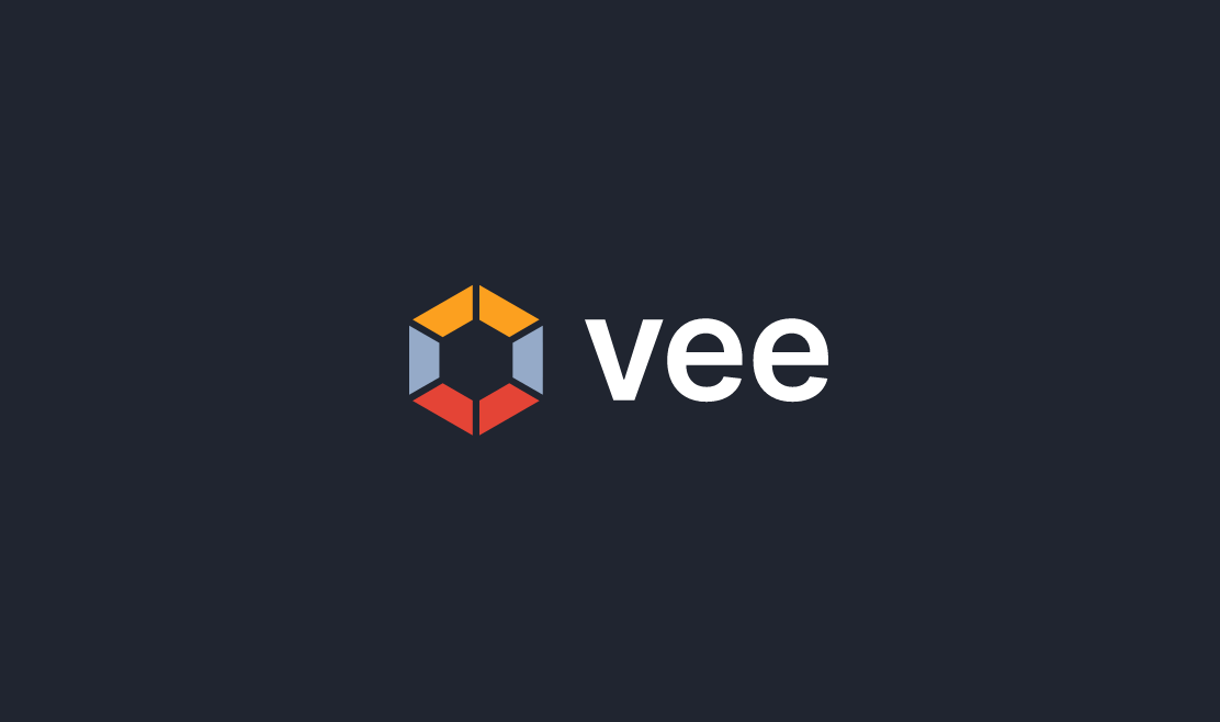
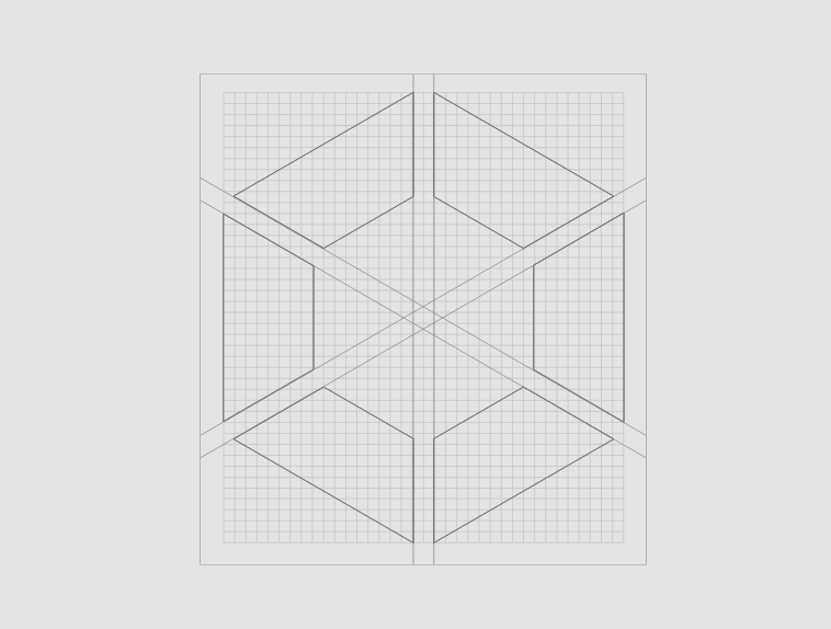
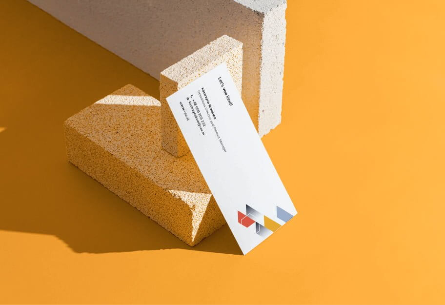
Logo
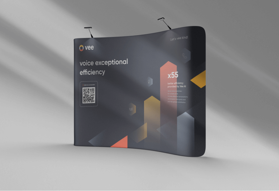
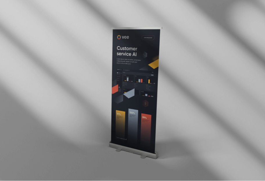
Production and printing
Social media
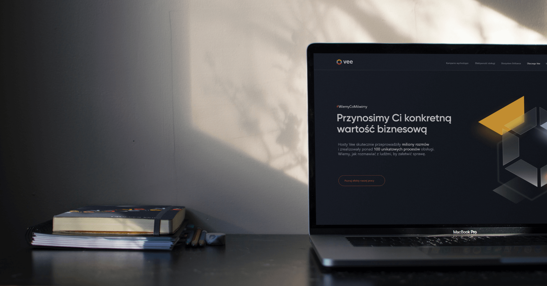
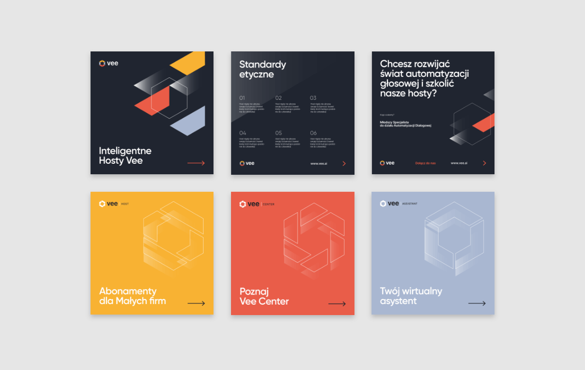
Website
2023
Vee S.A.
2023
Branding
Gadżety
Logo
Production and printing
Social media
Website

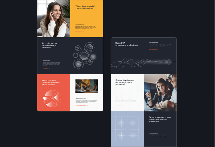
Website • Logo • Branding • Iconography •
Process
 rotate(-45)' fill='%23c2f500'/%3E%3C/svg%3E%0A)
objective
Our main goal was to create a brand image that emphasizes the innovativeness of the services provided by the client, but at the same time is friendly and accessible. We also wanted to present the wide possibilities of Vee technology in the best possible way - professional, substantive and encouraging - to help to establish new business relationships.
solution
The solutions we proposed were to best reflect the company's values, build a consistent image of the company and distinguish it from the competition. The key words we referred to during the entire creative process and which characterize Vee's services are: professional, substantive, effective and friendly.
effect
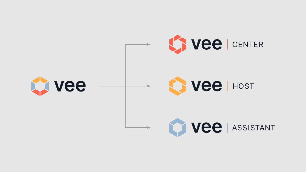
The brand's personality has been forged into a coherent and aesthetic visual system that engages the audience and makes the company recognizable and visible in many channels. We have created packages of company materials (printed and digital), advertising gadgets and functional websites and web applications that support Vee's daily activities and bring business value.
Big idea
Key words
Semantics
Website


RGB: 168 183 209
HEX: #a8b7d1
RGB: 234 92 71
HEX: #ea5c47
RGB: 248 177 51
HEX: #f8b133
Typography
Main font
Auxiliary font
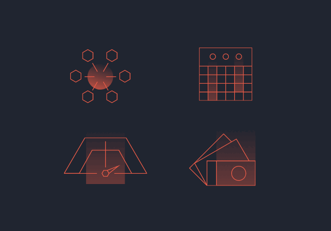
Iconography