WellB
Manufacturer of high quality and carefully designed pillows, specialist products for meditation, yoga or feeding children.
WellB
Scope of work
Branding
Logo
Production and printing
Social media
2023
WellB
2023
Branding
Logo
Production and printing
Social media
Social media • Logo • Branding • Packaging •
Process
 rotate(-45)' fill='%23c2f500'/%3E%3C/svg%3E%0A)
objective
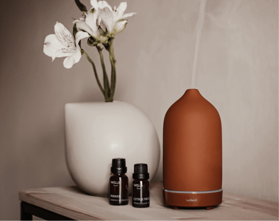
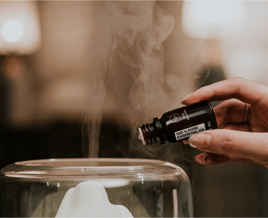
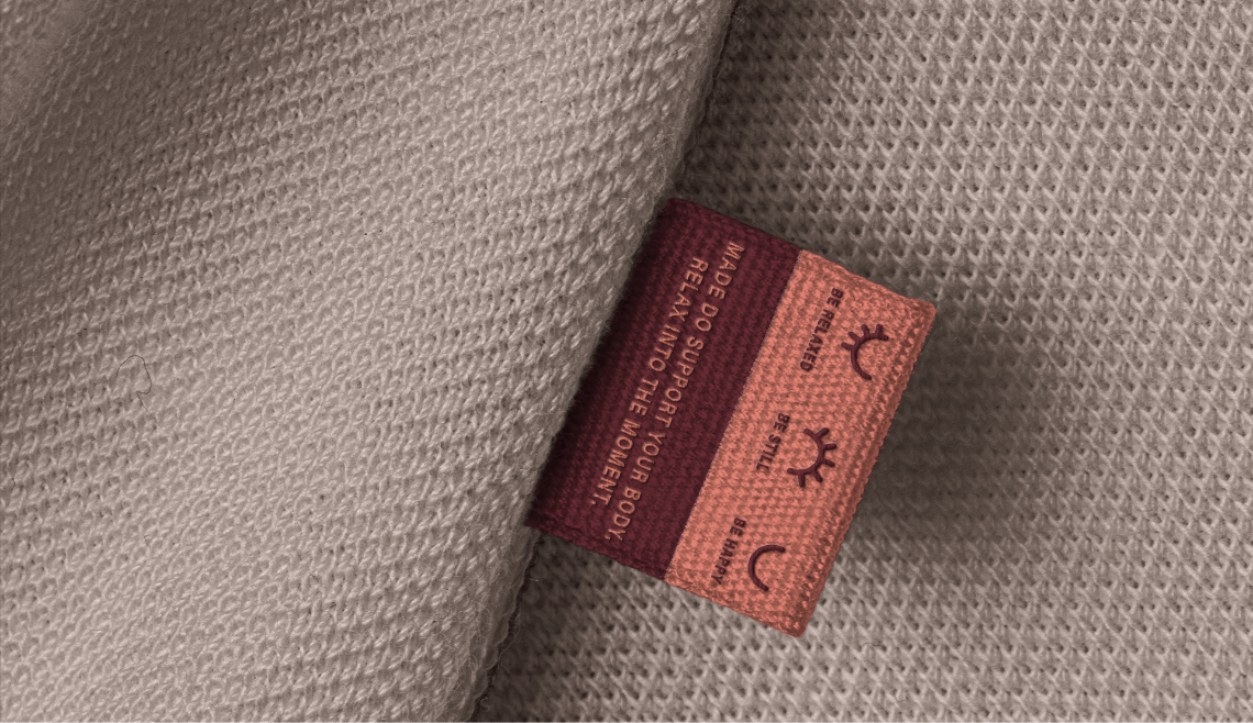
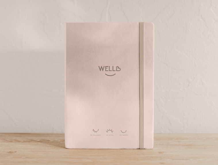
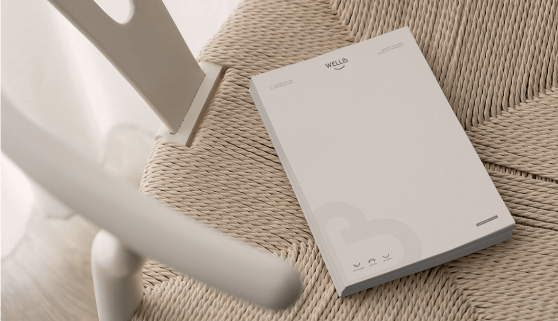
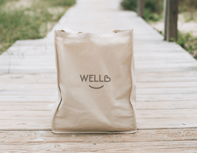
Creating a coherent image and identification system of a new brand - starting from developing a name that harmonizes with the company's mission and values, to product labels or oil packaging. Lightness, care, professionalism and quality.
solution
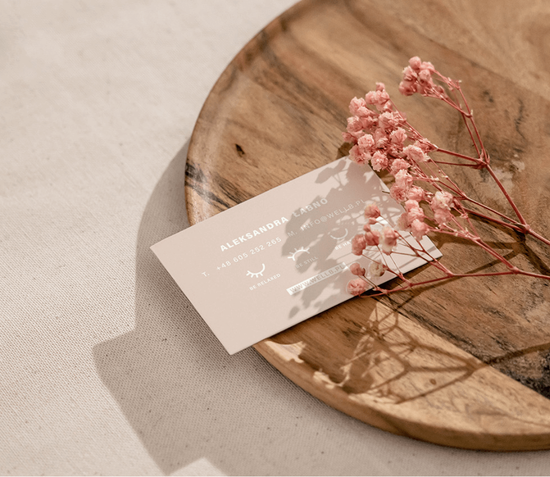
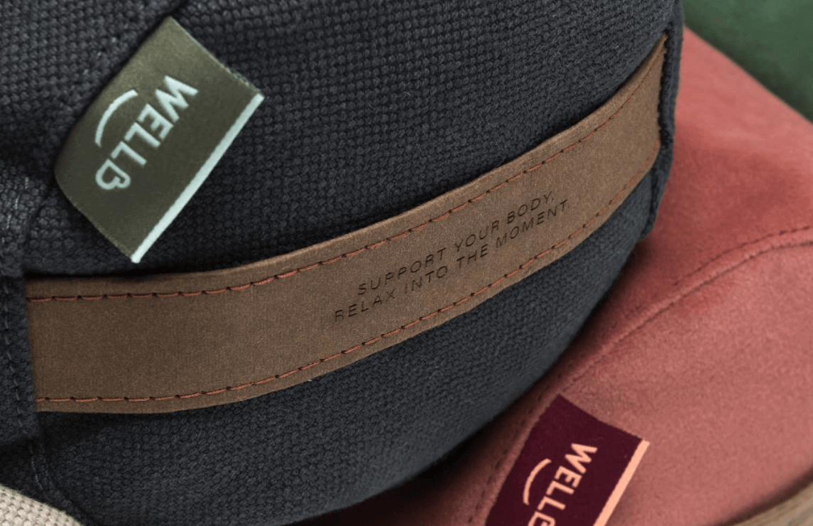
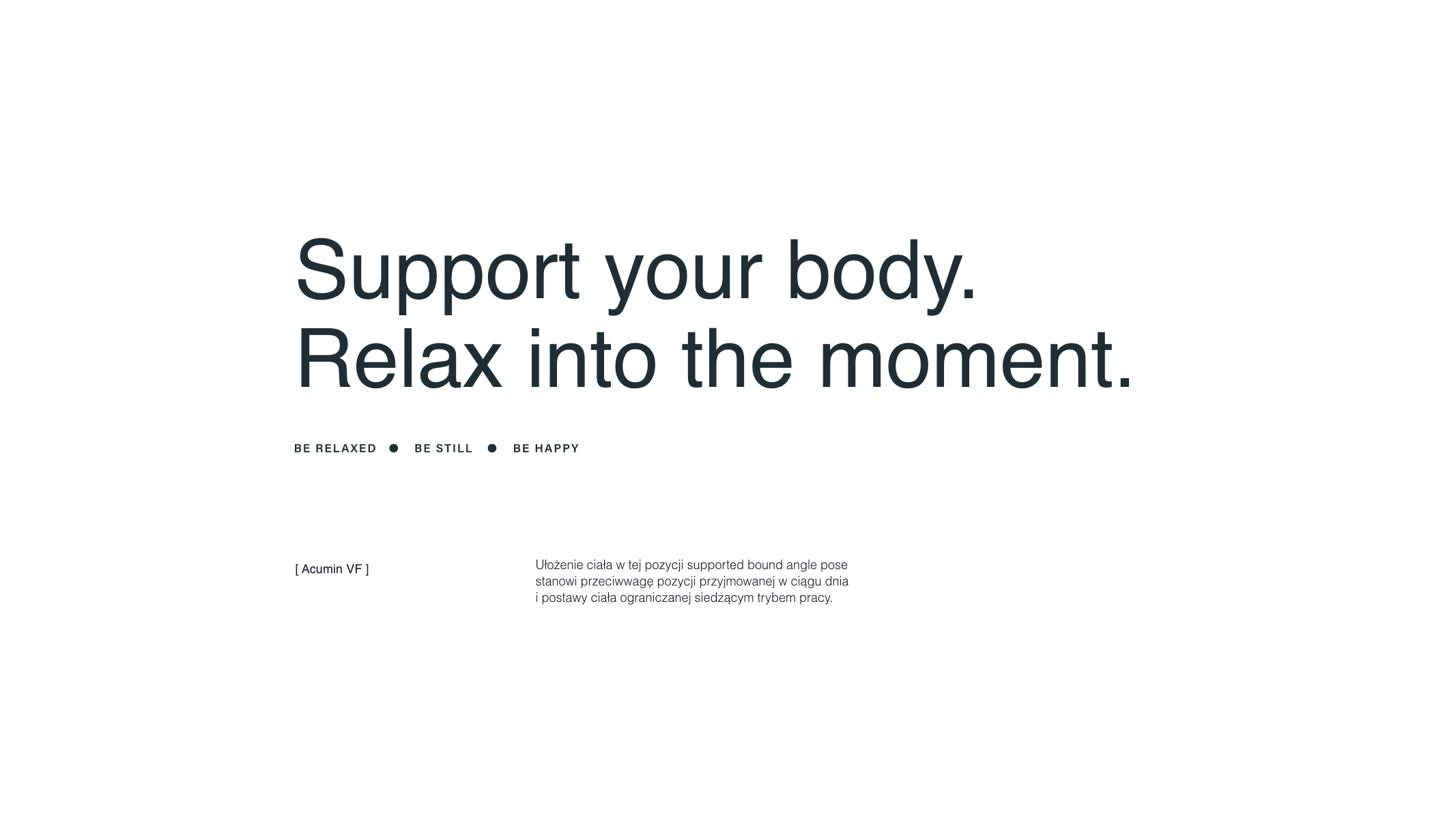
The name referring to the well-being of people using the brand's products - well b(e) - be calm, be happy, be relaxed. Identification based on delicate, pastel pink combined with pastel green and earth colors - mainly in packaging.
effect
Friendly identification supporting the brand image, conveying clear message of support, care for mental and physical health, and quality.
Big idea
Key words
Semantics
RGB: 232 210 201
HEX: #e8d2c9
RGB: 255 255 255
HEX: #ffffff
RGB: 135 135 135
HEX: #878787
Typography
Main font
Auxiliary font
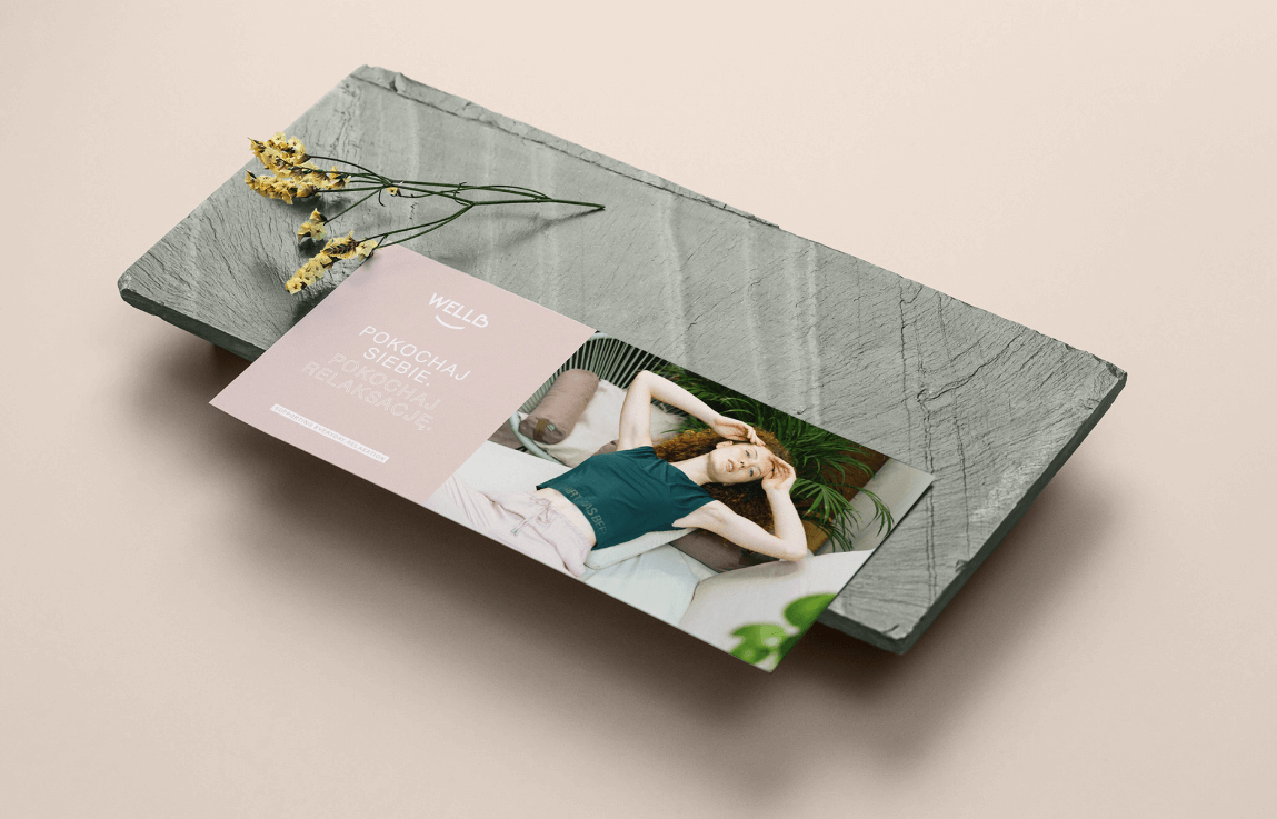
Packaging