.svg)
.svg)

HomeKoncept
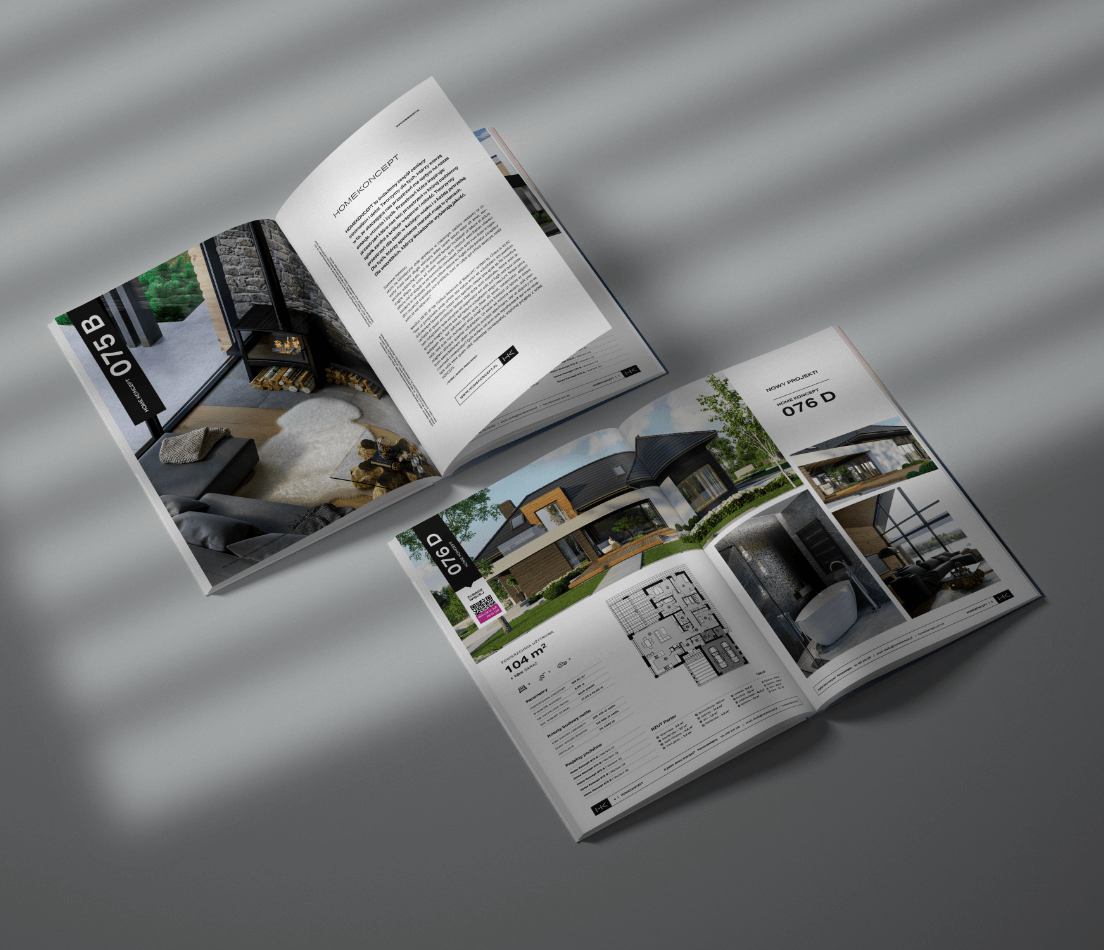
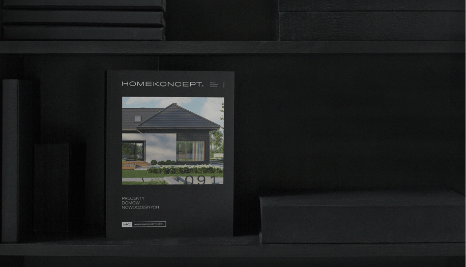
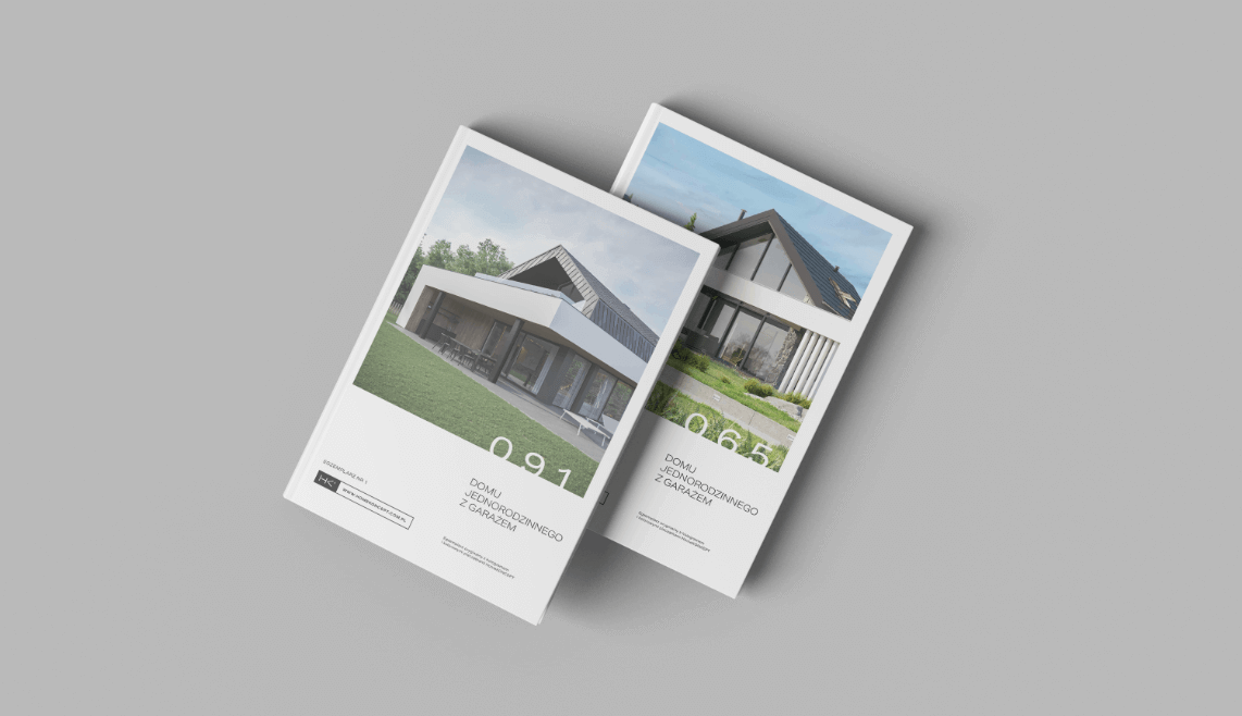
HomeKoncept is a studio specializing in designing modern and exceptional homes at the highest level. The brand is characterized by modern design, thoughtful solutions, and refined visualizations.
HomeKoncept
Scope of work
Branding
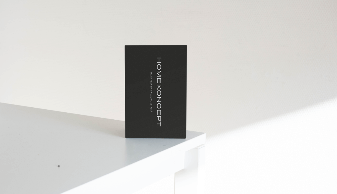
Logo
Production and printing
Social media
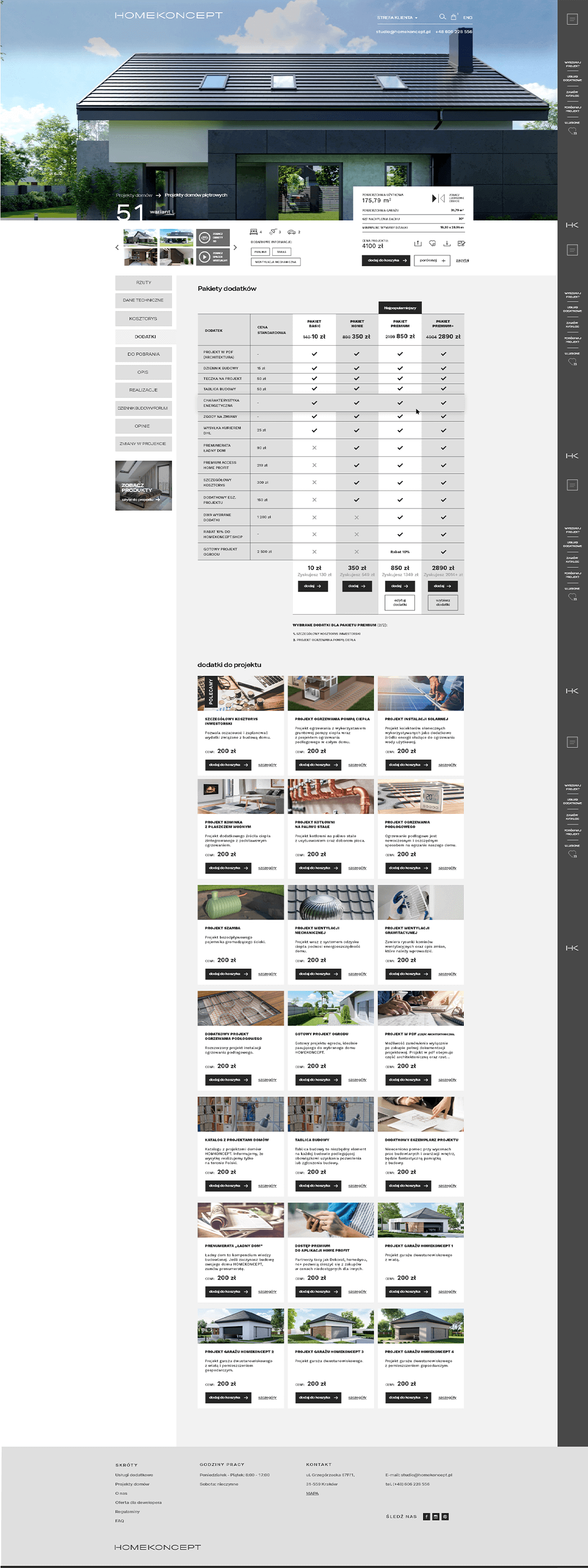
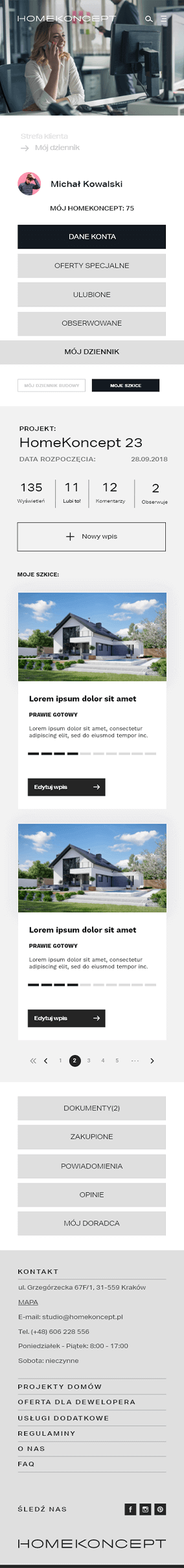
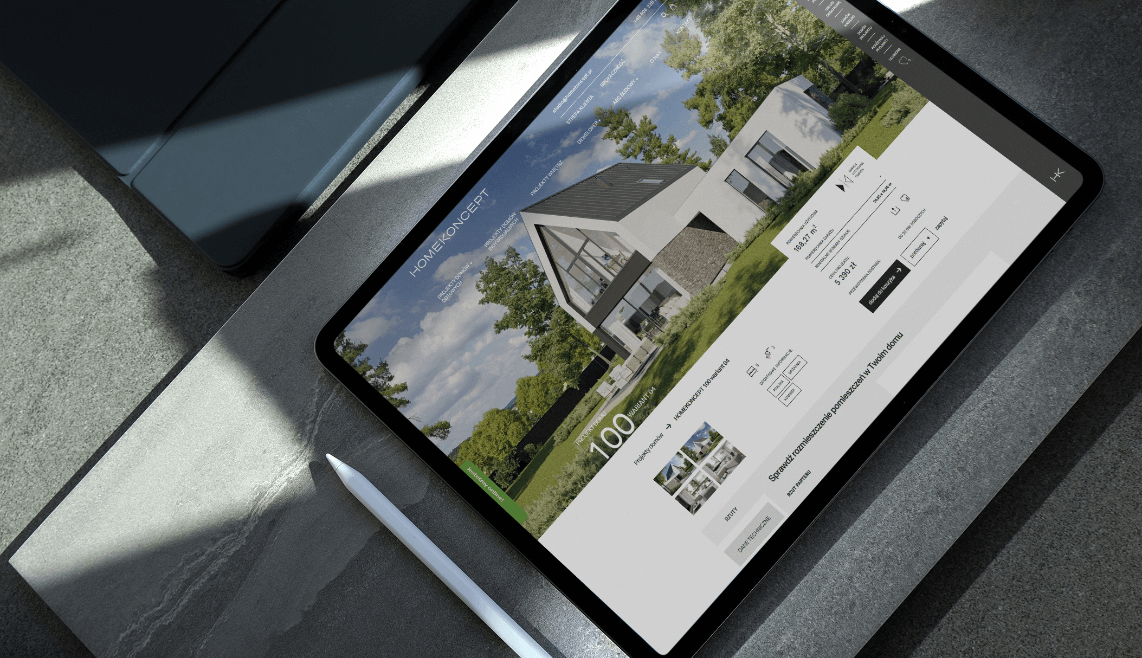
Website
2021
HomeKoncept
2021
Branding
Logo
Production and printing
Social media
Website
Process
 rotate(-45)' fill='%23c2f500'/%3E%3C/svg%3E%0A)
Goal
The goal was to rebrand and create a comprehensive identity that aligns with the brand's spirit, i.e., minimalism, timelessness, and unconventional character. Developing a visual key that is simple yet embedded in a rather exclusive style.
Solution
An identity in shades of black and white, focused on typography. Inspiration from house designs by developing a grid system and adhering to it in all materials, creating a sense of order and symmetry. Avoiding unnecessary embellishments, embracing simplicity.
Result
A simple, uncluttered image that harmonizes with the studio's activities and projects.
Big idea
Website
Key words

Semantics
RGB: 38 38 38
HEX: #262626
RGB: 217 220 222
HEX: #d9dcde
RGB: 255 255 255
HEX: #ffffff
Typography
Main font
Auxiliary font
