Choose your solutions wisely, but also, if you have the freedom, go wild!
2021, like the previous year, has resulted in an even greater focus on technology. The pandemic, lockdowns and the transfer of business and communication to the web have meant that the end user is constantly being surprised and pampered, and the content that is directed to them is even more personalised. This need to stand out from the competition and surprise the user can also be seen in current trends in web design. That is why we decided to present you with the 5 most interesting ones, in our opinion.
Parallax
Although it has been in use for several years, in 2021 parallax takes on a new dimension – in combination with scrolling it creates interactive, sometimes even “magical” animations that effectively add variety to the site. Parallax is an optical illusion created when objects near the viewer seem to move faster than objects further away. This effect, transferred to websites, creates an effect of depth, and the user, while scrolling, is increasingly drawn into an interactive world.
Scroll animations
This year, scrolling animations can be considered one of the most extensive trends in web design. The user scrolling through the page is no longer just moving around to get to some information, but is interacting, participating in what is happening, and his interest is constantly being attracted by different types of actions. It could be the colour of the page, which changes with every scroll, it could be more complex animations in the background, animations of typography, or it could also be an animated cursor changing its form. All this translates into a dynamic page, adds to the personality of the brand and effectively engages the user.
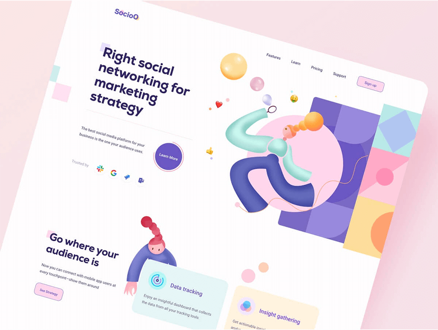
Abstract forms and colours
In 2021, web designers have apparently grown fond of colour. Far more often, strong colours are used as backgrounds for individual sections on a page, often also changed by scrolling animations. Abstract forms and shapes in vibrant colours are also widely used in combination with photos and typography and are often the central elements of a page. The whole looks very expressive, adds life and personality and attracts.

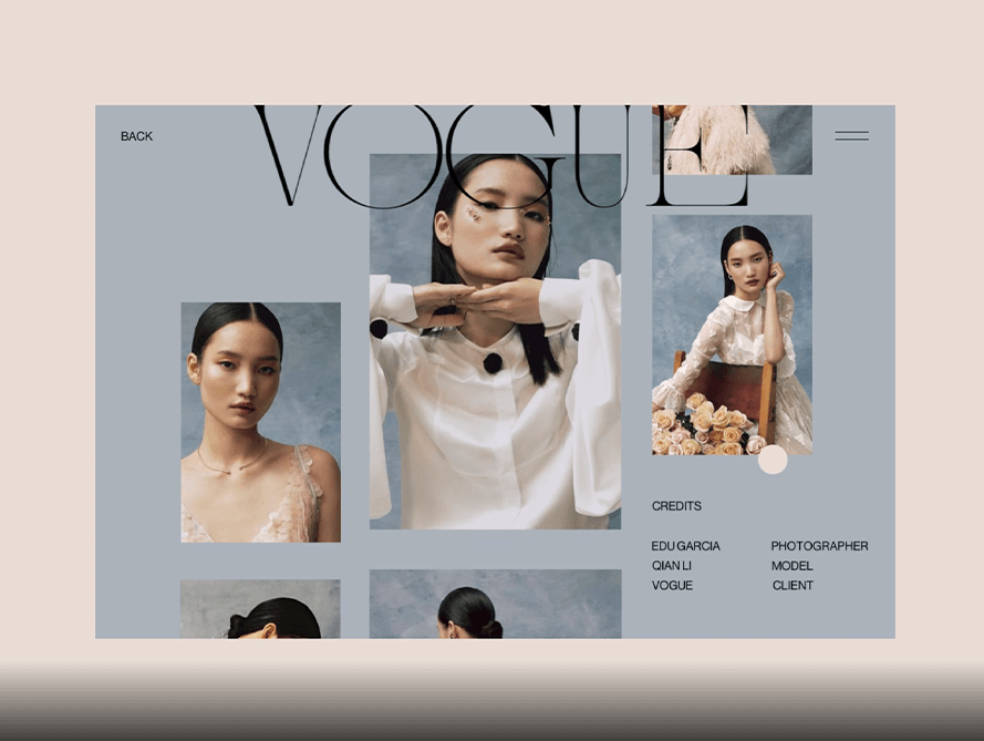
Asymmetry, irregular margins and offsets
Controlled chaos, or the use of asymmetry and shifting elements, is definitely one of our favourite web design trends. Moving away from rectangular grids with perfectly even margins provides an interesting and elegant look, while using different sizes of photos and their shifts makes the page look lighter and more customised. Skillfully introduced asymmetry can completely change the look of even a very simple page.

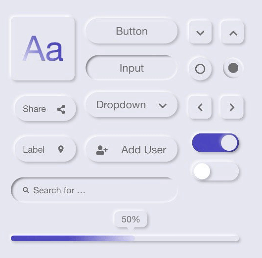
Neomorphism
In 2021 we are seeing a gradual development of this trend, although it is not yet visible on many pages due to its problematic nature. It is very easy to make the opposite effect – bad interlineation, oversized or thick fonts definitely do not serve to your advantage. Neomorphism relies on low contrast and the design is based on soft shadows, so it can be quite bland in the perception of the site user.

What’s next?
These are just a few of the trends we are seeing in web design this year. Certainly in the second half of 2021 other new trends will emerge, or take the lead over existing ones, but we’ll look at that and summarise it in December.
