
visual identity
visual identity
Nestino
Nestino is a brand dedicated to creating smart homes. It frees you from routines, automates processes, integrates devices and functionalities to make home management as simple as possible.
Client
Scope of work
Branding
Logo
Social media
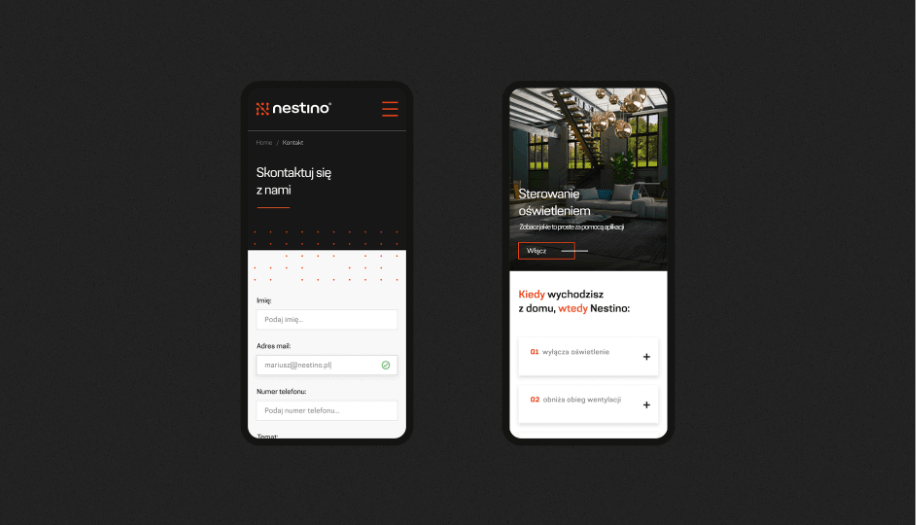
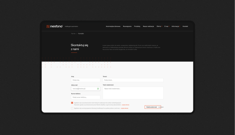
Website
Nestino
Scope of work
Branding
Logo
Social media
Website
Date
2021
2021
Client
Nestino
Date
2021
2021
Scope of work
Branding
Logo
Social media
Website
Branding
Logo
Social media
Website

notes
• Logo • Branding • Iconography • Website
sygnet
Process
 rotate(-45)' fill='%23c2f500'/%3E%3C/svg%3E%0A)
objective
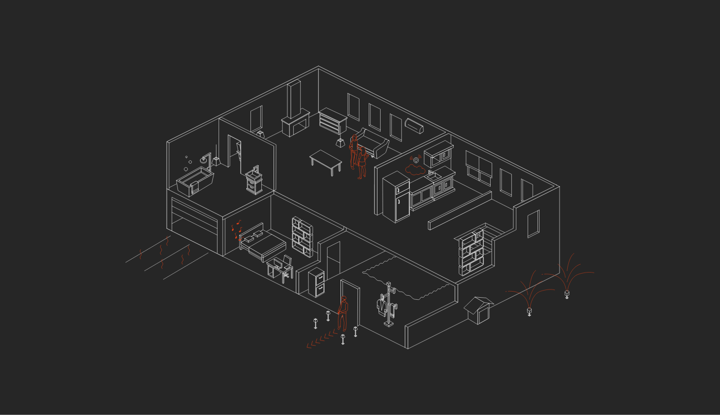
Creating an identity that conveys the brand's key differentiators: modernity, love of technology and a high standard of service.
solution
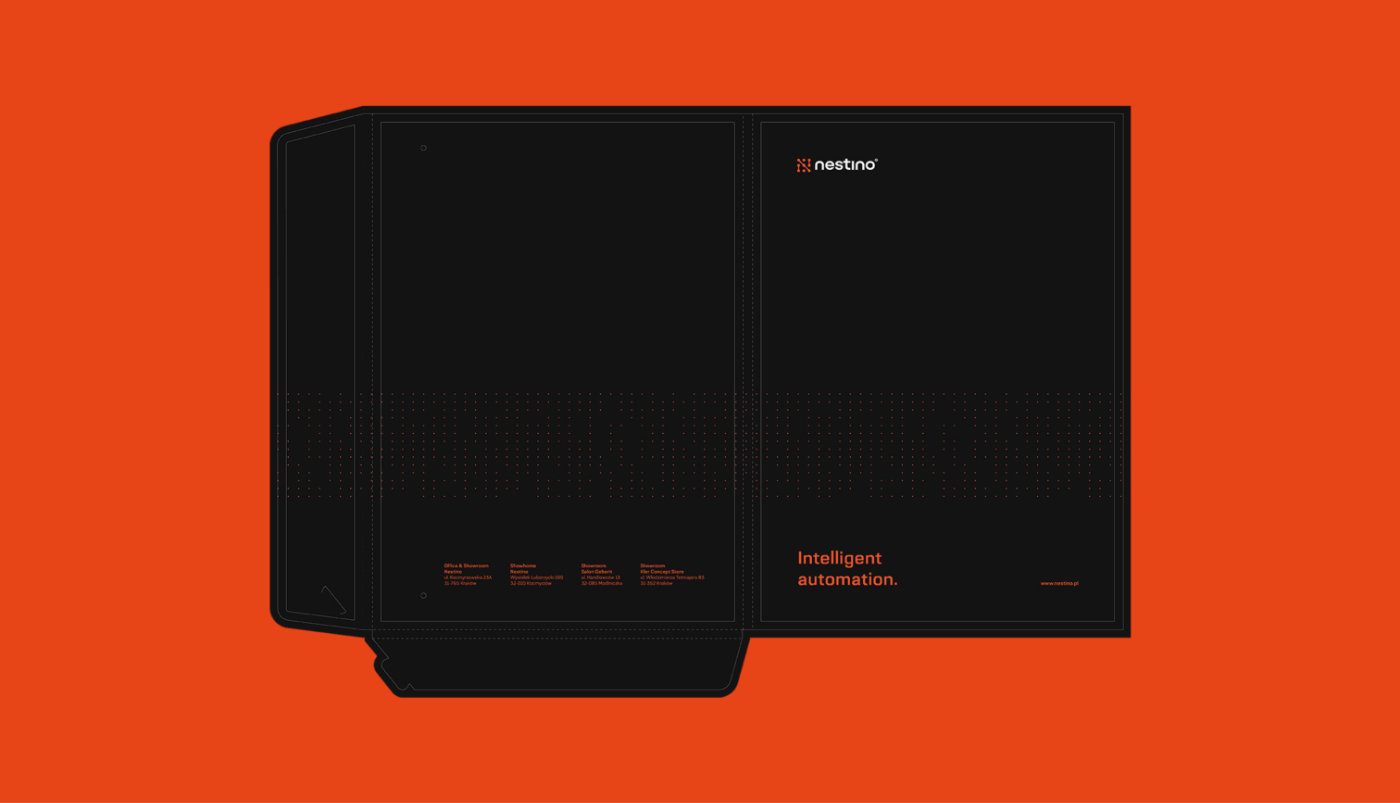
Complete identity with all company materials. Design and implementation of a responsive website. In the materials we used enhancements, tinted paper and cover cut-outs to emphasise the premium brand.
Big idea
When creating the identity, we wanted to present a premium brand - but at the same time, a professional and friendly one. It was also important to present an image that indicates competence and availability.
grafika
Website
The website in the case of Nestino is intended to serve as a tool in working with business and private customers, presenting possible solutions and products, focused on the benefits of having a smart home. Everything shown in a pictorial and clear way.

FILM
Key words
Change of thinking Change of thinking
Trends Design Branding Trends Design Branding
Change of thinking Change of thinking
Trends Design Branding Trends Design Branding
Trends Design Branding Trends Design Branding
Change of thinking Change of thinking
Trends Design Branding Trends Design Branding

Semantics
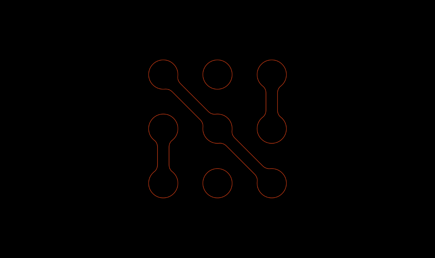
The signet - the letter N - combines the initial of the company's name, a reference to neural networks and associations with integrated circuits. The logotype has a sans-serif typeface to emphasise the modern, yet friendly character of the company related to the technology industry.

Semantyka
CMYK: 0 6 18 87
RGB: 34 32 28
HEX: #22201c
RGB: 34 32 28
HEX: #22201c
CMYK: 0 71 90 9
RGB: 231 68 23
HEX: #e74417
RGB: 231 68 23
HEX: #e74417
CMYK: 0 0 0 0
RGB: 255 255 255
HEX: #ffffff
RGB: 255 255 255
HEX: #ffffff
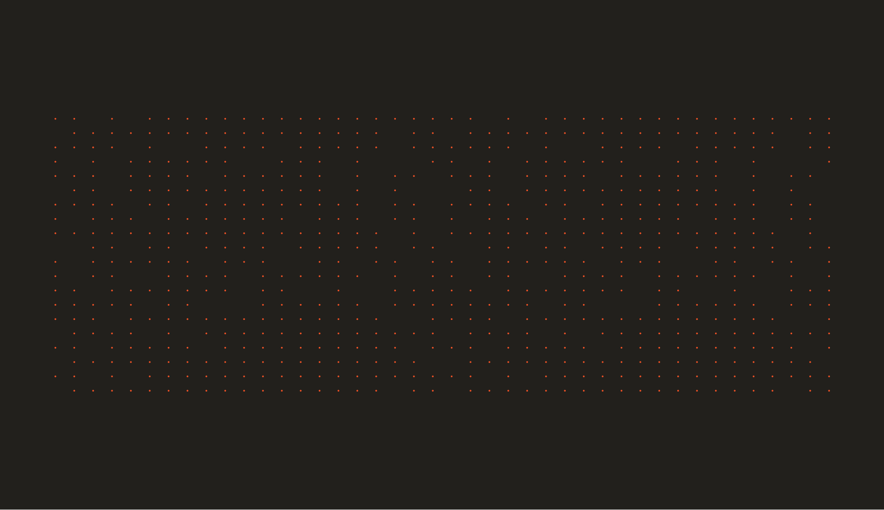
pattern
Typography
The font used in the communication is Grafia Sans Pro. The sans-serif typeface was chosen to emphasise the modern, yet friendly character of the company related to the technology industry.
Main font
Grafia Sans Pro
Auxiliary font
Grafia Sans Pro

Iconography
Icons are an important part of visual identity - they complement the design and have an informative function.

Recent projects
Intima Clinic
Holistic approach to the health of patients
irtech
High-quality specialized measurement devices
Itrons
HVAC projects, execution, investment supervision, and much more
myvee
Innovation in the mobile telecommunications market
Intima Clinic
Holistic approach to the health of patients
irtech
High-quality specialized measurement devices
Itrons
HVAC projects, execution, investment supervision, and much more
myvee
Innovation in the mobile telecommunications market