visual identity visual identity
Press play and see our showreel

PR Plastics

PR Plastics is a company that recycles LDPE waste and converts it into regranulate that can be reused with greater efficiency. The company boldly looks to the future by giving a second life to plastic and contributing to sustainable development.

Client

PR Plastics


Scope of work
Date
2021
Client

PR Plastics

Date
2021
Scope of work
08-mnml-branding-mockup@2x (1)

• Logo • Branding • Iconography • Social Media

logo PR

Process

objective

A visual identity for a newly established company dealing with recycling of plastic waste. Creating a solid visual image associated with technological advancement, care for the environment and innovation in sustainable development.

solution

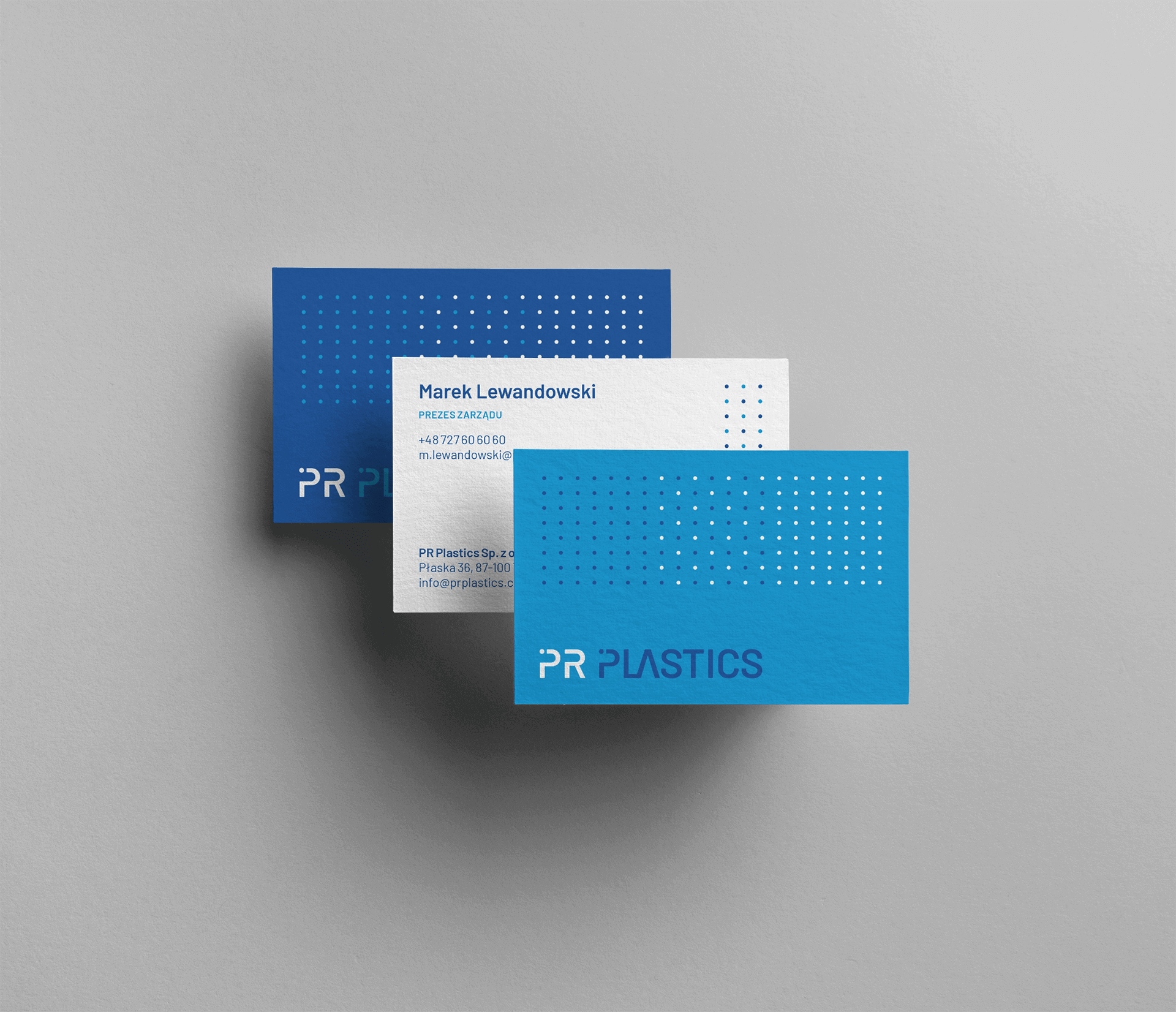
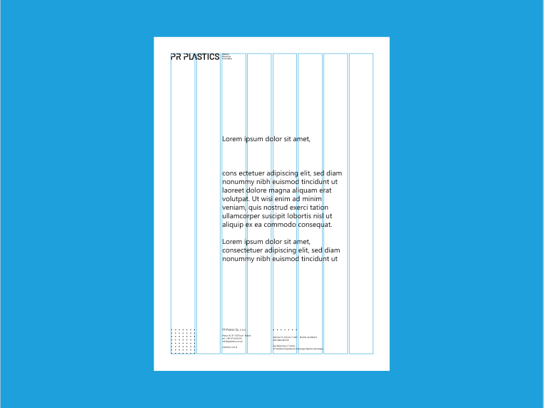
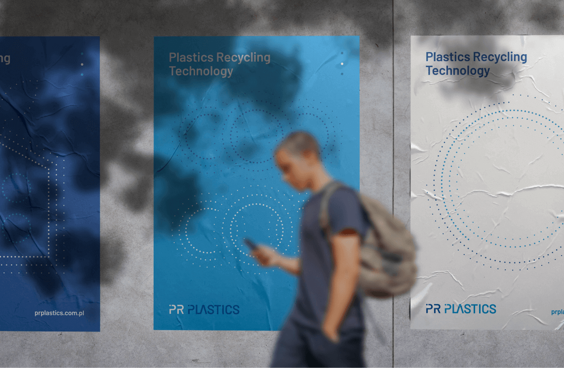
The constructed visual language is based on the use of a graphic motif in the form of dots symbolising recycled regranulate, forming different shapes, which are used consistently throughout the communication. The colours used, i.e. shades of blue and white, are reminiscent of technology and innovation.

effect

PR Plastics is ready to enter a competitive market and the image achieved is consistent with the brand's character and mission.

Big idea
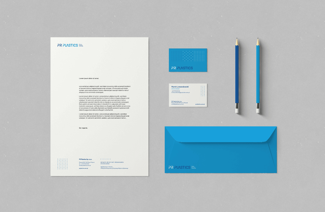
It was important that the visual key referred to technology, recycling effects, indicating sophistication and innovation. At the same time, it was important to show the company's well thought-out strategy and solid business foundation.
Branding-Stationery-Mockups
Przechwytywanie1

Key words

 Identification Branding Trends
 Logo Social Media KV
 Identification Branding Trends
 Logo Social Media KV
 
 Logo Social Media KV
 Identification Branding Trends
 
 Logo Social Media KV
 

Semantics

The logo has a typographic form, consisting of the text part alone with a modification in the letter P - a dot inscribed in the line of the letter.
Wall-Poster-Mockup2
brand-identity
CMYK: 87 28 0 15
RGB: 28 158 218
HEX: #1c9eda
CMYK: 77 44 0 36
RGB: 37 91 163
HEX: #255ba3
CMYK: 0 0 0 0
RGB: 255 255 255
HEX: #ffffff
fdvfv

Typography

A single font family, Barlow, has been used, with multiple typefaces, allowing for gradation and maintaining a technological feel.

Main font

Barlow

Auxiliary font

Barlow
typography

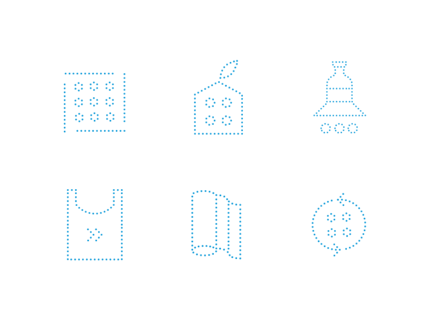
Iconography

The icons are a continuation of the main graphic theme - the dots. Sets of icons use dots to create specific shapes that symbolise a particular issue.
logo
Logo-Mockup

Recent projects

PolTREG
Revolutionary therapies for autoimmune diseases
WellB
Relaxation and balance in everyday life
Pure Dent
A place where the patient's smile counts
Regamet
Beautiful and durable roofing for years
PolTREG
Revolutionary therapies for autoimmune diseases
WellB
Relaxation and balance in everyday life
Pure Dent
A place where the patient's smile counts
Regamet
Beautiful and durable roofing for years