Novicare
Novicare is a manufacturer of orthopedic products and a distributor of recognized brands such as Orthocare, Dr. Med and ABCTeks. It also runs 4 Novicare24 orthopedic stores, offering a wide range of products with a great price-quality ratio. The brand is distinguished by its approach to the client and his recovery – it focuses on development and looks for tools allowing for the fastest and most comfortable return to full fitness.
Novicare Sp. z o.o.
Scope of work
Branding
Logo
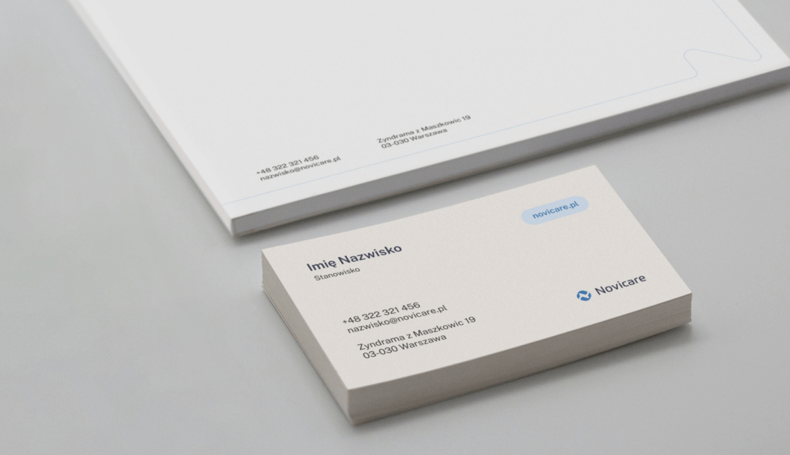
Production and printing
Social media
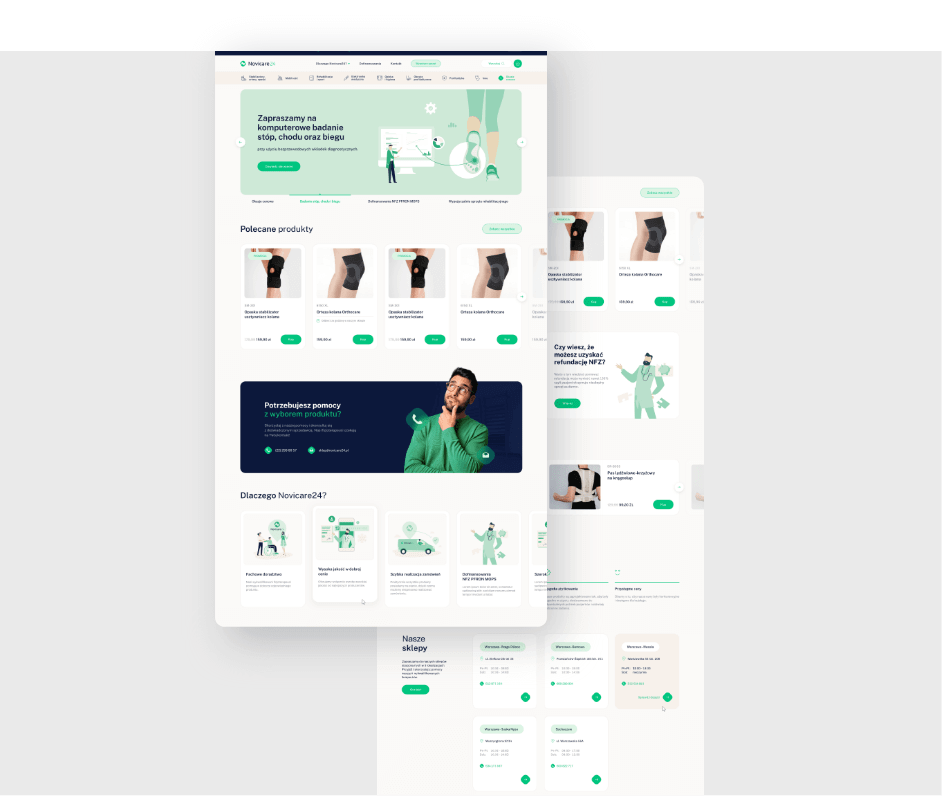
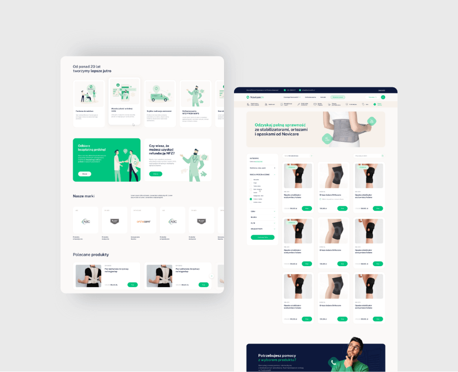
Website
2023
Novicare Sp. z o.o.
2023
Branding
Logo
Production and printing
Social media
Website
Website • Logo • Branding • Iconography •
Process
 rotate(-45)' fill='%23c2f500'/%3E%3C/svg%3E%0A)
objective
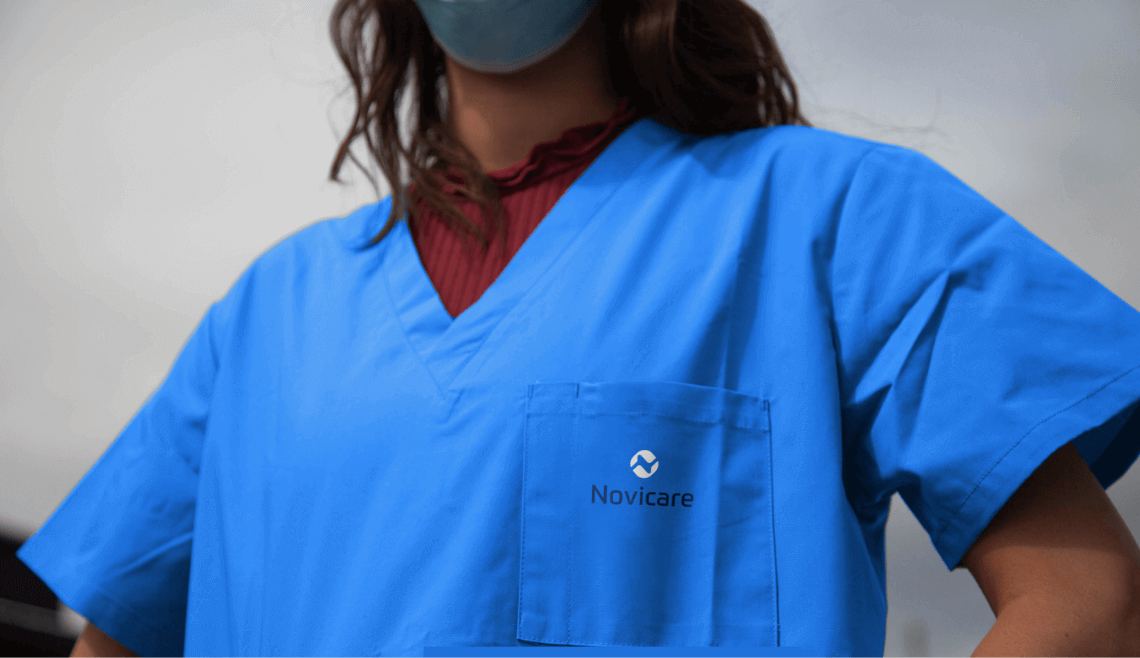
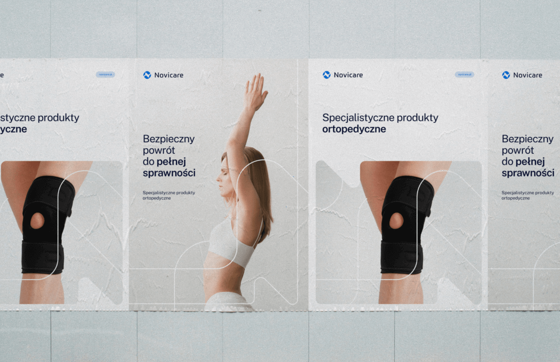
Developing a visual identity that shows the professionalism and expertise of the brand, as well as accessibility and empathy towards the recipient.
solution
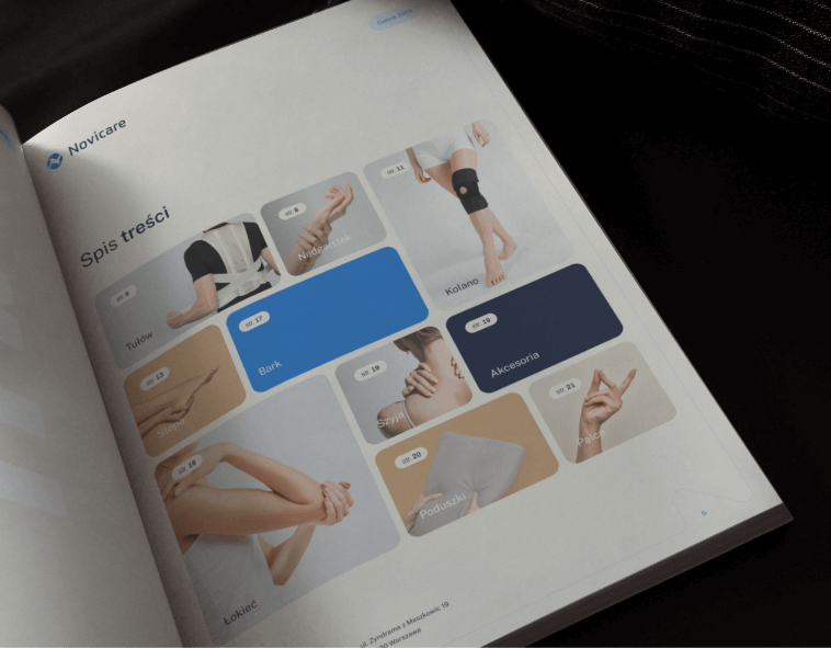
Identification based on colors associated with the medical area, professionalism and support. The use of natural, harmonious photos of patients and the products on plain backgrounds.
effect
A coherent and aesthetic visual system showing the personality of the brand and its values: empathetic relations with the recipient, combined with quality and professionalism. An image that gives a sense of certainty of choice and security.
Big idea

Key words
Semantics
RGB: 13 24 59
HEX: #0D183B
RGB: 247 241 235
HEX: #f7f1eb
RGB: 5 115 228
HEX: #0573e4
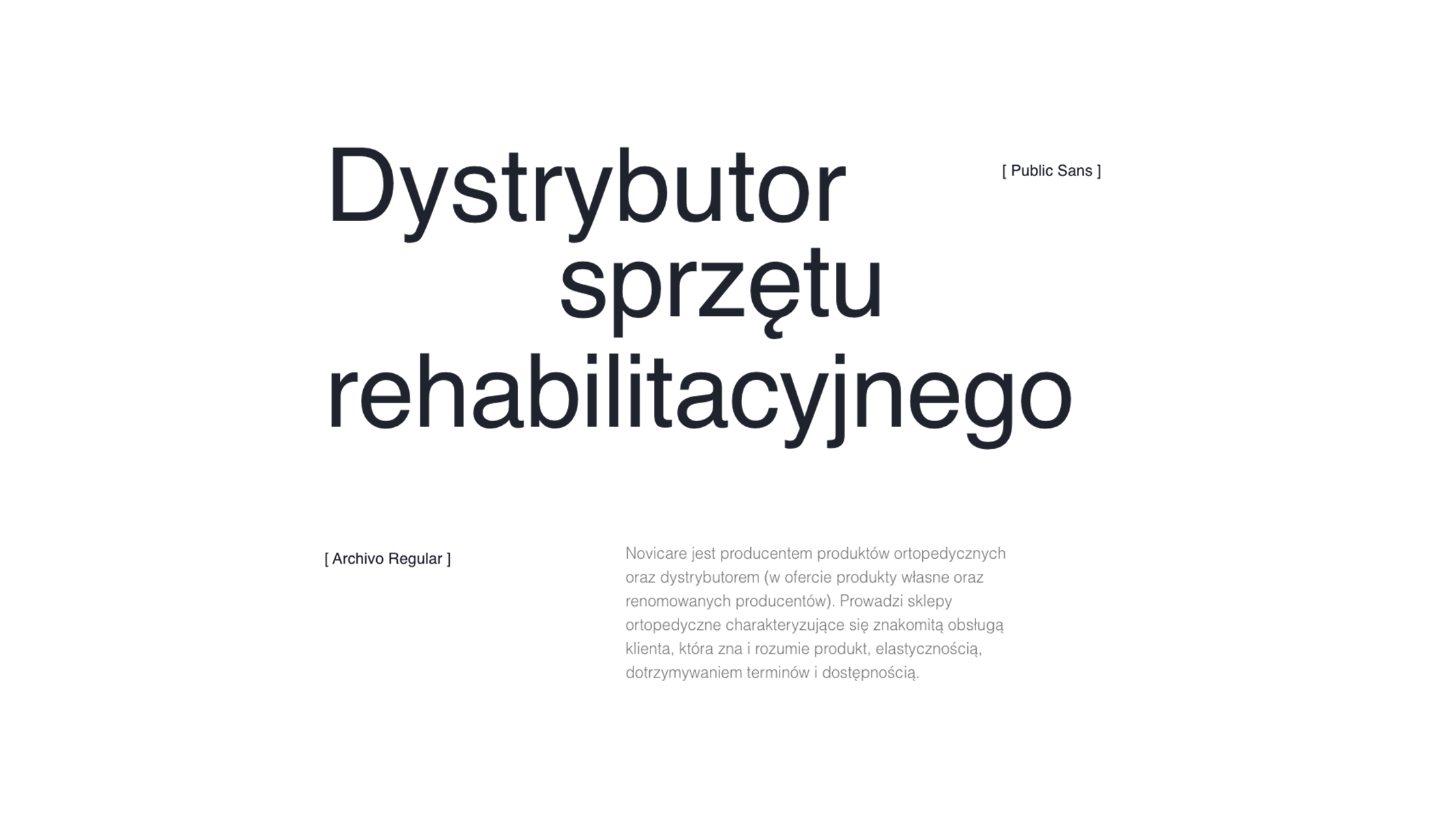
Typography
Main font
Auxiliary font
Sub-brands

Website
Iconography